What are microinteractions?
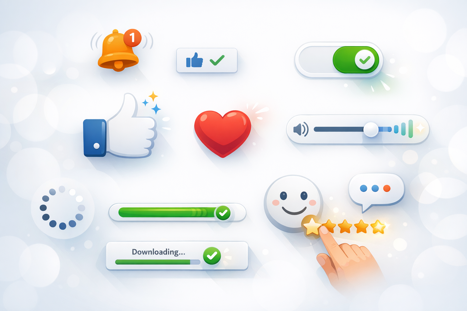
Microinteractions are the small, contained moments in a digital product that help users accomplish a single task, understand what’s happening, or feel in control. They’re the tiny pieces of feedback and behavior that show up when you like a post, toggle a setting, refresh a page, upload a file, or receive a subtle confirmation that something worked.
They may be brief, but microinteractions play an outsized role in how a product feels. When done well, they make interfaces seem responsive, trustworthy, and even a bit human. When missing—or done poorly—they can make an experience feel confusing or brittle.
Why microinteractions matter in UX
Microinteractions aren’t decoration. They’re functional design details that improve clarity and reduce friction. Here’s what they typically achieve:
- They provide feedback: Users instantly know an action was received (e.g., a button changes state after a click).
- They guide behavior: Small cues can teach users what to do next without extra instructions.
- They prevent errors: Inline validation and smart constraints stop mistakes before they happen.
- They build trust: Clear system status (loading, saving, syncing) reassures users that the product is working.
- They add delight (strategically): A tasteful animation or confirmation can make repetitive tasks feel lighter—without getting in the way.
In short: microinteractions improve usability, accessibility, and perceived quality—often with minimal surface area.
The anatomy of a microinteraction
Most microinteractions can be broken down into four parts. Thinking in this structure helps teams design them intentionally rather than accidentally.
1) Trigger
The trigger is what initiates the microinteraction. It can be:
- User-initiated: Clicking a button, swiping, hovering, pulling to refresh.
- System-initiated: A notification appears, a connection drops, an autosave completes.
2) Rules
Rules define what happens once the microinteraction is triggered. For example: “When a user toggles Dark Mode on, apply the dark theme immediately and save the preference.” Rules also cover edge cases, like what happens if saving fails or the user is offline.
3) Feedback
Feedback is how the system communicates the result—visually, textually, or haptically. Examples include a progress bar during upload, a checkmark confirming success, or a subtle vibration on mobile. Great feedback is timely, clear, and proportional to the action.
4) Loops & modes
Loops define what happens over time (e.g., does the animation repeat? does the status persist?). Modes describe different states the user can be in (e.g., “Do Not Disturb” changes notification behavior). Considering loops and modes prevents microinteractions from feeling inconsistent or surprising.
Common examples of microinteractions
Microinteractions show up everywhere, but a few categories are especially common:
- Button states: hover, pressed, disabled, loading (“Saving…”), success (“Saved”).
- Form interactions: inline validation, password strength meters, input masks, “show password” toggles.
- Notifications: toasts, snackbars, badges, gentle banners that confirm an action or flag an issue.
- Loading and progress: skeleton screens, spinners (used sparingly), step indicators, upload progress bars.
- Gestures and movement: pull-to-refresh, swipe-to-archive, subtle transitions that explain navigation.
- Status indicators: online/offline, syncing, “last saved,” unread markers, active filters.
Notice the theme: each one answers a user question like “Did that work?”, “What’s happening now?”, or “What can I do here?”
Principles for designing effective microinteractions
Strong microinteractions look simple on the surface, but they’re guided by a few consistent principles.
Keep them purposeful
Every microinteraction should solve a problem: clarify a state, confirm an action, prevent an error, or guide the next step. If an animation doesn’t add meaning, it can become visual noise.
Make feedback immediate and clear
Users shouldn’t wonder whether they clicked correctly or if the system is lagging. Provide instant acknowledgement (even if the full operation takes time). For longer processes, show progress or at least a clear “working” state.
Be consistent across the product
Consistency reduces cognitive load. If success messages appear as a toast in one area, they shouldn’t show as a modal elsewhere—unless there’s a strong reason. Define reusable patterns for common actions like save, delete, and upload.
Respect user control
Microinteractions should support the user, not hijack attention. Avoid unexpected motion, sound, or interruptions. Where possible, allow undo (e.g., “Item archived — Undo”) instead of forcing a confirmation dialog for every action.
Design for accessibility
Feedback shouldn’t rely on color alone. Pair color changes with text labels, icons, or shapes. Ensure focus states are visible for keyboard users, support screen readers with appropriate ARIA labels, and consider reduced motion preferences so animations don’t cause discomfort.
Match the brand—without overdoing it
Microinteractions can express personality through timing, tone of microcopy, and subtle motion. The key is restraint: brand flavor should never reduce clarity or slow down frequent tasks.
Microinteractions in product design workflows
Microinteractions are easiest to build when they’re part of the workflow, not an afterthought. A few practical ways to integrate them:
- Document states in design files: Show default, hover, pressed, disabled, loading, success, and error states for key components.
- Use a design system: Build microinteraction patterns into shared components (buttons, toasts, form fields) so teams don’t reinvent them.
- Write microcopy early: Short messages like “Saved,” “Try again,” or “Connection lost” should be consistent and tested like any other UI text.
- Prototype timing and motion: Tools like Figma prototyping can communicate intent, but align with engineering on realistic behavior.
- Define acceptance criteria: For example: “On save, show loading state within 100ms, confirm success, and revert to default after 2 seconds.”
This approach reduces ambiguity and ensures the final experience matches what was designed.
Measuring the impact of microinteractions
Because microinteractions are small, teams sometimes skip measurement. But they often influence key metrics—especially in high-frequency flows.
- Task success rate: Do users complete the flow without confusion or support?
- Error rate: Does inline validation reduce failed submissions?
- Time on task: Do clearer states and feedback reduce hesitation?
- Drop-off: Are users abandoning a flow due to unclear progress or uncertainty?
- Qualitative feedback: Usability testing often reveals “I wasn’t sure it worked” moments—perfect microinteraction targets.
Even lightweight A/B tests (e.g., adding an undo toast vs. a confirmation modal) can show whether a microinteraction reduces friction while maintaining safety.
Conclusion
Microinteractions are the fine-grained details that turn a functional interface into a confident, intuitive experience. By focusing on clear triggers, sensible rules, and accessible feedback—then validating the impact with real users—you can make everyday actions feel smoother, faster, and more trustworthy.
