
Web Design That Converts – Turn Visitors Into Revenue
Web design is not about aesthetics—it is about performance. Your website is your most important sales asset, and if it is not designed to convert, it is actively costing you money. Users make decisions in seconds. If your site feels outdated, slow, or confusing, they leave and never come back. Thinkit Media delivers high-performance web design engineered to drive engagement, trust, and conversions.
First Impressions Decide Everything
Research shows that 75% of users judge a business’s credibility based on its website design (Stanford Web Credibility Research). That means your design is either building trust or destroying it before your sales pitch even starts.
Thinkit Media designs modern, conversion-focused websites that immediately communicate professionalism, authority, and clarity.
Web Design Directly Impacts Conversions
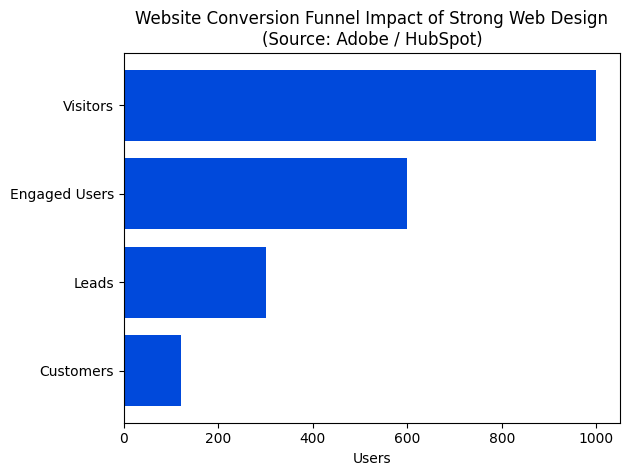
Strong web design dramatically improves every stage of the conversion funnel. According to Adobe and HubSpot, companies that prioritize UX and design see conversion improvements of up to 200%, while UX-focused optimization alone can increase conversions by up to 400%.
A poorly designed website leaks traffic. A high-performance site captures attention, guides behavior, and turns visitors into customers.
UX Is the Foundation of Revenue Growth
User experience is not optional. Google data shows that 88% of users will not return after a bad website experience. Navigation confusion, slow load times, and poor mobile optimization kill trust instantly.
Thinkit Media builds websites with intentional user flows that reduce friction, increase engagement, and move users toward action.
The Pyramid of High-Performance Web Design
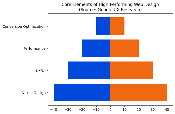
High-converting websites are built in layers. Visual appeal draws attention, UX keeps users engaged, performance ensures speed and stability, and conversion optimization turns interest into action. Remove any layer, and the entire system fails.
Thinkit Media engineers websites from the ground up using this exact hierarchy—ensuring every layer supports growth.
Speed and Performance Are Non-Negotiable
Page speed is a ranking factor and a conversion killer. Google reports that 53% of mobile users abandon a site if it takes longer than three seconds to load. Every second of delay reduces conversions by approximately 7%.
Thinkit Media optimizes performance through clean code, modern frameworks, and Core Web Vitals optimization—because speed equals revenue.
Mobile-First Design Is Mandatory
More than 60% of website traffic comes from mobile devices, and Google now ranks websites based on their mobile experience first. If your site is not mobile-optimized, you are invisible where it matters most.
Thinkit Media designs mobile-first experiences that perform flawlessly across devices.
Design Builds Trust—and Trust Drives Sales
Users do not buy from websites they do not trust. Consistent branding, intuitive layouts, and clear messaging dramatically increase perceived credibility. Well-designed websites convert visitors at significantly higher rates than outdated or cluttered designs.
Thinkit Media aligns design with brand authority, ensuring your website positions you as the clear choice in your market.
Why Thinkit Media Web Design Wins
Thinkit Media delivers web design built for performance, including:
- Conversion-focused UX/UI design
- Mobile-first and responsive layouts
- Speed and Core Web Vitals optimization
- SEO-ready site architecture
- Clear conversion paths and CTAs
- Scalable design systems for growth
This is not a template design. This is engineered performance.
The Cost of Bad Web Design
An underperforming website quietly drains revenue every day. Lost trust, lost traffic, and lost conversions add up fast. Your competitors are investing in better digital experiences—and winning because of it.
Final Word
Web design is your digital foundation. When done right, it multiplies the effectiveness of SEO, content marketing, and paid traffic. When done wrong, it sabotages everything.
Thinkit Media builds high-conversion websites designed to dominate, convert, and scale. If you want a website that works as hard as you do, it’s time to upgrade.
Frequently Asked Questions
What is end-to-end web design?
End-to-end web design is a full-service approach that covers every stage of building a website, from initial idea to long-term maintenance. Instead of handing off work between separate teams, a single process coordinates research, design, development, testing, launch, and ongoing optimization so the final site performs reliably and reflects your goals.
Typical stages include:
- Discovery & strategy: define goals, audience, content needs, and metrics.
- UX & wireframes: map user journeys and structure pages for clarity and conversions.
- Visual design: craft brand-aligned UI, components, and accessibility considerations.
- Development: build front-end and back-end, integrate CMS and third-party tools.
- Testing & optimization: QA, performance tuning, and cross-device checks.
- Launch & training: deploy the site and train your team to manage content.
- Maintenance: updates, security, analytics, and iterative improvements.
Benefits of this approach:
- Consistent brand and user experience from planning through delivery.
- Faster timelines because fewer handoffs are needed.
- Clear accountability and simpler communication.
- Better performance and SEO-ready structure out of the box.
At Thinkit Media we focus on practical, human-centered design: we listen, prioritize measurable outcomes, and keep you involved at every milestone so the final website supports your goals and is easy for your team to own. If you want a predictable process and a site that works, an end-to-end approach is the most reliable path.
UX to UI workflow for website design
The UX to UI workflow is the practical sequence teams use to turn user research and structure into polished website interfaces. It keeps the design focused on user needs while progressing from broad strategy to pixel-level decisions. Below is a clear, human-centered sequence you can follow or adapt for your project.
- Research & goals — Gather stakeholder objectives, user interviews, analytics, and competitor notes to define success metrics and primary user journeys.
- Information architecture — Organize content into a sitemap and content models so pages and navigation reflect how users think and search on the site.
- Wireframing — Sketch low-fidelity layouts to map content priority, calls to action, and layout patterns without visual styling distracting the team.
- Interaction design & prototyping — Add interactions, microcopy, and simple prototypes to validate flows and reveal usability gaps before full visual design.
- Visual design (UI) — Apply branding, typography, color, and component styles. Build a reusable component library to ensure consistency and speed implementation.
- Handoff & documentation — Deliver design specs, annotated components, and accessibility notes to developers and content teams to reduce rework.
- Usability testing & iterate — Test with real users, measure against your success metrics, and iterate quickly; treat the workflow as cyclical rather than linear.
Emphasize communication between designers, developers, and content editors, and prioritize accessibility and measurable outcomes. If you need a structured, end-to-end implementation, Thinkit Media can help tailor this workflow to your website goals.
Moving a website from design to development means turning visual mockups and interaction plans into working pages. A smooth transition reduces rework, keeps the project on schedule, and ensures the final site matches the intended look and behavior. Below is a clear, practical approach you can use or share with your team.
Key steps
- Finalize designs: Sign off on responsive mockups for desktop, tablet, and mobile so developers build the correct breakpoints.
- Prepare assets: Export optimized images, SVGs, fonts, and icon sets with clear naming conventions.
- Document interactions: Provide notes for animations, hover states, and transitions so behavior is implemented consistently.
- Create a build plan: Decide on structure, templates, CMS integration, and performance targets before coding begins.
- Set up staging: Use a development environment to review work in progress and test integrations early.
- Test and iterate: Perform responsive, accessibility, and cross-browser testing; address issues before launch.
Handoff checklist
- Design files (Figma/Sketch) with version history
- Style guide and component library
- Exported media and icons
- Content and SEO notes
- Acceptance criteria and test cases
Good communication between designers, developers, and stakeholders is essential. If you want help coordinating the entire process from concept through launch, Thinkit Media can manage the design-to-development handoff and delivery.
Turning a website prototype into a reliable production site means more than copying visuals — it requires testing, handoffs, deployment plans, and ongoing monitoring. Below is a concise, practical path you can follow to reduce surprises and launch confidently.
Checklist for going from prototype to production
- Finalize design and assets: Confirm layouts, typography, color system, and export optimized images and SVGs. Create a simple design system for consistency.
- Define scope and responsibilities: Clarify who handles front-end, back-end, content, and QA to avoid last-minute gaps.
- Build with responsive, semantic code: Implement components so they adapt across devices; ensure clean HTML structure for SEO and accessibility.
- Integrate CMS and content: Migrate real content into templates, set up editing roles, and verify rich snippets where relevant.
- Test usability and accessibility: Run quick user checks, keyboard navigation tests, and basic accessibility audits.
- Optimize performance: Compress assets, enable lazy loading, and minimize blocking scripts for faster perceived load.
- Staging and QA: Deploy to a staging site, complete cross-browser tests, and run a rollout checklist with rollback steps.
- Monitor and iterate: Launch with monitoring, analytics, and a short-term plan for bug fixes and small UX improvements.
Human tip: keep launches small and measurable. If you want hands-on help, Thinkit Media can manage the prototype-to-production process so you keep design intent while ensuring reliability and performance.
Turning a wireframe into a website is a practical, stepwise process that moves from structure to polished experience. Below is a clear roadmap you can follow, whether you're building it yourself or handing it off to a developer or agency.
Step-by-step process
- Validate the wireframe: Confirm goals, content hierarchy, and user flows with stakeholders so the structure reflects real needs.
- Define design system: Establish colors, typography, spacing, and reusable components. This keeps the site consistent and speeds up development.
- Choose technology: Decide on a CMS or framework based on content needs, scalability, and editing workflow. Plan templates for each wireframe layout.
- Build responsive layouts: Translate the wireframe into semantic HTML and CSS, using a mobile-first approach and flexible grid systems.
- Add interactivity and accessibility: Implement navigation, forms, animations, and ensure keyboard and screen-reader accessibility.
- Test and optimize: Check across devices, run performance and SEO basics, and use real content to avoid layout surprises.
- Launch and maintain: Deploy to production, set up backups and updates, and schedule regular reviews to iterate on user feedback.
Practical tips
- Use real content early to reveal spacing and hierarchy issues.
- Keep components modular so updates are quick and consistent.
- Prioritize performance — fast pages improve conversion and SEO.
If you prefer to hand this process off, Thinkit Media can take a wireframe and deliver a polished, production-ready site while handling design, development, and launch tasks.
What it is and why it matters
Design systems documentation is the single source of truth that keeps your website consistent, accessible, and faster to build. It explains visual tokens, reusable components, interaction patterns, and the rules for using them so designers and developers make the same choices across pages and templates.
Core sections to include
- Design principles: Short, human-focused guidelines that explain intent (voice, motion, accessibility goals).
- Tokens: Colors, type scales, spacing, elevation and naming conventions for use across CSS and design files.
- Component library: Each component should include purpose, anatomy, states, dos and don'ts, accessibility notes, and implementation hints.
- Patterns and templates: Page-level solutions—forms, navigation, search, and layout rules with examples.
- Contribution & governance: How to propose changes, review process, versioning, and release cadence.
- Changelog and examples: Clear history of updates and real-world screenshots or links to live pages.
Practical tips
Keep the docs concise and visual, link design files to live components, and include accessibility checks for each pattern. Treat the documentation as a living product: schedule reviews, assign ownership, and use analytics to see which pages teams consult most. Most importantly, write for humans—use plain language and concrete examples so new team members onboard quickly.
If you want hands-on help tailoring documentation for your website, Thinkit Media can audit your current setup and build a practical, living design system that scales with your product.
Overview
Figma is a visual design tool that works well for planning, designing, prototyping, and handing off website designs. Start by clarifying goals, content structure, and user flows so your design decisions match the site’s purpose. Keep accessibility and responsiveness in mind from the beginning.
Suggested workflow
- Research & sitemap: Map pages and user journeys before opening a file.
- Wireframes: Create low-fidelity wireframes to establish layout and content priority without getting distracted by visuals.
- Design system & components: Build reusable components (buttons, nav, cards) and set typography and color styles to keep consistency across pages.
- Responsive frames: Design for breakpoints (mobile, tablet, desktop) and use auto-layout to make components adapt naturally.
- Prototype interactions: Add basic navigation and microinteractions so stakeholders can click through realistic flows.
- Handoff: Clean up layers, name components clearly, and provide spec notes and assets for developers.
Practical tips
- Use grids and spacing tokens to maintain rhythm across pages.
- Annotate accessibility considerations (contrast, focus order) in the file.
- Keep file structure tidy: pages for wireframes, visual design, and components.
- Run quick usability checks with teammates or users before finalizing.
If you want a production-ready website based on Figma designs, Thinkit Media can help turn designs into a fast, accessible site.
Why collaboration matters
Effective developer collaboration in website design means fewer reworks, faster delivery, and a better user experience. Real success comes from shared goals, clear roles, and practical tools that keep designers, front‑end and back‑end developers aligned throughout the project.
Practical steps to improve collaboration
- Start with a joined kickoff: Gather designers, developers, content strategists, and stakeholders to agree on scope, priorities, and accessibility standards.
- Use a shared design system: Components, tokens, and a living style guide reduce ambiguity and speed implementation.
- Adopt consistent version control and branching: Clear branch naming and pull request templates make code reviews and rollbacks straightforward.
- Document handoffs: Annotated mockups, acceptance criteria, and example data help developers build to spec.
- Regular reviews and demos: Short, frequent feedback cycles catch design drift early and keep everyone invested.
- Automate testing: Visual regression, unit, and integration tests protect the design during iteration.
- Foster empathy and clear communication: Respect constraints, give constructive feedback, and prioritize user needs over individual preferences.
At Thinkit Media we emphasize human-centered processes: scheduled check-ins, practical documentation, and shared ownership of quality. These habits turn collaboration from a checkbox into a competitive advantage for your website design projects.
A website design handoff is the moment a design team passes pixel-perfect deliverables, specifications, and context to developers so the site can be built reliably. Whether you’re a designer or a project owner, a smooth handoff reduces rework, keeps the visual intent intact, and speeds development.
Essential steps for an effective handoff
- Bundle final assets: export optimized images, icons, SVGs, and font details with clear naming and folders.
- Document styles: provide a style guide or token list for colors, spacing, typography, and component states.
- Annotate interactions: include simple interaction notes or short prototypes that show hover, focus, and responsive behavior.
- Provide specs: list exact measurements, breakpoints, and acceptable substitution rules for responsive layouts.
- Prepare a component library: group reusable components and their variants so developers can map them to code structure.
- Define acceptance criteria: state what counts as complete for each page or feature to avoid ambiguity.
Communication tips
- Walk through the key screens with developers and record or summarize decisions.
- Centralize files in a single, versioned location and keep links up to date.
- Stay collaborative: encourage early questions and quick iterations to resolve implementation constraints.
At Thinkit Media we recommend treating handoffs as an ongoing collaboration, not a one-time transfer. The more context you give, the closer the final site will match your design intent.
Why design documentation matters
Good documentation turns ideas into buildable work. It helps designers, developers, content creators, and stakeholders stay aligned, reduce rework, and preserve decisions as the site evolves. Thinkit Media finds that clear documentation speeds delivery and improves quality.
Core sections to include
- Project overview — goals, target audience, scope, timelines.
- User research — personas, user journeys, key scenarios.
- Information architecture — sitemap and navigation rules.
- Wireframes & flow — annotated page flows and interactions.
- Visual & UI specs — typography, colors, components, spacing.
- Content requirements — templates, tone, SEO guidelines.
- Technical constraints — platforms, integrations, performance targets.
- Accessibility & testing — WCAG targets and acceptance criteria.
- Versioning & maintenance — how to update docs and where they live.
Practical tips
- Keep it practical: prioritize the items teams need to build and test first.
- Use annotated visuals and short notes instead of long essays.
- Make it a living document: review and update after each sprint or milestone.
- Assign a single owner so updates are consistent and the source of truth stays discoverable.
What quality assurance UX means for your website
Quality assurance for UX (QA UX) is the practice of verifying that a website delivers a usable, accessible, and consistent experience for real people across devices and scenarios. It blends usability testing, accessibility checks, interaction validation, and continuous monitoring so design intent becomes reliable user outcomes.
Core QA UX steps
- Define success criteria: map user goals to measurable acceptance criteria (task completion, time on task, error rates).
- Design and prototype review: validate flows early to catch confusing layouts, labels, and interaction patterns before development.
- Functional interaction testing: check links, forms, keyboard navigation, and responsive behavior across browsers and devices.
- Usability testing: observe representative users completing real tasks to find friction you wouldn’t see in specs.
- Accessibility audit: ensure WCAG basics—contrast, focus order, ARIA attributes, and screen reader behavior—are in place.
- Regression and analytics monitoring: re-test after updates and use analytics to spot unexpected drops or friction.
Why it improves design
QA UX turns assumptions into verified user outcomes. The result is fewer post-launch fixes, higher conversion and retention, reduced support load, and stronger trust in your brand. At Thinkit Media, we treat QA UX as an essential phase of website design, not an afterthought, so designs perform reliably in the hands of real users.
Browser testing in website design verifies that layouts, interactions, and content behave consistently across different browsers, devices, and screen sizes. It helps catch layout breaks, broken JavaScript, font or asset fallbacks, and accessibility issues before visitors see them. A practical, prioritized approach saves time and protects the user experience.
Step-by-step browser testing for designers
- Set priorities: Use your site analytics to pick the most common browser families and device types to test first. Focus on mobile, tablet, and desktop breakpoints.
- Test responsive layouts: Resize the viewport and check grids, images, navigation, and touch targets at key breakpoints. Ensure text reflows and components don’t overlap.
- Check interactions: Validate forms, dropdowns, modals, and keyboard navigation. Verify hover and focus states behave appropriately on both pointer and touch devices.
- Verify assets and fonts: Confirm web fonts, icons, and images load and display fallback options when needed.
- Accessibility and performance: Scan for semantic markup, color contrast, and tab order. Measure load speed and prioritize optimizations that affect first impression.
- Automate and document: Create visual and functional test cases for critical pages and components so regressions are caught quickly.
Quick checklist
- Responsive breakpoints pass
- Forms and links work
- Fonts and images fall back correctly
- Keyboard and touch interactions are usable
- Performance and accessibility basics met
If you prefer hands-on help, Thinkit Media can audit your site, create a testing plan, and implement fixes so your design looks and performs reliably across browsers.
Understanding cross-platform UX
Cross-platform UX in website design means creating a consistent, usable experience across desktops, tablets, and phones. It focuses on information architecture, visual hierarchy, interaction patterns, and performance so users can complete tasks regardless of device. Consider context, input method, and screen size when choosing layouts and behaviors.
Practical steps to implement it
- Start with a responsive foundation: build flexible grids, fluid images, and scalable type so layouts adapt without losing meaning.
- Prioritize content and tasks: identify core user journeys and surface the most important actions prominently on all viewports.
- Design for touch and mouse: ensure tappable targets are large enough, provide alternatives for hover interactions, and avoid patterns that rely on a single input.
- Maintain consistent patterns: reuse components, labeling, and affordances so users transfer knowledge between devices.
- Apply progressive enhancement and accessibility: use semantic structure, keyboard support, and ARIA where appropriate so the site works with assistive tech and limited connections.
- Test in real contexts: evaluate on actual devices and slow networks; check performance, readability, and micro-interactions.
- Measure and iterate: combine analytics with user feedback to find and fix platform-specific friction.
Design with empathy—clear labels, forgiving forms, and meaningful feedback reduce frustration across devices. If you want hands-on help, Thinkit Media can audit your site and recommend practical design changes to deliver a reliable cross-platform UX.
Device testing checklist for website design
Device testing ensures your site looks and works well on phones, tablets, laptops, and desktops. Start with a clear goal: confirm layout, navigation, performance, and key interactions are consistent across the devices your audience uses. Thinkit Media recommends a mix of real-device checks, emulators, and automated tests for reliable results.
- Define targets: List primary devices, operating systems, and screen sizes based on analytics and user research.
- Check responsive breakpoints: Verify your CSS media queries and flexible grids at common widths and during orientation changes.
- Test core interactions: Tap, swipe, scroll, keyboard navigation, form entry, and file uploads. Ensure touch targets meet recommended sizes and accessibility requirements.
- Validate media and assets: Confirm images, videos, and SVGs scale and respect resolution and bandwidth constraints.
- Measure performance: Use network throttling to test load times, time to interactive, and perceived responsiveness on slower connections.
- Cross-browser checks: Verify functionality in modern browsers and fallbacks for older ones; prioritize features critical to your site.
- Automate and document: Run visual regression and end-to-end tests for frequent releases and keep a log of issues and fixes.
Tip: prioritize real-device testing for critical user journeys and use emulators for broad coverage. If you want hands-on help, Thinkit Media can run targeted device testing and provide a prioritized report to improve design and user experience.
Why responsive testing matters
Responsive testing ensures your design works across screen sizes, orientations, and input types. A site that adapts gracefully keeps visitors engaged and reduces bounce rates. The goal is to confirm layout, navigation, images, and forms behave predictably on phones, tablets, laptops, and large screens.
Quick step-by-step approach
- Define breakpoints based on your design, not device models. Start with mobile, tablet, and desktop ranges and add intermediate points for unusual layouts.
- Test layout and typography to ensure content flows, headings remain readable, and line lengths are comfortable at each breakpoint.
- Check navigation and touch targets so menus are accessible and buttons are large enough for fingers.
- Validate images and media use responsive sources, proper aspect ratios, and do not overflow their containers.
- Exercise forms and interactive elements for keyboard focus, input types, and error messaging on small screens.
- Simulate slow connections to confirm performance and fallback behavior for images and scripts.
Practical checklist
- Orientation: portrait and landscape
- Breakpoints: content-driven testing
- Visual consistency: spacing and alignment
- Accessibility basics: contrast and focus order
- Performance: load time on mobile networks
If you want hands-on help to implement a reliable responsive testing workflow, Thinkit Media can audit your design and set up a repeatable testing plan.
What experience optimization means
Experience optimization in website design is the ongoing process of improving how visitors perceive, navigate, and complete tasks on your site. It combines usability, performance, content clarity, accessibility, and layout to increase satisfaction and conversions while reducing friction.
Practical steps to improve your site
- Audit performance and analytics: Review load times, bounce rate, and common user paths to find problem pages.
- Talk to real users: Run simple interviews or usability tests to uncover blocked tasks and confusing content.
- Map user journeys: Prioritize high-value flows such as signups, purchases, or lead forms and remove unnecessary steps.
- Test changes systematically: Use A/B tests and prototype feedback to validate improvements before rolling them out.
- Design for clarity and accessibility: Use readable typography, clear calls to action, and ensure keyboard and screen-reader support.
- Iterate continuously: Treat optimization as cycles, not one-off fixes — monitor results and refine.
Key metrics to track
- Conversion rate and goal completion
- Time on task and successful task percentage
- Page load speed and interaction delays
- User satisfaction scores or simple feedback
For site-specific strategies and implementation, Thinkit Media can assess your current experience and help set a prioritized, measurable optimization plan.
Habit-forming design for websites means shaping the experience so people return because the site reliably helps them solve a problem or get value. It focuses on clear triggers, low-friction actions, variable rewards, and small user investments that make the experience sticky without being manipulative. Use it to build useful routines—newsletter habits, repeat purchases, or daily check-ins—while keeping user benefit front and center.
Practical steps to apply habit-forming design
- Design meaningful triggers: add obvious external triggers (emails, notifications, targeted CTAs) and design the product to respond to internal triggers like a routine or feeling.
- Simplify the action: reduce clicks, use clear labels, offer single-field forms or progressive disclosure to make the desired behavior effortless.
- Provide variable rewards: mix predictable value (search results, saved content) with slight variation (personalized recommendations, new content, social feedback) to keep users curious.
- Encourage small investments: let users customize, save preferences, or contribute content—these investments increase the chance they return.
- Measure and iterate: track retention, DAU/MAU, and cohort behavior; run A/B tests and collect qualitative feedback to refine triggers and friction points.
At Thinkit Media we recommend starting with one core habit you want users to form, test it quickly, and prioritize value and transparency. When done ethically, habit-forming design helps users accomplish goals and builds a sustainable relationship with your site.
What sticky design means
Sticky design keeps an element visible on the screen as a visitor scrolls — commonly navigation bars, calls-to-action, or utility toolbars. When done well, it increases usability by reducing friction: users access key controls without having to scroll back to the top.
When to use sticky elements
- Primary navigation: Use a compact sticky header on content-heavy sites so visitors can move between sections quickly.
- Prominent CTAs: Keep conversion actions (sign-up, contact) visible on long pages, but avoid covering essential content.
- Contextual tools: Shopping carts, filter panels, or progress indicators can be sticky in apps or e-commerce flows.
Best practices and trade-offs
- Keep it minimal: limit height and visual weight so the sticky element doesn’t compete with content.
- Make it responsive: hide or simplify sticky elements on small screens to preserve reading space.
- Respect accessibility: ensure keyboard focus, readable contrast, and that screen readers can skip or access sticky controls.
- Monitor performance: excessive JavaScript-driven stickiness can cause jank; prefer native CSS position:sticky where possible.
If you want help planning sticky design that balances visibility, performance, and accessibility, Thinkit Media can review your layout and recommend a tailored approach that feels natural to real visitors.
What engagement-focused UX means
Engagement-focused UX prioritizes designing a website so visitors stay, interact, and return. It combines clear information architecture, compelling content, and small design details—like microinteractions and timely feedback—that make tasks feel effortless and meaningful. The goal is to guide real people toward outcomes that matter: conversions, repeat visits, or deeper interaction.
Practical steps to apply it
- Know your users: Use analytics, interviews, and simple personas to understand motivations and pain points.
- Reduce friction: Simplify navigation, minimize form fields, and surface the most relevant actions up front.
- Use clear content hierarchy: Headlines, subheads, and short paragraphs help visitors scan and engage quickly.
- Design meaningful interactions: Add microcopy, subtle animations, and feedback so people feel confident when they act.
- Prioritize speed and accessibility: Fast load times and inclusive design increase trust and time on site.
- Measure and iterate: Run quick A/B tests, watch session recordings, and improve based on real behavior.
If you want hands-on help, Thinkit Media can evaluate your site, prioritize the highest-impact changes, and set up testing so improvements are measurable. Start small, focus on real user needs, and iterate—engagement grows when design solves problems and respects people’s time.
What user retention design means
User retention design is the practice of shaping your website experience to keep visitors coming back and engaging over time. It focuses on first impressions, clear pathways to value, and ongoing reasons for users to return. Instead of just driving a single conversion, retention design treats each visit as the start of a relationship and designs the site to nurture that relationship.
Practical steps to apply it on your website
- Prioritize first impressions: Fast load times, a clear value proposition in the header, and an obvious next action reduce drop-off.
- Simplify onboarding: Reduce choices, use progressive disclosure, and guide new users to a quick win within minutes.
- Design for habit: Introduce features that encourage repeat visits (saved preferences, dashboards, progressive content).
- Use microcopy and trust signals: Clear labels, error recovery, testimonials, and privacy cues decrease friction and anxiety.
- Personalize thoughtfully: Surface relevant content and calls-to-action based on behavior or user segments without being intrusive.
- Close the loop with feedback and notifications: Lightweight feedback prompts, contextual nudges, and tailored email updates bring users back.
- Measure and iterate: Track retention rate, churn, session frequency, and DAU/MAU to prioritize design improvements.
Humanize your work by observing real users, listening to why they return or leave, and iterating quickly. If you want hands-on help implementing these patterns on your site, Thinkit Media can advise on strategy and design execution.
What is agile web design?
Agile web design is an iterative approach to building websites that breaks a project into short cycles (sprints), prioritizes working features, and relies on ongoing user feedback. Instead of waiting for a complete, polished site at the end, teams deliver small, testable improvements frequently so you see progress, uncover issues early, and pivot when real user data suggests changes.
Why it helps
- Faster value: Launch usable pages or features sooner so stakeholders and users get tangible results quickly.
- Lower risk: Problems are discovered and fixed in early sprints rather than after full build-out.
- Better alignment with users: Real feedback shapes design and functionality, improving conversions and satisfaction.
- Flexible budgeting: Scope can be adjusted as priorities evolve, avoiding wasted work.
Practical steps to use Agile for your website
- Define clear goals and an MVP (minimum viable product) focused on key user journeys.
- Plan short sprints (1–3 weeks) with specific deliverables: templates, components, or pages.
- Test early with prototypes or beta releases and collect analytics and user feedback.
- Prioritize the backlog each sprint based on data, business value, and technical constraints.
- Iterate, refine visuals and content, and deploy incrementally with continuous QA.
Human touch matters: involve stakeholders and users regularly. For hands-on implementation and sprint-based web builds, Thinkit Media can help translate agile principles into a practical plan that fits your team and timeline.
What a website design sprint does
A design sprint is an intensive, time-boxed process that helps teams quickly turn a website idea into a tested prototype. For website projects it focuses the team on critical decisions — layout, user flow, content priorities, and early usability — so you avoid months of guesswork and late-stage rework.
Typical sprint flow (5 days)
- Understand: Gather stakeholders, define goals, and map the user journey for the site.
- Sketch: Create multiple layout and interaction ideas for key pages, like homepage and product or service pages.
- Decide: Select the strongest concepts and refine a clear direction for a clickable prototype.
- Prototype: Build a realistic but lean prototype of core pages and flows — visuals, copy blocks, and navigation.
- Test: Run usability tests with real users to validate assumptions and uncover issues early.
Benefits for your website
- Accelerates decision-making and reduces costly late changes.
- Surfaces usability problems before development begins.
- Aligns stakeholders around measurable goals and a shared prototype.
- Produces testable evidence to prioritize features and content.
If you want a practical, low-risk way to move from concept to validated pages, Thinkit Media runs focused design sprints for website projects and can adapt the timeline to your team size and deadlines. A short sprint often saves weeks in implementation and delivers confidence that the site will meet user needs.
What iterative design means for websites
Iterative design is a repeatable cycle of prototyping, testing, analyzing, and refining a website. Instead of building the entire site perfectly on the first try, teams release small versions, gather real user feedback, and improve the product in short, focused rounds. This keeps your site aligned with how actual visitors behave and what stakeholders need.
How to apply it (practical steps)
- Set clear goals: Define key metrics like conversion, engagement, or task completion.
- Build a quick prototype: Start with wireframes or a limited-function page to test assumptions.
- Test with real users: Observe tasks, run usability tests, or use analytics to spot friction.
- Analyze results: Prioritize issues by impact and effort — focus on changes that move your goals.
- Refine and repeat: Implement improvements, then test again in the next cycle.
Why this improves your site
- Reduces risk by validating ideas before wide release.
- Delivers continuous, measurable improvement to user experience.
- Keeps design responsive to real user needs and business priorities.
- Helps cross-functional teams and stakeholders stay aligned.
If you prefer expert guidance, Thinkit Media applies iterative design for websites to produce measurable improvements while keeping teams and users central to every decision.
What continuous improvement means for your website
Continuous improvement in website design is the ongoing practice of making small, measurable changes to improve usability, conversions, and performance. Rather than waiting for a full redesign, you treat the site as a living product that evolves with real user behavior, shifting business priorities, and new technology. This reduces risk and delivers steady progress.
Practical steps to implement
- Define clear goals: pick specific metrics such as conversion rate, time-on-task, or bounce rate to measure success.
- Collect real user data: use analytics, heatmaps, session recordings, accessibility audits, and direct feedback to identify friction points.
- Prioritize changes: evaluate issues by impact versus effort to get quick wins and avoid low-value work.
- Test and validate: run A/B tests, usability sessions, or staged rollouts to verify improvements before full release.
- Document and iterate: keep a change log, capture learnings, and repeat the cycle so wins compound over time.
Why this matters: A steady improvement process keeps your site aligned with users and business goals while reducing the cost of fixes. If you prefer guided support, Thinkit Media can audit your site, help set realistic KPIs, and run prioritized experiments so you see measurable improvements without the disruption of a complete redesign.
Practical website optimization for design, speed, and conversions
Website optimization in a design context means balancing aesthetics with performance and user behavior. Start by clarifying the page purpose and the action you want visitors to take. Below is a focused, human approach you can apply right away.
- Audit user flow and goals: Map key pages and reduce friction around your primary calls to action. Remove or hide anything that distracts from the main conversion path.
- Prioritize mobile-first responsive design: Use a single flexible layout that adapts, simplifies navigation on small screens, and places CTAs within thumb reach.
- Improve perceived and real speed: Optimize and resize images, serve modern formats, implement lazy loading, and defer noncritical scripts. Aim to improve Core Web Vitals metrics.
- Simplify visuals and content hierarchy: Use consistent spacing, a clear typographic scale, and high-contrast CTAs so users scan and act quickly.
- Reduce third-party bloat and streamline code: Minify assets, combine where useful, and leverage caching to lower requests and render time.
- Test and iterate: Run real-user tests, measure conversion funnels, and perform small A/B tests to confirm improvements.
Quick wins: compress images, prioritize above-the-fold CSS, limit fonts, and remove unused plugins. If you want hands-on help making these changes while keeping your design intact, Thinkit Media can audit your site and implement a prioritized optimization plan.
Why headlines matter
Your headline is often the first thing visitors read, so it must communicate value quickly, guide scanning behavior, and support search intent. A well-designed headline improves click-through rates, reduces bounce, and sets expectations for the page content.
Practical design and writing steps
- Start with user intent: Identify the primary need your page addresses and make that benefit clear in one line.
- Keep it concise: Aim for 6–12 words or 50–70 characters so the headline displays well on desktop and mobile.
- Use hierarchy: Pair the headline with a supporting subhead that adds context, specifics, or a call to action.
- Focus on clarity over cleverness: Use familiar words and active verbs so visitors understand value immediately.
- Design for readability: Choose contrast, size, and spacing that make the headline scannable; ensure it stands out from body copy.
- Optimize for search: Naturally include a primary keyword near the front without sacrificing user clarity.
- Test and refine: Track engagement metrics and try small variations to improve performance over time.
If you want hands-on help tuning headlines and page hierarchy, Thinkit Media can review your copy and design, run simple tests, and help prioritize changes that move metrics — we focus on practical, measurable improvements that visitors notice.
CTA copy is the short text that tells visitors what to do next. On a website, clear and focused CTA copy guides users toward conversions without confusing them. Thinkit Media treats CTA copy as a mix of strategy and empathy: you must state the value, reduce friction, and match the visitor’s intent.
Simple steps to better CTA copy
- State the benefit: Use outcome-focused language—Start free trial is stronger than Submit.
- Use action verbs: Begin with verbs like Get, Try, Join, or Download.
- Match page intent: Top-of-funnel pages need low-commitment CTAs (Learn more), while product pages can use purchase-focused CTAs (Buy now).
- Keep it short: Aim for 2–5 words on buttons and one short supporting line if needed.
- Remove risk: Add microcopy if helpful—No credit card required or Cancel anytime.
- Create clarity over cleverness: Clear beats clever—users should never guess what happens when they click.
Testing and context: Test 2–3 variations, consider mobile length, and ensure the visual design supports the copy. Thinkit Media recommends tracking click-through and downstream conversion metrics so your CTA copy evolves with real user behavior.
What UX writing is
UX writing is the craft of choosing words that guide users through a website—labels, buttons, error messages, microcopy, and onboarding text. Good UX writing aligns language with design, reducing friction and helping users complete tasks quickly and confidently. It’s less about clever copy and more about clarity, context, and tone that matches your audience’s expectations.
How it improves website design
Clear, focused microcopy makes interfaces more usable and trustworthy. Benefits include:
- Lower support load: Anticipatory language prevents confusion and reduces help requests.
- Higher conversions: Better labels and calls to action improve task completion and sign-ups.
- Stronger accessibility: Simple, consistent language helps screen reader users and non-native speakers.
- Improved user confidence: Helpful error messages and progress indicators keep people moving forward.
Practical steps for designers
- Start with user goals: write copy that directly supports the main task on each page.
- Prioritize brevity and clarity: choose plain words over jargon and test for comprehension.
- Use consistent patterns: establish reusable microcopy for buttons, confirmations, and errors.
- Validate with real users: observe how people read and react to your copy during testing.
If you want a website that communicates clearly and converts, Thinkit Media can help integrate UX writing into your design process to make every interaction feel intentional and easy.
Quick approach to content and design alignment
Aligning content and design means making sure every visual element supports the message, and every piece of content fits the layout and user goals. When they’re in sync you reduce friction, speed decision-making, and improve conversions. Use this practical checklist to bring content and design together during your website process.
- Start with goals and audience. Define the primary task for each page and the audience’s needs before writing or styling.
- Create a content inventory and map. List existing pages, note gaps, and map content to user journeys so design can prioritize elements by purpose.
- Adopt a design system. Use consistent components, spacing, and typography to give content predictable places and reduce one-off decisions.
- Design with real content. Replace Lorem Ipsum early so layouts reflect true copy length, tone, and calls to action.
- Define voice and microcopy rules. Headings, buttons, and error messages should follow a single tone and length guidance.
- Prototype responsively. Check how content behaves across breakpoints and adjust hierarchy rather than shrinking text indiscriminately.
- Collaborate continuously. Schedule joint reviews between writers, designers, and developers to catch mismatches early.
- Test and iterate. Use usability testing and analytics to see where users struggle and refine both content and layout.
Practical tip: keep a living checklist and brief for each template so future pages inherit aligned structure. If you want an audit or hands-on help integrating content into your designs, Thinkit Media can assess gaps and create a repeatable process for your team.
How copy and design should align
Effective website design and copy are two sides of the same coin: design draws attention and clarifies flow, while copy explains value and prompts action. Start by defining a single primary goal per page—newsletter signups, product purchases, or lead generation—and make every visual and verbal element support that goal.
Practical steps
- Lead with clarity: Use a concise headline and supporting subhead that tells visitors what you offer in plain terms.
- Design for scannability: Break copy into short paragraphs, use clear headings, and place important messages above the fold.
- Match tone to visuals: Ensure colors, imagery, and typography reinforce your brand voice—playful copy with playful visuals, professional copy with clean, restrained design.
- Use visual hierarchy: Buttons, contrast, and whitespace should guide the eye toward your calls to action.
- Test and iterate: Run simple A/B tests on headlines, button text, and layouts to measure what improves engagement.
Human tip: Read your pages aloud—if a human voice sounds natural, visitors will likely stay. If you want help aligning copy and layout to reach specific conversion goals, Thinkit Media can provide a compact review and a prioritized fix list tailored to your site.
What is microcopy design?
Microcopy design is the practice of writing small bits of text across a website—labels, buttons, form hints, error messages, and confirmation notes—that guide users through tasks. Good microcopy is concise, human, and placed where decisions are made, turning friction into clarity and confidence.
Why microcopy matters for website design
Microcopy influences behavior and perception more than its size suggests. It helps users complete tasks faster, reduces errors, and builds trust by answering questions at the moment they arise.
- Conversion: Clear CTAs and form hints lower abandonment.
- Usability: Contextual guidance reduces mistakes and support requests.
- Brand voice: Consistent tone reassures users and strengthens identity.
Quick best practices
- Be direct: Use plain language—prefer "Save changes" over vague verbs.
- Place guidance where it’s needed: Inline hints beat long instructions.
- Anticipate errors: Write helpful, action-focused error messages that tell users how to fix the problem.
- Use a human tone: Friendly but respectful wording improves engagement.
- Test and measure: A/B test CTAs and microcopy variations to find what converts.
Working with Thinkit Media
Thinkit Media can audit your site’s microcopy, prioritize high-impact areas (onboarding, checkout, forms), and craft clear, brand-aligned text that improves usability and metrics. Small wording changes often yield large gains—start with your highest-traffic conversion pages.
What UX copywriting is
UX copywriting is the practice of writing clear, helpful words within a website’s interface so users can complete tasks quickly and confidently. It covers microcopy such as buttons, form labels, error messages, onboarding tips, and confirmation screens. Good UX copy focuses on user goals, reduces friction, and aligns tone with the brand while keeping the design functional.
How it improves website design
- Clarity: Simple, direct copy prevents errors and lowers cognitive load so users move through flows faster.
- Conversion: Well-crafted calls to action and trust-building messages increase sign-ups and purchases.
- Usability: Contextual help and microcopy reduce support requests and abandonment.
- Accessibility: Thoughtful labels and instructions make interactions easier for all users.
- Brand experience: Consistent tone and humane language make interfaces feel more trustworthy and approachable.
Practical tips for website design
- Start with the user goal: write copy that answers "What does this let me do?" immediately.
- Prioritize action words for CTAs and keep labels under three words when possible.
- Use error messages that explain the problem and the next step, not just the problem.
- Test copy in real flows: measure completion rates, time on task, and support tickets.
If you’d prefer expert help integrating UX copy into your site design, Thinkit Media can work with your team to audit flows, write microcopy, and test results to improve both usability and conversion.
What are conversion trust signals?
Conversion trust signals are design elements and content that reassure visitors your site is credible and safe to do business with. They reduce friction and help people move from browsing to taking action by answering unspoken questions: Can I trust you? Is this worth my time or money? Do you look professional?
Key trust signals to add
- Testimonials and reviews: Real quotes, names, and photos make feedback believable.
- Security badges and SSL notice: A visible SSL indicator and payment-security marks calm purchase anxiety.
- Clear contact info: Phone, email, and an address build accountability.
- Honest pricing and guarantees: Transparent costs, return policies, and a money-back promise reduce risk.
- Professional design and photos: Clean layout, readable typography, and authentic images convey competence.
- Case studies and results: Short, specific outcomes with numbers demonstrate value.
Design and testing tips
- Place the strongest signals near CTAs and above the fold to influence first impressions.
- Use visual hierarchy so trust elements don’t compete with conversion elements.
- Keep forms short and explain why you ask for each field.
- Run A/B tests to see which signals lift conversion and use heatmaps to track attention.
- Optimize for mobile: trust signals must be visible without excessive scrolling.
Your visitors are people—speak simply, show proof, and remove doubt. If you want an expert audit of which signals will move your users, Thinkit Media can help prioritize changes that increase conversions.
What credibility design does for your site
Credibility design is the practice of arranging visual elements, content, and interactions so visitors immediately trust your website and feel confident taking the next step. It combines clear messaging, consistent branding, and measurable trust signals to reduce doubt and increase conversions — whether that means signing up, contacting you, or buying a product.
Why this matters: people decide in seconds if a site is believable. Thoughtful credibility design turns that quick judgment into a positive one.
Key elements to focus on
- Clear hierarchy: readable fonts, appropriate contrast, and a logical layout help users find important information fast.
- Professional branding: consistent colors, well-crafted logos, and polished imagery communicate competence.
- Trust signals: visible testimonials, case summaries, certifications, and contact details reassure visitors.
- Transparency: accessible pricing, clear policies, and an easy-to-find about page build honesty.
- Performance and accessibility: fast load times and mobile-friendly pages make your site feel reliable and usable.
How to start: audit your homepage as a visitor, remove clutter, test one trust element at a time, and track engagement. If you want expert help, Thinkit Media can evaluate your site, prioritize high-impact fixes, and implement credibility-focused design changes that respect your brand and goals.
What trust-focused design means
Trust-focused design is a practical approach to website design that prioritizes clarity, credibility, and comfort for real people. It reduces user anxiety and uncertainty by making information easy to find, interactions predictable, and the brand appear reliable. The goal is to turn skeptical visitors into confident users or customers.
Key elements that improve trust
- Clear visual hierarchy: Simple layouts and readable typography help users find what they need without friction.
- Transparent messaging: Honest headlines, clear pricing, and straightforward calls to action remove doubt.
- Credibility signals: Testimonials, case studies, certifications, and visible contact options reassure visitors.
- Secure and fast experience: HTTPS, clear privacy notices, and quick load times reduce risk perception.
- Accessible interactions: Accessible forms, helpful error messages, and mobile-friendly design make the site usable for everyone.
Practical checklist to start
- Audit the homepage for confusing language or clutter.
- Add or update trust signals near conversion points.
- Test form flows for clarity and minimal friction.
- Verify site security, load speed, and mobile responsiveness.
If you’d like guided implementation, Thinkit Media can assess your site, prioritize changes, and design tests that measure increased conversions and lower abandonment. Trust-focused design is less about cosmetic tweaks and more about building confidence at every step of the user journey.
Why FAQ page design matters
An FAQ page is more than a list of questions; it’s part of your website’s navigation, trust-building, and conversion strategy. Good FAQ page design helps visitors find answers quickly, reduces support requests, and improves search visibility when structured clearly.
Design checklist
- Prioritize real user questions: Start with the most common support and buying questions. Keep language conversational and customer-focused.
- Group by topic: Organize questions into short sections so users can scan—billing, shipping, product, technical, etc.
- Short answers, clear links: Provide concise answers (one to three sentences) with links to detailed pages or resources when needed.
- Make it scannable: Use bold question headings and short paragraphs so visitors can skim and find answers fast.
- Mobile-first layout: Ensure questions are readable on phones and tap targets are large enough for touch navigation.
- Update regularly: Treat the FAQ as living content; remove outdated items and add new common questions.
Accessibility and performance
Ensure headings are semantic, text is readable at various sizes, and load times are fast. For SEO, use descriptive questions that match search intent and link to in-depth pages. If you want a tailored audit or a redesign that follows these principles, Thinkit Media can help improve usability and reduce support load.
A high-performing pricing page answers the visitor's key questions in seconds: which plan fits them, what they get, and how to start. Design should reduce friction, build trust, and guide attention to your recommended plan. Below are clear principles and a brief implementation checklist you can apply on any website.
Core principles
- Clarity first — use simple plan names, short benefit bullets, and consistent pricing units so visitors can compare quickly.
- Visual hierarchy — emphasize the most popular or best-value plan with size, color, or a badge to nudge choices without hiding other options.
- Feature-focused copy — highlight outcomes and value, not only technical features; show who each tier is for.
- Transparent terms — list trial length, billing cadence, renewal rates, and cancellation info to reduce hesitation.
- Trust signals — include testimonials, client logos, guarantees, or security badges near pricing and CTA areas.
- Mobile-first layout — stack plans sensibly, keep buttons reachable, and collapse dense feature lists for small screens.
- Fast and accessible — optimize load time, contrast, and keyboard navigation so no user is excluded.
Quick checklist
- Choose 3–4 plans and name them by use case.
- Show price, billing period, and top 3 benefits per plan.
- Highlight one plan as recommended and add a clear primary CTA.
- Include comparison details, FAQs, and a money-back or trial policy.
- Test copy, colors, and button placement with real users or A/B tests.
If you want hands-on help, Thinkit Media can audit your current page and build a conversion-focused redesign that follows these practices.
Quick plan
Designing a service page that converts starts with clarity: visitors must immediately understand what you offer and how it helps them. Think like a visitor — lead with a concise headline that states the outcome, follow with a brief value proposition, then show proof and a clear next step. Thinkit Media emphasizes empathy and simplicity in every page we design.
Design checklist
- Strong headline: One sentence that explains the main benefit.
- Supporting subheadline: A short follow-up that addresses who it’s for and why it matters.
- Clear visuals: Use relevant images or icons that illustrate the service and process.
- Benefits first: List outcomes or results your clients will get, not just features.
- Trust elements: Include testimonials, case highlights, and any certifications or client logos.
- Simple pricing or process: Show packages or a step-by-step workflow so visitors know what to expect.
- Single primary CTA: Make the main action obvious (book, contact, request a quote) and repeat it in logical spots.
- Mobile-friendly: Ensure fast load times, readable text, and tappable buttons on phones.
Track interactions, run small A/B tests, and refine copy and visuals based on real visitor behavior. If you want a tailored layout or conversion audit, Thinkit Media can help create a service page that speaks directly to your audience and drives measurable results.
An About page should quickly tell visitors who you are, what you do, and why they should care. Focus on clarity, trust, and personality: use a brief headline, a human-friendly bio, and one clear action you want visitors to take.
Key elements
- Clear headline: one sentence that states your purpose or mission.
- Human connection: short team or founder bio and an authentic photo.
- Value proposition: what you offer and how it benefits the visitor.
- Social proof: a concise testimonial, result, or trust indicator.
- Single CTA: contact, portfolio, or services—make the next step obvious.
- Accessibility & speed: readable text, alt text for images, and optimized media.
Design and copy tips
- Lead with a 1–2 sentence hook that answers "What do you do for me?"
- Keep sections scannable: headings, short paragraphs, and bullet lists.
- Use real photos and a conversational voice to humanize your brand.
- Prioritize mobile-first layout and fast-loading images.
- Include one clear CTA and measure clicks and time on page to iterate.
Start by drafting honest, customer-focused content that answers common visitor questions, then refine visual hierarchy to support that story. Test with real users and update periodically. If you'd like expert guidance, Thinkit Media can help audit your About page and provide templates tailored to your goals.
Quick overview
An effective contact page turns hesitation into action by making it fast, clear, and trustworthy for your visitors to reach you. Focus on clarity, simple choices, and visible confirmation so users know their message was received.
Essential elements
- Clear headline and short intro: Explain why someone should contact you and what to expect in one or two sentences.
- Primary contact options: Offer a short form, email address, and a phone number where appropriate. Keep the form minimal—name, contact method, and message.
- Location and hours: Add your address and business hours if you meet in person or serve local clients.
- Privacy reassurance: Briefly note how you’ll use their information and link to your privacy policy if needed.
Design tips
- Prioritize mobile: Ensure inputs and buttons are large enough to tap and the form keyboard types match the field (email, phone).
- Visible CTA: Use a strong, action-focused button label like Send Message or Request Quote.
- Reduce friction: Use placeholders and inline validation rather than long multi-page flows.
- Trust signals: Add a friendly photo, short testimonial, or a simple logo to humanize the page.
Launch checklist
- Test the form and confirmation messages.
- Monitor submissions and response times.
- Update contact details promptly.
If you want a quick review of your page layout or copy, Thinkit Media can help optimize it for conversions and clarity.
An effective header design balances branding, user navigation, and performance so visitors quickly understand who you are and where to go. Think of the header as the gateway: it should be clear, consistent, and unobtrusive on every screen size.
Key elements
- Logo and placement: Keep the logo visible and linked to the homepage; left-aligned or centered depending on your layout.
- Primary navigation: Use concise labels, a logical order, and no more than 6–8 top-level items.
- Clear call-to-action: Include a prominent CTA (Contact, Signup) with contrasting color and spare copy.
- Mobile-friendly controls: Use a well-labeled hamburger or condensed menu, large touch targets, and avoid hidden content.
- Load and accessibility: Optimize images/fonts, ensure keyboard focus order, and maintain sufficient color contrast.
Design checklist
- Prioritize hierarchy: logo, navigation, then CTA; remove distractions.
- Simplify visuals: one or two typefaces, restrained icons, and consistent spacing.
- Test responsiveness: check tablet and phone breakpoints and sticky header behavior.
- Measure and iterate: use analytics to see click patterns and refine labeling or placement.
Small changes to spacing, copy, or contrast often yield big usability gains. If you want professional guidance tailored to your site, Thinkit Media can review header options and implement a tested, accessible solution.
Why a footer matters
The footer is the final opportunity to guide visitors, reinforce your brand, and provide important links without cluttering the page. A well-designed footer improves usability, trust, and conversions by organizing contact info, legal links, and secondary navigation in a predictable place.
Essentials to include
- Contact details: phone, email, and a brief address or directions if relevant.
- Primary links: site map, main product or service pages, and a clear link to your contact or booking page.
- Legal and trust: privacy policy, terms of service, and any certifications or membership statements.
- Social or newsletter: simple icons or a one‑line newsletter sign-up prompt to keep visitors engaged.
- Branding: short tagline and a small logo to reinforce identity without repetition.
Design checklist
- Keep a clear visual hierarchy: headings, then grouped links so scanning is easy.
- Prioritize mobile: stack elements and ensure tap targets meet accessibility guidelines.
- Limit clutter: use columns or accordions for large sites, but avoid overwhelming users.
- Use contrast and readable fonts; ensure keyboard navigation and screen reader labels.
- Test load and performance: avoid heavy scripts in the footer that slow rendering.
If you want a tailored footer that supports conversions and accessibility, Thinkit Media can help craft and implement a footer that feels useful and human to your visitors.
Why breadcrumb navigation helps users
Breadcrumb navigation is a simple, compact trail that shows visitors where they are in your site's hierarchy. It reduces confusion on deeper pages, improves scanability for people and search engines, and makes it easy to move to broader categories without repeatedly using the back button. Thinkit Media recommends breadcrumbs as a usability and SEO enhancement for most content-heavy sites.
Practical design tips
Follow these guidelines to implement breadcrumbs effectively:
- Show hierarchy, not history: Use breadcrumbs to reflect the site structure (Home > Section > Subsection > Page), not the user's path.
- Keep labels short and meaningful: Use clear, human-friendly names that match navigation labels and page headings.
- Place them consistently: Put breadcrumbs near the top of the page, above the main content but below the page header.
- Make the current page readable: Show the current page as plain text, with earlier levels as links.
- Prioritize accessibility: Ensure keyboard focus works naturally and avoid relying only on visual cues like separators.
When to avoid breadcrumbs
Breadcrumbs add little value on simple, single-level sites or on pages designed as standalone landing pages. For large catalogs, blogs, and documentation, they greatly improve navigation and should be added alongside a clear primary menu and search.
What a mega menu is
A mega menu is a large, multi-column navigation panel that displays many options at once, helping visitors find deep content quickly. In website design, it organizes categories, highlights key pages, and reduces clicks for complex sites like e-commerce, media, or corporate portals.
Design and implementation steps
- Plan content hierarchy: Audit your pages and group related items into clear categories and subcategories before designing structure.
- Prioritize items: Put most-used pages and conversion targets near the top or left; use visual weight (bold, icons) for priority links.
- Use clear columns and headings: Label each column so users scan quickly; avoid long unbroken lists.
- Make it responsive: Provide a mobile-friendly alternative (accordion or simple menu) so the menu remains usable on touch devices.
- Focus on accessibility: Ensure keyboard navigation, visible focus states, and proper contrast so all users can navigate reliably.
- Optimize performance: Load menu assets efficiently and avoid heavy images that slow initial page render.
- Test and iterate: Run usability tests and analytics to see which links are used and refine labels and order.
Quick checklist
- Clear categories and concise labels
- Responsive behavior for mobile
- Keyboard and screen reader friendly
- Performance-optimized assets
- Ongoing testing and refinement
If you want help planning or building a mega menu, Thinkit Media can map your content and create a user-focused design that improves discovery and conversions.
Clear goals and quick wins
Start by defining the most important user tasks on your site and make those paths the easiest to find. At Thinkit Media we focus on reducing friction: label links clearly, group related pages, and keep primary navigation to 5–7 top items so visitors can scan quickly.
Practical design checklist
- Prioritize content: Place the highest-value pages first and use progressive disclosure for secondary links.
- Use clear labels: Avoid jargon; use words your users would search for.
- Consistent placement: Keep main navigation in the same spot on every page and ensure mobile and desktop follow the same structure.
- Mobile-first: Make sure menus are reachable with one hand and that tap targets are large enough.
- Search and shortcuts: Add a visible search box and consider quick links or CTA buttons for frequent tasks.
- Visual hierarchy and affordances: Use spacing, contrast, and icons sparingly to show relationships and clickability.
- Accessibility and keyboard navigation: Ensure links are focusable and readable by screen readers.
- Test with real users: Watch how people navigate and iterate based on where they hesitate or exit.
Next steps
Run a simple tree test or first-click test, then adjust labels and structure based on results. If you want a practical audit, Thinkit Media can help prioritize fixes that improve findability and reduce bounce.
Quick overview
Layout customization means arranging content, navigation, and visual elements so visitors find what they need quickly. Good layout choices increase clarity, trust, and conversions without adding clutter. Start with goals, then iterate with real user data.
Practical steps to customize a layout
- Define primary goals: Identify the action you want visitors to take (buy, sign up, contact). That drives placement and emphasis.
- Prioritize content: Arrange information in a clear hierarchy—headline, benefits, proof, and call to action—so the most important items are immediately visible.
- Use a flexible grid: A consistent grid and modular sections make it easier to change layouts across pages while keeping visual rhythm.
- Design mobile-first: Start with small screens and scale up. Ensure touch targets, readable font sizes, and simple navigation.
- Control white space and alignment: Enough breathing room improves scanability and trust. Align elements to guide the eye.
- Test and refine: A/B test headline placement, CTA color, and column widths. Use analytics and session feedback to inform decisions.
Checklist before launch
- Responsive breakpoints checked
- Fast loading layout assets
- Accessible headings and labels
- Clear primary and secondary CTAs
If you want hands-on help, Thinkit Media can audit your current layout, propose prioritized changes, and run tests to measure improvement. Small layout tweaks often produce noticeable gains in usability and conversion.
Design flexibility in website design means building pages and components that adapt easily to changing content, marketing goals, devices, and user needs. It lets you update visuals, add new sections, and experiment with layouts without rebuilding the site from scratch. For someone running or managing a website, design flexibility saves time, reduces cost, and keeps the site relevant.
Why it matters
- Faster updates: You can roll out campaigns, seasonal designs, or new features quickly.
- Better user experience: Flexible designs respond to device size and user behavior, improving engagement and conversions.
- Lower maintenance: Modular components are easier to fix and reuse, cutting long-term development costs.
- Future-proofing: A flexible foundation makes platform migrations or redesigns less disruptive.
How to achieve practical flexibility
- Use a component-based approach (reusable blocks for headers, CTAs, and content).
- Design responsively so layouts adapt across mobile, tablet, and desktop.
- Pair the design with a CMS that supports dynamic content and easy editing.
- Prioritize accessibility and performance to ensure flexible changes reach all users.
- Document design patterns and provide content guidelines so your team can make consistent changes.
If you need help turning goals into a flexible website, Thinkit Media can assess your current site, recommend modular patterns, and implement a design system that grows with your business.
Overview
Customizing a theme means aligning layout, colors, typography, and functionality with your brand and user goals while keeping the site fast and accessible. Start with a clear vision of who your users are and what actions you want them to take.
Practical steps
- Plan first: document brand colors, fonts, and key page layouts (homepage, blog, product/service pages).
- Use a child theme or customizer: make CSS and small PHP changes in a child theme or the theme customizer to preserve updates.
- Layout and templates: adjust header/footer, sidebars, and content width. Use template parts or block templates to create consistent sections.
- Typography and color: set readable font sizes and weights, contrast-friendly colors, and a small palette for consistency.
- Mobile-first and responsiveness: test breakpoints and touch interactions; prioritize mobile navigation and loading speed.
- Functionality: add only essential plugins or blocks for forms, galleries, or e-commerce; keep code lightweight.
- Staging and backups: test changes on a staging site and back up before deploying.
When to get help
If you need a pixel-perfect layout, complex templates, or performance tuning, Thinkit Media can assist with custom development, accessibility checks, and deployment support. A short consultation can clarify scope and avoid rework.
What are custom templates?
Custom templates are page layouts built specifically for your website to control structure, spacing, and which content elements appear where. Unlike generic theme pages, a custom template is tailored to your brand, content types, and conversion goals. It separates design from content so editors can add or update material without breaking layout.
Why choose custom templates?
- Consistent branding: Ensure every landing page and content type follows the same visual rules and UX patterns.
- Better performance: Streamlined templates load faster than one-size-fits-all builders because they include only the code you need.
- Improved conversions: Templates let you design focused pages (product, service, signup) that guide visitors toward a goal.
- Scalability: Reusable components make it easier to add new pages without redesigning from scratch.
Practical considerations
- Responsive design: Build templates that adapt to phones, tablets, and desktops.
- CMS compatibility: Match template structure to your content management system for easy editing.
- Testing & maintenance: Plan for A/B testing and future updates to preserve performance and accessibility.
If you want a template strategy that balances design, speed, and ease of use, Thinkit Media can help map templates to your content priorities and implement them for reliable site growth.
Choosing the right website template is one of the fastest ways to establish a professional online presence. A good template balances visual design, usability, and performance so your visitors quickly understand your brand and find what they need. Keep the focus on your content and goals rather than cosmetic features that don’t support conversions.
What to look for
- Responsive design: ensures the layout works on phones, tablets, and desktops.
- Clean code & performance: lightweight templates load faster and rank better.
- SEO-friendly structure: clear headings, schema-ready elements, and semantic HTML.
- Customization options: access to color, typography, layout settings, and custom CSS.
- Accessibility: keyboard navigation and readable contrast improve usability for everyone.
- Plugin/extension compatibility: ensures e-commerce, forms, and analytics integrate smoothly.
- Active support & updates: template maintenance prevents security and compatibility issues.
Simple workflow to decide
- Define primary goals (lead generation, ecommerce, portfolio).
- Shortlist templates by layout and must-have features.
- Preview on multiple devices and test load speed.
- Customize minimally to reflect brand, then test UX and accessibility.
If you’d like expert help, Thinkit Media can review templates, recommend the best fit for your goals, and handle customization and launch so your site looks polished and performs well from day one.
Low code web design uses visual builders and prebuilt components to create sites with minimal hand-coding. It speeds delivery for common website types while still allowing customization through configuration or targeted code snippets. For business owners and designers, it’s a practical middle ground between templated themes and full custom development.
Benefits
- Faster launch: Build pages and templates quickly for brochure sites, landing pages, and MVPs.
- Lower initial cost: Less developer time typically reduces budget and maintenance overhead.
- Content-first editing: Teams can update layouts and content without deep technical skills.
When low code is a good fit
- Create marketing sites, portfolios, or product landing pages that need frequent updates.
- Prototype site structure and user flows before committing to custom development.
- Maintain consistent brand elements with reusable blocks and templates.
Limitations to consider
- Design constraints: Some interactions and pixel-perfect layouts may require custom code.
- Performance & SEO: Poorly configured builders can add bloat; setup matters.
- Scaling: Large, complex platforms often benefit from a hybrid or fully custom approach.
If you want a practical evaluation for your project, Thinkit Media can assess whether low code, custom development, or a hybrid approach will best meet your design, performance, and growth goals.
What a no code website means
A no code website is a site built with visual tools and templates rather than hand-written code. It lets designers and business owners create pages, add content, and set up basic interactions using drag-and-drop editors, prebuilt blocks, and configuration panels. For website design, that means faster iterations and less dependency on a developer for routine updates.
When it works well
- Speed: Launch a simple, polished site quickly for a portfolio, small shop, or local service.
- Cost control: Lower initial build costs when you don’t need custom backend logic.
- Design-focused: Great if you want tight visual control without learning code.
- Easy updates: Non-technical team members can edit content and run marketing updates.
Limitations to consider
- Scalability: Complex custom features, unusual integrations, or heavy traffic may need custom development.
- Flexibility: You may be constrained by template and plugin capabilities.
- Performance and SEO: Careful setup is required to match the speed and SEO of a hand-coded site.
If you want a design-first website with quick turnaround, a no code approach is often a smart choice. If you expect custom transactions, specialized integrations, or large-scale growth, consider a hybrid plan. Thinkit Media can assess your goals and recommend whether no code, custom, or a mixed approach will best meet your needs.
Quick overview
A custom coded website is built from scratch by developers using HTML, CSS, JavaScript and server-side languages tailored to your needs rather than using a pre-made template or page builder. It gives you precise control over design, performance, functionality and scalability so your site behaves exactly how your business requires.
Benefits
- Unique design: your brand isn’t constrained by templates.
- Performance: lean code can load faster and reduce bounce rates.
- Flexibility: custom features and integrations for booking, e-commerce, or data workflows.
- Security & maintainability: evaluated codebase and predictable updates reduce risk.
When to choose custom code
- You need complex interactions, advanced integrations, or proprietary systems.
- You want full control over SEO, accessibility and page speed optimizations.
- You plan to scale or anticipate unique technical requirements over time.
Trade-offs: custom builds typically require higher upfront investment and a longer timeline than off-the-shelf solutions, plus ongoing maintenance. However, they often deliver stronger long-term value for businesses that need distinction and reliability.
If you’re unsure whether a custom coded website is right for your project, Thinkit Media can review your goals and recommend the most effective approach tailored to your budget and timeline.
Quick answer
The best website builder for professional website design is the one that gives you enough design control, fast performance, clear SEO options, and reliable ownership of your content. Focus on tools that balance visual flexibility with solid technical foundations so your site looks great and performs well.
What to look for
- Design flexibility: Choose a builder that allows custom layouts, typography, and CSS or design overrides so your brand feels unique.
- Performance and SEO: Ensure the builder produces clean code, fast loading pages, and lets you edit meta tags, headings, and structured data.
- Mobile-first and accessibility: Templates should be responsive and support basic accessibility to reach more users and improve conversions.
- Content ownership and exports: Confirm you can export content or move hosting if needed; you don’t want to be locked in forever.
- Scalability and integrations: Verify you can add blogs, e-commerce, analytics, and third-party tools as your needs grow.
- Support and maintenance: Professional support or agency assistance helps keep design and security up to date.
Practical next steps: list your must-haves, test builders with a trial site, evaluate templates on mobile, and check SEO controls. If you’d like hands-on design guidance or a custom build that prioritizes branding, performance, and user experience, Thinkit Media can help plan and build a site that meets those goals.
Choosing the right landing page builder shapes how quickly you can design, test, and launch pages that convert. Focus on tools and features that match your design goals, technical comfort, and the types of visitors you want to convert.
Key criteria to evaluate
- Design flexibility - drag‑and‑drop layout, customizable templates, and mobile responsiveness so pages look great on every device.
- Conversion features - clear forms, CTAs, social proof areas, and A/B testing to improve results over time.
- Performance and SEO - fast load times, clean HTML, and built‑in SEO controls for better search visibility.
- Integrations - connect with your CRM, email marketing, analytics, and payment systems without extra work.
- Usability and support - intuitive editor, documentation, and responsive customer support for when you need help.
Practical steps to decide
- List the top three outcomes you need from a landing page, such as lead capture, sales, or event registrations.
- Trial two or three builders using a real page concept to test workflow and performance.
- Measure actual metrics during the trial: page speed, form completion rate, and ease of updating content.
- Factor ongoing costs and team skills; a cheaper option may cost more time if it limits customization.
If you want guidance tailored to your brand and goals, Thinkit Media can review options, build a prototype, and set up tracking so your landing pages support long‑term website design success.
Design checklist to attract clients
Start by treating your site as a clear, one-page introduction to who you are and what you help clients achieve. Focus on clarity, trust, and a smooth path to contact rather than flashy features.
- Clarify your value: Lead with a concise headline that states who you serve and the main benefit you deliver.
- Prioritize the hero area: Place a short bio, strong value statement, and a single primary call-to-action (CTA) above the fold.
- Showcase work and outcomes: Use a simple portfolio or case-study section with visual examples and measurable results where possible.
- Use consistent visual identity: Choose 1–2 typefaces, a limited color palette, and professional photos that match your personality and niche.
- Build trust: Add short client testimonials, recognizable credentials, and an easy-to-find contact method.
- Optimize for speed and mobile: Keep layouts lightweight, compress images, and ensure buttons and forms work on small screens.
- Guide visitors: Use clear navigation and repeated CTAs that move people from interest to contact.
Small humane touches—an authentic photo, a brief story about why you do the work, and a friendly tone—help visitors connect and remember you. After launch, track behavior with basic analytics and iterate: refine headlines, test CTAs, and update portfolio pieces regularly.
If you prefer hands-on design support, Thinkit Media can help translate your brand into a conversion-focused website that feels personal and performs reliably.
What a high-converting consulting website does
A consulting website should quickly communicate expertise, build trust, and make it effortless for prospects to take the next step. Focus on clarity of offering, visible proof of results, and a streamlined contact path so visitors understand who you help and how you deliver value.
Key design elements
- Clear headline and positioning: A single sentence that states who you serve and the outcome you deliver.
- Client-focused messaging: Use benefits and case examples rather than long lists of features.
- Trust signals: Short case snapshots, testimonials, and client logos (if applicable) to show credibility.
- Conversion-focused layout: Prominent calls to action, a visible contact form, and easy access to scheduling or a discovery call.
- Mobile-first and fast: Many decision-makers browse from phones; speed and clear navigation improve conversions.
Quick launch checklist
- Write a one-line value proposition and place it above the fold.
- Add 2–3 short case examples with results.
- Include a single, clear call to action on every page.
- Optimize contact flow: brief form + calendar link or phone option.
- Test load times and mobile layout before publishing.
If you want hands-on help, Thinkit Media can assist with messaging, layout, and launch to ensure your consulting website attracts and converts the right clients.
Quick overview
An effective agency website design clearly communicates who you are, what you do, and why clients should choose you. It balances strong visuals with fast performance, intuitive navigation, and real proof of results so visitors quickly understand your value and can take the next step.
Key elements to include
- Clear value proposition: a concise headline and subhead that explain your specialty and the outcomes you deliver.
- Portfolio and case studies: curated examples with measurable results to build credibility.
- Service pages: focused pages that explain processes, outcomes, and who each service is best for.
- Strong calls to action: visible CTAs for contact, consultations, or project briefs.
- Responsive design and performance: fast loading across devices and accessible layouts for all users.
- SEO-friendly structure: clear headings, concise copy, and technical basics so prospective clients can find you.
- Social proof: testimonials, logos, and brief client quotes to humanize your work.
- Contact and trust signals: easy contact options, team bios, and transparent process details.
Process and next steps
Design with the client journey in mind: attract, inform, persuade, and convert. Prioritize clarity over cleverness, use real examples, and iterate based on analytics. If you want a tailored plan, Thinkit Media can help map a design that highlights your strengths and turns visitors into clients.
A law firm website design should communicate trust quickly and guide visitors to take action. Focus on clarity, credibility, and easy contact so potential clients feel confident reaching out within seconds of landing on your site.
Essential elements
- Clear hero message: A concise statement that explains who you serve and what you do, with an obvious call to action (call, contact form, or consultation booking).
- Attorney bios: Professional photos, short bios highlighting practice areas, credentials, and results to humanize the team and build trust.
- Practice area pages: Focused pages that address client questions, process steps, and outcomes rather than legal jargon.
- Contact and intake: Prominent phone number, simple contact form, and online intake or scheduling to lower friction for new clients.
- Social proof: Testimonials, case outcomes, accreditations, and secure badges to reinforce credibility.
- Performance and mobile-first design: Fast load times and a responsive layout so users on phones can act immediately.
- Security and accessibility: HTTPS, clear privacy info, and accessible navigation for all visitors.
Design tips
- Use clear typography, high-contrast colors, and a simple layout so visitors can scan quickly.
- Prioritize conversion points above the fold and repeat calls to action on every page.
- Optimize page structure and copy for the client’s questions to improve discoverability and trust.
If you want a site that converts and reflects your firm’s values, Thinkit Media can help with strategy, design, and implementation tailored to law firms.
A great restaurant website design does three things: communicates your brand, makes it effortless to get a table or order, and shows diners what to expect. Start with a clear, welcoming homepage that highlights your signature dishes, atmosphere, and most important actions—reserve, order, or call.
Essential elements
- Prominent calls to action – visible Reserve/Order buttons on every page and a simple booking flow that minimizes clicks.
- Mobile-first responsive design – many diners browse and book on phones, so layout, buttons, and menus must work smoothly on small screens.
- Easy-to-update menu – readable menus with pricing, categories, and downloadable or printable formats; mark seasonal items clearly.
- High-quality photos – optimized images of food and interior to set expectations without slowing the site.
- Location and hours – click-to-call phone number, address with map, parking details, and holiday hours.
- Performance and accessibility – fast loading, legible fonts, good contrast, and keyboard navigation for more diners.
- Social proof and SEO – featured reviews, links to social profiles, and on-page local SEO elements so customers can find you.
Design choices should reflect your personality—casual, upscale, family-friendly—and be maintained regularly. If you
like a professional audit or full design tailored to reservations and takeout, Thinkit Media can help translate your concept into a high-converting website.
Overview
A strong real estate website design combines clear visuals, intuitive navigation, and conversion-focused functionality so visitors find listings and contact you quickly. Think of the site as both a storefront and a follow-up system: it needs to showcase properties while making lead capture effortless.
Essential design elements
- Responsive layout: fast, mobile-first design that looks and performs well on phones and tablets.
- Search and filters: robust property search with map view, price, beds/baths, and neighborhood filters.
- Property detail pages: high-quality photos, virtual tours, clear pricing, and prominent contact CTAs.
- Lead capture: contact forms, click-to-call buttons, and newsletter signup placed strategically.
- SEO-friendly structure: clean URLs, schema for listings, and fast page speed to improve organic visibility.
- Integration: IDX/MLS feeds, CRM syncing, and appointment scheduling for seamless follow-up.
Design process and maintenance
Start with user research and wireframes, move to polished visuals and development, then test across devices before launch. Ongoing updates, security, and content additions keep the site competitive. Agencies like Thinkit Media often handle design, integrations, and ongoing optimization so agents can focus on clients.
Tip: prioritize conversion paths—make it obvious how a visitor requests a tour or saves a listing—and monitor analytics to refine the design over time.
Why design matters for fintech
Fintech websites must balance credibility, usability, and compliance while guiding users to complete financial tasks. Good design reduces friction, builds trust, and protects conversions—especially when customers are sharing sensitive information.
Practical design checklist
- Clear value proposition: Lead with a concise headline and benefits so users immediately understand what you offer.
- Trust signals: Prominently display SSL indicators, regulatory badges, partner logos, and customer testimonials.
- Simple onboarding: Break forms into steps, use progressive disclosure, and show progress so users don’t abandon tasks.
- Mobile-first & performance: Optimize load times and interaction for phones—many financial interactions start on mobile.
- Security-first messaging: Explain encryption and data handling in plain language; include accessible privacy links.
- Accessibility & inclusivity: Use clear contrast, keyboard navigation, and readable language for all users.
- Microcopy & error states: Provide helpful field hints and clear recovery paths when issues occur.
- Analytics & testing: Measure funnels, run A/B tests, and iterate based on real user behavior.
Design is an ongoing process: talk to real users, prioritize clarity over cleverness, and make trust a design principle. If you want expert help building a high-converting, secure fintech site, Thinkit Media can guide strategy, design, and testing to fit your product and compliance needs.
Design priorities for a healthcare website
Designing a healthcare website means balancing trust, clarity, and ease of use so patients find help quickly. Start by making contact points and appointment actions immediately visible, use plain, empathetic language, and prioritize accessibility and security to reassure visitors.
Key elements to include
- Responsive, mobile-first layout: many patients search on phones—ensure all functions work well on small screens.
- Accessibility (WCAG): clear contrast, scalable text, keyboard navigation, and descriptive headings so everyone can use the site.
- Clear patient pathways: obvious steps for booking appointments, finding providers, checking insurance, and accessing telehealth.
- Fast performance: optimized images, minimal blocking scripts, and thoughtful content structure to reduce load times.
- Trust signals: provider bios with credentials, patient testimonials, a visible privacy policy, and secure (HTTPS) hosting.
- Organized clinical content: condition pages, procedure explanations, and FAQs written for patients—not clinicians.
Humanize the experience: include friendly staff photos, short provider videos or quotes, and patient-centered copy that acknowledges emotions and next steps.
Next steps: run a quick usability audit, map the top user journeys (new patient, returning patient, urgent care), and create a prioritized redesign roadmap. If you want hands-on help, Thinkit Media can audit your site and translate these priorities into a practical design and implementation plan.
Design priorities
Start by defining who the site serves—prospective students, current learners, parents, or faculty—and set a clear primary goal such as enrollment, course discovery, or student support. Prioritize simple navigation, fast load times, and a mobile-first layout so learners can access content on any device.
Core elements to include
- Clear information architecture with visible menus and a prominent search box.
- Program and course pages that highlight outcomes, schedules, and admissions steps.
- Accessible content: readable fonts, proper color contrast, and descriptive alt text for images.
- Secure student portal and integration with an LMS or calendar for assignments and events.
- Strong calls to action (apply, request info, sign in) placed where users take action.
Practical steps to build and improve
- Map primary user journeys (apply, browse courses, contact) and design pages to minimize steps.
- Create wireframes and test them with actual learners and staff for clarity and usability.
- Optimize content: short paragraphs, clear headings, and visual hierarchy so critical info is scannable.
- Monitor analytics—form completions, bounce rates, and mobile performance—and iterate based on data.
If you want hands-on support, Thinkit Media can help design an education website that balances usability, accessibility, and conversion while reflecting your institution’s values.
Designing an effective nonprofit website
Start with your mission and the people you serve. A strong nonprofit website turns visitors into supporters by making your purpose clear, emotions accessible, and actions simple. Focus on trust, storytelling, and an effortless donation experience so people feel connected and able to help immediately.
Priority elements
- Clear mission statement: immediately visible on the homepage so visitors know why you exist.
- Prominent calls to action: donate, volunteer, subscribe — visible and repeated without being intrusive.
- Storytelling: short impact stories, photos, and results that humanize your work.
- Mobile responsiveness & speed: most donors browse on phones; fast pages increase conversions.
- Accessibility: follow basic WCAG practices so everyone can interact with your site.
- Simple forms: minimize fields for donations and signups to reduce friction.
- SEO & analytics: use clear headings, meta data, and tracking to grow and learn from traffic.
- Security & privacy: secure donation processing and transparent data handling build trust.
Quick launch checklist
- Define goals (donations, volunteers, awareness) and target audiences.
- Create a clear homepage wireframe that highlights mission and CTAs.
- Optimize donation flow for mobile and test with real users.
- Enable analytics, run accessibility tests, and publish with a plan for updates.
If you prefer hands-on support, Thinkit Media can help design, build, and maintain a site that converts while preserving your organization’s voice and values.
What emotional design does for your website
Emotional design is the practice of shaping a website so it deliberately evokes feelings that support user goals — trust, delight, clarity, or urgency. When a site connects emotionally, visitors are more likely to stay, complete tasks, and return. This isn't about gimmicks; it's a thoughtful combination of visuals, language, and interaction patterns that respect users and guide decisions.
Practical ways to apply emotional design:
- Visual hierarchy & color: Use color and layout to create mood and direct attention. Softer palettes can calm users; contrast highlights calls to action.
- Microinteractions: Small animations, loading states, and button feedback make actions feel responsive and human.
- Copy and tone: Write with empathy. Clear, conversational copy reduces friction and builds rapport.
- Imagery and people: Real photos or well-designed illustrations that reflect your audience increase relatability and trust.
- Reduce cognitive load: Simplify choices, use progressive disclosure, and prioritize essential tasks to avoid overwhelming users.
- Personalization: Relevant content and recommendations feel more thoughtful and useful when done respectfully.
Measure and iterate: Combine analytics (drop-off points, conversion rates) with user feedback and usability testing to see which emotional cues work. Small changes can yield big improvements in engagement.
If you want hands-on help applying emotional design to your site, Thinkit Media can assess your audience and implement tested patterns that improve trust and conversions.
Design a brand storytelling website that connects
Start with empathy: think of your website as a guided conversation, not a brochure. Use narrative structure—setup, challenge, resolution—to move visitors from first impression to trust and action. Design choices should support the story rather than distract from it.
Key design elements
- Clear hero and value statement: a concise headline, supportive subhead, and an evocative image or short video set the emotional tone instantly.
- Audience-driven hierarchy: prioritize content that answers your visitors' top questions first—who you are, why you matter, and what they should do next.
- Visual consistency: cohesive colors, typography, and imagery that reflect your brand personality and make the story believable.
- Show, don’t tell: use case studies, customer quotes, and process visuals to illustrate outcomes instead of abstract claims.
- Microcopy and CTAs: write human, benefit-focused CTAs that move people forward in the narrative (e.g., “See the results” vs. “Contact us”).
- Performance and accessibility: fast loading, mobile-first layouts, and accessible content keep the story available to everyone.
Make measurement part of the design: track flows, test headlines and imagery, and iterate. Thinkit Media recommends small, frequent experiments to refine messaging and layout based on real user behavior. A storytelling site that combines emotion, clarity, and usability will convert visitors into engaged customers.
First impressions come from design. If you want your website to strengthen your online brand presence, focus on clarity, trust, and consistency so visitors immediately understand who you are and what you offer. Speak like a real person—show the people behind the brand, explain why you exist, and make it effortless for visitors to take the next step.
Core website design elements
- Clear branding — Use a consistent logo, color palette, and tone so visitors recognize you across pages and channels.
- Simple navigation — Make main services, contact, and value propositions reachable in one or two clicks.
- Responsive layout — Design for mobile first so your brand looks polished on phones and tablets.
- Performance and accessibility — Fast load times and accessible content build trust and improve reach.
- SEO-friendly content — Structure headings and copy around real customer questions to help people find you.
- Trust signals — Add clear contact info, case highlights, and client-focused messaging to reduce friction.
Practical steps to get started
- Audit your current site: note what confuses or delays visitors.
- Simplify the homepage to a single, clear value statement and one primary call to action.
- Optimize images, fonts, and layouts for speed and mobile use.
- Implement basic on-page SEO and test changes with real users.
- Iterate monthly based on analytics and feedback to keep the brand evolving.
If you want hands-on help translating these steps into a website that grows your online brand presence, Thinkit Media specializes in practical, design-led solutions that put your audience first.
What a digital brand experience means on your website
Digital brand experience is how visitors perceive your brand when they interact with your website. It combines design, content, functionality, and emotion to create a consistent impression that supports user goals and business outcomes. In website design, it’s the sum of every touchpoint: layout, typography, imagery, microcopy, navigation, and performance.
Key elements to focus on:
- Visual identity — consistent colors, imagery, and typography that reflect your brand.
- User experience (UX) — intuitive navigation and clear paths to conversion.
- Voice and content — helpful, human copy that matches the brand tone.
- Performance & accessibility — fast pages and support for all users.
- Interactions — meaningful microinteractions and feedback that feel polished.
Practical steps to improve your website's digital brand experience
- Conduct a site audit to identify gaps in design, messaging, and speed.
- Create or refine brand guidelines for web use and apply them consistently.
- Prioritize UX flows for the top tasks users perform on your site.
- Optimize images, code, and hosting for faster, reliable performance.
- Run usability tests and iterate based on real user feedback.
If you want help aligning design with business goals, Thinkit Media specializes in website design that delivers a cohesive and measurable digital brand experience. We focus on practical improvements like increased engagement, clearer conversion paths, and faster, more accessible pages to build trust with your audience.
What a website branding strategy is
A website branding strategy is the plan you use to ensure your site consistently communicates who you are, what you stand for, and how visitors should feel and act. It ties visual design, content, functionality, and user experience together so every page reinforces your identity and goals.
Practical steps to create one
- Clarify your purpose and audience. Define your core message, primary audience, and the key actions you want users to take. This guides design and content choices.
- Create a visual system. Choose a logo treatment, color palette, typography, and imagery rules that work on web screens. Ensure components are reusable so pages feel cohesive.
- Design consistent layouts and UI patterns. Establish header, footer, navigation, buttons, forms, and grid systems so interactions feel familiar across the site.
- Write brand-led content. Adopt a consistent tone of voice and content structure for headings, calls to action, and product or service pages to build trust.
- Optimize for performance and accessibility. Faster pages and accessible design keep your brand reliable and inclusive to all visitors.
- Measure and iterate. Use analytics and user feedback to refine messaging, visuals, and flows over time.
Document your guidelines in a simple brand web style guide and test key pages with real users. If you’d like hands-on help, Thinkit Media can help turn your brand into a focused, high-performing website.
What is experience mapping?
Experience mapping is a visual, research-driven outline of how real users move through your website — from first discovery to final action and beyond. In website design it records user goals, touchpoints, emotions, and pain points so teams can focus on what visitors actually need, not just what pages exist.
Why it matters for your website
When you design from an experience map you reduce friction, improve navigation, and make content and calls-to-action more relevant. That leads to higher conversions, lower bounce rates, and a clearer product or service story. It also helps stakeholders agree on priorities because the map ties design choices to measured user behavior.
How to create a practical experience map
- Collect evidence: use analytics, session recordings, customer feedback, and short interviews.
- Define key personas: focus on 1–3 primary visitor types and their goals.
- Outline stages: awareness, consideration, decision, and post-conversion.
- List touchpoints and emotions: mark critical pages, CTAs, drop-off points, and user feelings.
- Turn pain points into tasks: prioritize fixes that impact conversions or support queries.
Measure success with clear metrics (conversion rate, bounce rate, task completion, time on page) and iterate after testing. If you’re redesigning or optimizing, a short experience-mapping workshop will surface high-impact changes quickly — Thinkit Media uses this approach to turn insights into concrete design and content improvements.
What a UX strategy does
A UX strategy for a website aligns business goals with real user needs so every design decision improves usability, trust, and conversion. It turns assumptions into prioritized actions you can test and measure.
Practical steps to build one
- Start with research: talk to users, review analytics, and run quick usability checks to identify pain points and opportunities.
- Define goals and KPIs: choose measurable outcomes like task completion rate, time on task, sign-ups, or accessibility compliance.
- Map journeys and prioritize: create user journeys and prioritize high-impact pages and flows for redesign.
- Prototype and test: build simple wireframes or prototypes, run usability tests, and iterate based on feedback.
- Design governance: document patterns, content rules, and accessibility standards so changes remain consistent over time.
- Measure and iterate: implement A/B tests, track KPIs, and make incremental improvements informed by data.
Keep the process human: involve stakeholders early, empathize with users, and treat the strategy as a living plan rather than a one-time deliverable. For hands-on help applying these steps to your site, Thinkit Media can run targeted research, prototype solutions, and help prioritize the most effective UX changes.
Small experiments and clear metrics win over big assumptions. Start simple, measure results, and scale what works.
Why design thinking matters for websites
Design thinking is a human-centered approach that helps teams build websites people actually want to use. Instead of starting with aesthetics or technology, it prioritizes understanding users, testing ideas quickly, and iterating until the site meets real needs. This reduces wasted work and increases conversions, accessibility, and satisfaction.
How to apply design thinking to your website
- Empathize: Talk to real visitors, analyze behavior, and map their goals. Qualitative interviews and simple analytics reveal friction points.
- Define: Turn observations into a clear problem statement: who you’re designing for and what outcome they need.
- Ideate: Brainstorm layout, navigation, content structure, and micro-interactions with your team. Encourage diverse ideas, then prioritize those that solve the defined problem.
- Prototype: Create low-fidelity wireframes or clickable mockups to explore flows and content hierarchy without heavy development costs.
- Test and iterate: Validate with real users, gather feedback, and refine. Repeat until metrics and user feedback improve.
Practical tip: Start small—test a single key flow like sign-up or checkout. If you want guidance translating design thinking into a website roadmap, Thinkit Media can help turn insights into measurable design improvements.
What human-centered design means for websites
Human-centered design (HCD) is a practical approach to creating websites that prioritize real people’s needs, behaviors, and emotions. Instead of guessing what visitors want, HCD uses research, empathy, and iterative testing to shape information architecture, content, and interactions so they are useful, accessible, and trustworthy. It connects designers, developers, and users to solve real problems together.
How to apply HCD to a website
- Research: speak with users, review analytics, and map real tasks and pain points.
- Define: turn insights into clear user goals, personas, and success metrics.
- Ideate: sketch multiple solutions focused on user value, not features.
- Prototype: build low-fidelity flows and clickable mockups to validate ideas.
- Test: observe people completing tasks, capture emotional responses, and collect qualitative feedback.
- Iterate: refine layout, copy, accessibility, and performance based on evidence.
Key metrics to track
- Task success rate: percentage of users who complete core actions.
- Time on task: how long key tasks take; interpret with context.
- Accessibility score: WCAG checks plus feedback from assistive technology users.
- Qualitative feedback: observed frustrations, suggestions, and user quotes.
Websites built with HCD reduce friction, increase conversions, and foster loyalty because they address real needs rather than assumptions. If you want a human-centered website tailored to your audience, Thinkit Media can assess usability, run tests, and implement designs that respect real user needs.
Short answer
User-centered design for websites means building every page, interaction, and content decision around the real needs, goals, and behaviors of your visitors. It focuses on clarity, accessibility, and ease of task completion so people can find what they need quickly and confidently.
Core steps to apply UCD on your site
- Research: Observe users, review analytics, and run interviews to understand tasks and pain points.
- Personas & journeys: Define representative users and map the steps they take to complete priority goals.
- Design & prototype: Create wireframes and interactive prototypes that prioritize common tasks and clear navigation.
- Usability testing: Watch real people use the prototype, fix issues, and repeat until flows are smooth.
- Measure and iterate: Use conversion rates, task completion, and support tickets to guide ongoing improvements.
Why it matters for your website
- Higher conversions and engagement because the site solves real problems.
- Lower support costs and fewer redesigns when decisions are evidence-based.
- Stronger brand trust from accessible, predictable experiences.
Human-centered websites balance user needs with business goals. Thinkit Media applies these principles through research, testing, and iterative design to create sites that perform for both people and your organization.
Website design standards are agreed guidelines that ensure a site looks, functions, and performs consistently across devices and browsers. They cover visual elements, interaction patterns, accessibility requirements, and technical constraints so users can navigate and trust your site. When applied thoughtfully, standards reduce friction and speed up development.
Core standards to follow
- Visual consistency: consistent colors, typography, spacing, and iconography across pages.
- Responsive layout: flexible grids and breakpoints that work on phones, tablets, and desktops.
- Accessibility: semantic HTML, keyboard navigation, and sufficient contrast (WCAG-aligned).
- Performance: optimized images, minified assets, and sensible loading strategies.
- Interaction patterns: predictable navigation, clear CTAs, and consistent error handling.
Why design standards matter
Standards improve usability, boost credibility, and reduce maintenance costs. A consistent site helps users complete tasks faster and makes testing easier. It also supports SEO and accessibility, which increases reach and conversion potential. For teams, standards speed onboarding and limit rework.
How Thinkit Media applies standards
We translate standards into a practical toolkit: a living style guide, reusable components, and a prioritized accessibility checklist. Typical steps include:
- Audit existing pages to identify gaps.
- Define visual and interaction rules tied to business goals.
- Deliver templates, documentation, and training for your team.
If you want a clear starting point, begin with an audit of color contrast, navigation flow, and mobile breakpoints—Thinkit Media can help you turn that audit into a measurable roadmap.
UI best practices for websites
Designing a website UI that feels effortless to users comes down to clear priorities, consistent visuals, and real-world testing. Below are practical, actionable guidelines we use at Thinkit Media to keep interfaces usable and trustworthy.
- Clarity first — Use plain labels, obvious controls, and familiar layouts so users understand what to do without thinking.
- Consistent patterns — Reuse components, spacing, and typography across pages to reduce cognitive load and speed up recognition.
- Visible hierarchy — Emphasize what matters with size, contrast, and spacing; group related actions and hide low-priority options.
- Mobile-first and performance — Design responsively and optimize assets so key interactions load quickly on any device.
- Accessible by default — Ensure proper contrast, keyboard navigation, semantic structure, and descriptive alt text so everyone can use your site.
- Immediate feedback — Provide loading states, confirmations, and clear error messages so users know the outcome of actions.
- Simple forms and helpful microcopy — Label fields clearly, validate inline, and use concise instructions to reduce abandonment.
- Measure and iterate — Test real users, track key flows, and prioritize fixes that improve conversion and satisfaction.
Start by improving the most frequent user journeys, keep changes small and testable, and involve stakeholders early. If you need help applying these principles to your site, Thinkit Media can assist with audits and iterative design work.
UX best practices for websites
Good UX starts with real people, not features. At Thinkit Media we focus on clarity, speed, and empathy so visitors can accomplish tasks quickly and feel confident using your site. Below are practical, human-centered practices you can apply right away.
Core practices
- Know your users: Gather simple personas and top tasks so design decisions solve real needs, not assumptions.
- Prioritize content and hierarchy: Place the most important information above the fold and use clear headings to guide attention.
- Simplify navigation: Keep menus concise, label links in plain language, and limit choices to reduce cognitive load.
- Design for performance: Optimize images, minimize scripts, and prefer fast-loading layouts—speed is part of the experience.
- Mobile-first and responsive: Start designs for small screens to ensure core tasks work everywhere.
- Accessible and inclusive: Use readable contrast, keyboard support, and semantic structure so everyone can use your site.
- Test and iterate: Validate flows with quick usability tests and analytics, then refine based on real behavior.
Quick checklist
- Define goals and primary user tasks.
- Map clear user flows and reduce steps.
- Create low-fidelity prototypes and test them.
- Measure success with analytics and user feedback.
- Repeat: refine visuals, interactions, and performance.
If you want hands-on help applying these practices to your site, Thinkit Media can run a focused audit and roadmap to improve conversions and satisfaction.
What makes a high converting website?
A high converting website is designed to guide real people smoothly from first visit to action. It balances clear messaging, fast performance, and trustworthy design so visitors can quickly understand value and take the next step. Think of conversion as the result of a chain of small decisions your site makes for the user.
Key elements to focus on
- Clear value proposition: A concise headline and supporting sentence tell visitors what you do and why it matters within seconds.
- User-centered design: Intuitive navigation, readable layouts, and a visual hierarchy that highlights the most important actions.
- Fast loading & mobile-first: Speed and responsiveness are non-negotiable—slow pages lose trust and conversions.
- Compelling CTAs: Single, obvious calls-to-action with benefit-focused text and minimal friction.
- Trust signals: Testimonials, case studies, credentials, and clear contact information reduce anxiety and increase commitment.
- Minimal forms: Ask only for essential information and use progressive disclosure if you need more later.
- Continuous testing: Use analytics and A/B testing to iterate on headlines, layouts, and CTAs based on real user behavior.
Start with an audit: review your landing flow, measure drop-off points, and prioritize fixes that remove friction. If you want practical help, Thinkit Media focuses on designing and optimizing high converting websites with a human-first approach—start small, measure often, and improve consistently.
What is a conversion-optimized layout?
A conversion-optimized layout is a website page structure designed to guide visitors toward a specific action—such as signing up, making a purchase, or requesting a quote—by reducing friction and emphasizing value. It balances visual hierarchy, clear messaging, and purposeful calls to action so users can complete tasks quickly and confidently.
Key principles
- Clarity: Simplify headlines, benefits, and next steps so visitors instantly understand what you offer.
- Visual hierarchy: Use size, spacing, and contrast to direct attention to the main action.
- Trust signals: Add testimonials, guarantees, or privacy cues near CTAs to reduce hesitation.
- Focused content: Remove distractions and limit choices to avoid decision fatigue.
- Loading speed and mobile first: Fast, responsive layouts keep more users engaged and ready to convert.
How to implement and test
- Define the single primary conversion for each page and design around it.
- Create a clear above-the-fold message and an obvious, well-labeled CTA.
- Organize supporting details in a logical flow: benefits, proof, how it works, CTA.
- Run simple A/B tests on headlines, button copy, and layout variations to measure lift.
- Iterate using analytics and user feedback until conversion rates stabilize.
If you want hands-on help, Thinkit Media can audit your current pages and build conversion-optimized layouts tailored to your goals and audience.
What inspiration galleries do for your website
Inspiration galleries are curated collections of website designs, layouts, and UI details you can study to shape your own site. They help you clarify visual direction, discover real-world patterns for navigation and content hierarchy, and spot trends that support usability rather than just style. Used well, they speed up decision making and reduce the false-starts that often happen in early design phases.
How to use galleries effectively
- Set a goal: Choose galleries with examples that match your objective—ecommerce, lead generation, portfolio, etc.
- Annotate what matters: Note type scale, spacing, CTA placement, and mobile behavior. Focus on behavior, not just visuals.
- Extract components: Identify reusable elements—cards, hero layouts, forms—and think how they fit your content.
- Adapt, don’t copy: Use galleries to inspire structure and interactions while customizing brand voice, accessibility, and performance needs.
- Test iteratively: Prototype the best ideas, test with real users, and iterate based on feedback.
Practical tip: review galleries together with stakeholders so everyone agrees on direction before detailed design begins. If you want outside help, Thinkit Media can curate an inspiration gallery aligned with your brand and translate it into a practical design roadmap.
Quick overview
A strong web design portfolio showcases your thinking, craft, and results. Focus on a small number of polished case studies, clear visuals, and evidence that you solve business problems — not just pretty layouts.
Essentials to include
- Featured projects: 3–6 recent sites that best represent your style and capabilities.
- Case studies: For each project, explain the client brief, your role, design process, key decisions, and measurable outcomes.
- Screenshots and context: Show desktop and mobile views and explain why those choices matter for usability and conversion.
- Tools and skills: List the design systems, frameworks, CMS, and prototyping tools you used.
- Client feedback and metrics: Short testimonials, traffic, conversion improvements, load-time or accessibility gains.
- Contact and call to action: Make it obvious how to hire you or request a quote.
How to present projects
- Start with a one‑line outcome: what problem you solved.
- Summarize the process in 3–5 bullets: research, wireframes, visual design, testing, launch.
- Finish with a clear result: metrics, client quote, or next steps.
Keep the portfolio focused, easy to scan, and updated. If you want a professional review or help building a conversion‑focused portfolio site, Thinkit Media can assist with strategy and execution.
Here are practical website design examples you can learn from, plus the core principles that make each approach effective. These patterns help you focus on users, clarity, and measurable results.
Example types and what to copy
- E‑commerce: Clean product grids, large imagery, clear pricing, and a persistent cart reduce friction and improve conversions.
- Portfolio: Minimal layouts, case studies that show process and results, and obvious contact options help build credibility for creatives.
- SaaS: Simple onboarding flows, concise feature pages, and consistent UI patterns keep new users from getting overwhelmed.
- Nonprofit/cause: Emotional imagery, clear impact metrics, and donation-focused CTAs create trust and urgency.
- Blog/authority site: Readable typography, clear category structure, and featured content encourage engagement and repeat visits.
- Landing page: Single-focused messaging, strong headline, social proof, and one primary CTA maximize conversion rates.
Why these examples succeed
- Clarity and hierarchy: Users scan—prioritize content with headings, whitespace, and visual weight.
- Mobile-first responsiveness: Designs must work on small screens first to reach most users.
- Performance and accessibility: Fast loading images, readable fonts, and keyboard-friendly navigation keep everyone engaged.
- Compelling CTAs and trust signals: Visible actions, testimonials, and real metrics lower hesitation.
- Measure and iterate: Use analytics and A/B tests to refine layouts and messaging over time.
Use these examples as patterns—not rigid templates. If you want a tailored review or real-world examples for your niche, Thinkit Media can audit your site and recommend practical design changes.
The best website designs balance clarity, performance, and brand personality to turn visitors into customers. Prioritize a clean visual hierarchy, fast loading times, and mobile-first responsiveness so users can find what they need quickly. Design should support your goals—lead generation, e-commerce, or content—while remaining accessible and consistent across pages.
Key design principles
- Clarity first — Use clear headings, whitespace, and logical content blocks so users understand your purpose at a glance.
- Mobile-first responsiveness — Design for small screens first, then scale up to ensure a reliable experience on every device.
- Performance and accessibility — Optimize images and code, and follow accessibility best practices to reach more customers.
- Conversion-focused elements — Make calls-to-action obvious, minimize friction, and guide users along a clear path.
- Consistent branding — Use a cohesive color palette, typography, and voice to build trust and recognition.
Essential features
- Clear navigation and search so visitors find products or information fast.
- Fast, optimized media (compressed images, smart fonts) to reduce load time.
- Strong, action-oriented CTAs placed strategically across the site.
- CMS and analytics integration to publish updates and measure performance.
- Accessible markup and semantic structure to improve usability and SEO.
How to pick the right design: test prototypes with real users, measure engagement, and iterate. If you want practical guidance tailored to your goals, Thinkit Media can audit your site and recommend design changes that drive results.
What separates award-winning sites from the rest
An award-winning website is more than pretty visuals. It succeeds by solving a clear user problem, delivering fast and accessible experiences, and supporting measurable business goals. Designers and developers work together to combine aesthetics with usability, technical quality, and storytelling so the site stands out to both judges and real users.
- Clear purpose and user focus: Every page answers a primary user question quickly. User research, personas, and testing guide decisions so the design meets actual needs.
- Exceptional UX and interaction: Logical information architecture, intuitive navigation, and thoughtful microinteractions reduce friction and delight visitors.
- Visual craft and originality: Cohesive branding, hierarchy, and polished motion or imagery create a memorable identity without compromising usability.
- Performance and accessibility: Fast load times, responsive layouts, and adherence to accessibility standards ensure the site works for the widest audience.
- Technical excellence and maintainability: Clean, semantic markup, scalable CSS, and robust testing reduce bugs and support long-term improvements.
- Measured impact: Case studies, analytics, and conversion metrics that show improved engagement or business outcomes make awards submissions credible.
If you want to pursue awards, document your process, collect before/after metrics, and prepare a compelling case study. Thinkit Media often emphasizes research-driven design and measurable results when preparing submissions, which strengthens entries for juried recognition.
Finding website design inspiration doesn't have to be random. Start with a clear goal and use a simple, repeatable process so ideas become useful design decisions rather than distractions.
A practical process for design inspiration
- Define your purpose and audience. Identify the primary action visitors should take and who they are—this frames which styles and patterns will actually work.
- Collect targeted examples. Save screenshots, links, and notes from sites in your industry, design galleries, and projects you admire. Focus on specific elements you like: navigation, form flow, or content hierarchy.
- Analyze, don’t copy. Break examples into layout, typography, color, imagery, and interaction. Ask what makes each choice effective for the goal and audience.
- Create a moodboard and style tiles. Combine colors, fonts, and component examples to test how elements play together before coding pages.
- Prototype and test quickly. Build a simple prototype to validate usability and emotional impact with a few real users or colleagues.
- Iterate and document. Turn successful experiments into guidelines so future pages stay consistent and scalable.
Quick tips: prioritize readability, white space, and accessibility; limit your palette; and favor clear hierarchy over trendy effects. If you want tailored direction, Thinkit Media can help refine inspiration into a focused website design that meets your goals.
The future of web design for businesses will focus on clearer user journeys, faster experiences, and designs that adapt to individual needs. Practical shifts will shape how sites are built and maintained, not just how they look. Designers will emphasize measurable outcomes—conversions, retention, and real user satisfaction—alongside aesthetics.
Key shifts to expect
- Performance-first experiences: Faster load times and leaner code lead to better engagement and SEO results.
- Accessibility as baseline: Inclusive design ensures pages work for everyone and reduces legal and usability risks.
- Personalized journeys: Content and layout will adapt based on user intent, device, and behavior to improve conversions.
- Design systems and modular UX: Reusable components speed development and keep brand consistency across products.
- Intent-driven interactions: Thoughtful motion and micro-interactions guide users without distracting them.
- Privacy-first patterns: Transparent data practices and minimal tracking build trust with customers.
How to prepare
- Audit your site for speed, accessibility, and conversion bottlenecks.
- Invest in a design system that supports rapid iteration and consistent experiences.
- Prioritize measurable goals: track performance, usability, and business KPIs.
- Plan content and navigation around user intent, not internal org charts.
- Partner with Thinkit Media for a clear roadmap that balances design, development, and business outcomes.
By treating design as an ongoing business discipline rather than a one-off project, companies will create sites that remain useful, competitive, and human-centered as the web evolves.
Overview
Modern UX trends for website design focus on clarity, speed, and empathy. They prioritize user goals over flashy visuals, improving conversions and retention. Below are practical trends you can evaluate for your site and ways Thinkit Media applies them to real projects.
Key trends
- Mobile-first and responsive design: design for touch, simplify navigation, and prioritize content for small screens.
- Performance and perceived speed: fast load times, progressive loading, and skeleton states that reduce friction.
- Minimalism and clear hierarchy: whitespace, readable typography, and purposeful CTAs to guide attention.
- Micro-interactions and feedback: subtle animations and confirmations that make interfaces feel alive and understandable.
- Accessibility and inclusive design: color contrast, keyboard support, and semantic structure so all users can interact.
- Personalization and content relevance: tailored content, smart defaults, and simplified journeys based on user intent.
How to apply these trends
- Audit user goals and analytics to identify friction points.
- Prioritize mobile and performance improvements with measurable KPIs.
- Prototype minimal interfaces with accessible components and test with real users.
At Thinkit Media we blend these trends into pragmatic designs that balance aesthetics with usability, ensuring websites not only look modern but also drive results for real people.
Quick overview
Web design trends keep shifting, but the constant is user-focused simplicity. Prioritize performance, accessibility, and clear content hierarchy so visitors find value fast. I’ll outline practical trends and steps you can act on for a better site experience.
Top trends to prioritize
- Mobile-first and responsive layouts — design for small screens first and scale up; most users browse on phones.
- Performance and Core Web Vitals — fast load times and smooth interactions reduce bounce and increase conversions.
- Inclusive, accessible design — readable fonts, sufficient contrast, keyboard navigation and semantic structure benefit everyone.
- Minimal layouts with bold typography — fewer distractions, stronger messaging, and clearer calls to action.
- Dark mode and theming — give users control over appearance and reduce eye strain.
- Microinteractions and subtle animation — purposeful motion guides attention without overwhelming the page.
- Content-first design — structure pages to highlight useful content and clear next steps for users.
- Design systems and componentization — reusable components speed development and maintain visual consistency.
Practical next steps
- Run a UX + performance audit to spot quick wins.
- Prioritize speed and accessibility fixes before visual polish.
- Test changes with real users and iterate based on behavior.
If you want hands-on help, our team at Thinkit Media can audit your site, recommend which trends to adopt, and implement changes that respect your brand and goals.
Quick overview
Design trends today emphasize fast, accessible, and human-centered websites that convert. Focus on performance, clear information hierarchy, and visual clarity so visitors can act quickly—while reflecting your brand voice. These choices improve trust and SEO simultaneously.
Key trends to prioritize
- Performance-first design — lightweight layouts, optimized images, and prioritized content to reduce load time.
- Inclusive accessibility — semantic structure, readable contrast, keyboard navigation, and clear labels for every user.
- Bold typography — expressive, readable fonts and flexible type scales that guide attention.
- Micro-interactions & motion — subtle animations that provide feedback without hurting performance.
- Immersive visuals — hero media, controlled 3D, and layered imagery used sparingly to enhance storytelling.
- Minimal, purpose-driven navigation — simplified menus, clear CTAs, and fewer clicks to conversion.
- Dark mode & theming — optional color schemes to improve comfort and perceived polish.
- Sustainable design — reduce resource use by trimming unnecessary scripts and assets.
- Data-informed personalization — adapt content based on behavior and intent while respecting privacy.
How to apply these trends
- Audit your site for speed and accessibility, then prioritize fixes that affect users immediately.
- Choose a restrained visual system: typography, color, and a small set of components.
- Use motion deliberately for clarity, not decoration.
- Test on real devices and collect analytics to iterate.
- Consider working with specialists like Thinkit Media to align trends with business goals and implement them efficiently.
What cross-device testing means for your website
Cross-device testing checks how a website looks, feels, and performs across phones, tablets, laptops, and desktops. For website design, it’s more than resizing elements: it ensures layouts, touch interactions, navigation, and visual hierarchy work consistently so visitors can complete tasks regardless of device.
How to approach it in practical steps
- Prioritize devices: Start with the devices and browsers most used by your audience, then expand to edge cases.
- Test core user flows: Focus on sign-up, checkout, search, and contact forms—these reveal layout, input, and validation issues.
- Check interactions: Verify touch targets, hover fallbacks, keyboard navigation, and gesture behavior.
- Assess performance: Measure load times on slow networks and optimize images, scripts, and critical CSS.
- Validate visuals: Ensure typography, spacing, and color contrast remain readable at different sizes.
- Use real devices and emulators: Emulators help early, but real-device testing reveals hardware and OS quirks.
- Record and iterate: Log issues, prioritize fixes, and re-test after changes.
Human tip: include a few real users in testing to surface unexpected behaviors. Thinkit Media recommends keeping a living checklist tied to your design system so cross-device quality is repeatable and easier to maintain.
Quick definition
Website QA is the process of testing and reviewing a site during design and before launch to ensure it works, looks, and performs as intended. For designers, QA bridges the gap between a concept and a reliable, user-friendly product.
What QA checks during design
- Visual consistency: layouts, typography, color, and responsive behavior across devices.
- Interaction: navigation, buttons, forms, and accessibility for keyboard and screen-reader users.
- Content accuracy: copy, links, images, and metadata match the design and SEO requirements.
- Performance basics: page load, image optimization, and perceived speed.
- Cross-browser testing: core functionality in major browsers and common screen sizes.
Simple QA workflow
- Review design specs and acceptance criteria with stakeholders.
- Create test cases that cover user journeys and edge cases.
- Run manual tests on representative devices and browsers.
- Log issues with clear reproduction steps and screenshots.
- Verify fixes and re-test critical paths before launch.
QA is not a one-time step — it helps catch small design regressions that damage trust and conversions. Thinkit Media recommends integrating QA early and often so designers and developers can fix issues fast and deliver a polished, accessible website that meets business goals.
Quick overview
Post launch optimization is the follow-up work after your site goes live to improve speed, usability, conversions, and reliability. It’s about fixing what real users reveal, measuring results, and making steady design and technical improvements so the site meets business goals.
First 30-day checklist
- Monitor analytics: Verify tracking, review traffic patterns, and identify high-exit pages.
- Performance tuning: Check Core Web Vitals, compress images, enable caching, and reduce render-blocking resources.
- Bug fixes & cross-browser testing: Address layout issues, form errors, and mobile quirks discovered by real users.
- SEO & indexing: Confirm sitemap, robots rules, structured data, and canonical tags so pages are discoverable.
- Security & backups: Apply patches, verify HTTPS, and schedule backups.
Ongoing improvements
After initial fixes, focus on iterative design and conversion gains. Run A/B tests on key CTAs, refine microcopy, improve accessibility, and update content to reflect user intent. Use session recordings and feedback to humanize decisions — real comments often reveal design assumptions you didn’t expect.
Practical note: Thinkit Media recommends a prioritized backlog with measurable KPIs and monthly audits so optimizations deliver business value without disrupting users.
If you'd like, Thinkit Media can help set up the monitoring, run tests, and turn user insights into a clear design roadmap.
Website design pre-launch checklist
Launching a site is exciting but easy to rush. Use this concise, practical checklist to catch common issues before go-live. Think of it as a final QA routine that balances visuals, functionality, performance, and legal requirements so visitors get the experience you designed.
- Content and copy — Proofread headlines, body copy, CTAs, image captions, and product descriptions; confirm alt text for every image.
- Responsive design — Verify layouts, typography, and touch targets across phone, tablet, and desktop breakpoints.
- Performance — Optimize images, enable caching, minify assets, and confirm fast first contentful paint and reasonably small page weight.
- SEO basics — Set unique meta titles and descriptions, correct heading hierarchy, and ensure canonical tags are present.
- Accessibility — Check keyboard navigation, color contrast, semantic markup, and descriptive alt text so more users can interact with your site.
- Forms and conversions — Test contact forms, sign-ups, and purchase flows, including confirmation emails and spam protection.
- Cross-browser testing — Test in major browsers and versions your audience uses to avoid layout or scripting errors.
- Security — Install SSL, enforce HTTPS, validate secure headers, and verify admin/login protections.
- Analytics and tracking — Add analytics, set up conversion events, and test that data is recorded correctly.
- Legal and compliance — Publish privacy policy, cookie notice, and required disclaimers.
- Redirects and URLs — Implement 301 redirects for moved content and confirm clean URL structure.
- Backup and rollback — Create a backup and a deployment rollback plan.
- Soft launch and monitoring — Launch to a small audience first, monitor errors, and iterate during the first 24–72 hours.
If you want a final audit, Thinkit Media can review this checklist with you and run targeted tests so the launch is smooth and professional.
Launching a website is more than flipping a switch; it’s a final design and user-experience checkpoint. This checklist focuses on design-specific items so your site looks polished, performs well, and reflects your brand from day one.
Pre-launch checklist
- Design consistency: Review typography, color palette, spacing, and button styles sitewide to ensure a cohesive visual system.
- Responsive checks: Test layouts on multiple screen sizes and devices. Prioritize readable text, tappable targets, and preserved visual hierarchy on mobile.
- Image and asset optimization: Compress images, use appropriate formats, and confirm alt text for accessibility and faster load times.
- Performance tuning: Minify CSS/JS, enable caching, and measure load times. Aim for a fast first contentful paint to improve user perception.
- UX testing: Run basic usability tests: navigation clarity, form flows, and CTAs are intuitive and work as expected.
- Content polish: Proofread copy, check headings for structure, and ensure imagery supports the message. Avoid placeholder text anywhere.
- SEO and analytics: Add meta titles/descriptions, structured headings, and set up analytics so you can track behavior immediately after launch.
- Backup and rollback plan: Create a backup and document steps to revert if a post-launch issue arises.
If you’d like help executing these design steps or want a final quality review, Thinkit Media can provide hands-on support to make your website launch smooth and professional.
Design implementation turns visual mockups into a working website. It’s the bridge between concept and user experience, and a smooth process prevents delays, inconsistencies, and costly rework. Below is a practical, human-centered approach you can follow whether you’re doing the work in-house or with an agency like Thinkit Media.
Practical steps
- Create a production-ready style guide. Collect colors, type scales, spacing rules, component states, and imagery guidelines so developers have a single source of truth.
- Prepare assets and component specs. Export optimized images, SVGs, icons, and provide clear component behavior (hover, active, error).
- Build responsive templates. Implement designs with mobile-first CSS, fluid grids, and breakpoints tied to content, not just device sizes.
- Integrate with your CMS. Map templates to content types, create flexible modules, and ensure editors can assemble pages without breaking styles.
- Test for accessibility and performance. Run accessibility checks, keyboard tests, and measure load times. Optimize images, lazy-load where appropriate, and minify assets.
- Use version control and a staging environment. Deploy to staging for client review and QA before going live to reduce surprises.
- Document and plan maintenance. Provide a handoff document, update process, and schedule for security and content updates.
Collaboration between designers, developers, and stakeholders is key—regular reviews and small iterative releases keep the product aligned with user needs and business goals. If you need help operationalizing these steps, Thinkit Media can assist with implementation and ongoing site care.
Modern CSS is the set of up-to-date layout, styling, and responsive techniques that let you design fast, accessible, and maintainable websites. It moves beyond legacy hacks and gives you predictable tools—like Grid, Flexbox, and custom properties—so you can focus on user experience instead of workarounds.
Key capabilities
- CSS Grid: two-dimensional layouts with precise control over rows and columns.
- Flexbox: fluid one-dimensional alignment for components and navigation.
- Custom properties (variables): centralize colors, spacing, and theme values for consistent design.
- Container queries: adapt component styles based on the container, not just the viewport.
- Logical properties: write direction-agnostic margins, padding, and alignment for internationalization.
- Responsive units & clamp(): build fluid typography and spacing that scale smoothly across viewports.
- Transitions & animations: add performance-friendly motion to improve perceived responsiveness.
Practical tips for web design
- Start mobile-first: write base styles for small screens, then scale up with queries.
- Combine Grid and Flexbox: use Grid for page layout and Flexbox for component alignment.
- Use variables: keep tokens for colors and spacing to speed iterations and maintain consistency.
- Test accessibility: ensure contrast, focus states, and keyboard navigation remain reliable as styles change.
- Progressive enhancement: provide sensible fallbacks for older browsers while using modern features where supported.
- Measure performance: avoid large repaints and prefer composited properties for animation.
If you want help bringing modern CSS into your site design, Thinkit Media can audit styles, implement responsive systems, and create maintainable patterns so your site looks great and performs well for real users.
Quick overview
Flexbox is a CSS layout mode that makes it easier to align, order, and distribute space among items in a container. For websites, it simplifies common tasks like centering, creating nav bars, and building flexible card grids that adapt to different screen sizes.
When to use flexbox
- Single-dimensional layouts: choose flexbox when you need to layout items in a row or a column with predictable spacing and alignment.
- Navigation and toolbars: flexbox handles alignment and wrapping for horizontal or vertical menus.
- Component-level layout: use it inside cards, form rows, and button groups for consistent behavior across viewports.
Practical tips
- Start with a mobile-first approach: use a column layout at small widths, then switch to row using media queries.
- Use flex properties: mix flex-direction, justify-content, and align-items to control flow and alignment; use flex: 1 to let items grow evenly.
- Avoid overusing flexbox: it’s not ideal for complex two-dimensional grids—reserve those for grid-based layouts.
- Test wrapping: add flex-wrap and set sensible min-widths on children to prevent awkward squashing.
If you want a practical review of your site or a responsive redesign using proven flexbox patterns, Thinkit Media can audit your layout and implement changes that improve performance and accessibility.
Why CSS Grid matters for responsive websites
CSS Grid gives you a two‑dimensional layout system that makes complex page structures easier to design and maintain. Unlike older techniques, Grid lets you control both rows and columns, place elements precisely, and rearrange them across breakpoints without changing the HTML structure.
How to use it effectively
- Define a grid container: establish the layout context and set column and row sizing using flexible units like fr and functions such as minmax().
- Use gap and alignment: spacing, alignment, and distribution are built in, so you avoid margin hacks.
- Leverage auto-placement and named areas: let the browser fill cells automatically or use grid-template-areas to create readable layouts that adapt well.
- Adapt with breakpoints: change grid templates at different widths to collapse, stack, or expand areas for phones, tablets, and desktops.
- Progressive enhancement: provide a simple linear fallback for old browsers and enhance with Grid where supported.
Practical tips
- Start mobile-first: design a single-column grid then increase complexity for larger screens.
- Test content flow: ensure reordering preserves reading order and accessibility.
- Iterate visually: tools like browser dev tools make experimenting fast.
If you’d like hands‑on help turning Grid layouts into a production site, Thinkit Media can collaborate on design and implementation to ensure performance and accessibility.
What a responsive grid is
A responsive grid is a flexible layout system that helps your site adapt to different screen sizes. Instead of fixed pixel positions, content is arranged into columns and rows that resize, wrap, or reorder to keep design readable and usable on phones, tablets, and desktops. Think of it as a blueprint that ensures consistency and balance as the viewport changes.
How to implement a responsive grid
Follow these practical steps we use at Thinkit Media to build reliable, responsive layouts:
- Plan your layout: Decide on content priorities and how many columns you need at different breakpoints.
- Choose grid tools: Use CSS Grid for two-dimensional layouts or Flexbox for linear flows.
- Define breakpoints: Set sensible breakpoints (not device-specific) where layout changes improve readability.
- Use relative units: Prefer percentages, fractions, or rems so columns and gutters scale smoothly.
- Control container width: Set a max-width for large screens and use padding/gutters to keep content comfortable.
- Test and refine: Check on real devices, keyboard navigation, and with different content lengths.
Common pitfalls
Avoid overcrowding columns, relying solely on fixed heights, or hiding important content at smaller sizes. Prioritize clarity and accessibility so the grid supports real user needs, not just visual balance.
What is PWA design?
PWA design applies progressive enhancement and mobile-first principles to create websites that feel and behave like native apps. It focuses on fast load times, reliable offline behavior, responsive layouts, and installability through a web app manifest and service workers. The goal is a seamless, engaging experience that works across devices and network conditions.
How to implement PWA design for your website
- Plan UX and content hierarchy
Design mobile-first interfaces, prioritize the most important actions, and make navigation clear. Keep interactions simple and consistent so users can complete tasks quickly.
- Optimize performance
Minimize resources, compress images, use critical CSS, and lazy-load nonessential assets. Fast paint times are central to perceived app quality.
- Add a web app manifest
Create a manifest.json with name, icons, theme color, and display mode so browsers can offer installation and an app-like launch experience.
- Implement a service worker
Register a service worker to manage caching strategies, enable offline access, and serve cached content quickly while updating in the background.
- Support progressive features
Consider push notifications, background sync, and hardware access only when they add clear value; ensure graceful fallbacks for unsupported browsers.
- Test and iterate
Use tools like Lighthouse, test offline scenarios, measure real-user performance, and refine accessibility and reliability based on results.
If you prefer expert help, Thinkit Media can assist with planning, building, and testing a PWA design that fits your website goals and improves user engagement.
Quick definition
Progressive web apps (PWAs) are websites designed to feel and behave like native apps while remaining accessible through a browser. For website design, that means building an interface that is responsive, fast, and reliable even when connectivity is poor. PWAs focus on user experience, performance, and progressive enhancement so every visitor gets the best possible interaction.
Key benefits for website design
- Faster, smoother UX: Service workers let you cache assets and serve content instantly, reducing perceived load time.
- Offline and low-connectivity support: Users can view and interact with parts of the site without a constant Internet connection.
- Installable and app-like: Design elements such as a start screen and full‑screen layout make the site feel native without app store friction.
- Better engagement: Push notifications and streamlined flows lead to higher return rates and conversions.
- Cost-effective: One codebase for web and app-like behavior lowers development and maintenance effort.
How to add PWA features to your site
- Audit current UX and performance to identify critical pages.
- Make the design responsive and touch-friendly across devices.
- Add a web app manifest for installability and icons.
- Implement a service worker with a clear caching strategy for assets and API responses.
- Test offline behavior, accessibility, and performance on real devices.
If you want hands-on help integrating PWA design patterns, Thinkit Media can evaluate your site, prioritize features that impact users most, and deliver a reliable, maintainable PWA-friendly design.
Why front-end performance matters
Fast front-end performance directly affects user experience, conversions, and search visibility. As designers at Thinkit Media, we focus on practical steps you can take today to make pages load faster and feel more responsive.
Practical checklist
- Optimize images and media — Serve appropriately sized images, use modern formats, and compress without visible quality loss.
- Limit render-blocking resources — Load critical CSS inline for first paint, defer noncritical scripts, and use async or lazy-loading patterns for JavaScript where possible.
- Streamline CSS and JavaScript — Remove unused code, split large bundles, and minify to reduce bytes transferred.
- Use caching and edge delivery — Configure browser caching and serve static assets from a nearby edge or CDN to cut latency.
- Prioritize content — Ensure hero images and visible content load first; defer third-party widgets that aren’t essential to the initial view.
- Lazy-load noncritical assets — Images, videos, and below-the-fold components should load only when needed.
- Measure continuously — Track real user metrics and lab tests to find regressions and focus improvements that matter to visitors.
Start with one or two high-impact changes, measure the gain, and iterate. If you want a focused audit and implementation plan, Thinkit Media can help prioritize fixes specific to your site design and goals.
Overview
Vue is a progressive JavaScript framework that helps designers and developers build modern, interactive websites without sacrificing maintainability. It shines for component-driven layouts, fast client-side interactivity, and incremental upgrades to existing sites. When applied thoughtfully, Vue supports both single-page and multi-page designs while keeping the codebase organized and approachable.
Benefits for website design
- Component-driven structure: Break pages into reusable UI pieces (headers, cards, forms) for consistent styling and faster updates.
- Reactive UI: Dynamic parts of the page update smoothly when data changes, improving perceived performance and usability.
- Maintainability: Clear separation of concerns makes design iterations and A/B testing easier.
- Incremental adoption: Add Vue to parts of an existing site without a full rewrite.
- Developer tooling: Modern tooling streamlines building, testing, and optimizing front-end assets.
Key design considerations
- Plan your component hierarchy around UX patterns so visual consistency is baked into the structure.
- Address SEO and first-load experience: consider server-rendering or pre-rendering for critical pages so content is crawlable and fast.
- Optimize performance with code-splitting, lazy loading, and careful asset management; avoid heavy client-side bundles.
- Keep accessibility and semantic HTML front and center so interactive components work for all users.
- Design fallbacks and progressive enhancement for users with limited JavaScript.
If you want hands-on help, Thinkit Media designs Vue websites focused on clear UX, fast load times, and maintainable code—whether you need an audit or a full build.
Why Next.js works for website design
Next.js combines fast performance, search-friendly rendering, and a flexible component-based workflow that keeps design and development tightly aligned. Our team at Thinkit Media focuses on real user needs—speed, accessibility, and clear visual hierarchy—so your site looks great and converts visitors into customers.
Key benefits
- Performance: server-side rendering and static generation reduce load time and improve perceived speed.
- SEO: prerendered pages and optimized metadata help search engines index content accurately.
- Design consistency: reusable components keep visuals and interactions uniform across pages.
- Scalability: modular architecture supports growth without redesigning core layouts.
- Developer efficiency: faster iteration cycles mean quicker launches and lower maintenance costs.
How we approach a Next.js website design
- Discovery: understand goals, audience, and brand priorities.
- Design system: build or adapt components for layout, typography, and accessibility.
- Prototype and test: interactive pages ensure the design works on real devices.
- Build and optimize: implement Next.js features like ISR and image optimization.
- Launch and monitor: measure performance and iterate based on user data.
If you want a fast, maintainable site that reflects your brand, Thinkit Media can guide the project from concept to launch with clear timelines and measurable results.
Quick overview
React website design uses a component-based approach to build interactive, fast user interfaces for websites. Instead of full page reloads, components update the parts of a page that change, which improves perceived speed and creates smoother user experiences. Thinkit Media leverages this approach to create maintainable, scalable sites that match your brand and user goals.
Key benefits
- Performance: Component updates and client-side rendering reduce lag for users, while options like server-side rendering or static generation improve initial load times and search visibility.
- Reusability: Design elements are built as modular components, speeding development and ensuring consistent UI across pages.
- Maintainability: Clear structure makes it easier to update features, fix bugs, and hand off work between designers and developers.
- Responsive design: Components can be tailored for different screen sizes, helping you deliver a strong mobile experience.
When to choose React
- Choose React when you need interactive features (dashboards, forms, dynamic content) or expect to scale the product over time.
- Consider alternatives if your site is largely static with limited interactivity and you need the lowest possible build cost.
If you want a clear plan and realistic timeline, Thinkit Media can assess your goals, recommend the right rendering approach for SEO and performance, and design a site that balances speed, maintainability, and user experience.
JavaScript UI refers to the interactive parts of a website built with JavaScript: menus, modals, form validations, animations, and dynamic content that respond to user actions. In website design, JavaScript UI bridges visual design and user experience, turning static layouts into usable interfaces that guide visitors toward goals like signing up, purchasing, or consuming content.
Why it matters for website design
- User engagement: Thoughtful interactions keep visitors on the page and reduce bounce rates.
- Perceived performance: Smooth, responsive UI elements make the site feel faster even when data loads in the background.
- Accessibility: Well-built JavaScript UIs improve keyboard and screen reader support when implemented correctly.
- Design consistency: Reusable components ensure a unified look across pages.
- Mobile responsiveness: Adaptive UI behaviors create better experiences on small screens.
Practical best practices
- Start with a clear interaction design and prototype critical flows before coding.
- Prefer progressive enhancement: ensure core functionality works without JavaScript.
- Keep components lightweight and minimize unnecessary DOM updates for performance.
- Implement accessibility features: ARIA roles, focus management, and logical keyboard navigation.
- Lazy-load nonessential assets and test on real devices and slow connections.
- Measure user behavior and iterate on interactions based on analytics and feedback.
If you’re redesigning or building a site, Thinkit Media can help balance attractive visuals with performant, accessible JavaScript UI so your design converts and delights users.
Practical HTML & CSS design for websites
Start from the content and the user. Good website design with HTML and CSS begins by structuring meaningful content, then styling it so it’s readable, accessible, and fast. Think like a visitor: prioritize clarity, headings, and predictable navigation. At Thinkit Media we focus on this content-first approach because it reduces rework and improves SEO and usability.
Step-by-step approach
- Plan the layout and content hierarchy: sketch wireframes and decide what must appear on each screen size.
- Write semantic HTML: use <header>, <nav>, <main>, <section> and proper headings so assistive tech and search engines understand your pages.
- Use CSS for presentation: prefer Flexbox and Grid for layouts, and keep styles modular using component classes or a naming convention like BEM.
- Make it responsive: use relative units (rem, %), media queries, and mobile-first styles so the design adapts gracefully.
- Optimize and test: compress images, reduce unused CSS, and test on real devices and browsers for performance and accessibility.
Quick best practices
- Accessibility: provide alt text, focus styles, and sufficient color contrast.
- Performance: load critical CSS first and defer nonessential assets.
- Maintainability: use variables, component styles, and clear folder structure.
Follow these principles and iterate with user testing. If you’d like hands-on help or a design audit, Thinkit Media can assist with practical HTML/CSS implementations and testing.
Frontend development in website design
Frontend development is the process of turning visual design into the interactive pages people use. It combines HTML for structure, CSS for presentation, and JavaScript for behaviors so a design becomes a usable, accessible website. In website design, frontend work determines whether the intended look and message translate into a clear, fast, and trustworthy user experience.
- Structure: semantic HTML supports layout, accessibility, and SEO.
- Presentation: responsive CSS ensures the design adapts across phones, tablets, and desktops.
- Interaction: JavaScript enables navigation, forms, animations, and instant feedback.
- Performance & Accessibility: optimized assets and accessible markup help users of all abilities and improve conversion.
When frontend development aligns with design, pages look like the mockups and behave predictably for users. That alignment reduces friction: visitors can read content, complete tasks, and convert without confusion. Designers and frontend developers must communicate about spacing, typography, states, and edge cases to keep the final product faithful to the design intent.
- Use a component-driven approach so design elements are reusable and consistent.
- Prototype and test on real devices to catch layout or performance issues early.
- Measure user behavior and iterate—small frontend tweaks often yield big usability gains.
Practical frontend development bridges aesthetics and functionality. If you need help implementing a design that performs and converts, Thinkit Media can assist with hands-on frontend execution and ongoing optimization.
What custom web development means for your site
Custom web development is the process of designing and building a website specifically tailored to your brand, goals, and users instead of relying on off‑the‑shelf templates. For website design, that means every visual and functional decision—layout, interactions, content structure, and responsive behavior—is created to solve your audience’s needs.
Why choose custom development for design:
- Unique brand expression: Design elements and animations reflect your identity without template limitations.
- Better user experience: Navigation, forms, and page flow are optimized for your visitors’ real tasks.
- Performance and accessibility: Code is written to be fast and usable by all audiences, improving SEO and conversions.
- Scalability: You can add features later without redesigning around a restrictive theme.
Typical approach:
- Discovery & goals: define audience, content, and KPIs.
- Design prototypes: visual mockups and interaction reviews.
- Development & testing: build responsive templates and run QA.
- Launch & measure: optimize based on analytics and user feedback.
Costs and timelines vary by complexity, but a clear brief and staged milestones keep the project predictable. If you want a website design that performs and feels distinctly yours, Thinkit Media can help plan and deliver a custom solution with transparent timelines and practical design choices.
Quick answer
Session recordings are playable replays of real visitors interacting with your site. For website design they reveal where people hesitate, get confused, or drop off so you can make targeted, user-centered improvements.
What session recordings reveal
- Navigation issues: unexpected clicks or repeated back-and-forth behavior that signals confusing menus or layout.
- Form friction: where users pause, erase input, or abandon a form.
- Mobile problems: touch targets that are too small, awkward scrolling, or pinch/zoom attempts.
- Performance pain points: long waits or repeated reloads that lead to rage clicks.
How to use them in your design workflow
- Collect a representative sample across devices and key pages.
- Group recordings by patterns (e.g., form abandonment, navigation loops).
- Combine recordings with analytics to prioritize high-impact issues.
- Form hypotheses, run quick design changes or A/B tests, then re-check recordings to confirm improvement.
Practical tip: focus on recurring patterns, not single sessions. One confusing session can be noise; many similar sessions point to a real design problem.
Privacy and ethics: always mask or exclude sensitive inputs, obtain consent where required, and follow GDPR/CCPA guidance. If you want help setting up session recordings in a privacy-first way and turning insights into design changes, Thinkit Media can assist with implementation and prioritization.
How behavioral analytics improves website design
Behavioral analytics looks at how real visitors interact with your site—where they click, what they scroll past, and where they drop off. For website design, this data turns assumptions into specific, testable changes so you can make the site easier to use and more effective at meeting business goals.
Why it matters: behavioral data reveals friction points and opportunities that visual inspection alone often misses. It helps you prioritize design fixes that move metrics like engagement and conversions.
- Key metrics to track: click heatmaps, session recordings, funnel conversion rates, form drop-off points, and time-on-task by page.
- Common insights: confusing navigation, overloaded pages, poor CTA placement, and mobile layout issues that reduce conversions.
Actionable process:
- Define clear goals (e.g., newsletter signups, purchases).
- Instrument pages to collect behavioral events and segments.
- Analyze patterns and identify the highest-impact problems.
- Design focused experiments (A/B tests or layout tweaks) and measure results.
- Iterate continuously based on real user behavior.
Follow privacy best practices and disclose tracking. If you want help turning behavioral data into design improvements, Thinkit Media can audit your site, prioritize changes, and run tests to boost usability and conversions.
Why engagement tracking matters in website design
Engagement tracking shows how real visitors interact with your site so you can design pages that meet user needs and business goals. It helps you spot confusing layouts, weak calls to action, and content that fails to connect — all huge wins when improving conversions and retention.
Key metrics to include
- Time on page and session duration — measure content relevance.
- Scroll depth — see whether users read important sections.
- Click and CTA tracking — determine which buttons lead to action.
- Form interactions — track submissions, abandonment, and errors.
- Navigation paths — understand common journeys and drop-off points.
How to implement it in your design
- Define goals: tie tracking to design objectives like sign-ups, downloads, or engagement time.
- Plan events: decide which clicks, scrolls, and form events matter for each page template.
- Integrate tracking early: add event triggers to prototypes and templates so metrics are captured from launch.
- Use the data to iterate: prioritize layout changes, microcopy tweaks, and CTA placement based on real behavior.
- Validate with testing: A/B test design variations and measure engagement lift before rolling out broadly.
If you need help embedding engagement tracking into a redesign, Thinkit Media can integrate metrics-driven tracking from the start so design decisions are backed by real user behavior.
Key UX metrics for website design
When improving a website, track both behavioral and attitudinal metrics so you understand what people do and how they feel. Below are practical, measurable metrics that directly inform design decisions and prioritize improvements.
- Task success rate — the percentage of users who complete a specific task (checkout, sign-up). Measure: usability tests or event funnels.
- Time on task — how long it takes visitors to complete key tasks. Shorter times may signal clearer design; very short times can also mean users gave up.
- Error rate — frequency of user mistakes or form validation failures. High error rates point to confusing interactions.
- Conversion and micro-conversion rates — main goal conversions and smaller steps (add-to-cart, form starts). These show where design blocks or helps progress.
- Drop-off / funnel abandonment — where users leave a process. Use analytics to identify pages needing design fixes.
- User satisfaction (CSAT, SUS, or simple post-task ratings) — captures perceived ease and enjoyment.
- Qualitative feedback — session recordings, open feedback, and moderated tests reveal why users behave a certain way.
To act on metrics: set baseline benchmarks, prioritize high-impact pages, run A/B tests for changes, and combine quantitative data with a few moderated tests. If you’d like a focused audit and measurable improvement plan for your site, Thinkit Media can help turn these metrics into design decisions that improve user experience and business outcomes.
How website analytics improves design
Website analytics turns visitor behavior into clear design decisions. By tracking how real people use your pages, you can prioritize fixes that reduce friction, raise engagement, and increase conversions — all while keeping design choices grounded in evidence instead of opinion.
Key metrics to watch
- Bounce rate and exit pages: identify pages that fail to engage so you can simplify layout or improve messaging.
- Time on page and scroll depth: see whether visitors consume important content or skip past it.
- Conversion funnels: find the exact step where users drop out of signups, carts, or contact flows.
- Device and performance data: detect mobile usability problems and speed-related abandonment.
Practical design steps using analytics
- Use analytics to prioritize: start with pages that have high traffic and poor outcomes.
- Run focused A/B tests on headings, CTAs, and layout to measure real impact.
- Improve perceived speed by deferring nonessential assets and optimizing hero images.
- Reduce friction in forms: eliminate fields, clarify labels, and track where users stall.
Segment visitors by source and behavior, and combine quantitative data with heatmaps or short user surveys to understand the why behind the numbers. Start small: implement one change, measure over 2–4 weeks, then iterate.
If you’d like hands-on support aligning analytics with a redesign, Thinkit Media can audit your data and recommend targeted design improvements that deliver measurable results.
Start by clarifying the business and user goals for the redesign: what conversion, retention, or trust metric do you need to move? Framing the objective makes prioritization practical and human-centered. We recommend mixing quick wins with strategic lifts so you get results while reducing risk.
Prioritized checklist
- Review analytics and user feedback – Identify pages with high drop-off, low engagement, or user complaints to target the biggest problems first.
- Fix performance and mobile issues – Faster pages and a responsive layout improve conversions immediately and benefit all users.
- Simplify navigation and information hierarchy – Make primary actions obvious and reduce choices that create friction.
- Improve clarity of content and CTAs – Use concise headlines, readable copy, and strong calls-to-action that match intent.
- Refresh key visuals – Update imagery, spacing, and color contrast to support readability and brand trust without overhauling everything.
- Ensure accessibility basics – Proper headings, alt text, and color contrast reduce barriers and legal risk.
- Prototype and test – Run small A/B tests or usability sessions to validate that changes actually help users.
- Measure and iterate – Track the impact on your target metrics and prioritize the next round based on results.
If you want a short roadmap tied to your goals, Thinkit Media can help run the audit, prioritize the work, and set up testing so improvements are both visible and measurable.
What is a heuristic evaluation?
A heuristic evaluation is a focused usability review where experienced designers inspect a website against established usability principles to identify problems quickly. Instead of running large user studies, a small team walks through common tasks—signing up, purchasing, finding information—and notes issues such as confusing navigation, unclear labels, poor feedback, and accessibility barriers.
How it improves your website
A heuristic evaluation delivers clear, actionable findings that help teams make targeted improvements before costly development cycles or public testing.
- Prioritize fixes: Highlights high-impact issues so you fix what matters first.
- Save time and money: Detects obvious problems early, reducing rework later.
- Improve conversions: Removes obstacles in key flows like checkout or sign-up.
- Boost accessibility: Reveals barriers for users with disabilities.
- Align the team: Provides a documented list of issues and recommended solutions.
Simple step-by-step process
- Define scope and typical user tasks you want reviewed.
- Assemble 3–5 evaluators (designers, UX, developers) to inspect the site independently.
- Walk through tasks using a consistent set of usability principles and record issues and severity.
- Consolidate findings, prioritize by impact and effort, and create clear recommendations.
- Validate the highest-priority fixes with a small round of user testing.
If you prefer expert help, our team at Thinkit Media runs practical heuristic evaluations with concise reports and prioritized recommendations to improve usability, accessibility, and conversions while keeping stakeholders informed every step of the way.
What a design audit does
A website design audit is a systematic review of your site’s visual design, usability, and conversion pathways. It identifies what’s working, what’s confusing visitors, and which design issues are costing you clicks, leads, or sales. Think of it as a health check for your site’s user experience and visual clarity.
Typical audit components
- Visual consistency: typography, color palette, imagery, and brand alignment.
- Usability and navigation: information architecture, ease of finding key content, and mobile friendliness.
- Conversion points: forms, CTAs, and funnel friction.
- Accessibility: readability, keyboard navigation, and basic WCAG checks.
- Performance indicators: perceived speed and layout stability from a design perspective.
How the audit helps
An audit turns observations into a prioritized action plan: quick wins to reduce user frustration, medium-term fixes that improve conversion, and long-term design system recommendations to keep pages consistent. You’ll get clear, non-technical explanations of problems and recommended design solutions you can implement or hand to your team.
If you’d like practical support, Thinkit Media can perform a tailored design audit and deliver a concise roadmap that balances user needs with business goals. The result should be a more usable, trustworthy site that converts better and aligns with your brand voice.
What a UX audit is
A UX audit is a structured review of your website’s design and user experience to find barriers that stop visitors from completing key tasks. It combines analytics, heuristic review, accessibility checks, and user observation to reveal what real people struggle with and why.
What the audit typically examines
- Navigation and information architecture: Are users finding the pages they need?
- Calls to action and conversion paths: Is the path to conversion clear and friction-free?
- Content clarity: Does copy answer user questions and match intent?
- Visual hierarchy and interaction design: Are important elements noticed and understood?
- Accessibility and performance: Can everyone use the site reliably?
Immediate benefits for your website
A practical UX audit produces prioritized recommendations and quick wins you can implement right away. Typical results include higher task completion, fewer support requests, improved conversion rates, and a clearer roadmap for redesign work. Thinkit Media focuses recommendations on measurable outcomes so your team can track impact.
After the audit, you’ll receive a clear report, prioritized fixes, and suggested testing methods for validation. The process is collaborative: we validate findings with your stakeholders and, when possible, real users to ensure solutions fit your business goals and feel human-centered.
What a website audit is
A website audit is a structured review of your site's design, usability, and technical setup to identify what helps or hinders real users. For design-focused audits we look beyond code to evaluate visual hierarchy, navigation, accessibility, and how well pages guide visitors toward your goals. The goal is practical insight, not theory.
Key areas a design audit checks
- Layout and hierarchy — clarity of headings, spacing, and visual emphasis.
- Navigation and information architecture — how easily users find content.
- Mobile responsiveness — real-world behavior on phones and tablets.
- Accessibility — readable contrasts, keyboard access, and semantic structure.
- Content and calls to action — messaging clarity and placement of CTAs.
- Performance indicators — perceived speed and how design choices affect load times.
- User flows and conversions — obstacles that stop people from completing tasks.
How this improves your site
The audit produces prioritized, actionable recommendations and quick wins you can implement immediately, plus longer-term redesign opportunities. Improvements reduce friction, increase clarity, and raise conversion rates while strengthening brand trust. We include measurable success metrics so changes are tracked and refined.
Next steps with Thinkit Media
Thinkit Media performs hands-on audits focused on design outcomes. We’ll walk you through findings, show examples, and provide a clear roadmap you can act on or hand to your development team.
What growth-focused web design is
Growth-focused web design is a practical, measurable approach to building websites that prioritize business outcomes—more leads, sales, or engaged users. It combines user-centered design, analytics, and ongoing testing so each change is tied to a clear goal. The process is collaborative and human: designers listen to users and stakeholders, then turn those insights into experiments that move the needle.
Core elements
- Clear conversion paths: intentional layouts and CTAs that reduce friction.
- Speed and accessibility: faster pages keep users and improve search visibility.
- Data and tracking: funnels, events, and heatmaps reveal real behavior.
- Continuous testing: A/B tests and iterative improvements replace guesswork.
- Content aligned to intent: content and pages designed for specific audience stages.
- Scalable systems: a CMS and design system that support rapid changes.
How it improves results
Rather than a one-off redesign, growth-focused sites evolve. You’ll see higher conversion rates, lower acquisition cost, and faster wins because priorities are data-driven. Practical benefits include shorter sign-up flows, better-performing landing pages for campaigns, and a prioritized backlog so teams focus on high-impact fixes first.
Next steps: start with a conversion audit, set measurable goals, and run a 60–90 day experiment plan. If you want help implementing this approach, Thinkit Media can assess your site, build a testing roadmap, and design pages that scale.
Designing a website for effective lead nurturing
Designing a site for lead nurturing means creating a clear path from first visit to meaningful action. Focus on clarity, trust, and progressive engagement so visitors feel guided rather than sold to. Use friendly language that reflects the human behind your brand, and prioritize measurable touchpoints.
- Clear entry point: Above the fold, state your value proposition and next step with one primary call-to-action (CTA) and a secondary, lower-commitment option.
- Progressive forms: Break long forms into steps and request minimal info up front. Use follow-up interactions to gather more details and personalize content.
- Content hierarchy: Offer a mix of educational pieces, case studies, and next-step offers. Design pages so each piece of content naturally points to a logical CTA.
- Personalization & dynamic content: Show relevant messages based on visitor behavior or referral source to increase relevance and conversion.
- Trust signals: Place testimonials, relevant metrics, and clear privacy assurances near CTAs to reduce friction.
- Mobile-first & performance: Fast load times and thumb-friendly layouts keep prospects engaged on any device.
- Measure & iterate: Instrument funnels, run A/B tests on CTAs and forms, and refine copy and layout from real user data.
If you want a practical audit or hands-on implementation, Thinkit Media can help translate these principles into a lead-nurturing website that converts.
What is marketing funnel UX?
Marketing funnel UX is the practice of designing each website page and interaction so visitors move smoothly from discovery to decision. In website design terms this means aligning page structure, content hierarchy, and calls-to-action with the different stages of a user's journey: awareness, consideration, and conversion. The goal is to reduce friction, answer questions at the right moment, and make the next step obvious.
Key design principles
- Clear entry points: Design landing pages that match the visitor's intent and remove distractions.
- Hierarchy and clarity: Use headings, visual weight, and concise copy to guide attention.
- Minimize friction: Short forms, predictable navigation, and fast loading keep people moving forward.
- Consistent cues: Buttons, colors, and microcopy should signal actions consistently across stages.
- Mobile-first: Many funnel drop-offs happen on mobile—prioritize responsive layouts and touch-friendly controls.
Practical sequence to implement
- Map the user journey and identify drop-off points.
- Design targeted landing experiences for each traffic source.
- Simplify conversion flows (fewer fields, progressive disclosure).
- Add trust elements and contextual help where people hesitate.
- Measure, test, and iterate with analytics and A/B tests.
Track funnel metrics like drop-off rate and time-to-conversion, use session recordings to find UX blockers, and iterate continuously. If you want a partner focused on website design and measurable uplift, Thinkit Media can help align your funnel stages with user-centered UX to improve conversions.
What a sales enablement website is
A sales enablement website is a purpose-built site or section of your site that makes it easy for sales teams to find, share, and convert prospects. It focuses on content organization, clear conversion paths, and backstage tools that help reps move buyers through the funnel faster.
Design priorities
Design your site around the buyer and the rep who will use it. Key priorities include:
- Information architecture: Logical content hubs for case studies, product sheets, pricing calculators, and playbooks so reps can retrieve assets in seconds.
- Clear conversion flows: Prominent CTAs, micro-conversion points, and tailored landing pages that match sales outreach.
- Speed and mobile-first design: Reps and prospects access content on the go, so responsiveness and performance matter.
- Search and tagging: Robust onsite search and consistent metadata to locate content by persona, stage, or industry.
- Analytics and tracking: Built-in event tracking to see which assets close deals and inform ongoing design improvements.
Practical checklist
- Organize content by buyer stage and use case.
- Design reusable components for product pages and case studies.
- Include easy download and share buttons for reps.
- Integrate lead capture and CRM hooks for immediate handoff.
- Test accessibility, load times, and mobile UX regularly.
If you want an expert partner to design a sales enablement website that aligns with your sales process and brand, consider working with Thinkit Media for a results-focused, maintainable build.
What is conversion-driven UX?
Conversion-driven UX is a practical website design approach that puts your users and business goals on the same page. It focuses on guiding visitors through clear paths, removing obstacles, and shaping pages so the desired action—purchase, signup, or contact—becomes the easiest choice. This is about measurable design, not guesswork.
Key principles to apply today:
- Clarity: Use headlines and visuals that explain value within seconds.
- Priority: Arrange content and CTAs so the user’s eye naturally flows toward conversion points.
- Minimize friction: Shorten forms, reduce clicks, and remove unnecessary links that distract from the goal.
- Trust signals: Add testimonials, guarantees, and clear privacy cues where decisions are made.
Practical steps to improve your site:
- Audit a single high-traffic page and identify one big friction point.
- Implement a focused change—simpler headline, fewer fields, stronger CTA—and measure impact.
- Run A/B tests, track conversion rate, drop-off points, and time on task.
- Iterate based on real user behavior; scale what works across similar pages.
Thinkit Media can help you turn these principles into prioritized fixes: a targeted audit, a test plan, and hands-on design changes that respect your brand while lifting conversions. Start small, measure confidently, and let data guide design decisions.
Overview
Behavior-based design focuses on shaping a website around how real visitors act, not just how you think they should. It uses observed patterns—analytics, session recordings, heatmaps and user feedback—to reduce friction, guide choices, and increase meaningful actions like sign-ups or purchases. This approach treats design as a conversation with users: you observe, learn, and iterate.
How to apply it
Start with evidence and then design interventions that make the desired behavior easier and more natural.
- Collect behavior data: track sessions, clicks, scroll depth and conversion funnels.
- Identify target behaviors: prioritize key actions (e.g., add to cart, request demo).
- Map user journeys: spot drop-off points and moments of hesitation.
- Design for intent: reduce steps, clarify CTAs, and use progressive disclosure to avoid overwhelming users.
- Test and iterate: run A/B tests, validate assumptions, and refine based on outcomes.
Quick checklist
- Clear hierarchy and CTAs
- Minimized form fields and distractions
- Fast loading and mobile-friendly layouts
- Measured micro-conversions and feedback loops
- Personalized touches based on user segments
If you want hands-on help, Thinkit Media can audit behavioral data, prioritize changes, and implement tested designs to improve real website outcomes.
What is smart UX?
Smart UX means designing a website around real human needs and measurable outcomes, not just aesthetics. It focuses on clarity, task flow, performance, and small details that reduce friction so visitors can find what they need quickly and confidently.
Core principles
- User-focused research: watch real users, gather analytics, and prioritize the most common tasks.
- Clarity and hierarchy: structure pages so the primary action is obvious and secondary options are unobtrusive.
- Performance and accessibility: fast load times and inclusive design keep more people engaged.
- Microinteractions and feedback: subtle cues—like confirmations or inline validation—reduce mistakes and anxiety.
How to implement on your site
- Start with a short audit: map key journeys, load times, and drop-off points.
- Prioritize changes that unblock conversions: simplify forms, improve navigation, and speed up pages.
- Test iteratively with real users or A/B experiments and refine based on data.
How you’ll know it worked
- Improved conversion and task completion rates
- Lower bounce rates and shorter paths to key actions
- Higher user satisfaction and fewer support requests
If you prefer hands-on help, Thinkit Media can audit your site and build a smart UX roadmap that balances user needs and business goals.
What is dynamic content design?
Dynamic content design tailors the information a visitor sees based on context such as location, device, behavior, or past interactions. Instead of static pages that show the same content to everyone, dynamic design adapts text, images, calls to action, and layouts so each visit feels more relevant and timely. This approach is focused on improving user experience and increasing conversions while keeping the visual and interaction design consistent with your brand.
How dynamic content improves website performance
- Higher engagement: Personalized sections keep visitors on the page longer and reduce bounce rates.
- Better conversions: Targeted calls to action and offers match user intent, raising sign ups and sales.
- Improved relevance: Showing content based on behavior or geography increases perceived value and trust.
- Easier content management: Templates and modular blocks let you update a single source that adapts across pages.
How to get started
- Define key visitor segments and the actions you want each to take.
- Map content blocks that should change by segment and design responsive templates.
- Use analytics to test variants and iterate on messaging and layout.
- Monitor performance and refine targeting rules over time.
If you want practical help, Thinkit Media can assess your current site, recommend which areas to make dynamic, and implement a measured rollout that preserves speed and accessibility. We focus on design decisions that deliver clear business results while keeping the user experience front and center.
Why personalization matters
The most effective websites deliver content and layout that feel relevant to each visitor. Personalization in website design helps reduce friction, highlight the right products or information, and increase conversions by matching page elements to user intent and behavior.
Practical steps to add personalization to your site
- Identify key signals — Start with clear data sources such as referral source, device type, location, on-site behavior, and past purchases.
- Define visitor segments — Create a few high-impact groups (new vs returning, product interest, geography) so you can design tailored experiences without overcomplicating implementation.
- Adapt page structure and content — Change hero headlines, product recommendations, images, and calls to action to match each segment’s needs.
- Prioritize speed and accessibility — Personalized elements should load quickly and degrade gracefully if data is unavailable.
- Test and measure — Use experiments to compare personalized layouts against a control and track conversions, engagement, and retention.
- Respect privacy — Be transparent about data use and offer clear controls to comply with regulations and build trust.
Practical tip: Thinkit Media recommends starting with one high-value page and two visitor segments, then iterate based on measurable uplift. Small, focused personalization wins are often better than broad, untested changes.
Overview
An intelligent-powered website uses data-driven automation and dynamic templates to adapt layout, content, and interactions to each visitor. For website design, that means the interface evolves to prioritize clarity, conversions, and accessibility rather than relying on static pages or guesswork.
Key design benefits
- Personalized layouts: Adaptive templates surface the most relevant sections and CTAs based on visitor behavior, so design feels tailored without maintaining multiple manual versions.
- Faster prototyping and iteration: Design teams can test variations and roll out changes quickly, shortening the path from concept to live pages.
- Content relevance: Contextual recommendations keep pages focused and reduce visual clutter, improving readability and engagement.
- Performance-aware design: Built-in optimization adjusts assets and layout for device and connection, preserving speed and visual integrity across users.
- Analytics-driven decisions: Real user signals guide design choices, helping prioritize improvements that boost conversions and retention.
- Accessibility and consistency: Automated checks and reusable pattern libraries maintain consistent styles and stronger accessibility across the site.
How Thinkit Media can help
Thinkit Media integrates intelligent-driven design tools with WordPress to create flexible templates, conversion-ready components, and ongoing monitoring that refines layout over time. We handle strategy, rapid prototyping, and continuous tuning so your site remains user-centered and measurable.
If you want to modernize your site design, contact Thinkit Media for a discovery audit to identify quick wins and a clear roadmap for improvement.
What is editorial UX?
Editorial UX focuses on how readers discover, consume, and act on written content within a website. It blends content strategy, visual hierarchy, and interaction design so articles, guides, and news are clear, scannable, and persuasive. Good editorial UX treats content as a product: consistent templates, clear metadata, and predictable navigation reduce friction for both readers and editors.
Why it matters for website design
Prioritizing editorial UX makes a site feel intuitive: visitors find relevant content faster, engagement improves, and editorial teams publish with confidence. It enhances findability through structured content, supports conversion by guiding attention, and improves retention by making reading pleasant on any device.
Practical design steps
- Map content types — define templates for news, long-form features, lists, and product pages so layout decisions are consistent.
- Prioritize typography — choose readable sizes, line length, and a clear heading hierarchy to support scanning.
- Use modular layouts — reusable blocks speed production and keep pages cohesive.
- Surface metadata — show tags, authors, publish dates, and summaries to aid discovery and build trust.
- Optimize navigation — implement category pages, related-article modules, and strong search to reduce dead-ends.
- Improve editorial workflow — previews, version control, and content governance cut publishing errors.
- Measure and iterate — track read depth, scroll, and clicks to refine templates and policies.
If you need help, Thinkit Media can audit your editorial UX and translate content strategy into clear templates and scalable processes.
What content hierarchy means
Content hierarchy is the deliberate ordering and styling of information on a webpage so visitors quickly understand what’s most important. By using headings, visual weight, placement, and spacing you guide users through tasks—finding info, making choices, and completing conversions—without confusion. A clear hierarchy respects scanning behavior and reduces friction.
How to create a clear content hierarchy
- Define primary goals. Decide the main action you want visitors to take and make that content dominant.
- Map user journeys. Prioritize content based on what different users need first—home, product, or support paths.
- Use typographic contrast. Headings, subheads, and body text should have clear size and weight differences to signal importance.
- Leverage layout and whitespace. Group related items, separate sections, and use a grid so visual scanning points to priority elements.
- Apply visual cues. Color, buttons, and imagery can draw attention, but use them sparingly to keep a clear focal point.
- Design for mobile. Reorder and simplify so the top of small screens shows the most critical content.
- Test and iterate. Use quick usability testing and metrics to confirm users notice and act on prioritized content.
If you’re redesigning or auditing content hierarchy, Thinkit Media recommends starting with a content inventory, sketching a few hierarchy options, and testing the simplest version first—then refine based on real user behavior.
What readability optimization means for your site
Readability optimization in website design ensures visitors can quickly scan, understand, and act on your content. It’s a mix of typography, layout, color, and plain language choices that reduce friction and keep users engaged.
Practical steps to improve readability
- Choose clear typography: Use web-safe or well-tested web fonts, limit families to two, and set a comfortable base size (typically 16px+). Adjust line-height to 1.4–1.7 for paragraphs.
- Establish visual hierarchy: Use headings, subheads, and consistent styles so readers scan sections and find key points fast.
- Optimize contrast and color: Ensure text contrasts sufficiently with the background; reserve bright colors for accents and calls to action.
- Break content into chunks: Short paragraphs, bullet lists, and descriptive headings make content scannable on both desktop and mobile.
- Design for whitespace: Adequate padding and margins prevent clutter and guide the eye across content blocks.
- Use plain, active language: Short sentences, familiar words, and clear calls to action improve comprehension and conversion.
- Test across devices and users: Check responsive type scaling, zoom behavior, and get feedback from real users, including those using accessibility tools.
If you want tailored improvements, Thinkit Media can audit your pages, prioritize changes by impact, and implement typography and layout adjustments that measurably boost readability and engagement.
Content layout design is the way text, images, and interactive elements are organized on a page to guide visitors toward key actions. Good layout balances clarity, visual hierarchy, and usability so people find what they need quickly. Thinkit Media approaches layout as a practical mix of design principles and real user behavior.
Core principles
- Hierarchy: Use size, contrast, and placement to show what’s most important.
- Whitespace: Give elements room to breathe to reduce cognitive load.
- Grid and alignment: Consistent columns and spacing create visual order.
- Responsive design: Ensure content adapts to phones, tablets, and desktops.
- Accessibility: Support readable fonts, clear color contrast, and logical DOM order.
Practical steps to improve layout
- Audit pages: Identify primary goals, top-performing content, and pain points.
- Prioritize content: Put the most useful information and calls to action above the fold.
- Wireframe and iterate: Start with low-fi layouts to test structure before styling.
- Optimize media: Use images that support the text and compress files for faster load times.
- Test with users: Check readability, scanning patterns, and conversion flow on real devices.
Quick tip: aim for one clear action per section and use headings that match visitor intent. If you want a focused audit or a redesign that converts, Thinkit Media can help implement these principles into your site.
Why UX matters
Good blog UX design reduces friction, helps visitors find content fast, and encourages return visits. Focus on clarity, speed, and trust so readers can read, act, and share without frustration.
Practical steps to improve UX
- Simplify layout: Use a clean header, clear post titles, and consistent spacing. Remove unnecessary elements that distract from reading.
- Prioritize readability: Choose legible fonts, comfortable line length, and generous paragraph spacing. Break long posts with headings and lists.
- Mobile-first design: Ensure touch targets, responsive images, and stacked content so mobile readers don’t pinch or scroll excessively.
- Speed and performance: Compress images, defer noncritical scripts, and use caching so pages load quickly — visitors often abandon slow pages.
- Clear navigation: Make categories, search, and related posts obvious so readers can discover more content easily.
- Focus on accessibility: Use meaningful alt text, keyboard-friendly navigation, sufficient color contrast, and semantic structure for assistive tech.
- Test and iterate: Watch analytics, run brief usability tests with real readers, and refine headings, CTAs, and layout based on feedback.
If you want practical design reviews or implementation help, Thinkit Media can audit your blog’s UX and deliver prioritized fixes that improve engagement and reading time.
Designing a media-rich website means balancing visual impact with fast, reliable performance and clear user experience. Start with purpose: choose images, video, and audio that support your content and goals rather than decorating randomly. Think of media as functional storytelling—each asset should answer the visitor's primary question.
Key design principles
- Prioritize content: place high-value media where it supports conversions, learning, or brand trust.
- Optimize for speed: use appropriately sized images, modern formats, and lazy loading.
- Maintain accessibility: provide captions, transcripts, and descriptive alt text for media elements.
- Responsive design: deliver different media sizes and streams for mobile, tablet, and desktop.
Practical implementation steps
- Audit your assets: remove duplicates and prioritize essential files.
- Compress and convert images to WebP or AVIF when supported.
- Host large video off your main server (CDN or streaming service) and embed with adaptive bitrate.
- Use lazy loading for below-the-fold media and preload critical images only.
- Test across devices and networks to ensure smooth playback and quick paint times.
If you want a practical audit and prioritized roadmap, Thinkit Media can help implement these techniques and measure impact. Small changes in file formats, delivery, and layout often yield big improvements in engagement and conversions.
What interactive video does for your website
Interactive video adds clickable elements, branched paths, and embedded forms directly into video players to turn passive viewers into participants. In website design, it’s a strategic tool for clarifying product use, guiding visitors through choices, and shortening decision time by combining visual storytelling with immediate actions.
Key benefits:
- Higher engagement: Viewers spend more time and interact with content instead of skimming.
- Better conversions: Inline CTAs and forms reduce friction between interest and action.
- Personalization: Branching paths tailor the experience by user choices, improving relevance.
- Richer analytics: Interaction events reveal intent signals more clearly than passive views.
Design considerations: Prioritize fast loading, mobile-first controls, keyboard accessibility, and captions. Use progressive enhancement so core content remains available if interactive layers fail or are blocked. Keep interaction points obvious but not intrusive, and limit choices to avoid decision fatigue.
Practical next steps: Prototype interactions on a single landing page, measure click-through and drop-off rates, then iterate. Thinkit Media can help design and implement interactive video that fits your site architecture and conversion goals. If you want, start with a short pilot to validate performance and user response before scaling.
A well-designed video hero can captivate visitors without slowing your site. Start by defining the goal: introduce a product, tell a brand story, or drive a call-to-action. Keep the clip short, visually clear, and focused on one central idea so it reads instantly on load.
Design checklist
- Keep it under 15 seconds: loop with subtle motion rather than a long narrative.
- Prioritize content: ensure a clear focal point and avoid busy scenes that compete with your headline and CTA.
- Use overlays: semi-opaque gradients or color overlays improve text contrast and legibility.
- Mute by default: allow users to enable sound; autoplaying audio harms usability.
- Provide a fallback: include a high-quality poster image for mobile or slow connections.
- Optimize performance: compress, serve modern formats (e.g., WebM), and lazy-load the video to reduce LCP.
- Accessibility: include captions/transcripts and ensure keyboard focus and skip options for screen readers.
- CTA placement: place primary actions where they remain readable and tappable on all devices.
If you want a hands-on review, Thinkit Media can audit your hero, reduce file size, and adjust visual hierarchy so the video enhances conversions without hurting speed. Small technical tweaks often yield big UX gains.
A background video can add motion, emotion, and context to your site when used correctly. It should support your message, not overpower it. Before adding one, prioritize performance, accessibility, and a clear fallback for small screens so visitors get the experience you intend.
Key considerations
- Purpose & length: Use video to reinforce a single idea — a short loop under 15 seconds works best for backgrounds; avoid long narrative clips.
- File size & formats: Compress aggressively and provide modern formats such as MP4 and WebM. Smaller files mean faster loads and fewer abandoned visits.
- Autoplay, mute & controls: If the video autoplays, keep it muted and looping, and give users a clear control to pause or disable motion.
- Mobile fallback: Offer a poster image or disable the background video on mobile to preserve bandwidth and battery life.
- Accessibility: Ensure important content is available as text, provide a short descriptive caption or transcript in the page content, and use overlays so text remains legible.
- Performance: Lazy load the video, serve responsive sizes, and deliver via CDN when possible to protect Core Web Vitals.
Implementation tips
- Optimize export settings and create a short, seamless loop.
- Host on a CDN or your server, use a poster image, and provide fallbacks for older browsers.
- Test on multiple devices and measure load times and perceived performance.
- Keep motion aligned with brand tone and avoid distracting visitors from calls to action.
If you want a practical audit or implementation, Thinkit Media can review your design, optimize assets, and add a background video that balances impact with speed.
Designing an effective video website — quick overview
If your site centers on video, design needs to put viewers first: fast playback, easy discovery, and clear calls to action. Thinkit Media recommends a practical, human-centered approach that balances strong visuals with performance and accessibility.
- Player and controls: Use a reliable, lightweight player with clear play/pause, volume, captions, and full-screen options. Offer adjustable quality so users on slow connections can still watch.
- Responsive layout: Prioritize mobile-first design. Place the player where eyes naturally land, use adaptive grids, and keep important controls reachable on small screens.
- Speed and hosting: Serve video through a CDN, enable progressive loading or HLS, and lazy-load thumbnails to reduce initial page weight.
- Discovery and metadata: Use clear thumbnails, concise titles, and structured metadata so visitors and search engines can find content quickly.
- Accessibility: Provide captions, transcripts, keyboard navigation, and readable contrast to include all viewers.
- Engagement and conversion: Add contextual CTAs, playlists, and related videos to keep users watching and guide them to next steps.
- Measurement: Track impressions, play rate, watch time, and dropoff points to iterate on layout and content.
Start by wireframing a mobile layout, testing real-world connections, and prioritizing captions and fast delivery. If you want a focused audit or prototype, Thinkit Media can review your site and recommend concrete improvements.
Quick guidance on trust badge placement
Trust badges should support user confidence without overwhelming design. Prioritize placements that influence purchase or contact decisions and match the page’s intent.
High-impact locations
- Product and service pages: Place a small badge near the primary call to action (CTA) — next to the price or Add to Cart button — so visitors see credibility when they decide to buy.
- Checkout and payment pages: Put payment/security badges directly beside payment fields or the final checkout button to reduce abandonment.
- Hero area on landing pages: A single, prominent badge near your headline or CTA can boost first impressions for new visitors.
- Footer and contact pages: Use secondary badges (certifications, awards) to reinforce trust for visitors seeking background information.
Best practices
- Keep badges consistent in size and style; avoid cluttering the interface.
- Use clear, recognized badges (security seals, accepted payments, warranty) and pair them with one short line of context when helpful.
- Prioritize mobile: make sure badges remain visible and don’t push important buttons offscreen.
- A/B test badge placement and combinations to see what actually improves conversions on your site.
If you’d like practical feedback for your layout, Thinkit Media can audit placements and run tests to find the best balance between trust and clean design.
Social proof design is the intentional placement and styling of customer signals—like reviews, testimonials, logos, user counts, and case studies—so visitors quickly gain trust and choose to act. In website design, social proof isn’t just content: it’s a visual system that supports credibility, reduces friction, and highlights outcomes in ways that match your brand.
Key tactics for effective social proof design
- Real testimonials: use short quotes with names, photos, and context near relevant CTAs.
- Trust indicators: display partner logos, certifications, or security badges in the footer or checkout flow.
- Quantified outcomes: show real metrics (customers served, success rates) with clear sourcing.
- Ratings and reviews: surface star ratings and short excerpts on product and landing pages.
- User-generated content: highlight recent social posts or photos to humanize your brand.
- Case studies: link to short case highlights with a clear result and CTA to learn more.
Implementation checklist
- Audit existing proof: gather testimonials, reviews, and metrics you already have.
- Choose 2–3 high-impact placements (homepage hero, product pages, checkout).
- Design consistent components: typography, photo treatment, and microcopy for authenticity.
- Keep claims specific and source them (dates, customer names, or data points).
- Optimize for mobile and page speed so proof remains visible and fast.
- Measure conversions and refresh content every 3–6 months.
If you want hands-on support applying these principles to your site, Thinkit Media can help translate real customer stories into effective, conversion-focused design elements.
Design principles
Testimonials should feel human, credible, and easy to scan. Use short, specific quotes that describe a real result or experience rather than generic praise. Present the speaker’s full name, title, company (when applicable), and a photo or logo to build trust. Where possible include a measurable outcome—numbers or before/after context make a testimonial believable.
Key elements to include
- Concise quote: One to three sentences focused on benefit or outcome.
- Attribution: Name, role, company, and a photo or logo.
- Context: What problem was solved and a specific result or metric.
- Verification: Date, link to case study, or short video for higher credibility.
Layout and accessibility tips
Place testimonials where decision-making happens: product pages, pricing, homepage. Use readable type size and strong contrast for legibility. Prefer a responsive grid for multiple testimonials and avoid autoplay carousels—if you use a slider, provide clear controls and pause on hover for accessibility. Keep images optimized to reduce load time.
Design-wise, use visual hierarchy: pull quotes or bold opening phrases for skimming, and a subtle background or card to separate testimonials from other content. Regularly refresh testimonials and tag them by use case if you have many.
If you want a tailored testimonial strategy and design for your site, Thinkit Media can help craft layouts and content that convert.
Design checklist for effective case study pages
A case study page should be a concise, scannable story that proves your design results and builds trust. Aim to answer three visitor questions quickly: Who was the client? What problem did you solve? What measurable outcome did you deliver?
- Clear headline and subhead: Lead with the main outcome or metric so readers know the value immediately.
- Problem → Process → Result: Structure content so visitors can skim sections but still follow the narrative.
- Use visuals: Include annotated screenshots, before/after images, and short captions to show decisions and interfaces.
- Highlight metrics and quotes: Quantify results (conversion lift, time saved) and add a short client testimonial for credibility.
- Scannability: Use short paragraphs, bolded key points, and bullet lists so designers and stakeholders can scan fast.
- Mobile and performance: Ensure images are optimized, layout adapts, and the key message appears above the fold on phones.
- Call to action and related work: End with a clear next step and links to similar case studies to keep visitors engaged.
Design-wise, prioritize readability, predictable hierarchy, and real numbers. If you want a tailored layout that converts, Thinkit Media can help refine the narrative, visuals, and CTAs so your case studies drive leads without overselling copy.
Designing portfolio UX
A strong portfolio UX helps visitors quickly understand your work, skills, and next steps. Think like a client: they want context, clarity, and trust. Prioritize readable layout, clear visuals, and an obvious path to contact. Small choices—headings, load speed, and microcopy—shape whether a visitor becomes a lead.
Key elements
- Clear hero — A short tagline and one visual set expectations immediately.
- Curated work — Show 6–12 representative projects, not everything you ever did.
- Case studies — For each project include challenge, approach, and measurable outcome so viewers understand your process.
- Visual hierarchy — Use contrast, white space, and predictable patterns so the eye lands on the most important items first.
- Easy navigation — Make projects, about, and contact reachable within two clicks; use descriptive labels.
- Performance & accessibility — Fast images, keyboard access, and readable fonts widen your audience and improve perception.
- Strong CTAs — Add a consistent contact prompt on project pages to convert interest into outreach.
Quick checklist
- Audit top tasks: What do visitors need first?
- Choose and write concise case studies.
- Optimize images and test on mobile.
- Run accessibility checks and speed tests.
- Set a clear, consistent contact CTA on every page.
If you want a professional review or redesign focused on results, Thinkit Media can audit your portfolio UX and recommend practical improvements.
Why cultural design matters
Designing a website with cultural considerations ensures the site feels familiar, respectful, and usable for different audiences. Small decisions about language, visuals, layout, and interaction can greatly affect trust and conversion.
Practical checklist
- Language & tone: Use clear, localized language and adjust formality. Avoid idioms or humor that don’t translate.
- Direction & layout: Support right-to-left scripts and flexible layouts so content reads naturally in all languages.
- Color and symbolism: Research color meanings and symbols—what’s positive in one culture can be negative in another.
- Imagery and people: Use photos and illustrations that reflect the target audience’s ethnicities, clothing, and social norms.
- Navigation and reading patterns: Adapt information architecture to common local habits—some users prefer scanning, others detailed step-by-step flows.
- Dates, numbers, and currencies: Display local formats and offer easy currency conversion where relevant.
- Legal and accessibility: Follow local privacy laws and accessibility guidelines to ensure compliance and inclusivity.
Testing and implementation
Conduct user testing with real local users and iterate on feedback. Use localization-ready tools, and keep copy editable so translators can adapt meaning, not just words. If you want hands-on help implementing culturally aware design on your site, Thinkit Media can assist with audits and localized builds.
What is global UX?
Global UX means designing your website so it works reliably, clearly, and respectfully for people across languages, cultures, devices, and connection speeds. It combines localization, accessibility, performance, and cultural sensitivity to create a consistent user experience that feels native to visitors anywhere.
Key considerations
- Content strategy: Prioritize core content, use clear language, and design for text expansion and right-to-left scripts.
- Visuals and tone: Choose imagery and color palettes that translate cross-culturally and avoid culturally specific metaphors when possible.
- Localization & legal: Provide localized dates, currencies, measurements, and comply with regional privacy laws.
- Accessibility: Follow accessibility standards to serve users with diverse abilities.
- Performance: Optimize assets and use adaptive loading for different connection speeds and devices.
Practical steps to implement
- Conduct user research in target regions and document cultural and technical constraints.
- Create modular components and a flexible design system that supports translations and alternate layouts.
- Localize content with native reviewers, then test with local users for clarity and cultural fit.
- Run accessibility and performance audits and iterate based on real analytics.
If you want hands-on help, Thinkit Media can audit your site and build a prioritized global UX roadmap tailored to your audience. Start with small experiments, measure impact, and scale successful patterns across the site.
Localization design for websites means creating a user experience tailored to specific languages, cultures, and regional expectations rather than just translating text. It covers layout, imagery, navigation, tone of voice, date and number formats, legal notices, and interaction patterns so users in each locale feel the site was built for them.
Why it matters
Localized design improves usability, trust, and conversion by reducing friction and cultural misunderstandings. It also boosts SEO in target markets and helps avoid compliance or reputation risks that happen when content feels foreign or insensitive.
Practical steps to implement localization design
- Research the audience: Gather cultural, linguistic, and technical expectations for each market.
- Prioritize content and flows: Identify pages and user journeys that drive conversions and require the most careful localization.
- Design flexible layouts: Allow space for longer text, right-to-left scripts, and region-specific imagery.
- Localize UX elements: Adapt forms, date/time, currency, and error messaging to local conventions.
- Translate and transcreate: Use native-speaking reviewers who can preserve tone and brand voice.
- Test with locals: Usability testing and linguistic QA catch cultural and functional issues.
- Measure and iterate: Track engagement and conversions by locale and refine design accordingly.
Common pitfalls include literal translation, ignoring layout constraints, and skipping legal or accessibility requirements. If you want practical help creating a localized website design strategy, Thinkit Media can guide planning, execution, and testing to make your site feel native in every market.
Designing a multilingual website: a practical plan
Designing a multilingual website is more than translating text; it's about architecture, user experience, and reliable SEO. Start by identifying the target languages and which pages need full localization versus simple translation. Keep the information hierarchy consistent so navigation, metadata, and calls to action behave predictably across languages.
Core steps
- URL strategy: choose subfolders (example.com/en/), subdomains, or country domains based on SEO, hosting, and maintenance trade-offs.
- Language switching: build a clear, persistent language selector, preserve user context when switching, and provide an obvious default and fallback.
- Localization: adapt images, formats (dates, numbers, currency), legal text, and tone for each audience, not just literal translations.
- Technical SEO: implement hreflang, localized sitemaps, and unique meta tags per language to avoid duplicate-content issues.
- CMS & workflow: use a CMS that supports multilingual content, versioning, and a translation workflow with native reviewer checks.
- Performance & accessibility: optimize assets for regional delivery and ensure keyboard and screen-reader support in every language.
Test with native speakers, monitor language-specific analytics, and roll out high-impact pages first. Start small and iterate—that reduces risk and improves quality. If you want hands-on help with strategy, design, or implementation, Thinkit Media can assist with a practical, SEO-focused approach.
Designing a website for international audiences means more than translating text — it’s about creating a tailored experience for different languages, cultures, and technical realities. Start by identifying target markets, primary languages, and critical user journeys so design choices solve real needs, not assumptions.
Key design and technical steps
- Localization vs. translation: Translate content and adapt imagery, tone, date/time formats, currencies, and legal notices to local norms.
- Language and URL strategy: Use clear language selectors, consider subdirectories (example.com/fr/) or country-code domains, and keep URLs consistent for SEO and user trust.
- Cultural UX: Adjust layout, color, iconography, and reading direction (LTR/RTL) so the interface feels natural to each audience.
- Performance and infrastructure: Prioritize fast loading with optimized assets, responsive images, and a CDN close to users.
- SEO and metadata: Implement hreflang tags, localized meta titles/descriptions, and local search console setups to help users find the right version.
- Testing and feedback: Validate designs with native speakers and real users in each market before launch.
Practical tip: keep content management flexible so editors can update regional versions without duplicating work. Also plan analytics per market to measure engagement and iterate.
If you prefer a partner who understands design, localization, and technical implementation, Thinkit Media can help you plan and build an international site that feels local everywhere.
What a website design roadmap is
A website design roadmap is a clear, time‑bound plan that outlines the stages, priorities, and responsibilities needed to design and launch a site. It turns goals and user needs into concrete milestones so your team knows what to build, when, and why. A good roadmap reduces rework, aligns stakeholders, and keeps development on schedule.
How to create a practical roadmap
- Define clear goals: Identify business objectives, target audience, and success metrics so the roadmap focuses on outcomes, not just features.
- Do a site audit & research: Review existing analytics, competitor sites, and user feedback to surface problems and opportunities.
- Prioritize features: Rank pages and functionality by impact and effort to avoid scope creep and focus on the most important user journeys.
- Map user journeys & content needs: Outline key flows (signup, purchase, contact) and list required content, assets, and integrations.
- Create structure prototypes: Draft a sitemap and wireframes to visualize pages and navigation before detailed design begins.
- Set milestones and timeline: Break the project into phases (discover, design, build, test, launch) with realistic dates and owners.
- Plan testing & launch: Include QA, accessibility checks, performance targets, and a soft launch plan with rollback steps.
- Schedule maintenance: Add regular reviews, content updates, and analytics checks to keep the site healthy after launch.
Keep the roadmap visible and update it as you learn. If you want help turning strategy into an actionable roadmap, Thinkit Media can partner with you to plan and execute each phase.
Long-term website strategy for design
Creating a sustainable website strategy means balancing user needs, technical foundations, and measurable goals. Think of it as a roadmap that guides design, content, and maintenance over 12–36 months so your site grows with your audience.
Core steps to build your plan
- Define clear goals: conversion targets, brand perception, lead generation, or support efficiency. Prioritize one or two measurable outcomes.
- Know your users: conduct basic research or audits to document key tasks, device habits, and accessibility needs so design choices solve real problems.
- Establish technical foundations: choose a CMS and template strategy that supports performance, security, and easy updates; plan for responsive and accessible design from the start.
- Content strategy: map evergreen pages, regular content cadence, and a governance plan (who updates what and when).
- Measurement and iteration: set analytics and KPIs, review quarterly, and prioritize improvements using impact vs. effort.
Ongoing activities
- Quarterly UX and performance audits
- Regular content updates and SEO checks
- Budgeting for redesigns, feature growth, and security
If you want an expert partner to turn this roadmap into a practical design and development plan, Thinkit Media can help you prioritize, implement, and measure progress.
Designing a scalable website architecture means planning a site that handles increasing traffic and feature demands without frequent, risky rewrites. As a designer or site owner, focus on modular systems, predictable performance, and the ability to expand components independently.
Core elements to prioritize
- Decoupled front-end and back-end: Use APIs so the presentation layer can evolve separately from business logic.
- Stateless services: Design servers so requests don’t rely on local state; this simplifies horizontal scaling and containerization.
- Caching and CDNs: Cache pages, assets, and API responses. A CDN reduces latency and offloads traffic from origin servers.
- Elastic infrastructure: Choose hosting that supports auto-scaling, load balancers, and resource orchestration.
- Database strategy: Use read replicas, sharding, or managed clustering to separate reads and writes and avoid bottlenecks.
- Observability & testing: Implement monitoring, alerts, and load testing so you spot and fix capacity issues early.
Practical steps
- Define expected growth and key performance targets.
- Choose modular tech and design patterns that allow component swaps.
- Automate deployments and backups to reduce risk during scaling.
- Continuously profile and iterate based on real metrics.
If you’d like a practical audit or an implementation plan, Thinkit Media can help translate these principles into a roadmap tailored to your site and traffic patterns.
Future-proof design for a website means creating a site that adapts to changing devices, user expectations, business goals, and web standards without full rebuilds. It’s about making intentional choices today so your site stays useful and maintainable tomorrow.
Core principles
- Modular, component-based design: Build reusable UI components and patterns so new pages reuse existing pieces.
- Responsive and accessibility-first: Ensure layouts scale across devices and meet accessibility standards so all users can access content.
- Performance and progressive enhancement: Prioritize fast load times and graceful degradation for older browsers or slow networks.
- Content-first approach: Structure content with semantic markup and a clean CMS so the site can evolve without redesigning pages.
- Standardized tech and documentation: Use widely supported frameworks, follow best practices, and document decisions for future teams.
Practical steps
- Choose a flexible CMS and design system to separate content from presentation.
- Adopt component libraries and a consistent pattern library for faster updates.
- Set performance budgets, automated tests, and CI/CD to catch regressions early.
- Use analytics to track behavior and plan iterative improvements rather than large, risky overhauls.
- Schedule regular reviews and maintenance to update dependencies and security measures.
Human note: focus on people—users, editors, and developers—when making choices. If you'd like guided help implementing a future-proof strategy, Thinkit Media can help plan a pragmatic, long-term approach tailored to your site and team.
Growing businesses need websites that stay fast, reliable, and easy to update. Start by thinking of your site as a system that will change — not a one-time build. That mindset helps you avoid costly rewrites later and keeps the user experience consistent as traffic, features, and content expand.
Practical steps to design for scalability
- Modular design: Build with reusable components so you can add or change features without touching unrelated code.
- Responsive and progressive enhancement: Ensure layouts adapt to devices and that core functionality works under varying network conditions.
- Performance-first assets: Optimize images, use efficient fonts, and lazy-load noncritical content to keep pages fast as you grow.
- Flexible hosting and caching: Choose hosting that supports horizontal scaling, integrate a CDN, and implement smart caching strategies.
- Clean data architecture: Structure databases and APIs for growth — avoid monolithic queries and plan for sharding or read replicas when needed.
- Maintainability: Use version control, consistent coding standards, and automated tests so new hires can contribute safely.
Next steps
Start with a roadmap that prioritizes the features and traffic levels you expect in the next 12–24 months, then validate with load testing and monitoring. If you want practical help turning this into a working site plan, Thinkit Media can assess your current setup and recommend a scalable design tailored to your goals.
Keeping content updates aligned with website design ensures your site looks current, performs well, and meets user expectations. Think of updates as small design investments that maintain visual consistency, accessibility, and conversion flow rather than one-off edits. A steady cadence prevents design debt and keeps your brand credible.
Recommended schedule
- Weekly: Minor text changes, event promotions, blog posts, and urgency banners. These keep pages fresh without redesigning layouts.
- Monthly: Review imagery, hero sections, and navigation labels; adjust calls-to-action and landing page variations based on analytics.
- Quarterly: Test layout adjustments, update templates, refresh color or typography accents, and validate mobile and accessibility fixes.
- Annually: Conduct a full design audit — evaluate UX flows, information architecture, and performance benchmarks; plan larger redesigns if needed.
What to prioritize
- User experience: Ensure navigation and forms remain intuitive after content changes.
- Visual consistency: Maintain imagery, spacing, and typography across pages.
- Performance: Optimize images and assets so updates don’t slow the site.
- Accessibility & mobile: Confirm updates work across devices and assistive tech.
- Analytics review: Let user data guide which pages or components to update first.
If you prefer a predictable plan, Thinkit Media can help set a maintenance cadence tied to design goals and analytics so updates are efficient and focused on impact.
What website management means for your site
Website management is the ongoing work that keeps a website healthy, usable, and aligned with your design goals. It includes content updates, performance tuning, security, and monitoring — all of which directly affect how a design looks and performs for real users. Good management ensures that the design you invested in continues to deliver the intended experience.
Key management tasks that shape design
- Content updates: Fresh text, images, and calls to action maintain visual consistency and relevance.
- Performance optimization: Faster pages preserve layout integrity and improve perceived design quality.
- Responsive maintenance: Regular testing on devices keeps the responsive design behaving as intended.
- Accessibility updates: Ensuring contrast, semantic structure, and keyboard navigation protects your design’s usability for everyone.
- Security and backups: Prevent design loss from hacks or failures and enable safe rollbacks.
- Analytics and iteration: Data-driven tweaks refine design elements that impact conversions.
How we help
At Thinkit Media we treat management as part of design. We prioritize maintainable templates, clean content workflows, and scheduled checks so your site looks modern and functions reliably. If you want a plan that balances aesthetics with long-term upkeep, we can outline regular tasks, expected outcomes, and simple ways you can review changes — keeping design and operation in sync.
What ongoing web support covers
Ongoing web support for website design means continuous care from a design and user-experience perspective, not just one-off fixes. It includes iterative visual updates, responsive layout adjustments, UX refinements, accessibility checks, and design-system maintenance so your site looks current and performs well across devices.
Typical services included
- Design updates: visual refreshes, new page templates, and branded asset creation.
- Responsive tuning: fixes for mobile/tablet breakpoints and cross-browser consistency.
- UX improvements: navigation tweaks, conversion-focused layout changes, and A/B testing support.
- Performance & accessibility: image optimization, stylesheet cleanup, and WCAG checks.
- CMS & template support: safe updates, component revisions, and editor training.
- Ongoing collaboration: scheduled design sprints, feedback cycles, and monthly audits.
How we work with you
Our designers and project managers treat your site as a living product. We prioritize requests, provide transparent timelines and estimates, and share monthly reports showing what changed and why. At Thinkit Media we focus on clear communication, assigning real people to your account so you always know who to contact.
What to expect: typically a retainer or hourly plan, defined response times, and a roadmap for design-led improvements that align with your business goals.
Why regular updates matter
Keeping your site updated improves security, performance, and user experience. For most small to medium business websites, a combination of routine maintenance and occasional content or design refreshes keeps the site relevant and protects it from vulnerabilities.
Recommended schedule
Basic cadence:
- Weekly: plugin and core security checks and backups.
- Monthly: install available updates, test forms, and review analytics trends.
- Quarterly: design and content review, SEO refresh, and usability testing.
- Annually: larger redesign, accessibility audit, and technology review.
What a typical update includes
A standard update workflow usually follows these steps:
- Backup: create a full site backup before making changes.
- Update software: apply CMS, theme, and plugin updates in a staging environment first.
- Test: confirm pages, forms, checkout, and mobile views function correctly.
- Optimize: clear caches, compress images, and check load times.
- Deploy and monitor: push to production and watch for errors for 24–72 hours.
If you prefer hands-off support, Thinkit Media can set a maintenance plan, run updates on a schedule, and provide a simple report after each service so you always know what changed and why.
Keeping your site healthy is part of good website design — it protects user experience, conversions, and brand trust. A practical maintenance rhythm mixes short checks with deeper quarterly and annual reviews. At Thinkit Media we recommend a predictable schedule so small issues don’t become expensive emergencies.
Suggested maintenance cadence
- Weekly: Confirm backups completed, check uptime, review analytics for traffic drops, and test key pages (home, product, contact).
- Monthly: Apply safe plugin/theme updates on a staging site before production, scan for security issues, optimize images, and run a speed test to catch regressions.
- Quarterly: Review design and content — refresh visuals, confirm mobile responsiveness, test forms and checkout flows, and audit accessibility basics.
- Annually: Reassess information architecture, renew SSL and licenses, plan any redesigns or major feature work based on analytics and business goals.
If you notice a broken layout, sudden traffic or conversion drop, or a security alert, contact Thinkit Media immediately — these warrant an ad‑hoc review regardless of schedule. Most small business sites do well with a modest monthly plan plus quarterly design checks; larger or high‑traffic sites need more frequent monitoring and staging-based updates.
We can help set a maintenance plan that fits your budget and keeps design, performance, and security aligned with your goals.
Designing event tracking for a website means deciding what user actions matter, mapping them to your site structure, and implementing a consistent, testable system. At Thinkit Media we start by treating tracking as part of the design process, not an afterthought.
Start with goals
- Identify business outcomes: conversions, sign-ups, downloads, and engagement metrics that reflect success.
- Map user journeys: list the key pages and interactions where those outcomes happen (forms, CTAs, video plays).
- Define events: keep each event descriptive and focused—what happened, where, and why it matters.
Implementation checklist
- Naming convention: create a predictable schema (category, action, label or similar) so reports are easy to read.
- Data layer plan: design a clear structure for sending event details from the site to your analytics tools.
- Instrument selectively: track the most valuable interactions first to avoid noise and performance impact.
- QA and staging: test events in a staging environment and validate payloads before deploying.
Best practices
- Avoid PII: never send personal data in event payloads.
- Document everything: keep a living event catalog that designers, developers, and analysts can reference.
- Iterate: review event usefulness regularly and retire or refine events that don’t inform decisions.
Follow this approach and you'll have event tracking that supports design decisions, improves user experience, and delivers reliable insights.
Quick overview
Integrating a tag manager into your website design makes tracking and marketing tags easier to manage without touching core templates each time. The key is planning, placing the container code correctly, and testing thoroughly so your design and performance stay intact.
Step-by-step checklist
- Plan your tags: map what you want to track (page views, forms, clicks) and where those events fit into your design and user flows.
- Prepare a data layer: define a simple data structure to pass page and user context to tags. Keep names consistent and document them for designers and developers.
- Add the container snippet: place the primary snippet where your site requires head-level scripts and the secondary snippet immediately after the opening body tag if recommended. Use your theme or template system to inject these cleanly.
- Configure triggers & variables: create rule-based triggers that match design elements (form IDs, link classes) rather than fragile CSS paths.
- Test in staging: use preview mode, check console messages, and verify dataLayer values. Test on multiple devices and when pages are loaded dynamically.
- Mind performance and privacy: load tags asynchronously, limit heavy third-party scripts, and honor cookie consent and GDPR/CCPA requirements.
- Versioning and rollback: publish releases with notes so you can revert if a tag breaks the design or user experience.
If you want hands-on help integrating a tag manager while keeping your site design intact, Thinkit Media can assist with planning, implementation, and QA.
Why setup matters for website design
Setting up analytics correctly gives you real user data to guide design choices: where visitors drop off, which pages convert, and how layout or load speed affects engagement. A clean setup helps you prioritize design fixes and prove the ROI of visual changes. If you prefer expert help, Thinkit Media can handle setup and interpret the results in design terms.
Quick setup checklist
- Create an analytics account and property tied to your domain and decide whether to use a single property or multiple properties for different subdomains.
- Add the tracking snippet to your site's <head> or use your CMS/plugin integration so every page sends consistent pageview data.
- Verify tracking and test by visiting pages in different browsers and devices to confirm data appears in real time.
- Exclude internal and spam traffic with filters or IP exclusions so your design decisions aren’t skewed by team activity or bots.
- Set up goals and events that map to design outcomes: form submissions, CTA clicks, scroll depth, and navigation interactions.
- Enable site speed and mobile reports to prioritize responsive design and performance improvements.
- Create design-focused dashboards for bounce rate, conversion funnels, and page-level engagement and review them regularly with stakeholders.
Human tip: start with 3–5 design KPIs and iterate—don’t try to track everything at once. If you want a fast, reliable setup aligned with your design goals, contact Thinkit Media for hands-on support and tailored dashboards.
Practical steps to add analytics during website design
Integrating analytics is a design decision, not just a technical task. When you plan tracking from the start you can measure user flow, validate layout choices, and iterate on real behavior instead of guesswork. If you prefer guided setup, Thinkit Media can help implement a clean, maintainable solution.
- Define clear goals. Identify the user actions that show success for your design: signups, clicks on key CTAs, form completions, or time-on-page.
- Design a data layer. Map the pages, components, and events you want to capture. A structured data layer makes event naming consistent and keeps analytics separate from presentation.
- Choose implementation method. Use a tag manager or direct tracking code depending on complexity. For designers, tag managers let you add events without changing templates repeatedly.
- Instrument in staging. Add tracking to prototypes or staging sites first, then test with real interactions. Verify events fire, values are correct, and performance is not impacted.
- Use reports to refine design. Translate data into design changes: reduce friction where drop-off is high, emphasize elements that drive conversions, and A/B test alternatives.
Tip: Respect privacy and cookie rules from the start. Thinkit Media can audit your setup and help prioritize the most actionable metrics tied to your design goals.
Simple conversion tracking setup for website design
Conversion tracking tells you which design choices actually produce leads, sales, or other valuable actions. Start by identifying the key actions you want visitors to take and then instrument those actions so you can measure them reliably.
Common conversions to track:
- Form submissions (contact, quote, demo)
- Completed purchases or checkout steps
- Phone clicks or calls from mobile
- Key CTA clicks, downloads, or signups
- Micro‑conversions like newsletter signups or video plays
- Define goals and pages: Map each conversion to a page, button, or event (thank‑you page, AJAX success callback, dataLayer push).
- Choose and configure a tracking tool: Pick an analytics/tracking solution and configure goals or events. If you prefer expert help, Thinkit Media can recommend and set this up for your site.
- Implement tags and events: Add the tracking script to your site header and create event triggers for buttons, form submissions, and virtual pageviews. Use structured event data so reports stay clear as designs evolve.
- Test and validate: Verify events in real time, use preview modes, and test across desktop and mobile. Confirm conversions fire after form success or payment completion.
- Analyze and iterate: Segment by design variant, landing page, and device. Use results to refine CTAs, layout, and copy.
Tip: Build tracking into your design process from the start and include privacy consent steps to remain compliant. If you want a hands‑on setup tailored to your site, Thinkit Media can help implement and monitor conversions.
Designing a GDPR compliant website means embedding privacy into every design decision so visitors understand what happens to their data and can control it easily. Focus on clear choices, minimal data collection, and visible controls. These changes improve trust and reduce legal risk while keeping the user experience smooth.
Practical design steps
- Data minimization: Only ask for information you truly need; make optional fields clearly optional.
- Clear consent UIs: Use explicit, granular opt-ins for cookies and marketing—no pre-ticked boxes.
- Accessible controls: Ensure consent widgets are keyboard- and screen-reader-friendly and easy to change or withdraw.
- Transparent notices: Link a short privacy summary near forms and a full privacy policy with plain-language descriptions of processing purposes and retention.
- Secure defaults: Set privacy-friendly defaults (e.g., analytics off until consent) and use HTTPS site-wide.
- Recordkeeping: Log consent timestamps and versions so you can demonstrate compliance if needed.
- Third-party checks: Audit plugins and integrations; only include processors with appropriate data agreements.
- Data subject rights: Design workflows for quick access, correction, and deletion requests, and surface those options in account settings.
- Retention and deletion: Make retention periods visible and automate deletion where possible.
Thinkit Media recommends testing designs with real users and legal review to balance usability and compliance. Start small: prioritize the most visible interactions (cookies, forms, account settings) and iterate based on feedback and audits.
Why privacy matters in design
Designing a privacy-compliant website builds trust, reduces legal risk, and improves user experience. A privacy-first approach treats personal data as a design constraint rather than an afterthought. That means clear language, minimal collection, and easy controls for visitors.
Design checklist
- Map data flows: document where user data is collected, stored, and shared before you design pages or forms.
- Minimize collection: only ask for what you need; prefer optional fields and progressive disclosure.
- Clear notices: place a concise privacy summary near key interactions and link to a readable privacy policy.
- Cookie and consent UI: give granular choices, not just an accept button; record consent server-side.
- Secure transport: enforce HTTPS sitewide and use secure form handling to protect data in transit and at rest.
- Third-party review: audit embedded scripts, fonts, and analytics for data sharing and provide alternatives if needed.
- User rights: design flows to let users access, export, correct, or delete their data easily.
- Retention and defaults: set reasonable retention periods and privacy-friendly defaults out of the box.
- Accessibility: ensure consent dialogs and privacy controls are keyboard- and screen-reader friendly.
- Document and test: log decisions, run privacy audits, and update design when laws or tools change.
Practical next steps: run a quick data inventory, simplify forms, and add a clear consent UI. If you want hands-on design changes, Thinkit Media can help put these principles into your site without disrupting user experience.
Designing a secure website means building protection into every stage, not bolting it on at the end. Think of security as part of user experience and reliability. Below is a concise, practical checklist you can use during design and development.
Core design principles
- Start with a threat model: Identify assets, likely attackers, and common attack paths so design choices target real risks.
- Use secure transport: Enforce HTTPS with a modern TLS setup and HSTS to protect data in transit.
- Harden hosting and access: Choose a reputable host, run services with least privilege, and secure administrative access with SSH keys and 2FA.
- Validate and escape data: Validate input on server side, escape output, and use parameterized queries to prevent injection.
- Protect authentication and sessions: Implement strong password policies, session timeouts, secure cookies, and multi-factor authentication.
- Keep components updated: Regularly patch CMS, libraries, and plugins; remove unused modules.
- Apply security headers and CSP: Use Content Security Policy, X-Frame-Options, and other headers to reduce client-side risks.
- Encrypt sensitive data at rest: Store keys separately and limit who can read data backups.
- Monitor, log, and test: Implement logging, intrusion detection, and regular vulnerability scans and penetration tests.
Next steps: Prioritize fixes from a risk perspective, build an update and backup schedule, and integrate security checks into your design process. If you want hands-on help, Thinkit Media can audit your site and recommend practical changes tailored to your design and users.
Quick answer
Switching your site to HTTPS protects visitors, improves perceived trust, and prevents modern browsers from blocking resources that affect layout and functionality. For designers and site owners, HTTPS is now a baseline expectation—not an optional upgrade.
Why it matters for website design
- Visual trust: The padlock and secure indicator reduce anxiety and increase conversions for forms, signups, and payments.
- Consistent rendering: Mixed content (HTTP assets on an HTTPS page) can be blocked by browsers, which breaks fonts, images, or scripts and ruins your layout.
- Performance and features: HTTPS lets you use HTTP/2, service workers, and other modern features that speed up pages and enable progressive web app behaviors important to design.
- SEO and referrals: Search engines prefer HTTPS and some referral data can be lost when linking from secure sites to insecure ones.
Practical steps for designers
- Install a valid SSL/TLS certificate and ensure the server is configured to serve HTTPS only.
- Update all internal links, media sources, fonts, and third‑party assets to HTTPS to avoid mixed content.
- Set up 301 redirects from HTTP to HTTPS and add HSTS when you’re ready to enforce security.
- Test across browsers and devices, checking the console for blocked resources and layout regressions.
If you want a hands-on review of how HTTPS affects your site's design and user flows, Thinkit Media can audit and implement the changes while preserving your visual and functional goals.
What is website security design?
Website security design means building security into both the visual and technical aspects of a site from the start. It ensures layout choices, interactions, and backend architecture work together to protect data, user accounts, and business logic while preserving a smooth user experience. Good security design reduces risk without creating unnecessary friction for visitors.
Core principles
- Secure by default: sensible defaults and minimized exposed features.
- Least privilege: limit what users and components can access.
- Input validation: validate and sanitize data at every boundary.
- Defense in depth: layered controls so one failure isn’t catastrophic.
- Encrypt and protect: use HTTPS, strong hashing, and secure storage.
- Usable security: make safe actions easy and dangerous ones clear.
Practical steps to implement
- Start with threat modeling during the design phase to identify high-risk flows.
- Adopt secure design patterns: parameterized queries, CSP, and proper session handling.
- Enforce HTTPS site-wide, use HSTS, and limit mixed content to protect users.
- Design clear authentication and recovery UX that encourages strong passwords and MFA.
- Keep dependencies and CMS components updated and use secure deployment pipelines.
- Test regularly: code reviews, automated scans, and occasional penetration tests.
- Plan logging, monitoring, backups, and an incident response playbook that designers know about.
Security affects layout, forms, and user flows as much as servers. We at Thinkit Media recommend treating security as a core design requirement so your site is both safe and user-friendly—reach out if you want help integrating these practices into your design process.
What technical SEO design means for your website
Technical SEO design is the process of planning and building a website so search engines can discover, crawl, and index it efficiently while delivering a fast, accessible user experience. In a design context, decisions about structure, templates, and assets are made with search-engine mechanics and user experience in mind.
Key technical elements designers should consider:
- Site structure: logical hierarchy, predictable URL patterns, and clear internal linking for both users and bots.
- Crawlability: clean robots rules, accurate XML sitemaps, and server responses that avoid redirects and errors.
- Performance: optimized images and assets, critical CSS, lazy loading, and a performance budget to keep pages fast.
- Mobile-first: responsive layouts and touch-friendly components that match how Google indexes pages.
- Markup and metadata: semantic HTML, proper canonical tags, and structured data where it adds clarity.
- Security and redirects: site-wide HTTPS and planned redirects to preserve link equity during changes.
How to apply it during a redesign:
- Run a technical audit early to find indexing issues and performance bottlenecks.
- Map content to URLs and plan redirects so high-value pages keep their rankings.
- Set measurable performance KPIs, test on staging, and monitor after launch.
Human tip: involve designers, developers, and SEOs from the start so technical choices aren’t patched later. When implemented correctly, technical SEO design reduces indexing errors, speeds up load times, improves accessibility, and helps protect organic traffic and conversions during launches. If you work with Thinkit Media, we treat technical SEO design as a core part of the design workflow to minimize surprises and preserve search visibility.
What is lazy loading?
Lazy loading defers loading noncritical resources (images, videos, iframes) until they are needed — typically when they enter the user’s viewport. In website design, it reduces initial page weight and speeds perceived load time so visitors see useful content faster without unnecessary network requests.
Benefits
- Faster initial rendering: fewer resources on first load improves metrics like First Contentful Paint.
- Lower bandwidth for users: mobile and metered connections avoid downloading unseen assets.
- Better conversion: quicker pages keep visitors engaged and reduce bounce rates.
Best practices for website design
- Prioritize critical visuals: do not lazy-load hero images or content that appears above the fold.
- Use native lazy loading where supported (e.g., loading='lazy') and provide a JavaScript fallback using Intersection Observer for older browsers.
- Serve responsive images (srcset) and consider low-quality image placeholders (LQIP) or subtle blurred placeholders to avoid layout shifts.
- Ensure layout dimensions are reserved with width/height or CSS to prevent cumulative layout shift (CLS).
- Test: run Lighthouse, real-user tests, and check behavior on slow networks and screen readers.
- Lazy-load only below-the-fold and nonessential embeds (third-party widgets, below-the-fold videos).
Accessibility & SEO notes
Make sure lazy-loaded content remains reachable by keyboard and screen readers, and verify that important content is available to crawlers. If you want a practical audit or implementation tailored to your site’s design, Thinkit Media can help plan and deploy lazy loading without harming usability or search visibility.
Why image optimization matters
Optimized images reduce page weight, speed up load times, improve mobile experience, and boost SEO. In website design, balancing image quality and file size is essential to keep pages feeling snappy without degrading visual appeal.
Practical checklist
- Choose the right format: Use SVG for vector graphics, WebP for photos when supported, JPEG for complex photos, and PNG for images that require transparency.
- Resize to display size: Export images at the largest size they’ll appear on the site instead of uploading full-resolution originals.
- Compress intelligently: Apply lossy compression for photographs and lossless for icons/graphics. Test different quality settings to find the best trade-off.
- Serve responsive images: Implement srcset or multiple size variants so the browser selects the appropriate file for each viewport.
- Enable lazy loading: Defer offscreen images so initial rendering is faster and bandwidth is saved for users who scroll.
- Use descriptive filenames and alt text: Improves accessibility, helps with SEO, and makes maintenance easier.
- Leverage caching and a CDN: Cache images and serve them via a CDN to reduce latency for global visitors.
Targets to aim for: keep hero images around 200–400KB when possible, content images under 100KB, and icons below 20KB. Always run visual checks after compression to ensure acceptable quality.
If you’d like expert assistance, Thinkit Media can audit your current assets, set up an efficient image workflow for your WordPress site, and implement best practices so your design looks great and loads fast.
Why speed matters
Fast pages make a site feel polished and increase engagement. In website design, speed directly affects perceived quality, user retention, and conversion. Treat performance as a design requirement, not an afterthought.
Practical steps to optimize page speed
- Optimize images: export correctly sized images, use modern formats, and compress without visible quality loss.
- Minimize assets: combine and minify CSS and JavaScript where possible to reduce file sizes and requests.
- Defer nonessential scripts: load third-party scripts and heavy JavaScript after the main content so the page renders quickly.
- Use caching: implement browser and server caching so returning visitors load pages instantly.
- Lazy-load media: delay loading below-the-fold images and videos until they’re needed.
- Prioritize critical CSS: inline above-the-fold styles to avoid render-blocking and speed up first paint.
- Reduce server response time: choose a hosting setup and configuration optimized for your site’s traffic and CMS.
- Simplify design elements: limit heavy animations, excessive fonts, and unused plugins that increase load.
Measure before and after with performance tools and monitor key metrics like load time and interactivity. Run iterative tests after each change so you know what helps most for your particular design.
If you want hands-on help, Thinkit Media can review your design, prioritize fixes, and implement optimizations aligned with your brand and user goals.
Design-first performance improvements
Thinkit Media recommends treating performance as a core design goal. Fast sites start with decisions made before a single line of code: simplify layouts, prioritize content, and design for mobile-first. That reduces complexity and speeds perceived load times for real users.
Key design-focused strategies
- Prioritize content: place critical content and calls to action in the initial viewport.
- Optimize images: use responsive sizes, modern formats, and lossless/lossy compression appropriate for each image.
- Reduce resource weight: limit heavy animations, large background images, and oversized libraries.
- Load smart: lazy-load offscreen media and defer nonessential scripts until after render.
- Critical CSS: inline minimal above-the-fold CSS and defer the rest to avoid render-blocking.
- Limit fonts: choose fewer font families/weights and use font-display strategies to avoid invisible text.
- Keep DOM simple: avoid deeply nested elements and unnecessary wrappers that slow rendering.
- Caching and distribution: implement browser caching and deliver static assets via a content distribution approach.
Quick checklist: audit pages with built-in browser performance tools, measure real-user metrics, and test the design on low-bandwidth mobile. If you want a tailored, design-first optimization plan, Thinkit Media can help prioritize changes and implement them with measurable results.
What a CMS-driven website is
A CMS-driven website uses a Content Management System to separate content from design so you can edit pages, add blog posts, and manage media without touching code. Popular CMS platforms provide themes, page builders, and plugins that make design changes fast and consistent across your site.
Design benefits
- Faster updates: Non-technical team members can change layouts, text, and images while preserving overall design rules.
- Consistent styling: Templates and global styles keep headings, buttons, and spacing uniform, which improves usability and brand perception.
- Responsive themes: Most CMS themes are built mobile-first, reducing the time needed to create a polished experience on phones and tablets.
- Built-in tools: SEO controls, image optimization, and accessibility plugins help your design perform better in search and for users.
Key considerations
- Customization vs. templates: Templates speed deployment, but custom design work is often needed to stand out.
- Performance & security: Keep plugins lean and optimize assets to avoid slow pages that hurt user experience.
- Editor experience: Choose a CMS that matches your team's comfort level to make content edits simple.
If you want help designing a CMS-driven site that looks unique and performs well, Thinkit Media can assess your needs and recommend the right theme, customizations, and maintenance plan to keep the design consistent as your site grows.
What is static site design?
Static site design means your pages are pre-built as HTML, CSS, and JavaScript files and served directly to visitors rather than being generated on each request. This approach focuses on clean, fast-loading pages with minimal server logic. It’s ideal for sites where content doesn’t change minute-to-minute and where performance, reliability, and simplicity matter most.
Why choose a static design?
- Speed: Pre-rendered pages load quickly because there’s no server-side rendering on each visit.
- Security: Fewer moving parts reduce attack surface since there’s no database or server-side code to exploit.
- Lower cost and maintenance: Static files can be hosted cheaply and require less day-to-day upkeep.
- Reliability: Fewer dependencies mean fewer points of failure.
When it’s not the best fit
Static design can be limiting if you need real-time personalization, complex e-commerce, or heavy server-side workflows. Those features are possible with hybrid approaches, client-side JavaScript, or by connecting to APIs and headless CMS tools, but they add complexity.
Practical recommendation: use static design for brochure sites, portfolios, documentation, marketing landing pages, and simple blogs. If you’re unsure how to balance static benefits with required dynamic features, Thinkit Media can help evaluate needs and implement a hybrid solution that keeps performance and maintainability top of mind.
What is Jamstack?
A Jamstack website is a design and delivery approach that separates the front end from backend services: pages are pre-built or rendered as static assets and served via a CDN, while interactivity and dynamic features are added through JavaScript and third-party or custom APIs. The result is a fast, secure, and scalable site that focuses on user experience and predictable performance.
Design benefits
- Faster load times: Pre-rendered pages and CDN delivery reduce latency and improve perceived performance.
- Improved security: Fewer server processes mean fewer attack surfaces.
- Better developer workflow: Designers and developers can iterate on static templates and components independently from backend services.
- Scalability: CDN-hosted assets handle traffic spikes more easily than traditional servers.
When to choose Jamstack for website design
Choose Jamstack when your project prioritizes speed, reliability, and modern UX patterns—examples include marketing sites, portfolios, documentation, blogs, and many ecommerce storefronts using headless approaches. It is less suitable if your project requires complex, tightly coupled server-side logic or many synchronous transactions that depend on a legacy CMS.
Quick steps to get started
- Audit content and third-party integrations you need.
- Pick a static site generator and plan your API endpoints.
- Design responsive, accessible templates and optimize assets.
- Deploy to a CDN and monitor performance and UX metrics.
If you want help assessing fit or designing a Jamstack implementation, Thinkit Media can evaluate your goals and create a practical plan.
What is headless CMS design?
A headless CMS design separates content management from the visual front end. Content lives in a backend service and is delivered via APIs to any presentation layer — websites, mobile apps, kiosks, or IoT. For website design, that means your design system and front-end stack control layout, accessibility, and performance without being constrained by the CMS's templating system.
Why choose headless for web design?
- Design freedom: Build custom layouts with modern frameworks without CMS-imposed constraints.
- Reusable content: Publish once and present across multiple channels with consistent structure.
- Performance: Static rendering and optimized APIs typically load faster, improving user experience and Core Web Vitals.
- Collaboration: Designers and developers can iterate independently, speeding up design sprints.
Key design considerations
- Model content thoughtfully: design components around content chunks, not pages.
- Create a robust design system and component library for consistency and reuse.
- Plan preview and authoring UX so editors see design changes before publishing.
- Keep SEO and performance in focus: server-side rendering, caching, and metadata handling are critical.
If you’re evaluating a redesign or migration, a practical audit will show whether headless fits your goals. Thinkit Media helps teams map content models, prototype front-end components, and deliver designs that scale across platforms while keeping editors productive.
Designing an effective Squarespace website means balancing visual appeal with usability and business goals. Start by clarifying your primary purpose—sell, inform, book appointments—and keep that goal visible in every page and call to action.
Essential steps
- Choose a starting template: Pick one that matches your content structure so you’re not rebuilding layout elements from scratch.
- Set brand styles: Establish a limited color palette, two complementary fonts, and consistent spacing. Apply them globally so pages feel cohesive.
- Mobile-first layout: Design and test on phones first. Simplify navigation, use readable font sizes, and keep buttons large enough for tapping.
- Prioritize imagery and hierarchy: Use high-quality images, consistent aspect ratios, and clear headings to guide the eye. Let whitespace give elements room to breathe.
- Clear CTAs and conversion paths: Place one primary call to action per section and make it visually distinct.
- Performance and SEO basics: Compress images, limit heavy scripts, write descriptive headings and meta text, and use meaningful URLs.
- Test and iterate: Preview on different devices, gather feedback, and adjust copy, images, or layout based on user behavior.
If you prefer hands-on help, Thinkit Media can audit your current site, implement design improvements, and optimize for conversion while keeping your brand voice. Small, strategic changes often deliver the biggest results—focus on clarity, consistency, and a simple path to action.
Getting a professional Wix website design means more than picking a pretty template; it’s about creating a site that represents your brand, converts visitors, and is easy to manage. Below I explain what a strong Wix design includes and the practical steps to get there so you can launch with confidence.
What a well-designed Wix site includes
- Clear structure and user flow — intuitive navigation and clear calls-to-action to guide visitors.
- Mobile-first layout — designs optimized for phones and tablets as well as desktop.
- Brand consistency — colors, typography, and imagery that reflect your identity.
- Performance and SEO basics — compressed images, fast loading, meta tags and sitemap settings.
- Conversion-focused pages — homepage, service/product pages, contact forms, and trust elements.
- Editable content and training — so you can update the site without breaking design.
How to work with a designer
- Define goals and audience — what actions do you want visitors to take?
- Gather content — logos, photos, copy, and examples of sites you like.
- Choose template or custom layout — templates speed delivery; custom gives a unique look.
- Build, test, and refine — check mobile, forms, speed, and basic SEO.
- Launch and measure — track analytics and iterate based on visitor behavior.
If you want hands-on help, Thinkit Media can audit your current site, recommend a design plan, and build a Wix site focused on conversions and ease of management. Most small business projects take a few weeks from brief to launch; clear priorities speed the process.
How does Webflow website design work and what’s included?
At Thinkit Media we design Webflow websites that blend brand, usability, and performance. A full build typically covers visual design, responsive layouts, a content-managed build, and hands-on training so your team can update content without a developer. We prioritize accessibility, fast load times, and an SEO-friendly structure while keeping the site simple to maintain.
Common deliverables you can expect:
- Design mockups for desktop, tablet, and mobile
- Responsive build with clean, semantic structure
- CMS setup for blogs, portfolios, or product pages
- Interactions & animations tuned for performance and usability
- Launch support including hosting configuration and DNS setup
- Training & documentation so editors feel confident managing content
Our collaborative process keeps you involved at every step:
- Discovery: define goals, audience, and content needs.
- Design: wireframes and visual rounds with your feedback.
- Build: develop the site, set up CMS, and optimize responsiveness.
- Test & refine: device testing, accessibility checks, and SEO basics.
- Launch & handoff: go live, migrate content if needed, and train your team.
Timeline and cost vary with scope, integrations, and content readiness. We include a clear project plan, regular check-ins, and a set number of revision rounds so there are no surprises. Contact Thinkit Media for a tailored estimate and a practical roadmap to launch your new site.
What Elementor design means for your site
Elementor design refers to building and styling web pages using the Elementor page builder for WordPress. It lets you visually compose layouts, control spacing, typography, and interactions without hand-coding. Used well, it speeds production and keeps design consistent across a site.
Practical steps to get a strong Elementor design
- Plan the structure: Map key pages and user journeys before opening the editor.
- Set global styles: Define colors, fonts, and button styles so elements stay consistent.
- Use templates wisely: Start from prebuilt sections for headers, footers, and CTAs, then customize.
- Design responsively: Adjust spacing, font sizes, and layout per device view within Elementor.
- Enhance with interactions: Add subtle hover effects and entrance animations for clarity, not clutter.
- Optimize for speed: Minimize widget use, compress images, and enable caching.
- Test and iterate: Preview on multiple devices and gather feedback before launch.
Quick design tips
- Keep visual hierarchy: Heading sizes and contrast guide attention.
- Prioritize whitespace: Breathing room improves readability.
- Consistent CTAs: Same style and placement across pages increases conversions.
- Accessibility basics: Use proper headings and alt text for images.
If you want expert help translating a brand into a fast, maintainable Elementor design, Thinkit Media can audit your site and implement these best practices for a polished, conversion-focused result.
Step-by-step customization
Start with a clear plan and a backup. I recommend working on a staging site so live visitors aren’t affected. Customizing a theme means matching colors, typography, spacing and content structure to your brand while keeping the site fast and accessible.
- Backup and staging: Export your database and files, then create a staging copy.
- Child theme or customizer: Use a child theme for code edits or the WordPress Customizer for safe visual changes.
- Design system: Define primary/secondary colors, font choices, and component spacing before editing templates.
- CSS and templates: Add small CSS tweaks for spacing and colors; edit theme templates for layout changes.
- Page templates and content blocks: Create templates for landing pages, blog posts, and product pages to keep designs consistent.
- Test responsiveness and performance: Check on multiple devices, run speed tests, and optimize images and scripts.
- Accessibility and SEO basics: Use semantic headings, alt text for images, and proper link structure.
- Deploy carefully: Move changes from staging to live with another backup and final check.
Design tips:
- Stick to a limited color palette and two complementary fonts.
- Use consistent button styles and spacing for a professional feel.
- Prioritize content hierarchy so users find key information quickly.
If you prefer hands-off help, a team like Thinkit Media can implement design and technical tweaks while preserving performance and accessibility. Small, planned changes usually deliver the best long-term results for website design.
Understanding cost helps you plan a WordPress website that fits your goals and budget. Prices vary based on features, design quality, and ongoing needs. Below is a practical breakdown to set realistic expectations and help you decide next steps.
Typical cost ranges
- Small brochure site: $1,000–$3,000 — simple design, a few pages, and basic contact forms.
- Small business or portfolio: $3,000–$10,000 — custom theme, more pages, basic SEO, and faster turnaround.
- E-commerce or membership sites: $5,000–$25,000+ — payment gateways, product catalogs, subscriptions.
- Complex or enterprise projects: $10,000+ — custom integrations, advanced functionality, performance tuning.
Key factors that affect price
- Design complexity: Custom UX or animations cost more than templates.
- Functionality: E-commerce, bookings, or custom plugins increase development time.
- Content and SEO: Professional copy, images, and on-page SEO add to the budget.
- Maintenance and hosting: Ongoing security, updates, and reliable hosting are recurring costs.
- Timeline: Faster delivery often requires a larger budget.
If you want a tailored estimate, Thinkit Media can review your goals, recommend phased approaches to control costs, and provide a clear, itemized quote so you know exactly what you’re paying for.
Quick overview
A UI kit is a collection of prebuilt user interface components, patterns, and styles that designers use to assemble web pages faster and more consistently. In website design, a UI kit typically includes buttons, form fields, navigation, grids, color palettes, and typography rules that match a visual language.
How it speeds up your workflow
Consistency: Reusing the same components keeps pages coherent and reduces visual bugs.
Efficiency: Designers and developers spend less time recreating common elements and more time solving UX problems.
Faster handoff: Well-documented kits make it easier to pass work from design to development with fewer questions.
Choosing and using a UI kit
- Look for flexibility: Components should be modular and easy to customize for brand needs.
- Check responsiveness: Ensure the kit includes rules or variants for mobile, tablet, and desktop breakpoints.
- Prioritize accessibility: Contrast, focus states, and semantic structure are essential for usable sites.
- Tool compatibility: Pick kits that work with your design tools and developer stack to reduce translation work.
If you prefer a tailored approach, Thinkit Media can adapt or build a UI kit that matches your brand, streamlines development, and keeps your website design consistent and maintainable.
Why consistency matters
Design consistency builds trust, speeds up development, and makes your site easier to use. When visual elements, interaction patterns, and content tone align across pages, visitors find information faster and the brand feels reliable.
Practical steps to keep your site consistent
- Create a living design system: Define colors, typography, spacing, button styles, form controls, and iconography in one place so every page references the same rules.
- Build a reusable component library: Turn common UI pieces (cards, headers, footers, modals) into templates that developers and editors reuse.
- Use clear content guidelines: Maintain voice, heading hierarchy, and image style rules so copy and visuals feel unified.
- Set responsive rules: Document how components should adapt across breakpoints to avoid one-off fixes that break consistency.
- Implement governance and QA: Add a checklist for reviews, track visual regressions, and assign someone to approve deviations.
- Train your team: Share the system with designers, developers, and content editors so everyone understands the why and how.
Human tip: start small—standardize your header, footer, and primary buttons first, then scale. If you want hands-on help aligning design and CMS templates, Thinkit Media can audit your site and create a maintainable system that fits your team and goals.
Quick overview
Modular web design breaks a website into reusable components or "blocks"—headers, cards, forms, galleries—so each piece can be designed, developed, and tested independently. That approach creates a consistent visual language and makes updates faster, reduces errors, and helps teams collaborate more efficiently.
Key benefits
- Faster updates: Reuse components across pages, so a single change propagates site-wide instead of editing dozens of templates.
- Consistency: Standardized components keep layout, spacing, and typography uniform, improving user trust and brand clarity.
- Scalability: Add new pages or features without starting from scratch—compose existing blocks into new layouts.
- Better collaboration: Designers, developers, and content editors work from the same library, reducing handoff friction.
- Maintenance and performance: Smaller, focused pieces are easier to test and optimize, often improving load times and accessibility.
How to get started
- Audit your current site and identify repeating patterns (hero areas, product cards, CTAs).
- Create a component library with clear naming and documentation for each block.
- Implement components in a staging environment and test responsiveness, accessibility, and SEO behavior.
- Train editors on composing pages from blocks and iterate based on analytics and feedback.
If you want a practical rollout plan or a component library tailored to your brand, Thinkit Media can help you adopt modular web design while keeping user experience and performance top of mind.
What is atomic design?
Atomic design is a methodology for building websites by breaking the interface into small, reusable parts: atoms (buttons, colors), molecules (form fields with labels), organisms (headers, card grids), templates, and pages. This hierarchy helps teams think in components rather than monolithic pages so each piece can be designed, developed, and tested independently.
How it improves website design
Atomic design makes websites more consistent, faster to build, and easier to maintain. Key benefits include:
- Consistency — shared atoms (typography, spacing, colors) ensure a unified look across pages.
- Reusability — molecules and organisms can be reused across templates, reducing duplication.
- Scalability — new pages are assembled from existing components, speeding development.
- Better collaboration — designers, developers, and content editors share a common vocabulary.
- Maintainability — a bug fixed in one atom applies everywhere that atom is used.
Getting started
- Audit existing UI into atoms, molecules, and organisms.
- Define design tokens for color, type, and spacing.
- Build a component library and document usage rules.
- Iterate with real content and user testing.
For practical implementation and a tailored plan on your website, Thinkit Media can audit your UI, create a component library, and train your team to adopt atomic design effectively.
What component-based design means
Component-based design breaks a website into reusable building blocks — headers, buttons, cards, forms, and other interface elements — each with clear structure, styles, and behavior. Instead of designing entire pages from scratch, you assemble pages from these tested components so the site stays consistent, easier to update, and faster to build.
Key benefits for your website
- Consistency: Reusable components keep visual language and interactions uniform across pages.
- Speed: Developers and designers move faster because they reuse proven parts rather than re-creating UI for each page.
- Scalability: As your site grows, new pages can be composed from existing components without multiplying maintenance work.
- Accessibility & Quality: When components are built with accessibility and testing in mind, those standards apply everywhere they are used.
How to get started
- Audit your current site to identify repeating patterns and common elements.
- Define a small set of core components and document their variations and purpose.
- Build a simple style guide or component library and integrate it into your development workflow.
- Iterate: refine components based on real use and feedback.
If you want hands-on help to plan or implement component-based design for your site, Thinkit Media can guide the audit, library creation, and rollout while keeping your brand and user goals front and center.
What a design system is
A design system is a living collection of rules, components, and visual tokens (colors, type, spacing) that guide how a website looks and behaves. Think of it as a shared language for designers, developers, and content creators so every page feels like part of the same product.
Why it matters for your website
Most businesses notice three immediate benefits when they adopt a design system:
- Consistency: Reusable components and tokens make navigation, forms, and buttons look and act the same across the site.
- Speed: Teams ship pages faster because they use prebuilt components instead of recreating UI for every page.
- Scalability & quality: Maintaining accessibility and visual standards becomes easier as the site grows.
How to get started
- Audit your current site to find repeating patterns and inconsistencies.
- Create a core set of design tokens (colors, typography, spacing) and a small component library (buttons, inputs, cards).
- Document usage rules, examples, and accessibility requirements so designers and developers can follow them.
- Set a lightweight governance process to update the system as needs change.
If you’d like practical help building or implementing a design system for your website, Thinkit Media can guide the audit, create components, and document rules so your team moves faster with fewer mistakes.
What is a custom theme?
A custom theme is a website design and codebase created specifically for your brand, content, and business goals rather than a generic template. It defines layout, typography, colors, interaction patterns, and how content is structured in the CMS. A well-built custom theme makes editing predictable for your team, reduces unnecessary code, and gives visitors a consistent, trustworthy experience.
Key benefits
- Brand alignment: Your site looks and feels like your organization, not like other sites using the same template.
- Performance: Only necessary features are included, which improves load times and conversion rates.
- Scalability: A custom theme is easier to extend with new features without breaking the design.
- SEO & accessibility: Built-in best practices help search visibility and make the site usable for more people.
- Maintainability: Clean, documented code reduces long-term maintenance costs and plugin conflicts.
How Thinkit Media approaches custom themes
We begin by talking with stakeholders and reviewing your content and analytics to prioritize outcomes. Design and development happen in short, collaborative cycles so you see progress and give feedback. Before launch we test responsiveness, accessibility, and load times, then provide documentation and short training sessions so your team can manage the site confidently. Post-launch support options are available to keep the theme secure and up to date.
Typical project steps
- Discovery & UX design
- Development, testing & review
- Launch, training & ongoing support
Quick overview
Theme switching lets visitors choose a light or dark (or branded) appearance while keeping layout and functionality intact. The safe approach focuses on a single design system, clear variables for colors/spacing, and a persistent, accessible toggle so users never see a broken or inconsistent page.
Practical steps
- Design with CSS variables: Define colors, fonts, and spacing as variables so each theme only changes values, not structure.
- Toggle and persist: Use a small script to switch a theme class and save the choice in localStorage or a cookie so the selected theme loads on every visit.
- Respect system preferences: Check prefers-color-scheme first and use it as the default for first-time visitors.
- Avoid layout changes: Keep typography sizes, spacing, and component behavior consistent across themes so switching only affects visuals.
- Prevent flash of unstyled theme: Apply a small inline script in the head to set the theme class before rendering to avoid a visible flicker.
- Test for accessibility: Verify contrast ratios, focus states, and keyboard navigation in all themes.
If you want implementation help or a review to ensure theme switching fits your brand and performance goals, Thinkit Media can assist with design-first, reliable solutions.
Quick overview
Light mode design focuses on clarity, contrast, and a calming visual hierarchy so content is readable in bright environments. Below are practical, site-design–focused steps you can apply immediately to improve usability and brand coherence.
- Prioritize readable contrast: Aim for WCAG contrast ratios (at least 4.5:1 for normal text). Use slightly off-white backgrounds instead of pure white to reduce glare.
- Choose neutral surfaces: Use a small palette of neutral background tones and reserve color for accents and CTAs to keep pages feeling clean and consistent.
- Refine typography: Increase line-height, choose medium weights for body text, and ensure font sizes scale well on mobile to maintain legibility in bright light.
- Make interactive elements obvious: Use clear borders, shadows, and color changes for buttons, links, and inputs so they remain tappable and discoverable.
- Use subtle depth: Soft shadows and separators help establish hierarchy without competing with content or creating harsh contrasts.
- Test images and icons: Ensure illustrations and photos have adequate contrast against backgrounds and consider light-mode variants for icons with thin strokes.
- Design for accessibility: Don’t rely on color alone to communicate state; include labels, icons, or text when necessary.
- Plan for dark mode: Create design tokens and semantic color roles so switching modes preserves hierarchy and brand intent.
If you want a practical audit or implementation help, Thinkit Media can review your style system, run contrast checks, and deliver light-mode designs optimized for readability and conversion.
Why offer dark mode?
Dark mode improves readability in low light, reduces eye strain for many users, and can give your site a modern aesthetic. It also helps preserve battery on OLED devices. Design it as an option that respects user preference and accessibility.
Simple, practical steps to implement
- Respect system preference — use the user’s preferred color scheme as the default so visitors see a mode that matches their device settings.
- Use CSS variables — define color variables for background, text, links, and borders, then switch the variable values for dark mode to keep styling maintainable.
- Provide a manual toggle — let users switch modes and persist their choice (for example, using local storage) so the site remembers them.
- Test contrast and readability — ensure text, form fields, icons, and images remain legible; prioritize accessibility standards (WCAG contrast guidance).
- Handle images and graphics — supply alternative assets or add subtle overlays so visuals work in both light and dark versions.
Practical tips
- Animate transitions subtly to avoid jarring changes.
- Offer a clear label for the toggle and an easy way to revert to system settings.
- Audit third-party components to ensure they adapt properly.
If you want a polished implementation tailored to your brand and accessibility needs, Thinkit Media can help design and build a reliable dark mode for your site.
What brutalist web design means
Brutalist web design strips interfaces down to raw structure, bold typography, stark contrasts, and unapologetic layouts. It rejects polished ornamentation in favor of a deliberately rough, utilitarian aesthetic that highlights content and functionality over visual gloss.
When it works
- High-impact branding: Use brutalism when your brand benefits from a bold, memorable presence that refuses to blend into safe templates.
- Creative portfolios and experimental projects: Artists, photographers, and design studios often use brutalist patterns to communicate authenticity.
- Performance-focused sites: The pared-back style can improve load times and clarity, especially when combined with solid accessibility practices.
Practical tips for websites
- Prioritize usability: Keep navigation obvious even if the visuals are raw—predictable interaction matters.
- Mind accessibility: Ensure sufficient color contrast, clear focus states, and semantic markup so all users can navigate.
- Balance rawness with clarity: Use whitespace, consistent typography scales, and clear call-to-action placement to avoid confusion.
- Test early and often: Validate on multiple devices and with real users to catch usability issues the aesthetic might hide.
If you want a brutalist site that performs and converts, Thinkit Media can help translate the style into an effective, user-friendly web presence.
What Material Design means for websites
Material Design is a visual language that treats the screen like layered physical surfaces, using depth, motion, and bold typography to create clarity and hierarchy. For websites, it helps you build predictable, accessible interfaces where users quickly understand what’s interactive and why.
Practical steps to apply it
- Establish a grid and hierarchy. Use a consistent layout grid and clear typographic scales so content flows logically across breakpoints.
- Use elevation and shadows. Implement subtle shadows and layering to show depth and affordances for interactive elements like cards and buttons.
- Choose bold, cohesive color. Pick a primary palette and accent colors for actions, and reserve contrast for important elements to aid scanning and accessibility.
- Design meaningful motion. Use short, purposeful transitions to indicate state changes and guide attention without distracting users.
- Build reusable components. Create consistent buttons, cards, dialogs, and navigation to speed development and reduce cognitive load.
- Test for responsiveness and accessibility. Ensure touch targets, readable text sizes, and sufficient contrast across devices.
Human tip: start by restyling a few core components (header, card, primary button) and iterate from there. If you want hands-on help translating Material Design principles into a live site, Thinkit Media can provide design and implementation support tailored to your brand and users.
What is flat design?
Flat design is a clean, minimalist approach to website design that emphasizes simple shapes, bold typography, and solid colors without 3D effects, heavy textures, or ornate shadows. It focuses on content and interaction clarity so users can quickly find information and complete tasks. For site owners, flat design reduces visual clutter and creates a modern, direct experience that adapts well across devices.
Benefits for websites
- Faster performance: Fewer decorative assets mean lighter pages and quicker loads, especially on mobile.
- Improved usability: Clear visual hierarchy and large targets make navigation and actions straightforward.
- Consistent branding: Limited palettes and typography help maintain a cohesive identity across pages.
- Scalability: Simple shapes and icons scale cleanly across different resolutions and screen sizes.
- Accessible foundation: When paired with good contrast and semantic markup, flat design supports accessibility.
When to choose flat design
Choose flat design when your priority is speed, clarity, and a contemporary look—ideal for portfolios, SaaS dashboards, blogs, and corporate sites with clear calls to action. If your site depends on rich, tactile storytelling or needs strong visual depth to communicate value, consider a hybrid approach that combines flat principles with subtle depth for affordance.
If you'd like practical guidance on applying flat design while preserving usability and brand voice, Thinkit Media can help plan colors, components, and layouts tailored to your website's goals.
What is clean website design?
Clean website design means a purposeful, uncluttered layout that guides visitors to the most important content quickly. It combines clear hierarchy, intentional white space, restrained typography, and focused imagery so users can accomplish tasks without distraction.
Practical steps to implement a clean design
- Define priorities: Start with the primary goals of the page—what should a user see or do first? Design around those actions.
- Simplify layout: Use a single clear column or a minimal grid. Remove unnecessary widgets and decorative elements that compete with content.
- Limit palette and type: Stick to 2–3 colors and 1–2 type families. Use strong contrast for headings and readable sizes for body text.
- Use white space: Give elements room to breathe. White space improves comprehension and highlights key items.
- Optimize visuals: Replace heavy imagery with purpose-driven photos or illustrations and compress files for speed.
- Focus on performance and accessibility: Fast load times, keyboard navigation, and clear ARIA labels keep the design clean for everyone.
- Test and refine: Watch real users, measure click paths, and remove friction points until the interface feels effortless.
If you want practical help applying these principles to your site, Thinkit Media can assess your pages and deliver a cleaner, faster design that improves conversions and user trust.
Minimalist web design focuses on removing unnecessary elements so content and functionality stand out. It uses whitespace, limited color palettes, clear typography, and a small set of deliberate visuals to create faster, more focused user experiences. For business websites, a minimalist approach helps visitors find key information quickly, reduces cognitive load, and improves perceived trustworthiness.
Core principles
- Prioritize content: show only what helps a visitor complete goals like learning, contacting you, or purchasing.
- Whitespace: use space to group related items and give the eye an easy path through the page.
- Limited choices: fewer buttons, links, and fonts leads to clearer decisions.
- Consistent hierarchy: headings, button styles, and spacing guide attention predictably.
How to apply it
- Audit content and remove or combine pages that don’t serve user goals.
- Define a simple visual system: two typefaces max, a restrained color palette, and one primary CTA style.
- Design with mobile-first constraints to force clarity, then scale up for larger screens.
- Test with real users and measure completion rates rather than aesthetic preference.
Designers at Thinkit Media often start every project by mapping user intent, then strip the interface down to elements that support those tasks. The result is a site that loads faster, converts better, and feels more professional—without losing personality. If you want help translating your brand into a minimalist website, focus first on content hierarchy and interaction clarity.
What design psychology does for websites
Design psychology is the study of how people perceive, process, and respond to visual and interactive elements. Applied to website design, it helps you create pages that feel intuitive, reduce friction, and guide visitors toward the actions you want—signups, purchases, or contact requests. It’s less about tricks and more about empathy: understanding real people and designing for their needs.
- Visual hierarchy: Use size, contrast, and spacing so users instantly know what’s important.
- Color and emotion: Colors influence trust and urgency; choose palettes that match the brand and user expectations.
- Microcopy and CTAs: Clear labels and benefit-focused calls to action remove doubt and boost conversions.
- Trust signals: Strategic placement of testimonials, credentials, and clear privacy cues reduces hesitation.
- Choice architecture: Simplify options to avoid paralysis and guide decisions.
Simple three-step approach
- Research: Talk to users, analyze behavior, and map common pain points.
- Design & test: Prototype variations, run quick usability tests, and observe how people actually interact.
- Measure & iterate: Track metrics like conversion rate and session flow, then refine.
Human-centered design is the core: small changes in layout, wording, or timing often produce large improvements. If you want practical help applying these principles to your site, Thinkit Media can evaluate your pages and recommend prioritized changes grounded in design psychology.
What visual hierarchy means
Visual hierarchy is the deliberate arrangement of elements on a webpage so visitors understand what to notice first, what to read next, and what actions to take. It uses size, color, contrast, spacing, and positioning to guide attention and make your content scannable and meaningful.
How to apply it on your site
- Define primary goals: Decide the one thing you want users to do (subscribe, buy, contact). Design everything to support that goal.
- Use size and scale: Make headlines and important buttons larger so they stand out. Larger elements attract attention first.
- Leverage contrast and color: High contrast and a distinct accent color for calls to action make them pop from the background.
- Prioritize whitespace: Adequate spacing around important elements isolates them and increases perceived importance.
- Organize with typography: Use font weight, size, and line length to create clear levels: headline, subhead, body.
- Follow reading patterns: Arrange elements along common scanning paths (F or Z patterns) so key items fall where eyes naturally go.
Test your hierarchy with real users or simple prototype tests: watch where they look first, what they click, and adjust accordingly. Small changes to contrast, spacing, or wording often produce large improvements. If you want expert help implementing a clear visual hierarchy that converts, Thinkit Media can collaborate with you to structure content and design for real user behavior.
Scroll depth measures how far visitors move down a page. Optimizing it is about design, content placement, and performance so people naturally reach key messages and calls to action. Thinkit Media recommends treating scroll depth as a design signal: it shows where visitors lose interest and where layout changes can guide attention.
Practical steps to improve scroll depth
- Measure a baseline: Add simple scroll-tracking to record percentages or element visibility so you know where users drop off.
- Prioritize above-the-fold content: Place the most important headline, value proposition, and a clear action visible on initial view.
- Use visual anchors: Break long content into scannable sections, subheads, images, and short paragraphs to invite further reading.
- Progressive disclosure: Reveal information gradually with tabs, accordions, or step sections so pages feel less overwhelming.
- Optimize performance: Reduce load time and avoid layout shifts so users don’t abandon before scrolling.
- Mobile-first tweaks: Ensure touch targets, spacing, and font sizes encourage swiping and vertical movement.
- Test and iterate: Move a single CTA or image, run a test, and compare scroll patterns before rolling out large changes.
How to know it worked
Look for steady increases in average scroll depth, higher click-throughs on mid-page CTAs, and improved conversion rates. Use the data to iterate — small design shifts often produce the clearest improvements. If you want help turning insight into practical page changes, Thinkit Media can assist with layout experiments and measurement.
What above the fold means
Above the fold refers to the portion of a webpage visible to a visitor without scrolling. In website design it’s the most valuable space to communicate who you are, what you offer, and what action you want visitors to take. Getting this area right helps users decide in seconds whether to stay or leave.
Why it matters
Visitors form first impressions very quickly. A clear, focused top-of-page reduces confusion, lowers bounce rates, and improves conversions. Thinkit Media treats the fold as both a visual and functional zone: high-impact messaging, fast rendering, and obvious navigation work together to encourage exploration.
How to optimize the top of your page
- Lead with clarity: Use a concise headline and one supporting sentence that immediately explains the benefit.
- Use visual hierarchy: Size, contrast, and spacing should direct attention to your most important element, usually a call to action.
- Place a clear CTA: Make the primary action obvious and within easy reach; secondary actions should not compete for attention.
- Prioritize speed: Optimize images, use modern formats, and defer non-essential scripts so the fold appears instantly.
- Design responsively: Test layouts on phones, tablets, and desktops—what lands above the fold changes with screen size.
- Measure and iterate: Run A/B tests and track engagement metrics to refine headlines, visuals, and CTAs over time.
Small, measured improvements above the fold often yield outsized results. If you want a focused audit and prioritized fixes, Thinkit Media can review your top-of-page layout and recommend practical changes.
A strong hero section quickly tells visitors who you are, what you offer, and what to do next. Prioritize a clear headline, a supporting line that explains value, a single prominent call-to-action (CTA), and visuals that reinforce your message without slowing the page down.
Key elements
- Headline: Make it specific and benefit-driven so a visitor understands value in one glance.
- Subheadline: Add one concise sentence that clarifies the headline and reduces friction for new users.
- CTA: Use one primary action (text like “Get started” or “See pricing”) and make it visually distinct.
- Visuals: Use a focused image or illustration that supports the message; avoid generic stock images that distract.
- Layout & hierarchy: Use contrast, spacing, and size to guide the eye from headline to CTA.
- Mobile & performance: Ensure the hero loads quickly, scales well on small screens, and keeps the CTA visible.
- Accessibility: Use readable fonts, sufficient color contrast, and proper alt text for images.
Quick checklist
- Define the primary goal of the hero (signup, sale, lead).
- Write a clear headline + one supporting sentence.
- Choose a single, prominent CTA and supporting visual.
- Optimize for mobile and reduce image sizes for speed.
- Test versions and refine messaging based on real visitor behavior.
If you want hands-on help turning these principles into a live design, Thinkit Media can audit your hero, build variants, and improve conversions without overcomplicating the process.
Well-designed website forms make it easy for visitors to take action while minimizing friction. Start with empathy: think about why a user is on the page, what information you truly need, and how the form fits into the overall task. Small choices in layout, language, and feedback dramatically affect completion rates.
Core principles
- Ask only for essentials. Each additional field increases abandonment—limit yourself to must-haves.
- Use clear labels and helpers. Place labels above fields and use succinct helper text for format expectations.
- Design mobile-first. Single-column layouts, large touch targets, and input types (email, tel) reduce friction on phones.
- Provide instant feedback. Inline validation and clear error messages help users correct mistakes without losing progress.
- Guide the user to completion. Use a single, strong call-to-action, explain benefits, and show progress for multi-step forms.
- Respect privacy and trust. Explain why you need data, show a brief privacy note, and minimize required personal fields.
Quick checklist
- Define the form's goal and map each field to that goal.
- Group related inputs and mark optional vs required.
- Optimize for speed: enable autocomplete and reduce typing.
- Test with real users, track drop-off points, and iterate.
If you want a practical review of your site forms, Thinkit Media can audit usability and provide prioritized changes that increase conversions while keeping the experience human and respectful.
An effective button design guides users to take action while fitting your site’s visual hierarchy. Good buttons are clear, visible, and usable on any device. They reduce friction, improve conversion, and communicate trust through consistent styling and accessible behavior.
Key principles
- Clarity: Use concise, action-first labels like "Buy now" or "Request demo" so intent is obvious.
- Hierarchy: Make the primary action visually distinct from secondary actions with color, size, or weight.
- Affordance: Buttons should look clickable—rounded corners, shadows, and consistent padding help.
- Accessibility: Ensure high color contrast, keyboard focus styles, and readable text for all users.
- Touch targets: Keep targets large enough for touch (roughly 44–48px minimum).
- Microcopy: Use supporting text sparingly to reduce hesitation (ex: "Free trial — no card required").
Practical tips to implement
- Prioritize one clear primary button per view and use a secondary style for other actions.
- Choose a high-contrast color that aligns with your brand and test it on light and dark backgrounds.
- Use consistent spacing and padding so buttons feel balanced across the site.
- Add subtle states: hover, active, disabled, and focus to communicate interactivity.
- A/B test label copy and placement to see what converts best for your audience.
- Include icons only when they clarify the action, not to decorate.
If you want a review tailored to your pages, Thinkit Media can audit button hierarchy, accessibility, and conversion impact to recommend focused improvements.
An effective CTA (call-to-action) guides visitors to the next step while feeling natural and trustworthy. Focus on clarity, visual prominence, and context so users immediately understand the benefit of clicking.
CTA design checklist
- Use clear, action-first copy. Start with a verb and state the benefit: "Get my free guide" or "Start your trial." Keep it short and specific.
- Prioritize one primary action. Each page should have a single dominant CTA; secondary actions can be smaller and less prominent.
- Make it visually distinct. Use contrast, size, and whitespace so the CTA stands out from surrounding content without overwhelming the page.
- Place CTAs near relevant content. Position buttons where users naturally decide to act: above the fold for primary offers and after persuasive copy for conversions.
- Optimize for mobile and accessibility. Ensure touch targets are large enough, labels are descriptive, and color contrast meets accessibility guidelines.
- Use microcopy for reassurance. Add small details like "No credit card required" or estimated time to reduce friction.
- Test and measure. Run A/B tests on copy, color, and placement and track click-through rate and conversion metrics.
Small changes often yield big gains. If you want a focused CTA audit or design help, Thinkit Media can review your pages and suggest prioritized, testable improvements tailored to your site’s goals.
Design A/B tests that answer one clear question
Good A/B testing starts with empathy: imagine the visitor, the obstacle they face, and the one change most likely to help. Keep tests focused so results are actionable and tie every variation to a measurable business goal.
- Define the goal: choose a single primary metric (conversion rate, signup rate, micro-conversion).
- Form a hypothesis: write a short statement like “If we simplify the signup form, more users will complete it.”
- Design controlled variants: change one element at a time—headline, CTA, layout, image—or run a planned multivariate test if needed.
- Estimate sample size & duration: use baseline conversion and expected uplift to calculate how long to run the test; don’t stop early.
- Segment & validate: review mobile vs desktop, traffic sources, and ensure no tracking gaps.
- Analyze and iterate: evaluate statistical significance, look for practical impact, then implement winners and plan follow-up tests.
Practical design tips:
- Prioritize high-impact elements (CTA copy, page layout, form length).
- Keep visuals realistic so user behavior is natural.
- Mind performance and accessibility—don’t trade speed for aesthetics.
If you want a pragmatic testing plan or help running experiments, Thinkit Media can design, implement, and analyze A/B tests tailored to your website goals.
Optimizing a landing page in website design means making the page clear, fast, and focused so visitors take the one action you want. Below are practical, design-centered steps you can apply right away to improve conversions and user trust.
Essential steps
- Clarify the single goal. Choose one conversion event (signup, download, purchase) and design every element to support that single objective.
- Create an immediate, benefit-led headline. The headline and subheadline above the fold must explain value in plain language so users know what to expect.
- Establish strong visual hierarchy. Use size, color, and whitespace to guide the eye from headline to supporting copy to the call to action.
- Make the CTA unambiguous and prominent. Use contrasting colors, clear verbs, and place it where users naturally pause; limit CTAs to one primary action per page.
- Reduce friction in forms. Ask only for essential fields, use inline labels, and offer social or single-click options when appropriate.
- Prioritize speed and accessibility. Compress images, defer noncritical scripts, and ensure readable fonts and keyboard navigation for all users.
- Design mobile-first. Buttons should be thumb-friendly and layouts should stack logically on smaller screens.
- Use trust signals and social proof. Include concise testimonials, client logos, or security badges without crowding the design.
- Run focused A/B tests. Change one variable at a time—headline, CTA color, or image—and measure real user behavior before adopting winners.
- Measure and iterate. Use analytics and heatmaps to find drop-off points and prioritize fixes that improve the funnel.
Start with headline, CTA, and load speed for the fastest wins, then iterate with tests. If you want professional design and testing help, Thinkit Media can assist with visual refinement, copy alignment, and analytics implementation.
Quick overview
Designing an effective subscription website means making value obvious, minimizing friction at signup, and creating habits that keep members coming back. Think like a subscriber: lead with benefits, make pricing and trials crystal clear, and focus on a smooth, trust-building experience from first visit to renewal.
Design checklist
- Clear value proposition: Put a concise benefit statement and the primary call-to-action above the fold so visitors immediately understand what they get.
- Simplified pricing: Show plan differences with easy comparisons, highlight the recommended plan, and avoid hidden fees that break trust.
- Seamless onboarding: Use progressive profiling, guided tours, and a friction-free checkout flow to reduce drop-off during sign-up.
- Mobile-first and performance: Fast pages and responsive layouts are essential—slow sites kill conversions.
- Secure payments and trust signals: Display secure payment badges, clear refund policies, and social proof to reassure users.
- Content gating strategy: Balance free previews with gated content to demonstrate value without frustrating prospects.
- Retention-focused UX: Make renewals, upgrades, and cancellations easy; surface personalized content and reminders to boost lifetime value.
- Measure and iterate: Track conversion funnels, churn reasons, and A/B test key pages to improve over time.
Next steps
If you want hands-on support with design, conversion copy, or checkout UX, Thinkit Media can help evaluate your current site and implement a roadmap that increases signups and retention.
Quick overview
Effective B2C website design turns casual visitors into customers by focusing on clarity, speed, trust, and simple paths to purchase. At Thinkit Media we design with the buyer’s mindset first: what questions do they have, how can we remove friction, and how do we build confidence quickly?
Focus on these essentials:
- Clear value proposition — a concise hero message that explains what you sell and why it matters within seconds.
- Mobile-first, fast performance — optimize images, minimize scripts, and aim for under 3-second load times so mobile shoppers don’t bounce.
- Simple navigation and search — intuitive categories, filters, and a visible search box to help users find products quickly.
- High-quality visuals and concise copy — strong product photography, scannable descriptions, and persuasive microcopy that answers buyer concerns.
- Trust signals and transparency — reviews, secure checkout badges, clear shipping/return info, and accessible contact options.
- Clear CTAs and streamlined checkout — visible calls-to-action and a minimal, predictable purchase flow to reduce drop-off.
Also prioritize accessibility, SEO-friendly content, and analytics-driven testing so improvements are measurable. We humanize experiences with helpful copy, visible customer support, and personalization that respects privacy.
If you want a practical plan, Thinkit Media can audit your site, identify the biggest conversion blockers, and deliver a prioritized roadmap that balances brand, UX, and revenue goals.
Designing a B2B website that actually generates leads means balancing clear messaging, trust-building, and frictionless conversion paths. Start with a strong, specific value proposition and make it easy for visitors to understand what you offer within seconds.
Key design elements
- Clear hero and value statement: a concise headline, supporting subhead, and a single, prominent call-to-action (CTA).
- Scannable layout: use headings, short paragraphs, and visual hierarchy so decision-makers can find answers fast.
- Lead-focused CTAs and forms: use progressive profiling, limit fields, and offer multiple conversion options (contact form, demo booking, downloadable case study).
- Trust signals: case studies, client logos, testimonials, and measurable outcomes that speak to ROI.
- Fast, responsive performance: mobile-first layout, quick load times, and secure connections (HTTPS).
- Content mapped to the buyer journey: service pages, industry pages, and resource sections for each stage (awareness, evaluation, decision).
- Analytics and testing: conversion tracking, heatmaps, and A/B testing to continuously improve results.
Practical next steps
- Interview customers to define priorities and pain points.
- Create wireframes and prototypes focused on conversion flows.
- Build responsive pages, implement tracking, and run user tests.
If you want hands-on support, teams like Thinkit Media specialize in designing B2B sites that prioritize lead quality and measurable growth.
Why it matters
Designing a software website is about more than aesthetics: it's how you communicate value, reduce friction, and convert visitors into users. Think about the real people who will use your product and the questions they need answered in the first 5–10 seconds.
Key elements to prioritize
- Clear value proposition: Lead with a short, benefit-focused headline and a visible call-to-action so visitors immediately know what your software does and why it matters.
- User journeys: Map typical tasks (trial sign-up, feature exploration, pricing) and make those flows obvious and low-friction.
- Trust and credibility: Include case studies, testimonials, and concise security or compliance signals to reduce purchase anxiety.
- Feature clarity: Present core features with visuals and short explanations rather than long technical lists.
- Performance and responsiveness: Fast load times and a mobile-first layout are critical for adoption.
Practical design steps
- Define target personas and success metrics before wireframing.
- Create simple, prioritized page templates (homepage, product, pricing, onboarding).
- Prototype and test with representative users for comprehension and task completion.
- Iterate based on analytics and qualitative feedback.
If you want a partner to translate product strategy into a practical site, Thinkit Media can help with UX, visual design, and implementation to make your software easier to understand and buy.
Core elements to focus on
An effective SaaS website answers a visitor’s main question quickly: "What does this product do and how will it help me?" Start with a clear above-the-fold value proposition, a single prominent call-to-action, and short supporting copy that uses your users’ language, not jargon.
Design checklist
- Clear value proposition: One sentence that explains the benefit, not the feature.
- Strong hero CTA: Try a primary action (Start free trial, Request demo) and a secondary option (See pricing, Watch tour).
- Visual demo: Product screenshots or a short video that shows the core workflow.
- Social proof & trust: Logos, testimonials, and measurable outcomes help reduce friction.
- Transparent pricing: Present tiers, limits, and what’s included to qualify leads faster.
- Performance & mobile: Fast load times and responsive layouts are essential for conversion and SEO.
- Onboarding signals: Describe the first 5–10 minutes of the user experience to set expectations.
Practical approach
- Start with user goals and map key pages to conversion steps.
- Prototype and usability test with real users, then iterate.
- Measure with analytics and track micro-conversions (trial starts, feature activations).
If you want a tailored audit or design plan, Thinkit Media can help prioritize the pages, copy, and tests that move metrics most efficiently.
Purpose in one line
A conversion funnel is the step-by-step experience you design to turn a visitor into a customer or subscriber. Good funnel design reduces friction, builds trust, and nudges users toward a single clear action.
Practical steps
- Define the goal and audience. Start with one conversion goal (purchase, sign-up, lead) and a clear user persona.
- Map the user journey. Outline awareness, consideration, conversion, and retention touchpoints on your site.
- Optimize entry pages. Make landing pages relevant to the visitor’s intent: clear value proposition, scannable layout, and a persuasive hero section.
- Use clear CTAs and hierarchy. Place strong, action-oriented CTAs above the fold and repeat them at logical points.
- Minimize friction. Shorten forms, reduce choices, and remove unnecessary steps.
- Build trust. Add testimonials, security badges, concise policies, and visible contact options.
- Measure and iterate. Track micro-conversions, use analytics and heatmaps, run A/B tests, and refine copy and layout.
Additional priorities: design mobile-first, speed up load times, and personalize content for key segments. Humanize copy—use real benefits and simple language that speaks to your audience’s needs.
If you prefer professional support, Thinkit Media can help map your funnel, implement changes, and run tests to improve conversion rates over time.
Why ecommerce UX matters
Good ecommerce UX reduces friction, increases conversions, and builds customer trust. Walk your site the way a shopper would: can they find products quickly, understand value, and complete checkout without confusion?
Practical improvements
- Simplify navigation: use clear categories, persistent search, and predictable labels so shoppers don’t have to hunt.
- Optimize product pages: prioritize high-quality images, scannable bullets, clear pricing, stock status, and a single primary call to action.
- Streamline checkout: enable guest checkout, minimize required fields, show progress indicators, and support popular payment options.
- Design for mobile first: use large tap targets, single-column layouts, and simplified forms for handheld users.
- Speed and performance: compress images, defer noncritical scripts, and enable caching to cut load times and reduce bounces.
- Trust signals and policies: display reviews, easy returns, transparent shipping info, and security cues to reduce purchase anxiety.
- Helpful microcopy: use inline hints, friendly error messages, and clear labels to guide users through tasks.
- Measure and iterate: run quick usability tests, monitor funnel drop-off, and prioritize fixes that move metrics.
Start by addressing the top three friction points you observe or measure. If you prefer a structured audit and prioritized fixes, Thinkit Media can evaluate your site and deliver an action plan tailored to your business.
Cart optimization focuses on removing friction so visitors can complete purchases without confusion or delay. Most shoppers abandon carts for slow pages, surprise fees, long forms, or unclear trust signals. Treat the cart as a key part of your website design: make it fast, simple, and reassuring on every device.
Practical cart optimization checklist
- Simplify the experience: keep the number of steps minimal and show a clear progress indicator.
- Optimize forms: request only essential fields, enable autofill, and use inline validation to reduce errors.
- Prioritize mobile: large tap targets, optimized images, and a responsive layout dramatically lower abandonment on phones.
- Speed up pages: minimize scripts, lazy-load images, and use caching so the checkout loads instantly.
- Be transparent about costs: show shipping, taxes, and fees early to avoid last-minute surprises.
- Offer secure payment options: display recognizable trust badges and multiple payment methods to match customer preferences.
- Provide easy edits: let shoppers change quantities, apply coupons, or save for later without leaving checkout.
- Recover lost sales: implement targeted cart abandonment emails or reminders with clear calls to action.
Measure changes with conversion rate, abandonment rate, and time-to-complete checkout, and run A/B tests to validate improvements. If you want a practical website design review and an action plan, Thinkit Media can audit your cart, prioritize fixes, and help implement measurable changes.
Quick guide to a high-converting checkout page
Design the checkout with one goal: remove friction. Think like your customer—make each step obvious, fast, and trustworthy. Small design choices directly affect completion rates.
- Keep it short: Ask only for essential information. Use guest checkout and let users save details later.
- Single-column layout: A single, vertical flow reduces cognitive load and works better on mobile.
- Clear progress indicators: Show steps and remaining time so users know where they are and what’s next.
- Prominent, descriptive CTA: Use a single action button like Complete Purchase rather than vague labels.
- Visible order summary: Keep product, price, shipping, and taxes visible with the ability to edit quantities or remove items.
- Minimize form friction: Use inline validation, autofill, and predictable keyboard flow.
- Trust signals: Display secure payment icons, privacy assurances, and a simple returns policy.
- Support access: Provide live chat, phone, or FAQ links without opening a new tab.
- Performance: Optimize load times and reduce redirects; every second matters.
Test regularly with analytics and A/B experiments to see what reduces abandonment on your site. If you want a professional audit and prioritized recommendations, Thinkit Media can evaluate your checkout flow and implement human-centered improvements.
Why product page design matters
An effective product page converts visitors into buyers by communicating value quickly, reducing friction, and building trust. Focus on clarity, hierarchy, and usability so shoppers can scan, understand, and act. Thinkit Media recommends designing with real users in mind and testing early.
Essential elements to include
- Clear hero area: headline, one strong image, and a concise value statement.
- Primary call to action: visible, descriptive, and repeated where helpful.
- Product visuals: high-quality images, alternate views, and scale indicators.
- Pricing and availability: obvious and transparent, with shipping and return notes nearby.
- Benefits and features: prioritize benefits first; list key specs for detail-oriented buyers.
- Social proof: reviews, ratings, or short testimonials that feel authentic.
- Trust signals: secure checkout badges, guarantees, and clear policies.
- Mobile-first layout: ensure tap targets, compressed images, and quick load times.
Quick checklist from Thinkit Media
- Identify your primary conversion goal and remove distractions.
- Craft a scannable layout with visual hierarchy and short headings.
- Optimize images and minimize page weight for speed.
- Include one clear CTA and supportive microcopy around it.
- Run A/B tests and track add-to-cart and checkout metrics.
Design decisions should be validated with analytics and user feedback; if you want hands-on help, Thinkit Media can guide optimization and testing.
Designing a BigCommerce store that converts combines clear visual hierarchy, fast performance, and shopper-focused details. Start by thinking like your customer: what information do they need to decide, and what actions should be easiest?
Core principles
- Mobile-first, responsive layout: most shoppers browse on mobile—ensure every template element scales and reads well on small screens.
- Visual hierarchy: prioritize product images, price, and call-to-action so the eye flows to the buy button.
- Speed and simplicity: reduce heavy scripts and large images; fast pages increase conversion and search visibility.
- Brand consistency: use consistent color, typography, and tone to build trust.
- Accessible navigation: clear categories, filters, and search so shoppers find products quickly.
Practical checklist
- Choose a responsive BigCommerce theme and customize header, footer, and product templates.
- Optimize product pages: high-quality images, concise descriptions, features, and social proof.
- Streamline cart and checkout: reduce steps, show progress, and offer clear shipping info.
- Compress images, enable caching, and remove unused apps to improve load times.
- Test across devices, run simple A/B tests on CTAs, and monitor analytics for drop-off points.
If you want hands-on support, Thinkit Media can audit your BigCommerce design, create prioritized fixes, and deliver conversion-focused mockups so your store looks great and sells better.
Magento web design focuses on creating an e-commerce site layout, user experience, and front-end code specifically for Magento stores. The goal is to translate your brand, product catalog, and conversion goals into a fast, usable storefront that scales as your business grows.
Why choose Magento for design?
- Flexible architecture: supports complex catalogs and custom flows.
- Custom theming: lets you create a unique, branded shopping experience.
- Built for growth: handles high traffic and enterprise features.
Core design priorities
- Responsive layout: mobile-first pages that convert on phones and tablets.
- Performance: optimized assets and caching to reduce load time.
- Conversion-focused UX: clear product pages, streamlined checkout, and persuasive CTAs.
- Accessibility and SEO: semantic markup and structure that help users and search engines.
A typical Magento web design project includes discovery, wireframes, theme customization or build, extension selection, performance tuning, QA testing, and launch. Post-launch maintenance—security patches, speed monitoring, and design refinements—is essential to protect sales.
How Thinkit Media helps
Thinkit Media delivers Magento design with a human-centered process: we audit your current site, propose measurable UX improvements, implement a custom or optimized theme, and train your team. If you want a design that converts while remaining maintainable, Thinkit Media can provide a clear roadmap and hands-on execution.
Design approach for conversion-focused WooCommerce sites
Start by focusing on clarity: every page should guide a visitor toward the next logical step. Good WooCommerce design balances visual appeal with usability so shoppers find products, trust your brand, and complete checkout quickly.
Key elements to prioritize
- Homepage and category layout: Use clear hierarchy, prominent search, and well-labeled categories so users can scan and find items in seconds.
- Product pages: Highlight a strong image, concise benefits, price, availability, and a single clear call-to-action. Include scannable bullet points and one or two lifestyle photos to show context.
- Checkout flow: Minimize steps, offer guest checkout, show progress indicators, and reduce form fields to lower abandonment.
- Mobile-first experience: Ensure buttons, images, and forms are touch-friendly and load quickly on cellular connections.
- Branding and trust signals: Use consistent colors and typography, display reviews, payment icons, and clear return policies.
- Performance and accessibility: Optimize images, use fast hosting, and follow basic accessibility patterns to widen your audience.
Test and iterate
Use A/B tests on headlines, product grid density, and checkout copy. Monitor real metrics—conversion rate, cart abandonment, and page speed—and iterate. If you want hands-on support to implement these design principles, Thinkit Media can help craft a tailored WooCommerce design that balances aesthetics and conversions.
Overview
A professional Shopify website design focuses on turning visitors into customers while reflecting your brand. Expect a design that balances aesthetics, performance, and usability so your store looks great and sells effectively.
What the service typically includes
- Custom visual design: color palette, typography, and imagery tailored to your brand.
- Mobile-first layout: responsive pages that work smoothly on phones and tablets.
- Product and collection pages: optimized templates for easy browsing and higher conversions.
- Checkout and navigation: simplified paths to purchase and clear menu structure.
- Speed and SEO basics: performance-focused assets and on-page SEO setup for discoverability.
Process & timeline
- Discovery: we clarify goals, audience, products, and technical needs.
- Design mockups: sample pages for review and feedback.
- Development: building templates, integrating apps, and configuring checkout.
- Testing & launch: cross-device testing, training, and go-live support.
Timelines vary by complexity but a typical small-to-medium store takes 4–8 weeks. Expect regular check-ins and at least one revision round to refine the design.
Why work with Thinkit Media
Thinkit Media combines practical e-commerce experience with hands-on support so the finished site is not just attractive but built to sell. We prioritize clear communication, measurable outcomes, and post-launch care to help your store grow.
Designing an effective ecommerce website
Start with your customers. An effective ecommerce website puts usability, clarity, and trust first. Below is a practical checklist to guide design decisions so visitors can find products, feel confident, and complete purchases.
- Mobile-first responsive layout — make navigation and product pages effortless on small screens.
- Clear information architecture — intuitive categories, filters, and search that match customer language.
- High-quality product pages — large photos, zoom, short benefit-driven bullets, and clear pricing.
- Strong calls to action — visible, consistent CTAs like "Add to cart" and "Buy now."
- Simplified checkout — guest checkout, minimal fields, progress indicator, and multiple payment options.
- Trust signals — reviews, secure badges, transparent shipping and return info.
- Performance and SEO — fast loading, compressed images, structured data, and crawlable URLs.
- Accessibility — readable fonts, keyboard navigation, and proper semantic markup.
Test and iterate. Use analytics and A/B tests to remove friction: test product page layouts, CTA wording, and checkout steps. Listen to customer feedback and prioritize fixes that reduce abandonment.
Need help? Thinkit Media builds ecommerce website designs focused on conversion and long-term growth. If you want a site that balances brand, performance, and usability, they can create a tailored plan and prototype to get you started.
What is editorial design for websites?
Editorial design for websites organizes written and visual content so readers can quickly find, understand, and act on information. It combines content strategy, typographic hierarchy, modular layouts, imagery and metadata to present articles, features, and recurring content in a clear, consistent way that supports brand voice and editorial goals.
Why it improves UX: thoughtful editorial design increases readability, reduces cognitive load, strengthens trust in your content, and guides users toward next steps—whether subscribing, sharing, or exploring related stories. It also makes content production repeatable and scalable through templates and patterns.
Core elements to focus on:
- Content-first structure — build pages from real headlines and media instead of placeholder text.
- Typographic scale & hierarchy — clear headings, lead paragraphs, and readable body text across devices.
- Grid and modular layout — reusable components for article pages, lists, and feature spreads.
- Visuals & metadata — strong imagery, captions, pull quotes, bylines, timestamps and tags to aid scanning.
- Responsive & accessible — ensure legibility on phones, quick load times, and accessibility compliance.
Humanize your site: include author bios, consistent voice, and an editorial calendar so content feels personal and trustworthy. Pay attention to small details like line length, link styling, and spacing—these build credibility.
Measure success with scroll depth, time on article, and referral clicks, and maintain a living style guide and component library to prevent design drift. Thinkit Media recommends piloting one template with real content and readers before rolling out sitewide to validate hierarchy, performance, and editorial workflows.
What is a content-driven website?
A content-driven website centers design around the material visitors come for—articles, guides, product information, videos, or tools—rather than starting from a visual concept alone. In design terms this means structure, navigation, and templates are built to present content clearly, help users find information quickly, and convert readers into customers or subscribers.
Design principles
- User-first structure: Organize pages by audience needs and tasks, not by internal departments.
- Consistent templates: Create content templates for articles, resources, and landing pages so information displays predictably.
- Visual hierarchy: Use headings, spacing, and images to make scanning easy and guide attention to key messages.
- Responsive and fast: Prioritize mobile layouts and optimize assets for quick load times.
- CMS and metadata: Choose a CMS that supports structured content, easy editing, and SEO fields.
Practical steps to build one
- Audit existing content and group it by user intent.
- Define content types and design templates for each type.
- Map navigation and internal links to reduce clicks to important pages.
- Optimize images, use lazy loading, and test performance on mobile.
- Set up analytics and iterate based on engagement and search data.
If you want hands-on design and content strategy, Thinkit Media can help create templates, define structure, and implement a CMS so your content drives growth while remaining user-friendly and scalable.
Design essentials for an engaging blog
Designing a blog that attracts and retains readers means balancing visual clarity, fast performance, and content-first structure. Start by identifying your reader: what questions are they trying to answer and what tone will keep them coming back? Prioritize readability and usability so your content is the star.
- Clean layout: Use a predictable grid, clear margins, and a single-column reading area for long posts.
- Readable typography: Choose legible fonts, comfortable line-height, and clear contrast for long-form reading.
- Mobile-first design: Ensure menus, images, and CTAs work smoothly on phones and tablets.
- Fast load times: Optimize images, lazy-load media, and limit heavy scripts.
- Clear navigation: Make categories, search, and recent posts easy to find.
- Visual hierarchy: Use headings, bolding, and spacing to guide attention.
- Calls to action: Place newsletter sign-ups and related post suggestions without interrupting reading.
- Accessibility: Use alt text, semantic headings, and keyboard-friendly navigation.
Simple setup steps:
- Define audience and primary goals (subscriptions, engagement, leads).
- Wireframe templates for homepage, post, and archive pages.
- Choose responsive theme and optimize images/layout.
- Test on devices, measure speed, and iterate based on analytics.
If you want hands-on help, Thinkit Media can translate your goals into a focused blog design that looks great and keeps readers coming back.
Design essentials for a personal website
Designing a personal website is about clarity, personality, and usability. Start by identifying the primary purpose—portfolio, resume, blog, or a combination—and structure the site around that goal. Choose a mobile-first layout, a limited color palette that reflects your brand, and clear typography so visitors can scan your work quickly.
Practical steps
- Define goals: decide what you want visitors to do (contact you, view projects, download a resume).
- Organize content: create clear sections—About, Work, Services, Contact—and prioritize the most important items.
- Showcase selectively: present a few strong projects with short case notes; quality beats quantity.
- Optimize performance: compress images, use efficient hosting, and test on phones for fast load times.
- Include a clear call to action: make contacting you or hiring you obvious and simple.
Quick tips to humanize your site
- Write like a person: use a friendly, concise voice that explains who you are and why you do what you do.
- Consistent visuals: one portrait or avatar, a consistent photo style, and aligned spacing make the site feel cohesive.
- Ask for feedback: have peers test navigation and clarity before launch.
If you want guided design and implementation, Thinkit Media can help refine your brand voice, select a layout, and launch a site that looks professional and feels personal.
Start with one clear purpose
Think about what you want visitors to do within 5–10 seconds: hire you, request a quote, or view your work. Design around that goal and treat each section as proof that you can solve a real problem. Use plain language and a friendly tone so the site feels human.
Core elements to include
- Hero statement that states your role and the primary benefit you deliver.
- Selected work — 6–12 strong pieces with thumbnails and a one-line context for each.
- Case studies showing the brief, your process, and measurable outcomes.
- About & contact — a short bio, a friendly photo, and clear contact options.
- Responsive design and fast loading so your site performs on mobile and desktop.
- Simple navigation and filters so visitors find relevant projects quickly.
Design tips: choose consistent typography, prioritize whitespace, optimize images, and write concise captions that explain the value of each project. Use contrast and hierarchy so the eye lands on the most important action.
If you want hands-on help turning this into a live site, Thinkit Media can assist with strategy, layouts, and WordPress implementation to ensure your portfolio looks professional and achieves your goals.
Start with the goal
Begin by defining what you want the site to do: attract local customers, sell products, or capture leads. Clear purpose drives layout, messaging, and calls-to-action.
Design principles
- Keep it simple: one primary action per page (call, book, buy, or contact).
- Mobile-first: most visitors will be on phones—prioritize readable text, tap-friendly buttons, and fast load times.
- Consistent branding: use your logo, colors, and voice to build trust across pages.
- Clear navigation: limit top-level menu items and make contact info obvious.
Essential pages and elements
- Homepage: concise value statement, main CTA, and a visual that reflects your business.
- Services or Products: clear descriptions, pricing or next steps, and images.
- About: humanize your brand with a brief story and team photos.
- Contact: phone, email, hours, and a simple form.
Also prioritize performance (compress images, use caching), basic on-page SEO (titles, headings, meta descriptions), and accessibility. Add social proof like reviews or case studies to increase conversions. Finally, plan for maintenance: backups, updates, and analytics to track what’s working. If you’d like hands-on support, Thinkit Media can help design or audit a WordPress site focused on conversions and long-term growth.
Startup website design: a simple roadmap
Your startup website should quickly explain what you do, who it’s for, and what action visitors should take. As a founder, you want a site that converts interest into trials, signups, or meetings without overcomplicating the first impression. Thinkit Media recommends focusing on clarity, speed, and measurable goals.
- Define your core message. Lead with a concise headline and a one-line subhead that state your value proposition—what problem you solve and for whom.
- Design mobile-first and fast. Ensure pages load quickly, use responsive layouts, and optimize images; most visitors arrive on phones.
- Make conversion paths obvious. Place primary CTAs above the fold, minimize form fields, and offer clear next steps (trial, demo, contact).
- Keep branding consistent. Use simple, consistent colors, typography, and imagery so the product feels trustworthy and professional.
- Show credibility early. Add customer logos, testimonials, short case highlights, and a short founder note to humanize the brand.
- Build on a practical stack. Choose a CMS that lets you edit quickly, connect analytics, set up basic SEO, and ensure accessibility basics are met.
- Launch an MVP and iterate. Start small, measure user behavior, run quick A/B tests, and improve based on feedback.
Focus on clarity and measurable outcomes: traffic, signups, and retention. If you prefer hands-on guidance, Thinkit Media can help you prioritize features and get a conversion-focused site live quickly.
Enterprise website design focuses on more than visual polish — it delivers a scalable, secure, and measurable digital platform that supports complex organizations. Expect a process that balances user experience, technical architecture, and business governance while keeping stakeholders involved at every step.
Core components to expect
- Strategy & discovery: workshops with stakeholders to define goals, audiences, KPIs, and integrations.
- Scalable architecture: an enterprise-grade CMS and modular codebase that supports multiple brands, regions, and languages.
- Security & compliance: role-based access, hardened hosting, and GDPR/industry-specific controls.
- Performance & reliability: CDN, caching strategy, and stress-tested infrastructure for high traffic.
- Integrations: seamless APIs for CRM, marketing automation, PIM, and single sign-on.
- UX & accessibility: user research, testing, and WCAG-aligned design for broad audiences.
- Governance & content: editorial workflows, component libraries, and permission models.
How the project typically runs
- Discovery and roadmap with measurable KPIs.
- Design and prototype with iterative stakeholder reviews.
- Build, integrate, and test at scale.
- Launch, monitor, and optimize with ongoing support.
Thinkit Media emphasizes clear timelines, regular demos, and practical handoffs so your team can operate the site confidently after launch. Expect a collaborative partnership that prioritizes business outcomes as much as beautiful design.
Designing a corporate website that builds trust and converts visitors means combining clear messaging, professional visuals, and a user-focused experience. Start by grounding design decisions in audience needs and business goals, then follow a repeatable process that prioritizes clarity, speed, and credibility.
Essential elements
- Clear value proposition: A concise headline and subhead that explain what you do and who you serve within seconds.
- Professional branding: Consistent logo, colors, and typography to signal reliability and recognition.
- Intuitive navigation: Simple menus and predictable paths that reduce friction to key pages.
- Mobile-first, fast performance: Designs optimized for phones and fast load times to keep visitors engaged.
- Trust signals: Testimonials, case studies, certifications, and clear contact information.
- Actionable CTAs: Prominent calls to action that match visitor intent (download, contact, demo).
Practical process
- Research & goals: Define audience segments, conversion goals, and success metrics.
- Structure & wireframes: Build a sitemap and page templates that prioritize important content.
- Visual design: Create a cohesive brand system and accessible UI components.
- Build & optimize: Implement responsive code, optimize images, and follow SEO basics.
- Test & iterate: Use analytics and user testing to refine messaging and flows.
Measure success with conversion tracking, page speed, and qualitative feedback. If you want hands-on support, Thinkit Media specializes in corporate website design that focuses on trust, usability, and measurable results.
As a business owner, your website must do three things: explain what you do, make it easy for visitors to act, and build trust quickly. A strong design balances visual clarity with practical features so visitors convert into customers.
Core elements
- Clear value proposition — A concise headline and subhead that tell visitors who you serve and what problem you solve.
- Mobile-first responsiveness — Design for phones first; layouts, buttons, and forms must work well on small screens.
- Fast load time — Compress images, limit heavy scripts, and use caching so pages load in under three seconds.
- Primary call to action (CTA) — Make the main action (call, quote, purchase) visible and repeated without being aggressive.
- Consistent branding — Use consistent colors, typography, and tone to build recognition and trust.
- Trust signals — Customer testimonials, case studies, and clear contact details reduce hesitation.
- Accessible navigation — Simple menus and a logical page hierarchy help users and search engines.
Practical steps to get started
- Map user goals: what should visitors do on each page?
- Create wireframes focusing on content hierarchy and CTAs.
- Prototype, test on real devices, and iterate based on feedback.
- Track performance with analytics and refine design for conversions.
If you want hands-on help to implement these principles, Thinkit Media can audit your site and create a practical design roadmap tailored to your business.
Design a website that markets for you
Marketing website design blends persuasive visuals, clear messaging, and user-first structure so your site consistently converts visitors into prospects. Good design answers three buyer questions instantly: Who are you? What problem do you solve? What should I do next? When those are obvious, trust and action follow.
Key design priorities:
- Clear value proposition — a compelling headline and brief subhead that communicate benefits, not features, so visitors understand relevance within seconds.
- Strategic calls-to-action — prominent buttons and contextual micro-conversions (download, contact, demo) placed to match user intent and reduce decision friction.
- Customer-focused layout — readable typography, visual hierarchy, and simplified navigation guide visitors through the buying journey without distractions.
- Fast, mobile-first performance — responsive design and optimized assets improve engagement and search visibility, especially on mobile devices.
- Trust signals — testimonials, case studies, clear contact details, and transparent pricing reduce anxiety and increase willingness to convert.
How to implement and measure:
- Map personas and critical paths so pages serve real needs.
- Create wireframes focused on conversion points, then build content around those elements.
- Run A/B tests on headlines, CTAs, and layouts and track metrics like bounce rate, time on page, and conversion rate.
- Iterate based on data and feedback to continuously raise lead quality and volume.
Human tip: show early designs to non-team members to spot unclear messaging. For a hands-on site audit and conversion-focused redesign, Thinkit Media can provide a practical plan and measurable next steps.
A sales-focused website is a design built to reduce friction, answer visitor questions fast, and guide people to a single clear action. Start by thinking like a customer: what do they need to know, how quickly do they decide, and what makes them trust you?
Key design elements
- Clear value proposition: Place a concise headline and supporting sentence above the fold that tells visitors what you do and why it matters.
- Prominent calls-to-action (CTAs): Use bold, action-oriented CTAs throughout the page and ensure the primary CTA is visible without scrolling.
- Simple navigation: Limit choices so visitors aren’t overwhelmed; use focused menu items that funnel toward conversion pages.
- Trust signals: Add testimonials, case highlights, secure badges, and concise social proof near CTAs to reduce hesitation.
- Fast, mobile-first performance: Optimize images, minimize scripts, and design for thumbs—mobile visitors should convert as easily as desktop users.
- Persuasive, scannable copy: Use short paragraphs, bullets, and benefit-focused language that answers common objections.
- Smooth forms and checkout: Ask only for essential information and show progress indicators for multi-step flows.
- Measure and iterate: Add analytics, heatmaps, and A/B tests to learn what improves conversions.
If you want a practical plan or a hands-on redesign, Thinkit Media can audit your site, prioritize fixes, and help implement a conversion-first design tailored to your audience.
Design a high-converting lead generation website
Successful lead generation starts with design choices that gently guide visitors to take action. Focus on clarity, speed, and trust so people understand your offer immediately and feel comfortable handing over their contact details.
- Clear value proposition: Use a concise headline and subheadline above the fold that explain what you offer and who benefits.
- Prominent calls-to-action (CTAs): Place one primary CTA on every key section. Make it visually distinct and use action-focused language.
- Minimal, optimized forms: Ask only for essential fields. Consider progressive profiling or multi-step forms to reduce friction.
- Trust signals: Add client logos, testimonials, case study links, and privacy notes near forms to reduce hesitation.
- Mobile-first and fast: Ensure responsive layouts, large touch targets, and optimized images to keep mobile users engaged.
- Clear information hierarchy: Use headings, short paragraphs, and bullet lists so visitors scan quickly and find the benefits.
- Testing and analytics: Track conversions, run A/B tests on headlines and CTAs, and refine based on real user behavior.
If you want a website designed to attract and convert leads, Thinkit Media combines design best practices, conversion optimization, and ongoing testing to turn visitors into qualified prospects.
What CRO design means
CRO design (conversion rate optimization design) is the practice of shaping website layout, content, and interactions to encourage visitors to complete key actions—like signing up, buying, or requesting a quote. It blends user-centered design, persuasive copy, and data-driven testing to make each page more effective without relying on more traffic.
Practical steps to improve conversions
- Clarify goals: Define primary actions and success metrics (form submissions, purchases, phone calls).
- Simplify journeys: Reduce steps, eliminate distractions, and make calls-to-action prominent and consistent.
- Optimize layout and hierarchy: Use contrast, whitespace, and clear headings so users scan and act quickly.
- Improve trust signals: Add testimonials, guarantees, and clear contact information to lower hesitation.
- Test and measure: Run A/B tests, track user flows, and use session data to iterate on what actually converts.
- Mobile-first focus: Ensure buttons, forms, and content load fast and feel natural on phones.
A human-centered approach matters most: observe real users, listen to feedback, and prioritize small measurable changes over big assumptions. Designers at Thinkit Media combine usability improvements with ongoing testing to lift conversions steadily while keeping the site on-brand and accessible.
What conversion rate optimization means for your website
Conversion rate optimization (CRO) in website design is focused on making layout, copy, and interactions so clear and friction-free that more visitors complete desired actions—like signing up, requesting a demo, or buying. It treats design choices as experiments: each change should help users move more easily from discovery to decision.
Practical steps to improve CRO
- Define a clear goal. Pick one primary action to measure so you know what success looks like.
- Measure a baseline. Record current conversion rates and where users drop off in the journey.
- Form a hypothesis. Example: "Shortening the form will reduce abandonment." Base changes on real user behavior, not guesses.
- Design a focused test. Change one variable at a time—CTA text, form fields, visual hierarchy—and compare performance.
- Iterate. Keep the winners, learn from losers, and run the next test with a new hypothesis.
Quick design wins
- Simplify CTAs: make them visible, action-oriented, and consistent.
- Reduce form friction: ask only what you need and use progressive disclosure for long flows.
- Improve visual hierarchy: guide attention to the offer with spacing, contrast, and direction.
- Prioritize load speed and mobile usability: slow or cramped pages lose conversions fast.
- Add trust signals: testimonials, clear guarantees, and transparent pricing reduce hesitation.
Start with one measurable change, track results, and involve real users in the process. Small, focused improvements in design compound quickly into meaningful conversion gains.
Heatmap analysis helps you see where visitors look, click, and scroll so you can make design decisions that reduce friction and boost conversions. It translates behavioral signals into clear visual patterns that guide practical changes instead of guesswork.
What heatmaps reveal
- Click maps: which buttons, links, and images attract interaction.
- Move/hover maps: where attention lingers and which elements draw interest.
- Scroll maps: how far users travel down a page and where content is missed.
How to apply heatmap analysis to web design
Start with a clear objective, such as increasing form completions or exposing key product information. Run heatmaps on your highest-traffic pages and compare results across desktop and mobile. Use these practical steps:
- Identify mismatches between your layout and user attention — for example, important CTAs that get little interaction.
- Prioritize visible, high-impact changes: move or restyle overlooked CTAs, declutter competing elements, and place critical content where eyes land.
- Test the change with A/B experiments and re-run heatmaps to confirm improvement.
Keep the process iterative: heatmaps show what is happening but not why, so combine them with session recordings, analytics, and user feedback for a fuller picture. If you want hands-on help interpreting heatmap data and redesigning pages, Thinkit Media can partner with you to turn insights into measurable design improvements.
What user testing is
User testing is the practice of observing real people as they use your website or a prototype to complete real tasks. In website design it reveals confusing navigation, unclear content, broken flows, and accessibility issues before you launch or during iterative updates. Hearing users’ actual language and watching where they hesitate gives designers and stakeholders practical fixes, not guesses.
Quick 5-step testing checklist
- Define goals: Decide what success looks like (signup, checkout, find information).
- Recruit representative users: Pick people who match your target audience, even a small sample is valuable.
- Create realistic tasks: Ask users to perform common tasks rather than answer hypothetical questions.
- Observe and record: Note where users succeed, fail, or express confusion; listen for exact words they use.
- Analyze and iterate: Look for patterns, prioritize fixes, then test again.
Practical tips
- Test early and often: Small, frequent tests prevent large rework later.
- Prototype at the right fidelity: Low-fidelity for flow, high-fidelity for visual details.
- Focus on patterns: Fix issues that affect many users first.
- Measure outcomes: Track task completion, time on task, and user satisfaction.
- Get help if needed: Thinkit Media can run moderated sessions and translate findings into prioritized design changes.
Start with one focused session and you’ll quickly uncover high-impact improvements that make your website easier to use and more effective.
What UX research does
UX research reveals how real people interact with your website so you can design with confidence. It answers practical questions: Can users find key pages? Do they understand your calls to action? Where do they get frustrated? This insight turns assumptions into testable facts, reducing guesswork and costly redesigns.
Common methods
- Usability testing — watch users complete tasks to identify pain points.
- Surveys and interviews — capture attitudes, needs, and expectations.
- Analytics review — spot drop-offs and high-exit pages on your site.
- Card sorting — validate navigation and information architecture.
How to use findings in website design
Start by defining the critical tasks your site must support (purchasing, signing up, finding info). Prioritize fixes that unblock those tasks. Use small iterative cycles: test a design, fix the top issues, then re-test. If you need a partner, Thinkit Media recommends beginning with a short discovery test that targets 3–5 core tasks and 5–8 typical users to get immediate, actionable results.
Measuring success
Track task completion rates, time on task, and user satisfaction before and after changes. Combine qualitative feedback with analytics to confirm improvements. Over time, regular lightweight research keeps your website aligned with evolving user needs and business goals.
What is usability testing for websites?
Usability testing is observing real people as they try to accomplish key tasks on your website. For website design it reveals whether navigation, content, forms, and visual cues let users complete goals with minimal effort. It surfaces confusing labels, broken flows, and accessibility barriers so you can design solutions that feel intuitive rather than just attractive.
Simple 6-step process
- Define goals: choose 3–5 critical user journeys (e.g., find product, sign up, complete checkout) tied to business outcomes.
- Recruit representative users: 5–8 people from your target audience uncover most major usability issues; include newcomers and returning users when relevant.
- Prepare realistic tasks: write clear scenarios and success criteria; avoid leading language.
- Run sessions: conduct remote or in-person sessions, ask users to think aloud, and observe frustrations and detours.
- Analyze results: synthesize findings, prioritize by frequency and impact, and note direct quotes that explain user thinking.
- Iterate and validate: implement fixes, then run a short follow-up test to confirm improvements.
Practical tips
- Test early and often: low-fidelity prototypes save time and catch structure problems before visual design.
- Combine metrics and context: measure success rate and time on task, but prioritize why users struggled.
- Document actionable fixes: convert observations into clear tickets for designers and developers.
- Balance scope with budget: quick remote tests can deliver high-impact insights on a small budget.
If you’d like hands-on support to plan and run tests or convert findings into design changes, Thinkit Media can help you prioritize fixes that improve conversions, reduce support requests, and create clearer user journeys.
Website usability means making it easy for visitors to find what they want and complete key tasks. A usable design reduces frustration, speeds conversions, and builds trust. Focus on real people—what they need, where they get stuck, and how quickly they can finish their primary task.
Practical steps to improve usability
- Clarify user goals: map primary tasks (purchase, contact, learn) and make them reachable within a few clicks.
- Simplify navigation: use clear labels, consistent menus, and a predictable layout so users don’t hunt for information.
- Design mobile-first and responsive: ensure touch targets, readable text, and usable forms on small screens.
- Improve performance: optimize images, enable caching, and minimize blocking scripts so pages load quickly.
- Prioritize readability: use headings, short paragraphs, and contrast to guide scanning.
- Streamline forms and CTAs: ask only for essential fields, show helpful inline errors, and make calls-to-action prominent.
- Make it accessible: include alt text, keyboard navigation, and sufficient color contrast for all users.
- Test and iterate: run short usability tests with 5–8 users, review analytics for drop-offs, and fix the highest-impact issues first.
Start small by fixing the top 2–3 obstacles users face, then repeat. If you want hands-on help turning these fixes into a practical plan, Thinkit Media can guide redesigns and usability testing tailored to your site.
What is interactive web design?
Interactive web design uses motion, feedback, and user-driven elements to make a website feel alive and responsive. Instead of static pages, interactive sites invite clicks, gestures, and exploration so visitors can discover information naturally. The goal is to guide users toward actions—reading, signing up, or purchasing—while making the experience enjoyable and clear.
How interactive design improves your website
- Better engagement: Thoughtful animations and microinteractions keep users on the page longer and reduce bounce rates.
- Clearer paths: Interactive cues (hover states, progress indicators) help visitors understand where to go and what to do next.
- Stronger brand feel: Personality through motion or playful elements creates a memorable impression without sacrificing usability.
- Improved accessibility: When done correctly, interactive features can make content easier to navigate for all users.
Practical steps to add interactivity
- Start with priorities: map key user tasks and add interactions that support them, not distract.
- Use progressive enhancement: ensure the core site works without animations, then layer interactivity on top.
- Test with real people: observe how interactions help or hinder typical visitors and refine accordingly.
If you want guidance tailored to your goals and audience, Thinkit Media can help design interactive elements that balance creativity, performance, and conversion.
What are scroll animations?
Scroll animations are motion effects that trigger as a visitor moves down a page. Examples include fades, slides, parallax background shifts, and sequential reveals. When used with restraint, these effects guide the user’s eye, highlight important content, and make long pages feel more engaging without interrupting the reading flow.
How they improve website design
- Improved engagement: Subtle motion can encourage exploration and reduce bounce rates by making content feel alive.
- Clearer hierarchy: Animations draw attention to headlines, calls to action, and key sections so users process information more efficiently.
- Perceived quality: Smooth, well-implemented effects convey professionalism and strengthen brand trust.
- Storytelling: Sequential reveals let you present information in logical steps, improving comprehension on long-scrolling pages.
Best practices
- Prioritize performance: Favor CSS transforms and composited properties, minimize layout thrashing, and lazy-load offscreen assets.
- Consider mobile: Simplify or disable complex effects on small screens to preserve speed and usability.
- Accessibility: Respect reduced-motion preferences, keep focus order logical, and ensure content remains understandable without animations.
- Be intentional: Use motion to support a clear goal—navigation, comprehension, or conversion—rather than for decoration alone.
If you want help deciding where scroll animations will add real value without harming performance or accessibility, Thinkit Media can audit your pages and implement tasteful, measurable motion that aligns with your design goals. A short audit will reveal where motion helps and where it should be avoided.
What is motion design for websites?
Motion design uses purposeful movement—microinteractions, transitions, and animated content—to guide attention, explain ideas, and make your site feel more intuitive. In website design it’s not just decoration: it communicates hierarchy, reduces cognitive load, and helps users understand what to do next.
Why it matters
Used well, motion design improves usability and conversion. It helps users notice important elements, understand changes (like adding an item to cart), and feel confident about interactions. Small, meaningful animations can make a site feel faster and more polished without slowing down load times when implemented correctly.
- Clarifies actions: Animated feedback confirms clicks, form submissions, and navigation.
- Improves flow: Smooth transitions preserve context when content changes.
- Boosts brand feel: Motion can reinforce personality while staying consistent with your visual identity.
- Supports accessibility: Thoughtful motion can aid comprehension for many users when alternatives are provided.
Best practices for web motion design
- Keep animations purposeful and short to avoid distraction.
- Prioritize performance: use CSS where possible and optimize assets.
- Provide reduced-motion options for users who prefer less animation.
- Test on real devices and with users to ensure clarity and value.
If you want motion design that enhances usability and conversions without compromising speed or accessibility, Thinkit Media can help plan and implement solutions tailored to your site and audience.
Microinteractions are the small, focused moments of interaction on a website—such as a button hover state, inline form validation, a subtle loading spinner, or a confirmation microcopy—that provide immediate feedback and guide users through tasks. In website design they shape perceived responsiveness, reduce friction, and influence whether a visitor completes an action.
Why they matter
Thoughtful microinteractions improve usability and trust by clarifying system status, preventing errors, and rewarding progress. They can make navigation feel intuitive, reduce cognitive load, and increase conversions by making actions feel safer and more satisfying.
Practical tips
- Be intentional: Design each microinteraction to solve a specific problem—confirm an action, show progress, or correct input—rather than adding flair for its own sake.
- Keep them fast: Short durations (roughly 150–300ms) feel responsive; avoid long or looping animations that stall the user.
- Stay consistent: Use a coherent motion language, timing, and labeling across the site so users learn predictable patterns.
- Prioritize accessibility: Provide alternatives for reduced-motion preferences, ensure keyboard operability, and use clear text feedback in addition to visual cues.
- Measure and iterate: Test with real users and track small metrics like form completion, error rates, or time on task to validate impact.
When applied thoughtfully, microinteractions raise the overall quality and effectiveness of a website. Thinkit Media can help audit existing interactions and design practical, accessible microinteractions aligned with your site goals.
Quick overview
Website animation can guide attention, explain interactions, and make your site feel more polished—when used with purpose. Thoughtful motion boosts clarity (showing where to click or how a process works) and can increase conversions by reducing friction and building trust.
Best practices
- Design with intent: Every animation should communicate something—state change, priority, or feedback—not just decoration.
- Keep it subtle: Micro-interactions (button responses, hover highlights) are more effective than large, distracting sequences.
- Optimize performance: Use CSS transforms and requestAnimationFrame; avoid heavy JavaScript that slows rendering, especially on mobile.
- Respect accessibility: Offer reduced-motion alternatives, ensure animations don’t trigger vestibular issues, and keep timing predictable.
- Maintain consistency: Use a small set of easing curves and durations to create a coherent visual language across pages.
Simple implementation checklist
- Define the goal: guide, inform, or delight.
- Choose the right type: micro-interaction, transition, or hero animation.
- Test performance on real devices and network conditions.
- Get feedback from users and measure impact on key metrics (bounce, time on task, conversions).
Human tip: start small—prototype one interaction and measure results. If you want help auditing or implementing animations that balance aesthetics, speed, and accessibility, Thinkit Media can assist with practical, design-led solutions.
What high-resolution web design means
High-resolution web design ensures your site looks crisp and professional on modern devices with dense pixel displays (often called Retina or high-DPI). It covers images, icons, typography, and layout so visuals remain sharp without slowing the site. The goal is a clear, polished user experience that reflects well on your brand.
How to implement it
- Use scalable assets: Prefer SVG for logos and icons because vectors scale cleanly to any resolution.
- Provide multiple image sizes: Serve appropriately sized raster images (2x/3x) with responsive techniques so devices get the right resolution without wasted bandwidth.
- Adopt modern formats: Use WebP or AVIF where supported to keep files small and sharp.
- Optimize and deliver smartly: Compress images, use lazy loading, and leverage a CDN to maintain performance while delivering high-quality assets.
- Design responsive UI: Test typography, spacing, and touch targets across resolutions and scale elements with CSS rather than rasterizing text.
Practical balance
High-resolution visuals shouldn’t sacrifice speed. Prioritize critical imagery, use progressive enhancement, and audit load times. Our designers at Thinkit Media combine visual fidelity with performance best practices so your site looks exceptional on every device. If you’d like a focused review or implementation plan, Thinkit Media can assess your site and recommend specific steps to achieve crisp, fast results.
What is retina-ready design?
Retina-ready design means delivering crisp, high-density visuals so images, icons, and UI elements look sharp on modern devices with high pixel density. Visitors expect clear, professional visuals; without retina-ready assets your site can appear soft or unprofessional on phones, tablets, and high-resolution laptops.
How to implement retina-ready design
Follow these practical, performance-minded steps to make your website look great on all screens:
- Provide high-resolution sources: Include 2x or 3x versions of raster images and let the browser choose the appropriate file for the device.
- Use vector graphics: Prefer SVG for logos and icons — vectors scale cleanly and often reduce total asset size.
- Use responsive image techniques: Implement srcset and sizes so browsers select the best combination of resolution and dimensions.
- Optimize image formats and delivery: Serve modern formats (WebP/AVIF), compress responsibly, and deliver via a CDN to reduce latency.
- Apply CSS strategies: Use device-pixel-ratio media queries when necessary and provide high-resolution background-image fallbacks.
- Balance quality and performance: Use lazy loading for noncritical images and test perceived quality on real devices.
- Maintain accessibility: Keep meaningful alt text and avoid relying on images for essential information.
If you want hands-on help, Thinkit Media can audit your site, create retina-ready assets, and implement a performance-conscious workflow so your design appears crisp and loads quickly across devices.
What cross-browser compatibility means
Cross-browser compatibility ensures your website looks and works reliably across different browsers and versions. As a web designer, focus on standards, graceful degradation, and practical fallbacks so visitors get a consistent experience whether they use Chrome, Edge, Safari, Firefox, or a mobile browser.
Practical checklist
- Start with standards: write semantic HTML, valid CSS, and accessible markup to reduce browser surprises.
- Use feature detection: prefer capability checks over browser sniffing to decide when to enable advanced features.
- Progressive enhancement: deliver a solid baseline experience, then layer on enhancements for modern browsers.
- Polyfills and fallbacks: add targeted polyfills for missing APIs and provide CSS fallbacks for older engines.
- Normalize styles: include a reset or normalize stylesheet and avoid browser-specific hacks unless necessary.
- Optimize assets: serve responsive images and modern formats with fallbacks to reduce rendering differences.
- Automated and manual testing: combine CI-driven cross-browser tests with periodic manual checks on real devices.
Quick testing tips
- Use browser devtools and network throttling to catch layout and performance issues.
- Test on a few real devices and browser versions — emulators miss touch and rendering quirks.
- Prioritize fixes by user impact and traffic, and keep a compatibility log for future releases.
If you want hands-on support, Thinkit Media can audit your site, recommend targeted fixes, and help implement testing workflows that keep compatibility manageable as your design evolves.
What mobile-first design means
Mobile-first design is a strategy where you design the website starting with the smallest screen and progressively enhance the experience for larger devices. It focuses on prioritizing essential content, faster performance, and touch-friendly interactions so your site works well for the majority of visitors using phones.
Core principles
- Content-first: show only the most important content and calls to action on small screens.
- Progressive enhancement: add layout, features, and visuals as screen size and bandwidth allow.
- Performance: optimize images, minimize scripts, and prioritize fast loading.
- Touch-ready UI: use larger tappable areas and avoid hover-only controls.
Step-by-step implementation
- Define priorities: list top tasks users must complete on mobile (contact, buy, request info).
- Layout and CSS: write base CSS for narrow screens first, then use media queries to adjust for tablets and desktops.
- Optimize assets: use responsive images (srcset), compress files, and lazy-load noncritical content.
- Test on devices: preview on real phones, tablets, and emulators; test network throttling and accessibility.
- Iterate: measure analytics and user feedback, then refine content and interactions.
If you’d like hands-on help, Thinkit Media can audit your current site and implement a mobile-first redesign that balances usability, speed, and brand goals.
A responsive layout is a website design approach that ensures pages adapt smoothly to different screen sizes and devices. Instead of fixed-width pages, a responsive layout uses fluid grids, flexible images, and CSS media queries so content reflows and remains usable on phones, tablets, laptops, and large monitors. The goal is a consistent, readable, and actionable experience for every visitor.
Why it matters for website design
- Better user experience: Visitors can read and interact without pinching or zooming, which reduces frustration and bounce rates.
- Improved conversions: Clear calls to action and simpler navigation on any device increase sign-ups, purchases, and leads.
- SEO benefits: Search engines favor mobile-friendly sites, so responsive design helps visibility and rankings.
- Lower maintenance: One adaptive codebase replaces separate mobile and desktop sites, saving time and cost.
Quick implementation checklist
- Design mobile-first: Start with the smallest screens and scale up.
- Use flexible grids and percentages: Avoid fixed pixel widths.
- Make images responsive: Serve appropriately sized images and use CSS to scale them.
- Apply media queries: Adjust layouts, typography, and spacing at breakpoints.
- Test across devices: Verify usability and performance on real phones, tablets, and desktops.
Thinkit Media recommends prioritizing speed and accessibility alongside layout to ensure your responsive design delivers real business results. If you need a site audit or practical fixes, start with those checklist items and test early with real users.
Accessible UX: what to do first
Accessible UX means designing your website so people of all abilities can perceive, understand, navigate, and interact with it. Start by prioritizing practical fixes that remove common barriers—this improves usability for everyone and reduces legal and reputational risk.
- Use semantic HTML and headings. Proper tags make content clear to assistive technologies and improve keyboard navigation.
- Ensure keyboard accessibility and visible focus. All interactive elements must be reachable and operable without a mouse; show a clear focus outline.
- Check color contrast and avoid color-only cues. Test text and interactive elements against WCAG contrast ratios.
- Provide clear labels, error messages, and form instructions. Associate labels with form fields and describe input requirements.
- Add meaningful alt text and captions. Describe images and provide captions or transcripts for multimedia where appropriate.
- Use ARIA thoughtfully. Prefer native controls; add ARIA only to fill semantic gaps.
- Test with people and assistive tech. Combine automated tools with keyboard-only checks, screen readers, and real-user feedback.
Practical workflow tips: maintain an accessibility checklist in your design system, treat issues like bugs with tickets, and prioritize fixes that affect the most users. Many teams find iterative testing during design sprints reduces rework.
If you want expert support, Thinkit Media can help audit your site and implement accessible UX improvements while keeping design cohesion and performance in mind.
What inclusive web design means
Inclusive web design ensures your website works for people of all abilities, ages, languages, backgrounds, and devices. It goes beyond compliance to remove real usability barriers—improving screen reader compatibility, keyboard navigation, readable language, color contrast, captions, and site performance. Treating people first reduces support requests, increases engagement, and strengthens trust in your brand.
Practical steps to implement
- Audit: Combine automated tools with manual checks and feedback from real users to find high-impact issues.
- Semantic HTML: Use correct headings, landmarks, lists, and ARIA only where necessary to improve assistive technology support.
- Keyboard & navigation: Ensure all interactive elements are reachable and usable without a mouse.
- Color & contrast: Maintain sufficient contrast and don’t rely on color alone to convey meaning.
- Media accessibility: Add captions, transcripts, and clear controls for audio and video.
- Readable content: Use plain language, consistent headings, and predictable layouts.
- Responsive and flexible: Design layouts and interactions that work across devices and assistive tech.
- Test with people: Include diverse users in usability testing and iterate based on their feedback.
- Measure and prioritize: Track accessibility issues, user feedback, and performance metrics; fix the highest-impact items first.
Start small: tackle navigation, forms, and critical content first, then build accessibility into your design process. If you want practical help, Thinkit Media offers audits and implementation support to align your site with inclusive web design best practices.
Quick answer
An ADA compliant website meets accessibility principles so people with disabilities can perceive, navigate, and interact with your content. It’s not a single checkbox—it's a design and development approach that reduces barriers for keyboard users, screen reader users, and people with low vision or cognitive differences.
Key steps to make your site compliant
- Use semantic HTML: Proper headings, lists, and form controls give assistive technologies structure.
- Ensure keyboard accessibility: All interactive features must be reachable and operable without a mouse.
- Provide text alternatives: Meaningful alt text for images and transcripts or captions for audio/video.
- Maintain contrast and readable text: Color contrast and scalable fonts improve readability for low-vision users.
- Label forms and controls: Clear labels and error messages help assistive tech and reduce user confusion.
- Use ARIA carefully: ARIA can enhance accessibility when native HTML isn’t enough, but should not replace semantic markup.
Testing and maintenance
- Run automated scanners for quick issues, but follow up with manual keyboard and screen reader testing.
- Prioritize high-traffic pages and critical user flows for immediate remediation.
- Document an accessibility statement and a plan for ongoing updates as content changes.
If you’d like hands-on help, Thinkit Media can perform an accessibility audit, remediate issues, and train your team so accessibility becomes part of your regular site workflow.
What WCAG compliant design means
WCAG compliant design means creating websites that follow the Web Content Accessibility Guidelines so people with a wide range of disabilities can perceive, understand, navigate, and interact with your content. In practical terms, it’s not only about meeting legal or policy requirements — it’s about designing and building with empathy so every visitor can use your site.
- Perceivable — make content available to sight, hearing, and touch (clear text alternatives, captions, readable fonts).
- Operable — ensure users can navigate and control the site with keyboard and assistive devices.
- Understandable — use clear language, consistent layout, and predictable interactions.
- Robust — use semantic HTML and standards so assistive technologies can interpret the page.
- Audit — run automated checks and manual testing with assistive tech and real users.
- Prioritize — fix critical barriers first (navigation, forms, media).
- Design & Build — apply accessible components, color contrast, focus states, and semantic markup.
- Test — perform keyboard-only tests, screen reader checks, and user testing across devices.
- Maintain — include accessibility in QA, content workflows, and future releases.
Quick checklist: color contrast, keyboard navigation, semantic headings, alt text, form labels, captions/transcripts, visible focus, and scalable text. If you want a practical, prioritized plan or a full accessibility audit, Thinkit Media can help you implement WCAG-compliant design across strategy, design, and development with clear deliverables and user-centered testing.
Designing for real people
Designing an accessible website means planning for people who use screen readers, keyboard navigation, voice control, or who have cognitive or visual differences. Start by treating accessibility as a core design requirement, not an afterthought. That makes your site more usable for everyone and reduces rework later.
Priority checklist
- Semantic structure: Use clear headings, lists, and landmarks so assistive technologies can navigate content easily.
- Keyboard support: Ensure every interactive element is operable via keyboard and visible focus states guide users.
- Color & contrast: Choose color combinations that meet WCAG contrast ratios and avoid conveying information by color alone.
- Alt text & media: Provide meaningful alt text for images, captions for video, and transcripts for audio.
- Forms & labels: Label fields clearly, provide helpful error messages, and design logical tab order for form completion.
- Readable content: Use plain language, adequate line spacing, and predictable layouts to reduce cognitive load.
- Testing: Combine automated checks with keyboard and screen reader testing and, whenever possible, feedback from users with disabilities.
Start small by prioritizing high-traffic pages and core user journeys. Use ARIA only to enhance native HTML, maintain an accessible component library, and include accessibility checks in each design sprint. Accessibility improves overall UX and lowers legal risk. If you’d like practical, design-focused support, Thinkit Media can review your site and help implement accessible solutions.
Why illustrations matter
Illustration web design uses custom graphics to communicate ideas, guide users, and strengthen brand personality. Instead of generic stock photos, thoughtful illustrations can make complex information easier to scan, build trust, and create emotional connection with visitors.
Practical benefits for website design
- Clarifies messages: Diagrams and step illustrations reduce cognitive load and improve comprehension for product features or processes.
- Improves navigation: Micro-illustrations and icons draw attention to calls to action and help users find key paths on the site.
- Boosts conversion: A unique visual voice increases memorability and can raise engagement and leads.
- Maintains accessibility: When combined with good contrast, clear labels, and alt text, illustrations support inclusive design.
How to use illustrations effectively
- Align illustrations with your brand tone and color system.
- Optimize assets for performance—use SVG for line art, compressed PNG/WebP for complex images.
- Ensure responsiveness so illustrations scale and remain legible on mobile.
- Write descriptive alt text and avoid relying solely on visuals to convey essential information.
If you want a practical plan, Thinkit Media can audit your site, recommend illustration styles, and implement optimized assets that enhance usability without slowing pages. A small, purposeful illustration strategy often delivers noticeable improvements to clarity and conversion.
Why good icon design matters
Icons guide users, save space, and reinforce your site’s visual language. On a website, well-designed icons improve usability, reduce cognitive load, and help visitors scan pages faster. Think of icons as small signals — they should be clear at a glance and consistent across the site.
Step-by-step approach
- Define purpose: Decide whether each icon is decorative, functional, or informational and pair it with text when clarity is needed.
- Keep shapes simple: Use basic, recognizable silhouettes that remain legible at small sizes.
- Use a consistent grid and style: Align stroke weight, corner radius, and visual weight so icons read as a family.
- Design as vectors: Create icons in SVG format for crisp scaling and small file sizes.
- Test at real sizes: Check icons at 16–24 px and on high‑DPI displays; refine details that blur or disappear.
- Consider accessibility: Ensure sufficient contrast and provide text labels or aria attributes for screen readers.
Practical tips and maintenance
- Limit your palette and use color to indicate state, not to define shape.
- Provide generous touch targets and spacing for mobile users.
- Optimize SVGs to remove unnecessary metadata.
- Keep a shared icon library so updates stay consistent across pages.
If you’d like a review of your site’s icons or an icon set tailored to your brand, Thinkit Media can help audit, design, and implement icons that improve clarity and conversion.
Choosing fonts for a website is both creative and technical. The right selection supports readability, strengthens your brand, and reduces loading delays. Below is a practical, step-by-step approach you can use during design reviews or handoffs.
Practical process
- Define purpose and tone. Start by clarifying your site’s goals and audience. Is it formal, playful, or highly functional? The answer narrows choices quickly.
- Limit families. Use no more than two or three font families: a primary for headings, a secondary for body copy, and an optional display or accent font.
- Prioritize legibility. For body text choose sizes, line-height, and weights that remain readable at small viewports and on low-resolution screens.
- Check performance. Prefer system fonts or optimized web fonts with limited weights to reduce load. Preload critical fonts when necessary.
- Respect hierarchy. Create clear contrasts between headings, subheads, and body text using weight and size rather than exotic styles.
- Test pairing and contrast. Ensure pairs work together across pages — avoid combinations that clash or create visual noise.
- Accessibility matters. Verify color contrast, scalable sizes, and screen-reader friendliness for all typographic elements.
- Prototype and test. Evaluate on multiple devices and browsers, and iterate based on real content and user feedback.
If you want a tailored font system for a project, Thinkit Media can help audit options, set performance budgets, and implement a consistent typographic scale across your site.
Why typography matters
Good typography on a website does two things: it makes content easy to read and it communicates your brand’s personality. People skim web pages, so thoughtful type choices help visitors find information quickly and feel confident in your business. At Thinkit Media we treat typography as a functional design decision, not just decoration.
Simple, practical steps
- Define tone: Choose typefaces that match your brand—serif for tradition, sans-serif for modern clarity, and a display face sparingly for personality.
- Prioritize readability: Use comfortable base sizes (typically 16px+), 1.4–1.6 line-height, and sufficient contrast between text and background.
- Limit choices: Stick to 2–3 families (heading, body, accent). Too many fonts create visual clutter and slow page load.
- Pair thoughtfully: Combine a clear body font with a complementary heading font. Test pairings at different sizes and weights.
- Optimize for web: Use web-safe or variable fonts for performance, preload critical fonts, and self-host when licensing allows.
- Test across devices: Check legibility on mobile, tablet, and desktop and adjust sizes with responsive CSS.
- Consider accessibility: Ensure text scales well, avoid overly light weights, and provide sufficient color contrast.
Start with these guidelines, then iterate using real content and user feedback. If you want hands-on help, Thinkit Media can review type choices in the context of your site goals.
Why color theory matters
Color shapes first impressions, guides attention, and supports brand recognition. Applying color theory to web design helps create visual hierarchy, improve usability, and evoke the right emotions while keeping pages readable and accessible.
Practical steps to apply color theory
- Start with purpose: Define the brand personality and user goals—calm, energetic, trustworthy—and let that steer your palette choices.
- Choose a system: Limit your palette to a dominant color, one or two accents, and neutrals for backgrounds and text. This keeps layouts coherent across pages.
- Use contrast and hierarchy: Reserve bright or saturated colors for CTAs and key elements, use muted tones for backgrounds, and ensure text sits on high-contrast backgrounds for legibility.
- Consider cultural context: Colors carry different meanings in different markets; test choices with representative users when relevant.
- Prototype and iterate: Apply colors to real components—headers, buttons, forms—and refine based on readability and emotional fit.
Accessibility and testing
- Check contrast ratios for text and interactive elements to meet WCAG standards.
- Test for color-blind users by ensuring information isn’t conveyed by color alone (add labels, patterns, or icons).
- Preview on multiple devices and lighting conditions to catch issues in real-world use.
If you want hands-on help, Thinkit Media can audit your palette, suggest accessible adjustments, and build a style guide so color decisions stay consistent as your site grows.
A website style guide is a single, shareable reference that defines visual and interaction rules for your site so designers, developers, and content creators stay consistent. It focuses on brand identity in a web context—colors, type, spacing, components, and accessibility—so pages feel cohesive and scale cleanly as the product grows.
Core elements to include
- Color palette: primary, secondary, accents, and usage rules.
- Typography: font families, sizes, line-height, and hierarchy.
- Spacing & layout: grid, margins, and responsive breakpoints.
- Components: buttons, forms, cards, navigation, and the states for each.
- Imagery & iconography: style, sizing, and placement guidance.
- Interaction patterns: hover, focus, transitions, and microcopy.
- Accessibility rules: contrast, keyboard focus, aria guidance.
How to create it
- Audit your current site to collect existing styles and repeated patterns.
- Define foundational tokens (colors, type scale, spacing units) and document usage.
- Design and build reusable components with clear examples and do/don’t notes.
- Provide code snippets or CSS variables for developers and downloadable assets for designers.
- Include accessibility checks and responsive rules for each component.
- Publish the guide in a simple, searchable format and assign an owner to keep it updated.
Thinkit Media recommends starting small—document the most-used components first—then iterate. A living style guide reduces rework, speeds launches, and keeps your site feeling human and intentional.
What is visual identity design for a website?
Visual identity design for websites is the cohesive set of visual decisions—logo, color palette, typography, imagery, layout, and iconography—that shapes how your brand appears and behaves online. On a practical level it defines consistent patterns that guide users, reduce confusion, and reinforce trust so visitors know what to expect and where to go.
Core elements
- Logo and marks — web-ready, responsive versions for headers and social previews.
- Color system — primary, secondary, and utility colors with contrast rules.
- Typography — clear hierarchies, readable sizes, and limited type scales.
- Imagery and iconography — consistent style, treatment, and accessibility practices.
- Layout and spacing — grids, responsive behavior, and component spacing rules.
Why it matters
A consistent visual identity increases recognition, improves usability, and speeds development by turning design choices into reusable components. It helps users trust your content, find calls to action faster, and complete goals more reliably across devices.
How to get started
Begin with a short site audit to document existing styles, then create a concise style guide and a small component library. At Thinkit Media we combine design decisions with front-end implementation so identity elements become tested, accessible components. Practical priorities: enforce contrast for readability, keep CTA treatments consistent, and limit typographic scales to improve clarity.
A logo and website should feel like one consistent identity. When your logo's colors, proportions, and tone are reflected in layout, typography, and imagery, visitors trust your site more and navigate it with confidence. Below are practical steps to align your logo with website design while keeping usability and performance top of mind.
Practical steps to align logo and website
- Start with a design brief. Capture brand values, primary colors, preferred typography, and how the logo will appear across pages.
- Define a color system. Pull primary, secondary, and neutral colors from the logo and use them for buttons, backgrounds, and accents to create visual unity.
- Match typography and scale. Choose webfonts that harmonize with the logo’s letterforms and set a clear hierarchy for headings, subheads, and body text.
- Plan responsive logo use. Provide alternate logo versions (full, stacked, simplified) so the mark reads well on desktop, tablet, and mobile.
- Apply consistent imagery and iconography. Use photos, illustrations, and icons that echo the logo’s mood—color grading, shapes, and contrast reinforce brand personality.
- Test for accessibility and performance. Ensure sufficient contrast, readable sizes, and optimized assets so the cohesive design is also usable and fast.
Quick design tips
- Keep clear whitespace around the logo to avoid visual clutter.
- Use SVG for crisp logos and CSS variables to maintain color consistency.
- Document your choices in a simple style guide for future updates.
If you'd like hands-on help implementing this on your site, we at Thinkit Media can audit your current design and create a plan to integrate your logo across layouts and templates. Our focus is clarity, performance, and a human feel so your website represents your brand with confidence.
Why brand identity matters on your website
Your website is often the first place people meet your brand online. A clear brand identity design builds trust, improves recognition, and guides visitors toward action. When visual and verbal elements are consistent, users feel confident and can navigate faster—resulting in higher engagement and better conversion rates.
Key website elements shaped by brand identity
- Color palette: Sets mood and improves recall across pages.
- Typography: Ensures readability and conveys personality.
- Imagery and icons: Support messaging and increase credibility.
- Layout and components: Create predictable user journeys and reduce friction.
- Tone of voice: Keeps copy consistent from headlines to calls-to-action.
Practical steps to align identity with website design
- Audit your current site to identify inconsistencies and performance gaps.
- Document a visual system (colors, type, imagery rules) and component library for repeated use.
- Apply the system to templates and test critical pages for clarity and trust signals.
- Iterate based on real user feedback and analytics to improve conversion paths.
If you want hands-on support, Thinkit Media can help translate your brand identity into a cohesive website design that looks great, performs reliably, and connects with your audience. We focus on practical steps you can measure and improve over time.
Why branding and web design must align
Your website is often the first place people meet your brand. When branding and web design work together, they create a cohesive experience that builds trust, improves usability, and turns visitors into customers. Thinkit Media recommends treating design and branding as one continuous process, not separate tasks.
Practical steps to combine branding with design
- Audit brand assets: Review logo, color palette, typography, imagery, and tone of voice to ensure consistency across the site.
- Map user journeys: Use wireframes to align brand messaging with key paths—home, product, contact, and conversion pages.
- Design components: Create a component library (buttons, forms, headings) that reflects brand rules for color, spacing, and interaction.
- Optimize content: Ensure headlines, microcopy, and calls-to-action use the brand voice while staying scannable and SEO-friendly.
- Accessible and responsive: Maintain brand clarity on all devices and follow accessibility best practices so your message reaches everyone.
Final check and iteration: Before launch, test for visual consistency, load speed, and conversion performance. After launch, measure behavior and refine both brand messaging and design patterns based on real user data. If you want a guided, integrated approach, Thinkit Media can help blend your brand strategy with practical web design to achieve clear business results.
What web graphics design means for your site
Web graphics design is the craft of creating visual elements—icons, hero images, backgrounds, buttons, and illustrations—specifically optimized for websites. Good graphics clarify content, build trust, and guide visitors toward actions like signing up or buying. In short, they make your site both attractive and useful.
Key practical tips
- Prioritize clarity: Use images that support the message and avoid decorative graphics that distract from goals.
- Optimize performance: Choose the right format (SVG for icons, WebP/PNG/JPEG for photos), compress files, and use responsive images so pages load fast on all devices.
- Ensure accessibility: Add clear alt text, maintain sufficient contrast, and avoid graphics that cause motion sensitivity issues.
- Keep consistency: Stick to a limited color palette, consistent icon styles, and standardized spacing to create a professional look.
Simple workflow to get started
- Define visual goals tied to user tasks (learn, buy, contact).
- Create wireframes with placeholders for graphics.
- Design assets in appropriate formats and test on real devices.
- Measure performance and user engagement, then iterate.
If you want hands-on help turning these ideas into a live site, Thinkit Media can collaborate on design, optimization, and implementation to ensure visuals support your business goals.
Why visuals matter
Strong website visuals guide attention, build trust, and make content easier to understand. Visual clarity reduces friction, helps users complete tasks faster, and supports brand recognition. Focus on hierarchy, consistency, and performance rather than adding decorative elements that distract.
Practical steps to improve visuals
- Clarify layout: Use a clear grid and consistent spacing so elements align predictably. White space is a feature, not wasted space.
- Refine color and contrast: Choose a limited palette tied to your brand. Ensure sufficient contrast for readability and accessibility.
- Optimize typography: Pick two complementary typefaces, set clear sizes for headings and body text, and use consistent line-height and rhythm.
- Use purposeful imagery: Favor high-quality photos or illustrations that support content. Compress images to balance quality and load time.
- Maintain visual consistency: Buttons, icons, and form fields should look and behave the same across pages to reduce cognitive load.
- Improve performance: Faster pages keep visuals crisp and prevent layout shifts—use responsive images and defer nonessential scripts.
- Test and iterate: Gather feedback, run simple A/B tests on key pages, and adjust based on real user behavior.
For a practical review, Thinkit Media can audit your visual hierarchy, accessibility, and load performance to create a prioritized plan that improves both aesthetics and conversions.
What design mockups are and why they matter
Design mockups are detailed, static visual representations of a website’s pages that show exact layout, typography, color, imagery, and content placement. They sit between wireframes (structure) and a working prototype (interactive). For website design, mockups make the intended look and feel tangible so stakeholders can evaluate aesthetics and content flow before development begins.
Key benefits
- Clarify visual direction: Everyone sees the same polished version of the site concept.
- Reduce costly revisions: Catch design issues early, before code is written.
- Improve collaboration: Designers, developers, and clients use mockups as a common reference.
- Validate content and hierarchy: Ensure headings, calls-to-action, and imagery guide users as intended.
How to use mockups effectively
- Start from a clear brief and real content, not placeholder text.
- Create device-specific mockups for desktop, tablet, and mobile views.
- Annotate spacing, fonts, and responsive behavior for developers.
- Collect focused feedback and iterate; keep one source of truth for versions.
- Prepare asset exports and style notes to streamline handoff into code.
Tip: Treat mockups as living documents—practical, testable guides that bridge visual design and development. If you want help turning mockups into a polished website, Thinkit Media can assist with design refinement and design-to-code handoff.
What is website prototyping?
Website prototyping is the process of building a simplified, interactive version of a site to test layout, navigation, and core functionality before full development. Prototypes can be low-fidelity (sketches, wireframes) or high-fidelity (clickable screens that feel like a real site). The goal is to validate ideas quickly, reduce risk, and align stakeholders around the user experience.
How to prototype effectively
- Define primary goals: identify target users and the main tasks they must complete.
- Create sketches or wireframes: map key pages and content hierarchy.
- Build an interactive prototype: focus on core flows like signup, search, checkout, or content discovery.
- Test with real users: observe where they hesitate, ask questions, and collect feedback.
- Iterate and handoff: refine the prototype and deliver annotated screens to developers.
Why it matters and practical tips
Prototyping saves time and budget by catching usability issues early and creating a shared reference for designers, developers, and stakeholders. Keep prototypes focused on primary journeys, test early and often, and treat feedback as direction rather than criticism. At Thinkit Media we emphasize collaborative sessions that include designers, product owners, and real users so decisions are practical and documented for a smooth development handoff.
Quick tip: start with the worst-case user path; if that works, the rest will follow more easily.
What is a wireframe?
A website wireframe is a simple visual guide that outlines the structure, layout, and hierarchy of a web page without detailed design elements. It focuses on placement of content, navigation, and key user interactions so teams can discuss functionality and priority before investing in visuals or development.
Why it matters for your web design
- Clarifies structure: Wireframes make it obvious where content, calls-to-action, and navigation belong.
- Saves time and budget: Catching layout issues early reduces costly redesigns later in the project.
- Improves user focus: By prioritizing information and paths, wireframes support better user journeys and conversions.
- Speeds collaboration: Stakeholders and developers can agree on functionality without debating colors or typography.
- Supports testing: Low-fidelity wireframes are ideal for quick user testing to validate assumptions.
How Thinkit Media uses wireframes
We start with low-fidelity sketches to map core pages, then iterate to mid- and high-fidelity wireframes that include real content and interaction notes. That process helps clients make informed decisions, lets designers focus on user goals, and gives developers a clear blueprint to build from. We prioritize accessibility, mobile responsiveness, and measurable user flows during each iteration.
If you’re beginning a website project, ask for wireframes in the discovery phase—they turn vague ideas into a practical plan and reduce surprises during design and development.
Why navigation matters
Good navigation helps visitors find answers quickly, reduces frustration, and improves conversions. Navigation design is about clarity, predictability, and making the site feel trustworthy; it should guide first-time and returning users alike.
Practical checklist for effective navigation
- Keep structure shallow and logical: Limit top-level menus and avoid deep hierarchies so users can reach content within two or three clicks.
- Use clear, familiar labels: Prefer plain-language labels (e.g., "Pricing," "Services") over clever or ambiguous terms.
- Prioritize tasks and audiences: Place primary actions (sign up, contact, shop) prominently; tailor labels for your core users.
- Ensure consistency: Keep placement, style, and wording consistent across pages to reduce cognitive load.
- Design for mobile first: Make touch targets large, use a clear mobile menu pattern, and avoid hiding essential links behind multiple taps.
- Support scanning: Use grouping, separators, and visual hierarchy so users can scan and find options fast.
- Make the current location obvious: Highlight the active page and include breadcrumbs on deep pages.
- Test and measure: Use analytics, tree testing, and short usability sessions to validate your choices.
Simple, tested navigation improves engagement and conversions. If you want expert help implementing these patterns or auditing your site, Thinkit Media can provide practical recommendations and hands-on design support.
What is information architecture?
Information architecture (IA) is the structure and labeling of a website so people can find what they need quickly and easily. Think of it as the blueprint that organizes pages, navigation, and content relationships to match how real users search, read, and act. Good IA reduces confusion, speeds task completion, and supports clear user journeys.
Why it matters for your site
IA affects usability, engagement, and conversions. When visitors can locate answers, products, or actions without friction they stay longer, convert more, and return. Poor IA creates dead ends, increases bounce rates, and makes content hard to maintain.
Practical steps to improve IA
- Start with user research: interview real visitors and map primary tasks and goals.
- Organize content: group related pages into clear categories and consistent labels.
- Create a sitemap and wireframes: visualize hierarchy and navigation before design.
- Test with people: run card sorting and usability tests to validate the structure.
- Iterate based on metrics: use analytics to refine paths and reduce friction.
Human-centered IA makes websites feel intuitive. If you want hands-on guidance, Thinkit Media can help audit your current structure, run user research, and deliver a practical roadmap to a clearer, higher-performing website.
Website structure is the backbone of good design: it determines how visitors find information, how search engines index your pages, and how easily your team can maintain content. Think of structure as a clear map that prioritizes users’ goals, not just a list of pages. A strong structure improves conversions, reduces frustration, and makes design decisions simpler and more consistent.
Key components
- Clear hierarchy — group related pages under logical parent categories and keep top-level navigation simple (5–7 items).
- Consistent templates — use a few page types (home, category, product/service, article, contact) to speed design and maintain visual rhythm.
- Descriptive URLs & titles — make URLs human-readable and match headings so users and search engines understand page purpose.
- Internal linking — connect related content with contextual links to guide users and distribute link value.
- Mobile-first layout — structure should prioritize small screens so navigation and content remain clear on phones.
Simple action plan
- Sketch a sitemap from the user’s perspective: tasks first, pages second.
- Limit top-level categories and use subpages for depth.
- Create reusable templates and clear calls to action on each page type.
- Add breadcrumbs, search, and a logical footer for findability.
- Test navigation with real users and on multiple devices.
- Monitor analytics and refine structure based on behavior.
If you want a tailored review, Thinkit Media can audit your current structure and provide a prioritized redesign plan focused on usability and SEO.
Overview
An effective web page layout guides visitors to the most important content quickly and comfortably. Good layouts balance visual hierarchy, clarity, and performance so users can find what they need without friction. Think of layout as the map that helps people navigate your message and actions.
Core principles
- Visual hierarchy: Use size, color, and spacing to prioritize content—headings, images, and calls to action should stand out in order of importance.
- Grid and spacing: A consistent grid and generous white space improve readability and make the page feel organized.
- Responsive design: Ensure the layout adapts to different screens so content remains clear on phones, tablets, and desktops.
- Readability: Choose legible type sizes, line lengths, and contrast so users can scan and consume content easily.
- Navigation and flow: Place menus and primary actions where users expect them; guide visitors toward conversion with logical flow.
- Performance: Lightweight layouts load faster, keeping users engaged and reducing bounce rates.
Simple workflow to apply these ideas
- Define the primary goal of the page (inform, sell, capture leads).
- Create a wireframe to establish hierarchy and placement of key elements.
- Apply a responsive grid, tune spacing and typography, and add clear CTAs.
- Test on real devices and gather quick feedback.
- Iterate for clarity and speed until the page meets your goals.
If you want a practical review, Thinkit Media can evaluate your layout and suggest specific improvements focused on user experience and conversion.
Website layout design essentials
Good layout design organizes content, guides users, and supports your business goals. Start by defining primary goals—sales, leads, or information—and design around them. Prioritize clarity: use a strong visual hierarchy, ample whitespace, and predictable navigation so visitors find what they need quickly.
Key principles
- Hierarchy: Place the most important content above the fold and use size, contrast, and spacing to show priority.
- Consistency: Use a grid, consistent typography, and repeatable components for trust and faster scanning.
- Responsiveness: Design mobile-first so elements reflow and tap targets remain comfortable on smaller screens.
- Accessibility: Ensure readable contrast, clear labels, and keyboard navigation to reach more users.
How to choose a layout
- Map user journeys: identify common tasks and place CTAs where users naturally look.
- Prototype quickly: wireframes expose layout problems without expensive visual work.
- Test with real users: iterate based on where people click, scroll, or get stuck.
For most businesses the best layout balances clear goals, prioritized content, and strong mobile behavior. Thinkit Media can help translate these principles into a custom layout that reflects your brand and converts visitors. If you’re unsure where to start, focus first on goals, content prioritization, and mobile experience—those decisions shape the rest of the design.
Why Core Web Vitals matter for design
Core Web Vitals measure real user experience on your pages — primarily Largest Contentful Paint (LCP), Cumulative Layout Shift (CLS), and Interaction to Next Paint (INP). For designers, these metrics translate to perceived speed, visual stability, and responsiveness. Improving them makes your design feel faster and more trustworthy to visitors.
Practical checklist for designers
- Optimize heroic content for LCP: compress and serve hero images in modern formats, set explicit width/height, use responsive image sizes, and add preload for critical assets. Consider progressive image loading and a fast host or CDN.
- Cut render-blocking resources: inline critical CSS, defer nonessential scripts, and use preconnect for key origins to speed initial render.
- Limit long JavaScript tasks for INP: break heavy scripts into smaller tasks, lazy-load noncritical code, and avoid heavy third-party widgets on initial load.
- Prevent layout shifts (CLS): reserve space for images, ads, and embeds; include size attributes; use font strategies like font-display: swap and avoid inserting content above the fold after load.
- Measure and iterate: combine lab tools (Lighthouse) with field data and real-user monitoring so design changes are validated across devices and networks.
Designers should balance aesthetics with performance: sometimes a simpler hero, adaptive art direction, or component-level performance budgets deliver better results than large visual flourishes. If you want hands-on help, Thinkit Media can audit your site, prioritize design changes, and implement optimizations while keeping your brand intact.
Why speed matters
A fast-loading website improves user satisfaction, lowers bounce rates, and supports better search visibility. In design terms, speed starts with choices you make before development: layout complexity, media handling, and how interactive elements are delivered.
Design-first steps to achieve speed
- Optimize images and media: serve appropriately sized images, modern formats, and compress without losing perceptible quality. Use responsive images so devices only download what they need.
- Prioritize above-the-fold content: design a lightweight initial view. Defer nonessential scripts and styles so the first paint is quick.
- Minimize third-party elements: every widget, font, or tracker adds requests. Keep only what brings clear user value.
- Streamline CSS and JS: reduce, combine, and load noncritical scripts asynchronously. Use critical CSS for the initial render.
- Use lazy loading: load images and sections only when they enter the viewport to reduce initial payload.
- Optimize fonts: limit font families and weights, and use efficient loading strategies to avoid blocking rendering.
- Design for mobile first: simpler layouts and smaller assets on mobile deliver faster experiences for most users.
Practical approach: run regular performance tests, prioritize fixes that improve perceived load time (first contentful paint, time to interactive), and iterate. If you'd like hands-on help, Thinkit Media can audit your current site, recommend design-driven optimizations, and implement them with measurable results.
A performance optimized website loads quickly, feels responsive, and keeps visitors engaged. In website design, optimization is both technical and strategic: it starts with clean design decisions that reduce work for the browser and continues with tools that measure and maintain speed.
Quick checklist for a performance optimized website
- Fast hosting and server setup: choose servers with low latency, enable HTTP/2 or HTTP/3, and configure server-side caching.
- Responsive, lean design: avoid heavy layout frameworks when possible and design components to scale efficiently across devices.
- Optimize assets: compress and resize images, use modern formats, minify CSS/JS, and inline critical CSS.
- Reduce requests: combine files thoughtfully, defer noncritical scripts, and limit third-party embeds.
- Use caching and CDN: implement browser caching and serve static assets via a CDN to improve global load times.
- Lazy loading: load images and media only when they enter the viewport to reduce initial payload.
How to measure and keep it fast
Track Core Web Vitals, Lighthouse scores, and real-user metrics. Prioritize fixes that give the biggest improvement to Largest Contentful Paint and Time to Interactive. Make performance part of your design process: prototype with realistic data, test on mobile networks, and iterate after launch.
If you want help prioritizing changes or an audit tailored to your goals, Thinkit Media can evaluate your site and provide a focused optimization plan.
Practical design steps to make your site SEO friendly
Designing for SEO starts with user-focused website architecture and clean code. Focus on clear content hierarchy, fast load times, and mobile-first layouts so search engines and people can find and use your pages easily. Below are core design principles you can apply from the start.
- Structure and navigation: Build a logical hierarchy with descriptive URLs and a shallow click-depth (important pages reachable in 2–3 clicks).
- Responsive, mobile-first design: Design layouts that adapt to phones and tablets; mobile usability is a major ranking factor.
- Performance: Optimize images, minify CSS/JS, use caching and fast hosting to reduce load times—fast pages keep visitors and improve search visibility.
- Semantic HTML and accessibility: Use proper headings, alt text for images, and ARIA where needed so content is understandable to both users and search engines.
- Content placement and on-page SEO: Place primary keywords naturally in headings and opening paragraphs, while prioritizing readability and user intent.
- Internal linking and sitemaps: Link related pages clearly and generate an XML sitemap and robots rules to guide crawlers.
- Technical basics: Implement HTTPS, canonical tags, and structured data for rich results where relevant.
If you prefer hands-on help, Thinkit Media can review designs, run site audits, and implement these changes so your design decisions boost both usability and search rankings.
Start design decisions with users in mind; SEO will follow.
SEO web design is the practice of designing and building a website so it is easy for both users and search engines to find, understand, and use. It blends visual layout, information architecture, on-page optimization, technical performance, and accessibility into design choices that support higher search rankings and better conversions. A well-designed site reduces friction, improves engagement metrics, and makes your content more discoverable.
Core design elements that impact SEO
- Mobile-first responsive layout: designs that adapt to all screens improve rankings and user satisfaction.
- Page speed optimization: lean templates, optimized images, and minimal blocking scripts.
- Semantic HTML and headings: clear structure with H1–H3 and proper tags helps crawlers and readers.
- Logical URL and navigation: shallow menus and readable URLs make pages easier to index.
- Accessible design: alt text, keyboard navigation, and readable contrast help users and search engines.
- Internal linking and content hierarchy: guide users and distribute authority across pages.
Practical steps to apply SEO web design
- Start with a technical audit to find crawl, speed, and mobile issues.
- Create a clear information architecture that groups related topics and minimizes clicks.
- Design templates that include semantic headings, meta areas, and structured content blocks.
- Optimize assets (images, fonts, scripts) and enable caching and compression.
- Test with real users and tools, then iterate based on performance and search data.
If you want hands-on help aligning design and SEO without sacrificing user experience, Thinkit Media can assess your site, prioritize fixes, and design templates that balance aesthetics with search performance.
Conversion-focused web design is a strategy that aligns layout, content, and user experience to encourage visitors to take specific actions—like signing up, making a purchase, or requesting a quote. Instead of prioritizing aesthetics alone, this approach prioritizes measurable outcomes and removes friction that keeps users from converting.
Core elements
- Clear hierarchy and CTAs: Visual emphasis on primary actions so visitors know what to do next.
- Fast loading and mobile-first layouts: Performance and responsiveness reduce drop-off.
- Social proof and trust cues: Testimonials, case studies, and recognizable badges increase credibility.
- Focused content: Concise headlines and benefits-driven copy that answer visitors’ top questions quickly.
- Optimized forms: Short, contextual forms with progressive disclosure minimize abandonment.
- Data-driven testing: A/B tests and analytics inform iterative improvements.
How to get started
- Define a single primary conversion and measurable goals.
- Audit existing pages for speed, clarity, and friction points.
- Prioritize quick wins (CTA placement, headline tweaks, reduced form fields).
- Run small A/B tests and track conversion metrics over time.
If you want help implementing these changes, Thinkit Media can design and test pages focused on real business outcomes while keeping visitors’ needs front and center.
An effective homepage quickly answers three visitor questions: Who are you, what do you offer, and what should they do next. Focus on clarity, priority, and speed so first-time visitors can decide in seconds whether to stay.
Essential elements
- Clear headline that communicates your main value in one line.
- Supporting subhead with a concise explanation of benefits or features.
- Primary call to action (CTA) above the fold, repeated logically as users scroll.
- Strong visual such as a hero image or short explainer that reinforces the message.
- Simple navigation that guides users to key pages without clutter.
- Trust signals like testimonials, client logos, or concise social proof.
- Mobile-first performance and fast load times to reduce bounce rate.
Simple design process
- Define your main audience and one measurable goal for the homepage.
- Sketch a content hierarchy so the most important information is prominent.
- Create a focused headline, supportive copy, and a single dominant CTA.
- Optimize visuals, test load speed, and ensure accessibility on mobile.
- Measure behavior with analytics and iterate based on real user data.
If you want a practical audit or prioritized changes that move metrics, Thinkit Media can help evaluate your homepage and recommend focused improvements.
Key elements of a high-converting landing page
The main goal of a landing page is to convert one visitor into one action. Keep the page focused on a single offer, remove distractions, and make the desired action obvious. Use clear, benefit-driven language and visuals that support the offer.
- Compelling headline: Lead with a short, specific headline that states the primary benefit.
- Supporting subheadline: Add one sentence that clarifies who the offer is for and why it matters.
- Relevant visual: Use an image or short graphic that illustrates the product or outcome—avoid generic stock images.
- Concise benefits: Use 3–5 bullets to highlight what the visitor gains, focusing on outcomes, not features.
- Strong CTA: Make the call-to-action prominent, action-oriented, and above the fold. Use contrast and clear text (e.g., "Get my free audit").
- Minimal form fields: Ask only for essential information; fewer fields = higher conversion.
- Social proof and trust: Add testimonials, stats, or recognizable badges to reduce friction.
- Mobile & performance: Ensure fast load times and a layout that works on phones.
- Test and iterate: Run A/B tests on headline, CTA, and form length to improve results over time.
Quick checklist:
- Single offer, clear hierarchy
- Visible CTA above the fold
- Short, benefit-led copy
- Trust signals and fast load
If you want a tailored plan or hands-on help building and testing landing pages, Thinkit Media can design, write, and optimize pages that convert.
What a web redesign typically includes
A web redesign is more than a visual refresh — it rethinks how your site meets business goals and user needs. Typical components are discovery, user experience (UX) and visual design, responsive development, content migration, SEO preservation, and testing. A strong redesign focuses on conversions, performance, and making administration easier for your team.
- Discovery & strategy: audits of analytics, user needs, and technical constraints to set measurable goals.
- UX & design: wireframes, visual mockups, and user validation to improve navigation and trust.
- Content & SEO: content prioritization, metadata, and redirect planning to protect search traffic.
- Development: responsive front-end, CMS setup, integrations, and performance optimizations.
- QA & launch: testing across devices and browsers, speed checks, and a launch checklist.
- Training & measurement: handoff documentation, analytics setup, and a plan for continuous improvement.
How Thinkit Media approaches your redesign
Choose a partner that blends strategy with execution. Thinkit Media starts by aligning the redesign with your business objectives, then validates design choices with real user data. We prioritize mobile-first performance and SEO-safe migrations so you don’t lose existing visibility. After launch, we provide clear reporting and a roadmap for iterative improvements. Expect transparent timelines, realistic budgets, and a focus on measurable results rather than just aesthetics.
Planning a website redesign starts with clear goals, realistic timelines, and a focus on the people who use your site. A redesign is more than a cosmetic update — it should solve user problems, improve performance, and support business outcomes. Be honest about what’s working and what isn’t, and involve stakeholders early to avoid scope creep.
Core steps to follow
- Define goals: list primary objectives (lead generation, sales, brand clarity, content access).
- Audit your site: review analytics, top pages, user flows, accessibility, and technical issues.
- Understand users: map key journeys, gather feedback, and create simple personas.
- Content strategy: decide what to keep, revise, or remove; prioritize fresh, scannable content.
- Design & prototype: start with wireframes, validate with users, then create a visual system.
- Build & test: develop with responsive performance in mind and run usability plus QA tests.
- Launch & measure: publish, monitor KPIs (traffic, conversion, load time), and iterate.
Human touches matter: schedule regular check-ins, set milestones, and communicate trade-offs. Expect to balance design ambitions with content and technical constraints. If you’d like help, Thinkit Media can guide you from audit through launch and measurement.
Quick next step: write down the top three goals you want your redesigned site to achieve and use them to prioritize decisions throughout the project.
Practical steps to improve UI for websites
Good user interface design helps visitors complete tasks quickly and feel confident on your site. Start by understanding real users and the one or two actions you want them to take most often. Prioritize clarity and ease over cleverness.
- Clarity — use plain language, clear labels, and prominent calls to action so users know what to do next.
- Consistency — reuse components, spacing, and interaction patterns across pages to reduce cognitive load.
- Visual hierarchy — guide attention with size, contrast, and whitespace so important elements stand out.
- Feedback — provide immediate responses for clicks, form submissions, and errors so users aren’t left guessing.
- Accessibility — support keyboard navigation, readable contrast, and semantic structure to serve all visitors.
- Performance — fast-loading pages improve perceived usability more than decorative effects do.
Simple process to follow:
- Research user goals and map the main task flows.
- Create quick prototypes and test with a few representative users.
- Refine visuals and micro-interactions based on feedback.
- Deploy, measure behavior, and iterate regularly.
Small, empathetic changes like clearer button text or simplified forms often deliver the biggest gains. Design with real people in mind: talk to customers, observe how they use the site, and prioritize fixes that remove friction. If you want hands-on help auditing or redesigning your site’s UI, Thinkit Media can run a usability review, recommend prioritized improvements, and help measure the impact.
What is user experience (UX) design?
User experience design in website design focuses on making your site easy, efficient, and pleasant to use. It combines layout, content hierarchy, interaction patterns, performance, and accessibility so real visitors can complete tasks—like finding information, signing up, or purchasing—without confusion or friction. Good UX reduces errors, builds trust, and makes people want to return.
How UX improves your website
- Higher conversions: Clear paths and reduced friction help visitors complete goals.
- Better engagement: Relevant content and readable layouts keep people on the page longer.
- Lower support costs: Intuitive design reduces questions and support requests.
- Stronger brand trust: Fast, accessible experiences feel professional and reliable.
Practical steps you can take now
- Start with user goals: Identify primary tasks visitors must accomplish and prioritize those flows.
- Simplify navigation: Use clear labels, predictable patterns, and logical content groups.
- Prioritize content: Put the most important information and calls to action above the fold.
- Design for performance and accessibility: Fast load times and readable text improve usability for everyone.
- Test and iterate: Run usability tests, analyze analytics, and refine based on real behavior.
If you’d like hands-on help auditing or improving your site’s UX, Thinkit Media can assess problems and deliver practical changes that boost user success and business results.
What UI and UX mean for your website
UI (User Interface) refers to the visual elements visitors interact with—buttons, menus, forms, typography, and layout. UX (User Experience) is the overall feeling someone has while using your site: how easy it is to find information, complete tasks, and move from one page to the next. Both work together to shape how your website performs for real people.
Why it matters
- Conversions: Clear navigation and purposeful layouts increase sign-ups, sales, or inquiries.
- Trust: A professional, consistent UI reduces friction and makes visitors more likely to stay.
- Retention: Good UX encourages repeat visits and referrals.
- Accessibility: Thoughtful design reaches more users, including those with disabilities.
Practical steps to improve your site's UI/UX
- Start with user goals: map common tasks and prioritize the simplest paths to completion.
- Prototype and test: quick wireframes and usability tests reveal friction before you build.
- Design consistently: use a limited set of components for predictability and speed.
- Measure and iterate: track task completion, bounce rates, and user feedback to guide changes.
If you want hands-on help, Thinkit Media can audit your site, recommend prioritized fixes, and implement UI/UX improvements tailored to your audience. Good design isn’t an extra—it’s how your website delivers results.
What UX design means for websites
UX design for websites is the practice of shaping how visitors feel, find information, and complete tasks on your site. It combines research, information architecture, interaction design, and testing to make pages intuitive, fast, and accessible. Good UX reduces friction, helps users trust your brand, and leads to better engagement and conversions.
Core steps to improve your site's UX
- Know your users: Gather analytics, run interviews, and map common tasks so design decisions solve real problems.
- Organize content: Create clear navigation and content hierarchy so visitors find what they need in three clicks or fewer.
- Design and prototype: Build wireframes and responsive layouts with mobile-first thinking to ensure consistent experiences across devices.
- Test and iterate: Use simple usability tests, heatmaps, and A/B tests to identify blockers and refine interactions.
- Measure outcomes: Track task completion, load times, bounce rate, and conversion paths to prioritize improvements.
Practical changes like clearer calls to action, faster page loads, better form design, and accessible content deliver immediate benefits. Start small: pick a high-traffic page, run a short usability session, and implement the top three fixes. If you prefer expert help, Thinkit Media focuses on website UX for measurable results and can guide research, prototyping, and testing. With a user-centered approach, your site becomes easier to use, more trustworthy, and more effective at meeting business goals.
What is UI design for websites?
UI design for websites is the craft of arranging visual and interactive elements so visitors can complete tasks easily and enjoyably. It covers layout, buttons, navigation, form fields, typography, color, and the behavior of interactive components. Good UI puts the visitor first and reduces friction between intent and action.
Key elements of website UI
- Layout and hierarchy: Organizes content so the eye finds the most important items first.
- Visual clarity: Clear labels, readable type, and consistent spacing prevent confusion.
- Interaction design: Button states, feedback, and predictable behaviors guide users through tasks.
- Responsiveness: A UI that adapts to phones and tablets keeps visitors engaged on any device.
- Accessibility: Inclusive design ensures people with disabilities can use your site.
Why it matters for your website
A well-designed UI directly affects conversions, time on site, and perceived trustworthiness. Visitors who can find information quickly are more likely to complete goals—newsletter signups, purchases, or contact requests. Conversely, confusing layouts drive people away and hurt SEO and revenue.
Practical steps to improve website UI
- Map primary user journeys and prioritize the most frequent tasks.
- Use simple layouts, clear calls to action, and consistent visual rules.
- Test with real users and iterate based on what they actually do.
If you want focused improvements, Thinkit Media can help audit your site's UI and turn insights into measurable design updates that respect both users and business goals.
What is creative web design?
Creative web design blends visual style, user experience, and brand voice to make a website both memorable and useful. It goes beyond pretty layouts to solve problems: guiding visitors, communicating value, and encouraging action with thoughtful visuals, clear hierarchy, and purposeful interactions. A well-designed site feels human — it respects the user's time and expectations while showing the brand's personality.
How to apply it to your site
- Clarify goals. Start with what you want users to do (buy, subscribe, contact) and design toward that outcome.
- Prioritize UX. Mobile-first layout, clear navigation, and readable content keep creativity from becoming confusing.
- Use distinct visual elements. Typography, color, imagery, and white space should reflect your brand while maintaining accessibility.
- Add purposeful interaction. Microinteractions and subtle animations can delight visitors if they support usability rather than distract.
- Optimize performance. Fast load times and efficient media are essential; creativity must not hurt speed.
- Test and iterate. Try one creative change at a time and measure engagement, then refine based on real user behavior.
Practical tip: Start small—pick one area (homepage hero, product pages, or forms) to apply creative design and track results. With a clear goal and user-first approach, creative web design boosts trust, increases conversions, and makes your site stand out without sacrificing usability.
What is modern website design?
Modern website design means creating sites that are clear, fast, and focused on real user needs. It combines a clean visual hierarchy, responsive layouts, quick load times, accessible navigation, and concise content so visitors can complete tasks with minimal friction. Instead of flashy extras, modern design emphasizes usefulness, trust, and a polished presentation that reflects your brand.
Core principles
- Clarity: clear headings, readable type sizes, and deliberate spacing so users scan easily.
- Performance: optimized images, efficient code, and good hosting to reduce load time and bounce rates.
- Mobile-first: design for small screens first; ensure touch targets and simplified navigation.
- Accessibility: semantic structure, sufficient contrast, alt text, and keyboard compatibility.
- Purposeful visuals: use images and subtle motion to support content and reinforce messaging.
- Consistent branding: unified color palette, tone, and components that build credibility.
How to apply it to your site
- Define the top 2–3 actions you want visitors to take and make them prominent on every page.
- Choose a responsive theme or framework and replace oversized images, enable compression, and defer nonessential scripts.
- Write concise headings and microcopy that guide decisions; use clear calls to action with a single primary goal per page.
- Run simple accessibility and performance checks on real devices, gather user feedback, and iterate regularly.
Start small: redesign one high-traffic page using these principles and measure the change. Incremental improvements make a modern, effective website that serves both your visitors and your goals.
What mobile-friendly web design means
Mobile friendly web design ensures your site looks, reads, and functions well on smartphones and tablets. It focuses on fast loading, touch-friendly interactions, readable text without zooming, and a layout that adapts to different screen sizes. A mobile-friendly site improves user satisfaction, reduces bounce rates, and boosts conversions and search visibility.
Practical checklist for designers
- Responsive layout: Use fluid grids and breakpoints so content reflows naturally.
- Touch targets: Make buttons and links large enough to tap comfortably.
- Readable typography: Set scalable font sizes and line lengths for small screens.
- Optimized media: Compress images, use modern formats, and apply responsive image techniques.
- Performance: Minimize CSS/JS, enable caching, and consider lazy loading above-the-fold content.
- Simple navigation: Prioritize core tasks and hide secondary links behind collapsible menus.
- Accessible forms: Label fields clearly and use input types appropriate for mobile keyboards.
Quick implementation steps
- Start with a mobile-first stylesheet and define critical breakpoints.
- Use flexible containers and percentage-based widths instead of fixed pixels.
- Replace hover-only interactions with tap-friendly alternatives.
- Measure load time and optimize the biggest offenders (images, fonts, third-party scripts).
- Test on real devices and emulators, gather user feedback, and iterate continuously.
Making a site mobile-friendly is both technical and user-centered: balance performance improvements with simple, human-focused design decisions and test often to ensure the experience meets real visitors' needs.
Quick definition
Responsive web design means designing a single website that adapts its layout and content to fit different screen sizes and devices—phones, tablets, laptops, and large monitors—so visitors get a usable, attractive experience no matter how they access your site.
Why it matters for your website
- Better user experience: Visitors can read, navigate, and convert more easily when pages adapt to their screen.
- More mobile traffic: A large share of traffic is mobile; responsive design keeps those users engaged.
- SEO benefits: Search engines favor mobile-friendly sites, which helps visibility.
- Lower maintenance: One responsive site is easier to update than separate mobile and desktop versions.
- Improved conversions: Clear layouts and properly sized touch targets lead to higher signups, sales, and form completions.
Practical steps you can take
- Adopt a mobile-first approach: design for small screens first, then scale up.
- Use fluid grids and percentage widths so elements resize naturally.
- Make images and media flexible and use optimized file sizes.
- Apply CSS media queries for breakpoints and adjust typography and spacing.
- Prioritize content and large touch-friendly buttons on smaller screens.
- Test on real devices and browser emulators, then measure speed and engagement.
If you manage a site, start by checking pages on your phone—small layout fixes and faster images can noticeably improve engagement and search performance.
What is custom website design?
Custom website design is the process of creating a website tailored specifically to your brand, audience, and goals rather than using an off‑the‑shelf template. It covers layout, visuals, user experience, content structure, and technical choices to meet unique needs like complex functionality, ecommerce, or a distinct brand voice.
Key benefits
- Brand distinction: A design made for you reinforces your visual identity and builds trust.
- Higher conversions: Pages optimized for your audience improve signups, sales, or leads.
- Scalability and control: Custom builds accommodate growth and unique integrations without workarounds.
- Performance and SEO: Clean code and focused structure help speed and search visibility.
- Accessibility and security: You can prioritize accessibility standards and stronger security measures.
Is it right for your business?
Custom design is a smart choice when you need differentiation, complex features, or long‑term scalability. If your budget and timeline allow an investment in a tailored solution, it usually pays off in better user experience and fewer future reworks. If you only need a simple brochure site and have limited budget, a well‑chosen template can be a practical starting point.
How to get started
- Define clear goals and target users.
- Audit your brand and current site (if any).
- Choose a designer or agency with relevant experience.
- Agree scope, timeline, and maintenance plan.
- Test, iterate, and plan ongoing updates.
If you want, we can outline a simple checklist to assess whether a custom build makes sense for your specific situation.
What a professional website design should include
A professional website design is more than a pretty homepage. It combines strategy, user experience, visual branding, and technical build to help your business meet clear goals. A good designer will guide you from idea to launch and beyond.
- Discovery & strategy: goals, audience, sitemap and success metrics.
- UX & wireframes: clear navigation and conversion-focused page structures.
- Visual design & branding: typography, color system, and consistent visual elements.
- Responsive development: fast, mobile-first code and cross-browser testing.
- Content optimization: clear headings, calls-to-action, and image optimization.
- CMS & training: easy editing workflow and documentation for your team.
- SEO basics & analytics: on-page SEO, metadata, and tracking setup.
- Testing & launch: QA, performance checks, and a rollout plan.
- Maintenance & support: updates, backups, and future improvements.
Typical projects take 4–12 weeks depending on scope. Costs vary with custom design, integrations, and content work. Ask for a proposal with milestones, deliverables, and a post-launch support plan so you know exactly what you’re paying for.
Tip: When evaluating designers, review their portfolio, request references, and confirm they build with accessibility and mobile users in mind. That ensures your site not only looks professional but performs for real visitors.
Website design services typically cover everything from initial strategy to a live, maintainable site. Expect a discovery phase, visual design, responsive front-end development, content setup in a content management system (CMS), basic on-page SEO, and testing across devices and browsers. A good provider will also offer training, documentation, and ongoing support or maintenance options.
Core elements to expect
- Discovery & planning: goals, audience, sitemap, and timeline.
- Design: wireframes, visual mockups, and brand consistency.
- Development: responsive layout, CMS integration, and performance optimizations.
- Launch & training: testing, hosting setup, and CMS walkthrough.
- Post-launch support: updates, backups, and optional marketing or SEO services.
How to choose the right provider
- Review portfolios: Look for sites with similar goals and clean user experience.
- Ask about process: Clear milestones, testing practices, and revision rounds matter.
- Check references: Talk to past clients about communication and timelines.
- Confirm technology: Ensure the CMS and hosting match your comfort level and future needs.
- Clarify costs: Get a breakdown for design, development, hosting, and ongoing maintenance.
If you want, I can help you draft questions to ask potential designers or evaluate a proposal you received.
What web design services typically include
Web design services cover everything needed to turn an idea into a functioning, attractive website. At a minimum you should expect:
- Discovery & strategy: goals, audience, content needs, and success metrics.
- UX/UI design: wireframes, visual mockups, and user flows focused on clarity and conversion.
- Responsive development: layouts that work on phones, tablets, and desktops.
- Content management: setup of a CMS (WordPress, etc.) so you can update pages without a developer.
- Basic SEO & performance: on-page SEO, fast loading, and mobile-friendly structure.
- Testing & launch: cross-browser checks, accessibility basics, and deployment.
- Ongoing support: updates, backups, and optional maintenance or marketing services.
How to choose the right provider
Choose a provider who matches your priorities, budget, and communication style. Use this checklist:
- Review their portfolio: look for sites with similar goals and industries.
- Ask about process: clear milestones, deliverables, and a staging site are essential.
- Check references: talk to past clients about timelines and follow-through.
- Clarify ownership: confirm you’ll own the site, content, and access credentials.
- Agree on support: know what’s included after launch and hourly rates for changes.
We recommend starting with a small paid discovery or prototype so you can test fit before committing to a full build.
What effective web design includes
Effective web design balances user needs, business goals, and technical performance. It makes your site clear to visitors, fast to load, easy to use on any device, and aligned with your brand. A good design helps people find information quickly and trust your business.
Key elements to focus on
- User experience (UX): Clear navigation, readable typography, predictable interactions.
- Responsive layout: Works well on phones, tablets, and desktops.
- Performance: Optimize images and code so pages load quickly.
- Accessibility: Make content usable for people with disabilities.
- Content and hierarchy: Prioritize the most important information and calls to action.
- SEO basics: Clean HTML structure, fast pages, descriptive headings.
How to get started
- Define goals: What should visitors do on your site?
- Plan structure: Sketch a simple sitemap and page hierarchy.
- Choose tools: Pick a CMS or builder that fits your skill and budget.
- Design and test: Build wireframes, test on devices, and gather feedback.
- Launch and maintain: Monitor analytics, fix issues, and update content regularly.
Start small, focus on clarity and speed, and iterate based on real user behavior. If you prefer guidance, a short consultation with a designer can save time and prevent costly rework.
What makes effective website design
Good website design solves a real problem: it helps the right people find you, understand your value quickly, and take the action you want. Start by clarifying your goals and who you’re designing for — that focus guides every decision from layout to copy.
- Clear purpose: Every page should have one main objective so visitors aren’t confused.
- User-centered navigation: Make it easy to find key information in two to three clicks.
- Mobile-first and responsive: Design for small screens first, then scale up so the experience is consistent on every device.
- Fast performance: Minimize load time by optimizing images, limiting heavy scripts, and using caching.
- Readable content and hierarchy: Use headings, short paragraphs, and visual contrast so visitors scan and absorb your message.
- Accessible and inclusive: Ensure alt text, keyboard navigation, and sufficient contrast so more people can use your site.
- Clear calls to action: Guide visitors with obvious next steps — contact, buy, subscribe — and place them strategically.
- Consistent branding: Use consistent colors, fonts, and tone to build trust and recognition.
How to get started
- Define goals and target audience so the design solves a specific need.
- Plan content first: outline pages, headlines, and key messages before designing visuals.
- Create simple wireframes to map layout, then design high-fidelity mockups for review.
- Choose a CMS or builder that fits your skills and scale (WordPress, site builders, or a developer-built site).
- Test on real devices for speed, usability, and accessibility; fix major issues before launch.
- Launch, track analytics, and iterate — small tests and updates improve results over time.
If you’d like, start with a one-page outline of goals and must-have pages; that makes decisions faster and keeps the project human-focused rather than technical.