Introduction
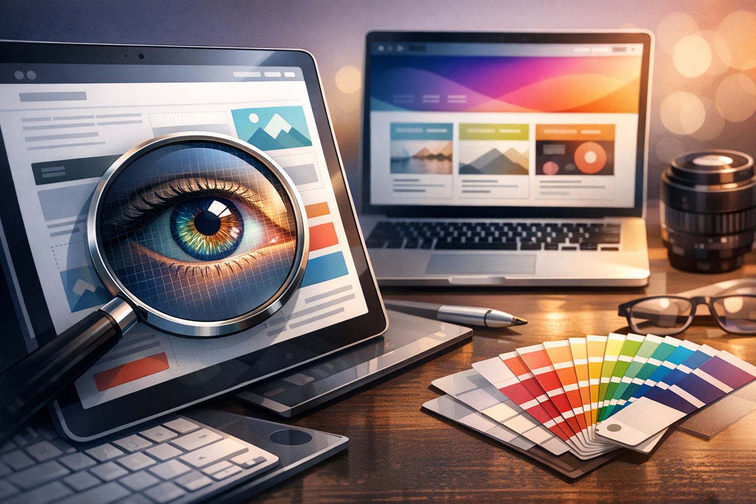
People expect websites and apps to look crisp on every screen—from budget laptops to high-end smartphones. If your visuals appear blurry or soft on modern devices, it can quietly undermine trust and make your interface feel dated. That’s where retina ready design comes in: it’s a practical approach to delivering sharp graphics and clean typography on high–pixel-density displays without sacrificing performance.
In this guide, you’ll learn what “retina” really means, how high-density screens affect your assets, and the best methods to create and ship retina-ready visuals for WordPress and beyond.
What Is Retina Ready Design?
Retina ready design refers to designing and building digital interfaces so that images, icons, and UI elements appear sharp on high pixel density screens (often 2× or 3× the pixel density of “standard” displays). The term “Retina” originated with Apple’s marketing, but today it’s used as shorthand for any high-DPI (dots per inch) or high-PPI (pixels per inch) display.
Understanding pixel density and device pixel ratio (DPR)
The key concept behind retina-ready work is Device Pixel Ratio (DPR). DPR describes how many physical pixels are used to represent one CSS pixel.
- DPR = 1: 1 CSS pixel maps to 1 device pixel (traditional displays).
- DPR = 2: 1 CSS pixel maps to 2×2 device pixels (four physical pixels).
- DPR = 3: 1 CSS pixel maps to 3×3 device pixels (nine physical pixels).
On a DPR 2 screen, a 300×200 image displayed at 300×200 CSS pixels may look soft because the device has more pixels available than your asset provides. A retina-ready approach supplies higher-resolution sources and lets the browser pick the best one.
Retina vs. standard displays: what changes visually?
On standard displays, a 1× image often looks fine. On high-DPI screens, the same image can show:
- Blurred edges and text baked into images
- Icons that look slightly fuzzy or “washed out”
- Low-quality brand marks (logos) that reduce perceived professionalism
Retina-ready design minimizes those issues by using scalable formats (like SVG) where possible and responsive image techniques (like srcset) where needed.
Why Retina Ready Design Matters
High-density screens are now the norm across phones, tablets, laptops, and even desktop monitors. Supporting them is less of a “nice to have” and more of a baseline expectation.
Sharper visuals and improved user experience
When images, UI elements, and iconography are crisp, interfaces feel more polished and easier to use. Details like thin lines, small type, and subtle shadows hold up better—especially in UI-heavy pages such as dashboards, portfolios, and ecommerce product galleries.
Brand perception and trust
Blurry graphics can make a site feel outdated or hastily built. Conversely, sharp logos, clean icons, and high-quality product imagery communicate professionalism—an important factor for conversions, sign-ups, and credibility.
Better accessibility and readability (when done right)
Retina readiness can support readability by preventing the softening of small text in images and improving the clarity of interface cues. The best practice is still to use real text (HTML/CSS) rather than text embedded in images, but high-resolution assets help where images are necessary.
Core Principles of Retina Ready Design
Retina-ready design isn’t about “making everything huge.” It’s about matching the asset strategy to how browsers render pixels, then delivering the right image at the right size.
Design in vector when possible (SVG icons and logos)
SVG (Scalable Vector Graphics) is ideal for logos, icons, simple illustrations, and UI shapes because it scales cleanly to any resolution without becoming blurry. Common use cases include:
- Navigation icons and social icons
- Logos and wordmarks
- UI indicators (arrows, chevrons, badges)
Tip: Keep SVGs lightweight by simplifying paths and removing unnecessary metadata. For WordPress, ensure SVG uploads are handled securely (via a trusted plugin or controlled code) because SVG is an XML-based format.
Use high-resolution raster images appropriately (2x/3x)
For photos and complex imagery (e.g., product photography, hero backgrounds), raster formats like JPG, PNG, and WebP are common. The retina-ready pattern is:
- Define the display size in CSS (e.g., 400px wide).
- Export images at 2× (800px) and sometimes 3× (1200px) depending on the use case.
- Let the browser select the best source with
srcset.
This keeps visuals sharp while avoiding the mistake of forcing every visitor to download the largest possible file.
Match image dimensions to CSS display sizes
A common cause of blur is scaling images up beyond their native resolution. Another issue is shipping images that are far larger than needed, which hurts performance. The goal is to:
- Avoid upscaling (never display 1200px-wide visuals from a 600px source).
- Avoid extreme oversizing (don’t ship a 5000px image to display at 500px).
Plan your layout’s image slots (cards, thumbnails, hero areas) and export sources that fit those slots at 1×/2× where appropriate.
How to Implement Retina Ready Design (Best Practices)
The technical implementation matters as much as the design exports. Modern HTML provides excellent tools for responsive, retina-friendly images.
Responsive images with srcset and sizes
Use srcset to provide multiple image candidates and sizes to tell the browser how large the image will be in the layout. Example:
<img
  src="image-800.jpg"
  srcset="image-400.jpg 400w, image-800.jpg 800w, image-1200.jpg 1200w"
  sizes="(max-width: 600px) 100vw, 400px"
  alt="Product photo">
This approach supports different screen widths and different pixel densities efficiently.
Use modern formats (WebP/AVIF) with fallbacks
WebP and AVIF can deliver smaller file sizes at comparable (or better) quality than JPG/PNG—especially helpful when serving 2× assets. Use the <picture> element for format fallbacks:
<picture>
  <source type="image/avif" srcset="image-800.avif 2x, image-1200.avif 3x">
  <source type="image/webp" srcset="image-800.webp 2x, image-1200.webp 3x">
  <img src="image-400.jpg" srcset="image-800.jpg 2x, image-1200.jpg 3x" alt="Hero image">
</picture>
Optimize image compression and performance
Retina-ready doesn’t mean “heavy.” Balance clarity with speed:
- Compress images during export (and re-check after upload).
- Choose JPG/WebP for photos and PNG only when you truly need transparency.
- Lazy-load below-the-fold images (WordPress does this by default in many cases).
- Use a CDN to reduce latency and speed up delivery globally.
WordPress-specific tips (themes, plugins, media settings)
WordPress already generates multiple image sizes and outputs srcset automatically for standard <img> tags in content. To make the most of that:
- Upload sufficiently large originals so WordPress can generate high-quality intermediate sizes (within reason).
- Use well-built themes that rely on WordPress image functions (so
srcsetis preserved). - Consider an image optimization plugin to generate WebP/AVIF and compress images (e.g., tools that integrate with the media library).
- Check featured images and hero sections—these are frequent hotspots for blur if the theme scales images beyond their generated size.
Common Mistakes to Avoid
Retina-ready efforts can backfire if they ignore performance or rely on the wrong formats.
Uploading massive images without responsive handling
Simply uploading 2× images and using them everywhere can increase page weight dramatically. Always pair high-resolution sources with responsive techniques (srcset, sizes, and appropriate theme behavior) so devices only download what they need.
Ignoring performance budgets
High-density assets should not derail Core Web Vitals. Set practical targets for image weight (especially on mobile), and test pages on real devices and slower networks.
Using PNG when SVG or WebP would be better
PNG is great for certain cases, but it’s often overused. Prefer:
- SVG for icons/logos/flat illustrations
- WebP/AVIF for photos and complex visuals
- PNG mainly for images requiring lossless quality or specific transparency needs
Conclusion
Retina ready design is about delivering crisp visuals on modern screens while keeping your site fast and efficient. By leaning on SVG for scalable graphics, exporting smart 2×/3× raster assets, and implementing responsive images with modern formats, you can create a polished experience that looks sharp everywhere—without bloating your pages.
