What Is Brand Identity Design?
Brand identity design is the process of creating the visual and verbal system that represents a brand and helps people recognize it instantly. It includes tangible elements like logos, colors, typography, imagery, and layout rules, as well as the brand’s voice, messaging, and tone. Together, these components form a cohesive identity that communicates who you are, what you stand for, and what customers can expect from you.
It’s easy to confuse brand identity with branding. Branding is the broader, ongoing experience people have with your business—your reputation, customer service, product quality, and how you make people feel. Brand identity design is the structured toolkit that makes that experience consistent and recognizable across every touchpoint.
Why Brand Identity Design Matters
A strong brand identity does more than “look good.” It creates clarity, builds trust, and makes marketing more efficient. When people can quickly recognize your brand and understand your promise, they’re more likely to remember you, choose you, and recommend you.
- Recognition: Consistent visuals and messaging make you easier to spot and recall.
- Trust: Professional, cohesive design signals reliability and attention to detail.
- Differentiation: A distinct identity helps you stand out in crowded markets.
- Consistency at scale: With defined rules, teams can create on-brand content faster.
- Stronger connections: Identity design helps communicate values and personality, not just products.
Core Elements of a Brand Identity
Brand identity is a system, not a single asset. The goal is to create a set of building blocks that work together and stay consistent across platforms.
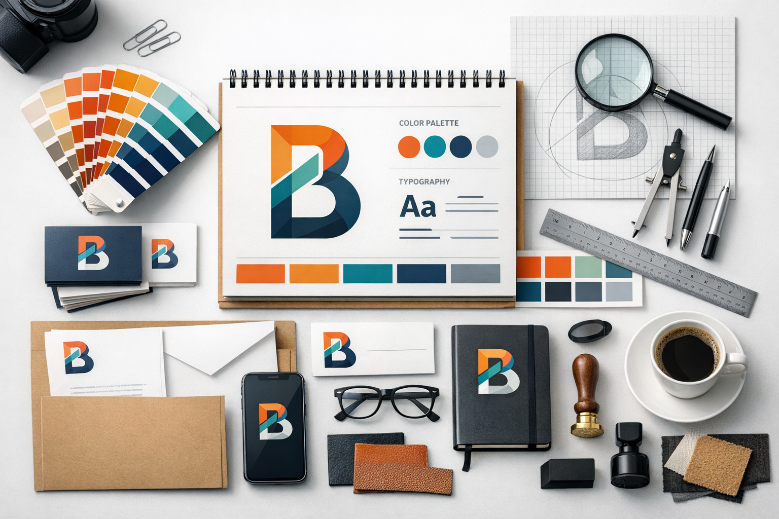
Logo and Logo System
Your logo is often the most recognizable part of your identity, but it’s rarely just one file. A well-built logo system usually includes primary and secondary versions (horizontal, stacked), a simplified mark for small sizes, and clear spacing and sizing rules. The “system” approach ensures your logo performs well everywhere—from a website header to a social media icon to packaging.
Color Palette
Color is one of the fastest ways people identify a brand. A good palette includes primary colors, supporting neutrals, and accent colors, with guidelines for how and when each should be used. Practical palettes consider accessibility (contrast), printing requirements (CMYK vs. RGB), and how colors look on different screens.
Typography
Typography shapes how your brand “speaks” visually. Most brands choose a primary typeface for headings and a secondary typeface for body copy, plus rules for hierarchy, spacing, and emphasis. Great typographic choices improve readability and reinforce brand personality—whether it’s modern, classic, playful, or bold.
Imagery and Graphic Style
Imagery includes photography direction (lighting, composition, subject matter), illustration style, iconography, textures, patterns, and graphic motifs. Defining these details prevents your brand from feeling inconsistent—like using sleek minimal photos on your site but busy, high-saturation graphics on social media.
Voice and Messaging
Brand identity design isn’t only visual. Voice and messaging guidelines define tone (friendly, authoritative, witty), preferred language, and how you communicate your value. This includes taglines, key messages, and examples of how to write headlines, product descriptions, and social captions in a way that sounds like “you.”
The Brand Identity Design Process (Step by Step)
While every designer has a unique approach, most brand identity projects follow a structured path. This keeps decisions grounded in strategy rather than personal taste.
1) Discovery and Research
Discovery lays the foundation. This phase often includes stakeholder interviews, customer insights, competitor analysis, and a review of what currently works (and doesn’t). You’re looking for patterns: what your audience values, what competitors overuse, and where opportunities for differentiation exist.
2) Brand Strategy and Positioning
Design becomes much easier when strategy is clear. Positioning typically defines your target audience, brand promise, unique differentiators, and personality. Many projects also clarify mission, values, and a concise brand story. The output is a set of decision-making criteria that guides everything that comes next.
3) Creative Direction
This stage translates strategy into a visual path. Designers may use mood boards or style tiles to explore color, typography, and imagery directions. The goal is to align on an overall look and feel before investing time in final assets.
4) Design Development
Now the identity takes shape: logo concepts, typography pairings, palette refinements, and supporting graphics. Strong design development focuses on versatility (does it work small and large?), cohesion (do elements feel like a family?), and practicality (can your team use it day to day?).
5) Brand Guidelines and Assets
Brand guidelines document how to use the system. This can be a PDF brand book, a web-based brand portal, or both. It typically includes logo rules, color codes, typography hierarchy, imagery direction, examples of layouts, and do’s and don’ts. Final deliverables often include multiple file formats (SVG, PNG, EPS, JPG) and templates for common needs.
6) Implementation and Rollout
The final step is applying the identity across touchpoints: website, social media, email marketing, proposals, packaging, signage, and more. A thoughtful rollout plan prioritizes high-impact updates first (often the website and sales materials), then expands to the rest over time.
Common Mistakes to Avoid
Even attractive identities can fall short if they aren’t built for real-world use. Avoid these common pitfalls to protect your investment.
- Designing without strategy: If positioning isn’t clear, the identity may look nice but communicate the wrong message.
- Inconsistency across channels: Using different colors, fonts, or tones weakens recognition and trust.
- Overcomplicating the system: Too many colors, typefaces, or logo variations can confuse teams and dilute the brand.
- Ignoring accessibility: Poor contrast and hard-to-read typography can exclude users and reduce conversions.
- Following trends too closely: Trend-heavy designs can date quickly; aim for “timely” but not “temporary.”
- Skipping guidelines: Without clear rules, even great design assets get used incorrectly.
How to Know If Your Brand Needs a Refresh or a Full Redesign
Not every brand needs a complete overhaul. Sometimes a refresh—small adjustments to modernize and improve consistency—is enough. Other times, a full redesign is the smarter move.
- A refresh may be enough if: your logo still fits your positioning, but execution feels dated; you need better consistency; or you’re expanding your marketing channels.
- A full redesign may be needed if: your business model or audience has changed; your brand is regularly confused with competitors; or the current identity no longer represents your values and offer.
A helpful litmus test: if you’re constantly explaining what you do, or your visuals don’t match the quality of your product, it’s likely time to revisit your identity.
Conclusion
Brand identity design is a strategic system that helps people recognize your business, understand your promise, and feel confident choosing you. When built on clear positioning and executed with consistency, it becomes a long-term asset—making marketing easier, strengthening trust, and supporting growth across every channel.
