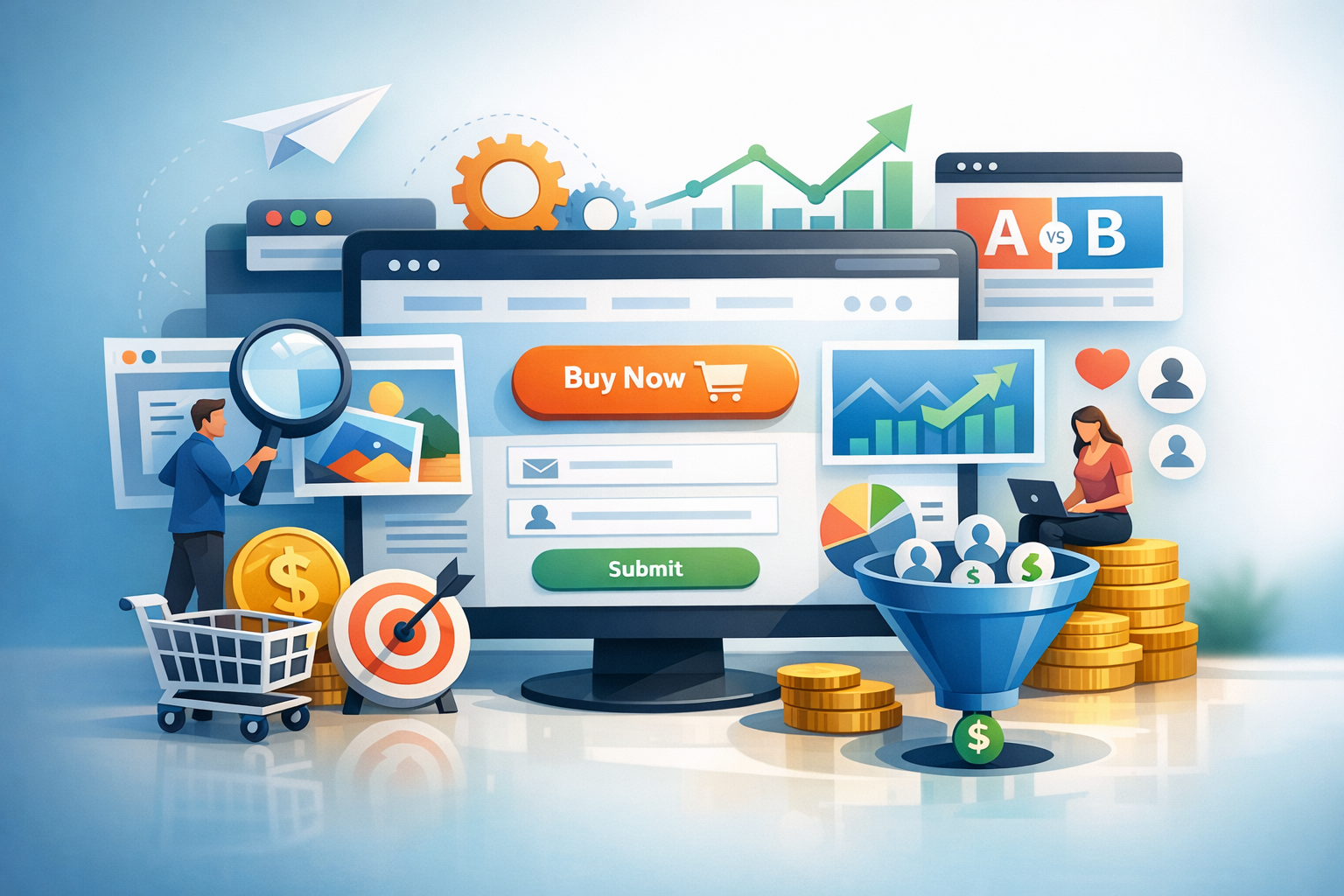
Beautiful design is great, but if your website isn’t turning visitors into leads, trials, or purchases, it’s not doing its job. Conversion-focused web design (often called conversion-centered design) aligns every page element—layout, copy, visuals, and interactions—around one goal: helping the visitor take a clear next step. The result is a site that feels easier to use, communicates value faster, and consistently performs better.
What is conversion-focused web design?
Conversion-focused web design is the practice of designing web pages specifically to increase the percentage of visitors who complete a desired action (a “conversion”). That action might be buying a product, requesting a quote, booking a demo, subscribing to a newsletter, or downloading a guide.
Unlike purely aesthetic design, conversion-focused design is intentional. It prioritizes clarity, relevance, and trust while reducing friction. The goal isn’t to trick users—it’s to remove confusion and make the best next step obvious and appealing.
The pillars of a high-converting website
High conversion rates rarely come from one “magic” button color. They come from a system of choices that work together. These pillars show up again and again on websites that convert.
1) Clear messaging and a strong value proposition
Visitors decide within seconds whether they’re in the right place. Your headline, subheadline, and supporting visuals should answer three questions quickly:
- What is this? (product/service category)
- Who is it for? (target audience or use case)
- Why choose you? (unique value, outcomes, or differentiators)
Keep language specific and outcome-oriented. “Save 6 hours a week on invoicing” is more compelling than “A modern invoicing platform.”
2) Visual hierarchy that guides attention
Conversion-focused layouts are designed like a roadmap. Size, spacing, contrast, and placement should guide the eye from the most important message to proof, then to the call to action (CTA). When everything screams for attention, nothing gets noticed.
Use one primary CTA per page section, create breathing room around key elements, and ensure headings are scannable so users can understand the page without reading every line.
3) Reduced friction and fewer distractions
Every extra step, field, or choice can reduce conversions. Conversion-focused design removes obstacles:
- Shorter forms (ask only what you truly need)
- Fewer competing links near critical CTAs
- Simple navigation that doesn’t overwhelm
- Fast-loading pages and mobile-friendly layouts
Think in terms of “effort vs. reward.” The higher the perceived effort, the stronger your perceived value needs to be.
4) Trust signals and credibility
Even with great messaging, people hesitate if they don’t trust you. Add credibility where it matters most—near CTAs, pricing, and forms. Useful trust signals include testimonials, reviews, case study snippets, recognizable client logos, security badges (when relevant), guarantees, and clear contact information.
Trust can also be communicated through details: transparent pricing, clear policies, professional photography, and consistent branding.
Key conversion elements to design (and how to optimize them)
These are the page components that most directly influence conversion behavior. Designing them well can make a measurable difference.
Calls to action (CTAs)
Your CTA is the moment of commitment. Make it easy to find and easy to understand:
- Use action-driven text: “Get a free quote,” “Start a 14-day trial,” “Book a demo.”
- Match intent: colder traffic may prefer “Learn more,” while warmer traffic converts on “Buy now.”
- Design for visibility: strong contrast, ample whitespace, and consistent placement.
If you have multiple offers, prioritize one primary CTA and treat others as secondary (less prominent) to avoid decision paralysis.
Forms and lead capture
Forms are often the biggest conversion bottleneck. To improve performance, keep them short, explain what happens next, and reduce anxiety:
- Use clear labels (not just placeholder text).
- Add microcopy like “No spam” or “We’ll respond within 1 business day.”
- For longer forms, consider multi-step layouts with a progress indicator.
Also ensure error states are helpful and accessible—users should know exactly what to fix.
Landing pages that align with traffic sources
A conversion-focused landing page continues the conversation started by your ad, email, or social post. If someone clicks “Accounting software for freelancers,” don’t drop them onto a generic homepage.
Maintain message match: repeat the same promise, use similar terminology, and highlight the benefit that made them click. This alignment increases relevance and lowers bounce rates.
Pricing pages that reduce uncertainty
Pricing pages are decision pages. Design them for clarity:
- Make plan differences easy to compare.
- State what’s included, who each plan is for, and the next step.
- Address common objections with an FAQ (billing, cancellation, support).
If you offer a free trial or guarantee, place it near the pricing table to reduce perceived risk.
Conversion psychology and UX best practices
Conversion-focused web design is rooted in how people evaluate choices online. A few behavioral principles show up consistently in high-performing pages:
- Cognitive ease: Simple layouts and plain language feel more trustworthy and easier to act on.
- Social proof: People look for evidence that “others like me” succeeded with your offer.
- Loss aversion: Clarify what visitors miss if they don’t act (without resorting to gimmicks).
- Commitment and consistency: Small steps (like a short quiz) can increase follow-through.
Importantly, good UX is conversion optimization. If your site is hard to read, slow, or confusing on mobile, conversion rates will suffer no matter how persuasive your copy is.
Measure, test, and iterate
Conversion-focused design isn’t a one-time project—it’s a cycle. Start with measurement so you know what to improve:
- Analytics: track conversions, drop-off points, and top landing pages.
- Heatmaps and recordings: see where users click, scroll, and hesitate.
- User feedback: run short on-page polls like “What’s stopping you from signing up?”
Then test changes with A/B experiments when you have enough traffic. Focus on high-impact hypotheses such as improving above-the-fold clarity, reducing form fields, or adding stronger proof near the CTA.
Common mistakes that hurt conversions
- Too many CTAs: giving visitors multiple “primary” actions creates confusion.
- Designing for stakeholders instead of users: internal preferences can dilute clarity.
- Weak mobile experience: cramped layouts and tiny buttons kill momentum.
- Generic copy and stock visuals: if your site looks like everyone else’s, trust and differentiation drop.
- No proof: claims without testimonials, results, or specifics rarely convert.
Conclusion
Conversion-focused web design is about designing with purpose: clear messaging, smart hierarchy, low friction, and strong trust signals—then improving through measurement and testing. When you combine great UX with persuasive content, your website becomes more than a brochure; it becomes a reliable growth engine.
