What Are Design Mockups?
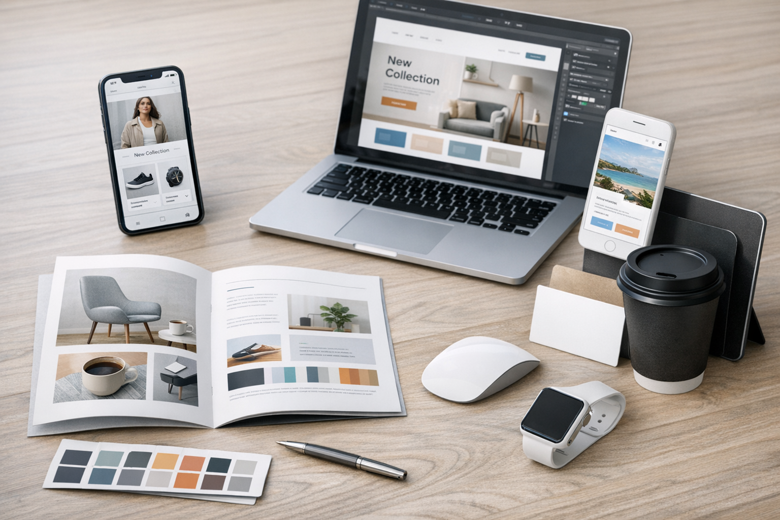
Design mockups are high-fidelity visual representations of a product or interface. They show how a design is expected to look and feel once it’s built—typically including layout, typography, color, spacing, imagery, and key UI components. Unlike rough sketches or basic wireframes, mockups aim to be close to the final aesthetic, making them ideal for communicating visual direction and gathering precise feedback.
Mockups are used across many design disciplines—web, mobile apps, SaaS dashboards, marketing pages, packaging, and even physical products. In digital product design, a mockup often serves as the “bridge” between structure (wireframes) and reality (prototypes and development).
Why Design Mockups Matter
Mockups help teams align on what’s being built before time is spent on code or production. They reduce misunderstandings, reveal visual and usability issues early, and create a single source of truth for stakeholders.
They’re also invaluable for presenting work. A thoughtful mockup can make an idea tangible, helping clients and internal teams visualize the end result, compare options, and make decisions faster.
Align stakeholders faster
When stakeholders can see a realistic design, feedback becomes more specific and actionable. Instead of vague comments like “make it pop,” you’ll hear things like “the primary button doesn’t stand out enough” or “this section feels too dense.” That clarity saves revision cycles and keeps projects moving.
Reduce expensive rework
It’s far cheaper to adjust layout, hierarchy, or branding in a mockup than after development has started. Mockups make it easier to catch issues like inconsistent spacing, poor contrast, or unclear navigation before they turn into costly rebuilds.
Communicate visual direction
A mockup captures the visual language: the tone of the typography, the rhythm of spacing, the style of icons, and the overall polish. This is especially helpful when multiple designers or developers are contributing to the same product, because it sets expectations for what “done” looks like.
Mockups vs. Wireframes vs. Prototypes
These terms are often used interchangeably, but they serve different purposes:
- Wireframes: Low-fidelity layouts focused on structure and content hierarchy. Typically grayscale and fast to iterate.
- Mockups: High-fidelity static designs focused on visual styling, branding, and UI detail.
- Prototypes: Interactive models that simulate user flows (clicking, scrolling, transitions). Prototypes can be low or high fidelity.
A common workflow is: wireframes to validate structure → mockups to finalize look and feel → prototypes to validate interactions and flows.
Types of Design Mockups
Mockups can take different forms depending on the goal, audience, and stage of the project. Choosing the right type helps you get the right feedback.
Low-fidelity vs. high-fidelity mockups
Low-fidelity mockups may include basic visual styling while still leaving room for exploration—useful when you want some brand direction without locking every detail. High-fidelity mockups closely reflect the final product, including refined typography, real imagery, accurate spacing, and realistic content.
Device and context mockups
Contextual mockups place your design inside a real-world setting: a phone in someone’s hand, a laptop on a desk, or a billboard in a street scene. These are excellent for presentations and marketing because they show how the design “lives” in its environment.
Marketing vs. product UI mockups
Marketing mockups (landing pages, ads, email templates) prioritize messaging, brand visuals, and conversion elements. Product UI mockups (dashboards, settings, onboarding) prioritize usability, consistency, and interaction patterns. While both benefit from strong visuals, the evaluation criteria differ—conversion performance for marketing, task success and clarity for product UI.
How to Create Effective Design Mockups
Great mockups are not just “pretty screens.” They’re clear, consistent, and designed to answer questions. These practices will help you create mockups that are easier to review and simpler to build.
Start with clear goals and requirements
Before pushing pixels, define what the mockup needs to accomplish. Is it meant to confirm a visual direction? Validate a layout? Present to a client? Establish which screens, breakpoints, and states are required (e.g., empty states, error states, hover/focus states). Clear scope prevents half-finished designs that can’t be implemented confidently.
Use a design system (or build light foundations)
Mockups are stronger when they’re built from consistent components—buttons, inputs, cards, typography styles, spacing rules, and colors. If you have a design system, use it. If you don’t, create a lightweight foundation: a type scale, a spacing scale, a color palette with accessible contrast, and a few reusable components. Consistency improves usability and makes development significantly easier.
Design for real content
“Lorem ipsum” can hide problems. Use realistic headings, body copy, and data examples so you can evaluate truncation, wrapping, empty states, and information density. Real content also helps stakeholders focus on the right questions—like clarity of messaging and hierarchy—rather than guessing how the final content might fit.
Show states and variations
Many projects stall because the mockup only shows the ideal scenario. Strong mockups include key UI states and edge cases, such as:
- Loading, empty, and error states
- Form validation (success, warning, error)
- Hover, focus, active, and disabled components
- Responsive layouts for major breakpoints
Including these details makes the design more implementation-ready and reduces last-minute surprises.
Annotate for clarity
Annotations turn a static mockup into a communication tool. Add brief notes to explain behavior (e.g., “filters persist across sessions”), content rules (“title truncates after 2 lines”), and component usage (“use primary button only once per screen”). Well-placed annotations reduce back-and-forth and help developers build with confidence.
Tools for Design Mockups
Most mockups today are created in UI design tools that support components, shared libraries, and collaboration. Popular options include Figma, Sketch, and Adobe XD, along with supporting tools for handoff and documentation.
When choosing a tool, prioritize how your team works: real-time collaboration, component management, version history, and easy sharing for reviews. The best tool is the one that helps you iterate quickly while keeping designs organized and consistent.
Common Mistakes to Avoid
Even experienced teams can run into avoidable problems when creating mockups. Watch for these common pitfalls:
- Over-polishing too early: If the layout and flows aren’t validated, spending hours on perfect shadows and imagery can slow learning.
- Ignoring accessibility: Poor contrast, tiny text, and unclear focus states lead to redesign later. Check contrast and design with keyboard navigation in mind.
- Designing only the “happy path”: Missing edge cases creates confusion during development and QA.
- Inconsistent spacing and typography: Small inconsistencies compound into a design that feels untrustworthy and harder to build.
- Unclear handoff: Without specs, annotations, or component references, developers may implement something that looks similar but behaves differently.
Conclusion
Design mockups are a key step in turning ideas into clear, buildable visuals. By choosing the right fidelity, designing with real content, documenting states, and leaning on consistent components, you’ll create mockups that align stakeholders, reduce rework, and speed up development. Treat mockups as a communication asset—not just a deliverable—and they’ll consistently elevate the quality of your final product.
