Introduction
Choosing the right font can make a design feel polished, trustworthy, and easy to read—or confusing and forgettable. A font selection website helps you explore typefaces, compare styles, test real text, and build font pairings without guesswork. Whether you’re designing a brand identity, updating a website, or creating marketing materials, the right tool can speed up your workflow and improve your results.
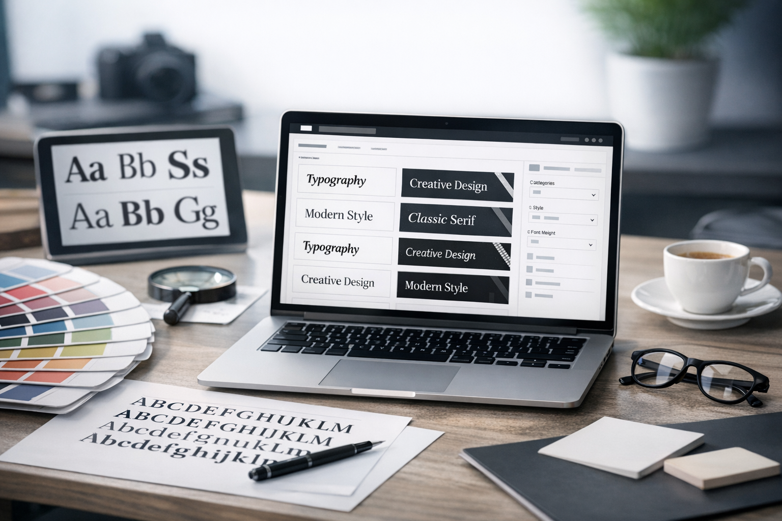
What Is a Font Selection Website?
A font selection website is an online tool or library that helps you browse, preview, compare, and choose fonts. Some platforms focus on curated recommendations and pairing suggestions, while others provide large catalogs with advanced filtering and testing. Many also support licensing details, variable font controls, and export options for web and design software.
Key features to look for
- Live preview: Type your own text and see it in different fonts instantly.
- Filtering and search: Narrow fonts by category (serif, sans-serif), mood, width, weight, x-height, and language support.
- Pairing tools: Suggested heading/body combinations and harmony checks.
- Style controls: Weight, size, line-height, letter spacing, and variable font axes (where supported).
- Licensing clarity: Easy-to-find terms for web, print, app, and commercial use.
- Performance guidance: File sizes, subsets, and loading recommendations for web fonts.
Why Font Selection Matters
Fonts do more than “look nice.” They influence how people feel and how quickly they understand your content.
Readability and accessibility
Font selection affects legibility across devices and user needs. A well-chosen typeface with clear letterforms, sufficient spacing, and a strong regular weight improves scanning and comprehension. A good font selection website makes it easy to test paragraphs, headings, buttons, and small UI labels so you can spot issues early.
Brand voice and trust
Typography communicates personality: modern, classic, friendly, technical, luxurious, playful, and more. The wrong font can make a serious business feel casual—or a creative brand feel generic. Using font selection tools to compare “vibes” side by side helps you pick a type system that matches your message.
Consistency across platforms
Your type choices should hold up across web, mobile, print, presentations, and social graphics. A strong font selection website provides information on formats, weights, and character coverage so your typography stays consistent as your brand grows.
How to Use a Font Selection Website Effectively
Having thousands of options can be overwhelming. The best results come from a repeatable process.
Step 1: Define your requirements
- Use case: Website, app UI, long-form reading, packaging, ads, or editorial.
- Audience: Consider age, accessibility needs, and reading context (mobile vs. desktop).
- Brand traits: Write 3–5 adjectives (e.g., “confident, minimalist, warm”).
- Language support: Ensure accents, symbols, and any required scripts are available.
Step 2: Start broad, then filter
Begin with the big decision: serif vs. sans-serif (or a mix). Then use filters like weight range, contrast, width, and “editorial” or “geometric” styles. Good font selection websites let you quickly narrow from hundreds to a short list of 10–20 candidates.
Step 3: Test with real content
Don’t rely on lorem ipsum or a single headline. Paste in:
- A short headline (6–10 words)
- A subheading (1–2 lines)
- A paragraph (3–5 sentences)
- UI microcopy (buttons, form labels, navigation)
Look for awkward letter shapes, confusing characters (I/l/1, O/0), and cramped spacing at small sizes.
Step 4: Compare font pairings
Many projects need at least two fonts: one for headings and one for body text. On a font selection website, compare pairs using the same layout and sizing. Strong pairings often have either:
- Contrast: A serif headline + a clean sans-serif body.
- Harmony: A superfamily (multiple styles designed to work together).
Keep it simple: two fonts is usually enough; three is a maximum for most brands.
Step 5: Check weights, italics, and small caps
A font can look great in one weight and fail in another. Ensure you have the styles you need—regular, medium, bold, and italics are common essentials. If you design editorial content, you may also want small caps, tabular numerals, or extended weight ranges.
Popular Types of Font Selection Websites
Not all platforms serve the same purpose. Choosing the right kind of site depends on whether you need free options, premium families, or pairing guidance.
Font libraries (free and paid)
Font libraries provide large collections with previews, filters, and downloads or web embedding. Some focus on open-source fonts, while others offer premium licensing and high-end type families. If you need variety and flexibility, start here.
Font pairing and inspiration tools
Pairing-focused websites emphasize curated combinations, typography systems, and real-world examples. These are ideal when you want direction quickly or need typography that “just works” for a landing page or brand refresh.
Foundries and marketplace sites
Foundries showcase professionally crafted families with detailed specimen pages, usage recommendations, and licensing options. Marketplaces aggregate fonts from multiple creators. These sites are particularly useful for distinctive branding and extensive language support.
What to Evaluate Before You Commit
Before you lock in a font, use your font selection website to verify the details that can affect quality, budget, and performance.
Licensing and usage rights
Read the license carefully. Webfonts may be priced by pageviews or domains, while app and broadcast usage can be separate. Make sure your planned use (commercial, client work, product packaging, templates) is explicitly allowed.
Web performance and loading
Typography can slow down a website if you load too many files. Consider:
- Limit weights: Use 2–3 weights max on the web.
- Subset characters: Only load the languages you need.
- Use variable fonts: One file can replace multiple weights (when supported).
Character set and multilingual support
If your site includes names, locations, or multiple languages, verify accent marks and special characters. For global brands, ensure the font supports the scripts you need and maintains consistent style across them.
Rendering quality across devices
Some fonts render differently on Windows vs. macOS, or at certain sizes in browsers. Use preview tools to test on multiple screens if possible. Watch for thin strokes disappearing, blurry curves, or uneven spacing.
Practical Font Selection Tips (Quick Wins)
- Prioritize readability for body text: Choose a typeface designed for long-form reading, then add personality in headings.
- Set a “type budget”: Limit the number of families and weights to keep design consistent and pages fast.
- Use typographic hierarchy: Size and weight differences should be clear enough that users can scan quickly.
- Test in context: Preview fonts in your real layout—hero section, blog post, forms—not just a specimen page.
- Save and compare favorites: Shortlists help you make decisions based on objective criteria, not just first impressions.
Conclusion
A great font selection website turns typography from a time-consuming guessing game into a structured, confident decision. Focus on real-text previews, pairing tools, licensing clarity, and performance insights, and you’ll end up with fonts that look great, read well, and support your brand everywhere your content appears.
