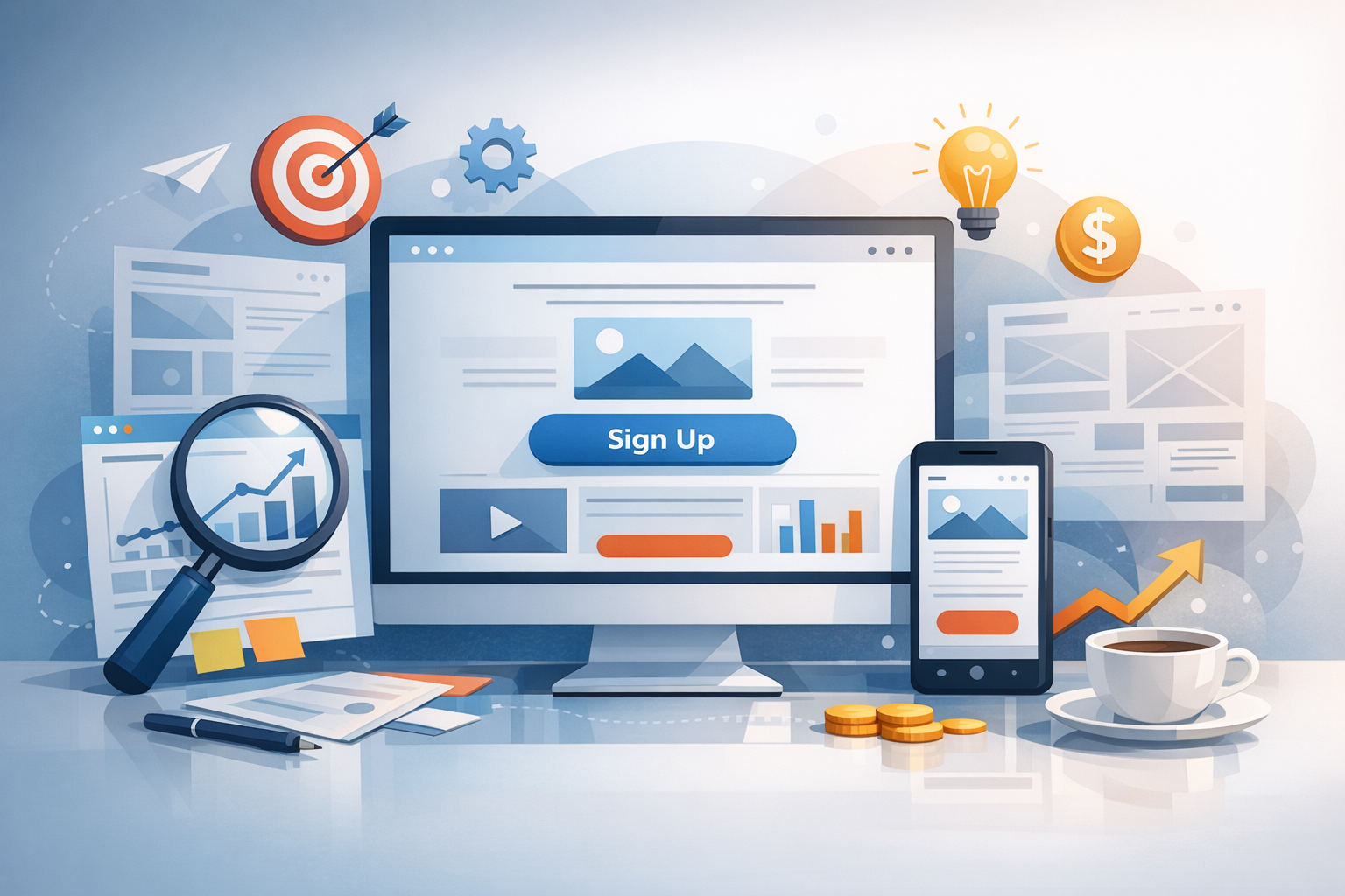
A landing page has one job: guide visitors to take a specific action—sign up, book a demo, download a guide, or buy a product. Great landing page design blends clear messaging, strong visual hierarchy, and low-friction user experience so your offer feels obvious and easy to accept. Below is a practical, conversion-focused guide you can apply to any industry.
What Is Landing Page Design (and Why It Matters)
Landing page design is the intentional layout, copy, visuals, and user flow of a single page built around one conversion goal. Unlike a homepage (which must serve many audiences), a landing page is focused. That focus improves performance because it reduces distractions, clarifies value, and creates a straight path from “interest” to “action.”
If you’re running ads, email campaigns, or social promotions, sending traffic to a dedicated landing page typically converts better than sending visitors to a general page—because the message matches the promise that brought them there.
Core Elements of a High-Converting Landing Page
Most successful landing pages share a set of fundamentals. You can customize the style, but the building blocks remain remarkably consistent.
A Clear Headline and Supporting Subhead
Your headline should communicate the primary outcome visitors will get, not just what you’re offering. Pair it with a subhead that adds specificity—who it’s for, how it works, or what makes it different. If someone only reads these two lines, they should still understand the value.
A Strong Hero Section (Visual + Context)
The “hero” area is your first impression. Use a relevant image, product screenshot, or short video that reinforces the promise. Avoid generic stock photos that don’t clarify the offer. If you sell software, show the interface; if you offer a service, show the deliverable or outcome.
Benefit-Driven Copy (Not Feature Dumps)
Features explain what something is; benefits explain why it matters. Great landing page copy leads with benefits, then uses features as proof. Make it scannable with short paragraphs, bold emphasis where helpful, and bullet points that connect product/service capabilities to real outcomes.
One Primary Call to Action (CTA)
Pick a single primary action and design the page around it. Your CTA button should be visually prominent, use clear language (e.g., “Get the Free Template,” “Start My Trial,” “Book a Demo”), and appear multiple times on longer pages. Secondary links should be minimized so they don’t compete with your main goal.
A Simple Form or Checkout Flow
Every extra field adds friction. Ask only for what you truly need at this stage. If you need more information, consider a two-step form (where the first click is a micro-commitment) or collect additional details after the conversion.
Layout and Visual Hierarchy: Make the Next Step Obvious
Landing page design is largely about directing attention. Your layout should guide the eye in a natural sequence: value proposition → key benefits → proof → CTA.
Optimize “Above the Fold” Without Hiding Key Details
While users will scroll, the top of the page must quickly answer: What is this? Who is it for? Why should I care? What do I do next? Include a headline, brief supporting copy, a primary CTA, and a relevant visual. Then use the rest of the page to remove doubt and build confidence.
Use Whitespace and Contrast Strategically
Whitespace isn’t “empty space”—it’s a tool that increases clarity and readability. Combine whitespace with contrast to make the CTA stand out. If everything is bold and bright, nothing is. Give your main CTA a clear visual advantage.
Design for Mobile First
Mobile traffic is often the majority. Ensure buttons are thumb-friendly, text is readable without zooming, and forms are easy to complete on small screens. Check how your hero image crops on mobile and avoid huge blocks of text that create endless scrolling.
Trust and Persuasion: Reduce Anxiety and Increase Confidence
Visitors arrive with skepticism. Your job is to reduce perceived risk and answer unspoken questions.
Social Proof That Matches the Offer
Testimonials work best when they’re specific and relevant. Use quotes that mention measurable results, time saved, or a clear before/after. If possible, include names, titles, company logos, star ratings, or short case-study snippets. Place social proof near CTAs to support decision-making at the moment it matters.
Credibility Signals and Reassurance
Add trust elements that fit your audience: security badges for payments, privacy reassurance near forms, guarantees, certifications, media mentions, or partner logos. If you collect email addresses, a short note like “No spam—unsubscribe anytime” can meaningfully reduce friction.
Handle Objections Before They Become Drop-Offs
Common objections include price, time, complexity, or compatibility. Address these with a short FAQ, a “How it works” section, or a quick comparison. Keep it concise: the goal is clarity, not an essay.
Conversion-Focused UX: Speed, Clarity, and Low Friction
Even a beautiful page can underperform if it’s slow or confusing. Conversion-centered design is as much technical and usability work as it is visual design.
Improve Page Speed and Performance
Compress images, avoid heavy scripts, and use modern formats when possible. A slow page increases bounce rates and wastes paid traffic. Test with tools like PageSpeed Insights and prioritize improvements that affect the initial load.
Make It Accessible (and Easier for Everyone)
Accessible design improves usability across the board. Use sufficient color contrast, readable font sizes, descriptive button labels, and proper form field labels. Accessibility isn’t just compliance—it’s conversion-friendly clarity.
Remove Distractions
Navigation menus, extra outbound links, and multiple competing CTAs dilute focus. Many high-performing landing pages remove the main site navigation entirely. If you must include links, keep them subtle and limited to essentials like privacy policy or terms.
A/B Testing and Optimization: Turn Good into Great
Landing pages improve through iteration. Instead of guessing, test systematically and let user behavior guide decisions.
What to Test First
- Headline: Try outcome-focused vs. feature-focused messaging.
- CTA copy: “Get Started” vs. “Start My Free Trial” vs. “Download the Guide.”
- Hero visual: Screenshot vs. short demo video vs. static illustration.
- Form length: Fewer fields vs. more qualified leads.
- Social proof placement: Above vs. below the fold, near CTAs.
Metrics That Matter
Track conversion rate, cost per lead (if paid traffic), scroll depth, and form abandonment. Look beyond raw conversions to lead quality and downstream performance—sometimes a small drop in conversion rate produces higher-quality leads and better revenue outcomes.
Common Landing Page Design Mistakes to Avoid
- Unclear value proposition: If visitors can’t explain the offer in 5 seconds, you’ll lose them.
- Too many CTAs: One page, one goal.
- Generic visuals: Use imagery that clarifies, not decorates.
- Overwhelming copy: Make it scannable; lead with benefits.
- Ignoring mobile: A desktop-only design leaves money on the table.
- No trust elements: Proof and reassurance are not optional.
Conclusion
Effective landing page design is focused, fast, and built around clarity. Start with a strong value proposition, support it with benefits and trust signals, and make the path to conversion effortless—especially on mobile. Then test and refine. Small improvements in messaging, layout, or friction can compound into major gains in leads and sales.


