What is navigation design?
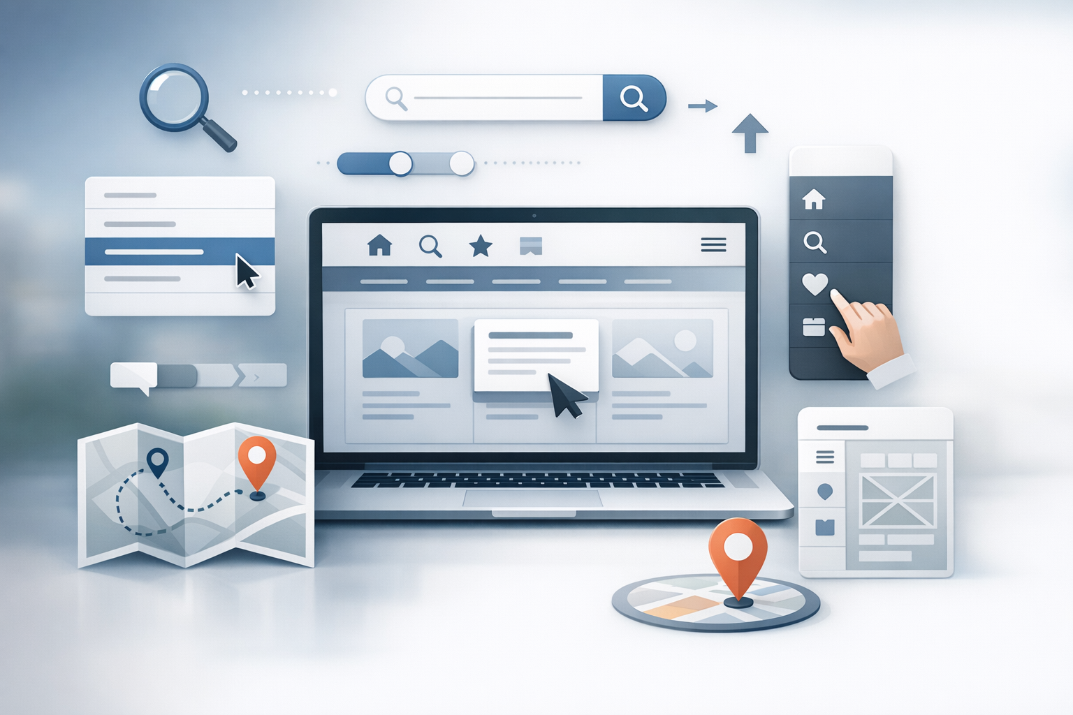
Navigation design is the practice of structuring and presenting the paths people use to move through a website or app. It includes global menus (like your main header), local navigation (like section tabs), contextual links inside content, and utility elements such as search, filters, breadcrumbs, and footers.
Good navigation design helps users answer three questions quickly: Where am I? Where can I go? and How do I get there? When those answers are obvious, users feel confident, tasks take fewer steps, and your content becomes easier to discover.
Why navigation design matters
Navigation is often the difference between a site that “looks great” and a site that actually works. If people can’t find a product, an article, pricing, or support, they don’t keep searching—they leave.
Strong navigation design supports:
- Usability: Clear paths reduce confusion and cognitive load.
- Conversion: Users reach key pages (signup, checkout, contact) without friction.
- Content discovery: Related links and logical grouping surface more of what you offer.
- Accessibility: Keyboard and screen reader users can move efficiently.
- SEO: A clear information architecture and internal linking help search engines understand your site.
Core principles of effective navigation
1) Clarity over cleverness
Labels should be instantly understandable. “Products” typically beats “Solutions” unless you truly offer solutions rather than purchasable items. Avoid internal jargon and brand slogans as primary menu items. If a new visitor can’t predict what’s behind a link, the label needs work.
2) Consistency and predictable patterns
Keep navigation in familiar locations (often the top header and/or left side), and maintain consistent naming across pages. Users rely on repeated patterns—moving menus around or changing labels between sections forces them to re-learn your interface.
3) Visual hierarchy and scannability
Navigation should be easy to scan in a second or two. Use typography, spacing, and grouping to distinguish primary items from secondary items. Dropdowns or mega menus should be structured with headings and columns so the eye can land quickly.
4) Feedback and orientation cues
Users need constant reassurance that the interface is responding. Provide clear states like:
- Current page indicator: Highlight the active menu item.
- Hover/focus states: Especially important for keyboard navigation.
- Breadcrumbs: Helpful for deep hierarchies and eCommerce categories.
5) Flexibility for different user intents
Not everyone navigates the same way. Some people browse categories; others search directly; others follow “Related content.” A strong navigation system offers multiple routes without duplicating complexity.
Common navigation patterns (and when to use them)
Global navigation (top menu)
This is your primary map. Use it for the highest-level categories a majority of visitors need. Keep the number of top-level items manageable—typically 5–8—so each label remains distinct and scannable.
Dropdown menus vs. mega menus
Dropdowns work well for smaller sets of subpages. Mega menus are useful when you have a large catalog or multiple content types and need to show structure at a glance (for example, by product line, audience, and resources).
Whichever you choose, prioritize:
- Logical grouping with clear subheadings
- Short, descriptive link labels
- Usable spacing (avoid densely packed lists)
Side navigation (section navigation)
Side navigation is ideal for deep content sections such as documentation, account settings, or knowledge bases. It supports orientation and makes it easier to move within a section without repeatedly returning to the homepage.
Breadcrumbs
Breadcrumbs show a user’s position within a hierarchy (e.g., Home > Shop > Shoes > Running). They’re especially helpful for:
- Large eCommerce sites
- Sites with multi-level categories
- Users arriving from search to a deep page
Search, filters, and faceted navigation
Search is a navigation tool, not just a utility. On content-heavy or product-heavy sites, search often becomes the fastest route to the right page. Filters and faceted navigation (multiple attributes like size, color, price, brand) help users narrow options without feeling lost.
Make filters clear, reversible, and visible—show selected filters and provide an easy way to remove them.
Footer navigation
Footers are excellent for secondary destinations: support, policies, careers, press, and social links. They’re also a good place to repeat key pathways (like “Pricing” or “Contact”) without crowding your header.
How to design navigation: a practical process
1) Start with user goals and top tasks
Before drawing menus, identify what people come to do. Review support tickets, site search logs, analytics, sales conversations, and user interviews. Your navigation should reflect user priorities, not internal org charts.
2) Build a clear information architecture
Create a simple hierarchy: categories, subcategories, and pages. Card sorting (open or closed) can help validate how users naturally group your content. Aim for a structure that is broad enough to scan but not so broad that everything becomes vague.
3) Write strong labels and microcopy
Use plain language, consistent grammatical patterns, and specific terms. For example, “Case Studies” is clearer than “Success.” If you must use a broad label like “Resources,” make sure the next level clarifies what’s inside (Blog, Guides, Webinars, Templates).
4) Prototype and test early
Navigation is easy to test with low-fidelity prototypes. Try:
- Tree testing: Can users find items in your hierarchy without the UI?
- First-click testing: Where do people click first to complete a task?
- Usability tests: Watch real users attempt common journeys.
5) Validate with analytics and iterate
After launch, use analytics to see what’s working: menu click-through rates, search queries, exit pages, and conversion funnels. If users frequently search for a page that’s already in the menu, your labeling or grouping may be unclear.
Navigation design best practices and pitfalls to avoid
Best practices
- Keep key items visible: Don’t bury core pages under multiple clicks.
- Design for mobile first: Ensure touch targets are large enough and menus are easy to open/close.
- Support accessibility: Use semantic HTML, logical tab order, visible focus states, and ARIA labels where appropriate.
- Provide a clear “home” path: Logo linking to home is expected; ensure it’s consistent.
- Use progressive disclosure: Reveal complexity only when needed (especially in mega menus and filters).
Pitfalls
- Too many top-level items: It dilutes attention and makes scanning harder.
- Ambiguous labels: Vague terms force users to guess.
- Hover-only interactions: Can be difficult on touch devices and for accessibility.
- Inconsistent structure: Different sections using different patterns creates confusion.
- Ignoring search behavior: If users rely on search, invest in its quality and placement.
Conclusion
Navigation design is about helping people move with confidence—finding the right information quickly, understanding where they are, and reaching their goals with minimal friction. Start with user tasks, build a clear information architecture, use plain-language labels, and test early. With a few thoughtful decisions, your navigation can become a quiet strength that improves usability, conversions, and overall trust in your site.
