What Is Style Guide Design?
Style guide design is the process of creating a structured set of visual and editorial rules that define how a brand looks and sounds across every touchpoint. A well-designed style guide aligns teams, reduces inconsistencies, and speeds up production—whether you’re building a website, social templates, product UI, presentations, or print materials.
In practice, style guide design is equal parts decision-making (choosing the right elements) and documentation (making those decisions easy to follow). The goal is a system that’s clear enough for newcomers, flexible enough for growth, and specific enough to keep the brand recognizable.
Why Style Guides Matter (More Than Ever)
Brands rarely live in one place. They appear in apps, emails, landing pages, ads, packaging, customer support replies, and more. Without shared rules, design and messaging drift over time—often without anyone noticing until things feel “off.”
Strong style guide design helps you:
- Maintain consistency across channels and teams
- Improve efficiency by reducing decision fatigue and rework
- Scale faster when hiring, outsourcing, or launching new products
- Protect brand equity by preventing accidental misuse of logos, colors, and tone
- Create better experiences by making interfaces and content more predictable
Core Components of Great Style Guide Design
While every organization has unique needs, most effective style guides include a mix of brand foundations, visual identity rules, and practical usage examples. Below are the components that typically deliver the most value.
Brand Foundations
Start with the “why” before the “how.” Brand foundations make it easier for designers and writers to apply guidelines with good judgment.
- Mission and values: what the brand stands for and how it behaves
- Audience and positioning: who you’re speaking to and how you’re different
- Personality traits: 3–5 attributes (e.g., confident, warm, practical)
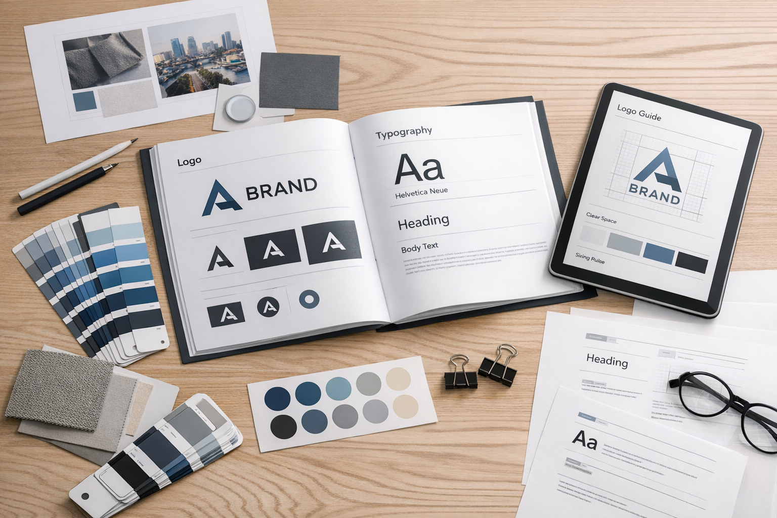
Logo Usage
Logo rules prevent the most common inconsistencies: stretching, recoloring, or placing the logo where it becomes hard to read.
- Primary and secondary logo versions: horizontal, stacked, icon-only
- Clear space: minimum padding around the mark
- Minimum size: the smallest readable dimensions for print and digital
- Background control: when to use full-color, one-color, or reversed
- Don’ts: distortions, effects, outlines, unauthorized colors, busy backdrops
Color Palette
Color is one of the fastest ways to build recognition, but it needs structure. Good style guide design includes both a clear palette and guidance for how to use it.
- Primary colors: core brand colors used most often
- Secondary and neutral colors: support colors and UI neutrals
- Accessibility guidance: contrast recommendations for text and UI states
- Values: HEX, RGB, CMYK (and optionally Pantone)
Typography
Typography rules create hierarchy and make layouts feel cohesive. Include practical details that prevent ad-hoc styling.
- Font families: primary, secondary, and system fallbacks
- Type scale: headings, subheadings, body sizes, captions
- Weights and styles: when to use bold/medium/regular
- Spacing: line-height and letter-spacing guidance for readability
- Usage examples: page sections, cards, forms, and marketing headers
Imagery and Illustration Style
Photos, icons, and illustrations can either unify a brand—or pull it apart. Define what “on-brand” looks like with clear do’s and don’ts.
- Photography: lighting, composition, subjects, and color treatment
- Illustration: line weight, corner radius, shading, and texture rules
- Iconography: grid size, stroke width, filled vs. outline, and consistency
Layout and UI Elements
If your brand lives in digital products, style guide design should connect brand identity to interface patterns. This makes your style guide more than a brand document—it becomes a design system starter.
- Spacing system: consistent increments (e.g., 4/8-point grid)
- Buttons and links: sizes, states (hover/active/disabled), and usage
- Form elements: inputs, validation, helper text, error styling
- Cards and containers: borders, shadows, radius, and padding rules
- Motion (optional): transitions and duration guidelines
Voice, Tone, and Editorial Guidelines
Design consistency isn’t only visual. A complete style guide includes language rules that keep brand messaging coherent.
- Voice: the consistent personality of the brand
- Tone: how the voice adapts to context (support vs. marketing vs. legal)
- Grammar and mechanics: Oxford comma, capitalization, numerals, punctuation
- Preferred terms: approved product names and vocabulary
- Examples: sample headlines, CTAs, error messages, and email intros
How to Design a Style Guide (Step by Step)
Creating a style guide is easier when you treat it like a product: define the users, assemble the components, and test it in real workflows.
1) Audit What You Already Have
Collect existing assets: logo files, marketing pages, slide decks, UI screens, social posts, emails, and printed materials. Identify inconsistencies (multiple blues, mismatched fonts, conflicting button styles) and decide what should become the standard.
2) Define Your Non-Negotiables
Choose the elements that must remain consistent for recognition—typically logo rules, primary colors, typography, and core voice principles. These become the backbone of your style guide.
3) Build a Practical System (Not Just a Pretty PDF)
Style guides work best when they’re easy to use. Provide tokens or variables where possible (color names, spacing scale), and include copy-paste-ready values. If you use tools like Figma, consider publishing a shared library with components that mirror the guide.
4) Add Real Examples and Use Cases
Rules alone can feel abstract. Include “correct vs. incorrect” examples, sample layouts, and common scenarios (e.g., placing the logo on photos, writing a CTA, designing a notification banner).
5) Validate for Accessibility and Legibility
Check color contrast, font sizes, and interactive states. Make accessibility part of the guideline—not an afterthought—so teams can build inclusive experiences by default.
6) Decide Ownership and Update Cadence
A style guide is a living document. Assign owners (often brand + design leads), set a lightweight review cadence, and define how changes are proposed, approved, and communicated.
Common Style Guide Design Mistakes to Avoid
- Being too vague: “Use our brand blue” isn’t enough—include exact values and contexts.
- Overcomplicating the system: too many colors, type styles, and exceptions reduce adoption.
- Forgetting the ‘why’: without foundations, teams won’t know how to adapt rules responsibly.
- No examples: people follow what they can see; include templates and do/don’t visuals.
- Not integrating with workflows: if the guide isn’t easy to find or use, it won’t be used.
Conclusion
Style guide design turns brand decisions into a usable system—one that keeps your visuals and messaging consistent, accelerates production, and supports growth. Focus on clarity, real-world examples, and ongoing maintenance, and your style guide will become a practical tool teams rely on every day.
