Introduction
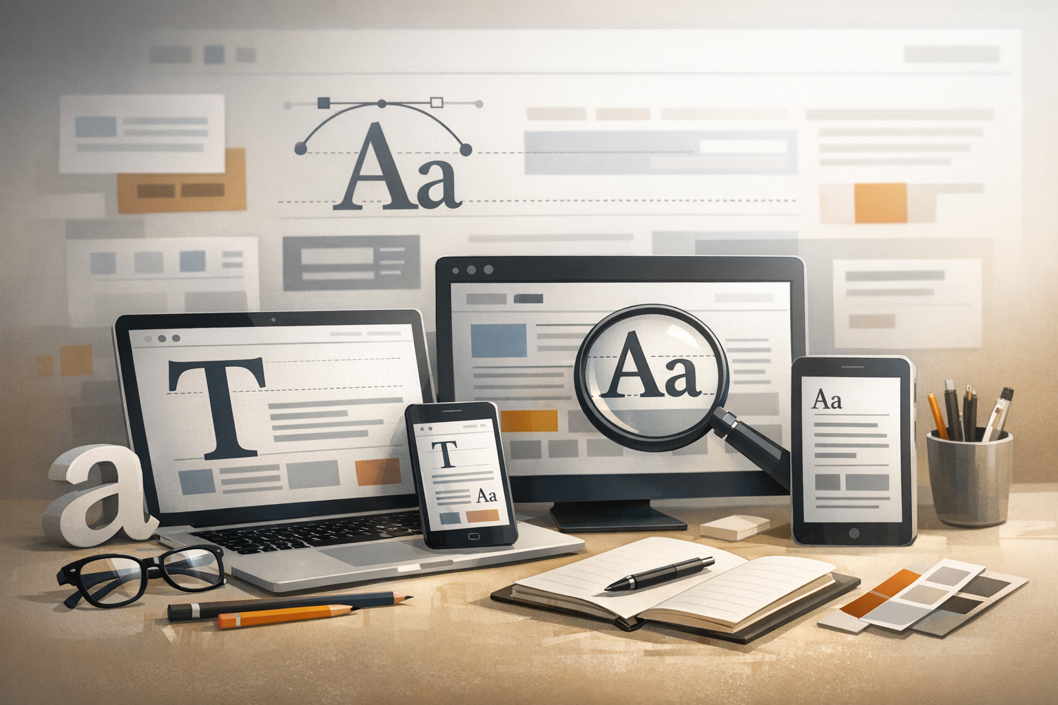
Typography is one of the most powerful tools in web design. It shapes how users perceive a brand, how easily they can scan content, and whether they feel comfortable reading a page for 10 seconds—or 10 minutes. Great typography web design isn’t just about picking a “nice” font. It’s about building a system of type choices that supports clarity, hierarchy, accessibility, and performance across devices.
In this guide, you’ll learn what web typography is, why it matters, and how to make confident, professional decisions about fonts, sizing, spacing, and responsive behavior.
What Is Typography in Web Design?
Typography in web design refers to how text is styled and arranged on a website. This includes selecting typefaces (fonts), setting sizes, defining line height and letter spacing, choosing colors, and establishing hierarchy so users can quickly understand what’s most important.
Unlike print, web typography must adapt to different screen sizes, operating systems, and rendering engines. That means successful typography web design accounts for responsiveness, readability on various displays, and loading performance—without sacrificing brand personality.
Why Typography Matters for User Experience
Most web pages are text-heavy, even when they look “visual.” Headlines, buttons, navigation labels, product descriptions, and forms all rely on readable type. When typography is done well, users can scan quickly, understand content structure, and take action with confidence.
When typography is done poorly—tiny text, low contrast, cramped lines, inconsistent headings—users feel friction. They may abandon a page, misunderstand information, or struggle to complete a task.
Readability and Scanability
Readability is how easy it is to read blocks of text, while scanability is how quickly users can skim and find what they need. Web typography supports both by using comfortable font sizes, clear hierarchy, and predictable patterns (like consistent headings and spacing).
- Readable body text helps users stay engaged.
- Scannable structure helps users find answers faster.
Brand and Visual Identity
Typography communicates personality before users read a single sentence. A modern sans-serif can feel clean and tech-forward, while a serif might feel editorial or classic. Even subtle choices—like rounded letterforms or condensed headings—can reinforce brand voice and positioning.
To keep the experience cohesive, treat typography like part of your design system: define rules for headings, body, UI labels, and emphasis styles (bold/italic), and apply them consistently.
Core Principles of Typography Web Design
Professional typography is built on a few foundational principles. Master these, and you’ll be able to evaluate and improve nearly any website’s text presentation.
Font Pairing (How to Choose Typefaces)
Font pairing means selecting two (sometimes three) complementary typefaces—typically one for headings and one for body text. The goal is contrast without conflict.
- Keep it simple: Start with one font family that includes multiple weights (regular, medium, bold). This often eliminates the need for pairing at all.
- Create contrast intentionally: Pair a serif heading with a sans-serif body (or vice versa), or use a display font sparingly for headings.
- Match mood and purpose: A playful display font might work for a creative portfolio, but it can hurt trust on a financial services site.
Tip: Avoid pairing fonts that are too similar (two neutral sans-serifs with similar proportions). If they’re close, it can look like a mistake rather than a choice.
Hierarchy (Headings, Subheadings, Body)
Hierarchy tells users what to read first, second, and third. It’s created through size, weight, spacing, and sometimes color. A clear hierarchy improves comprehension and reduces cognitive load.
- H1: The page’s main message (usually one per page).
- H2/H3: Break content into logical sections and subsections.
- Body text: Prioritize comfort and consistency.
Good hierarchy is not just “bigger headings.” It’s also about spacing before/after headings, consistent line lengths, and ensuring headings look distinct from body text.
Spacing and Layout (Line Height, Letter Spacing, White Space)
Spacing is where many typography designs succeed or fail. Even a great font can feel uncomfortable if it’s too tight or too loose.
- Line height (leading): For body text, a line-height around
1.4to1.8is commonly comfortable, depending on the typeface and size. - Letter spacing (tracking): Use sparingly. All-caps text often needs slightly increased letter spacing for readability.
- White space: Generous spacing around paragraphs, headings, and UI elements improves clarity and perceived quality.
Practical guideline: Aim for a readable line length—often around 45–80 characters per line for body content on desktop. Too wide strains the eye; too narrow feels choppy.
Typography Best Practices for Modern Websites
Modern web typography balances aesthetics with performance and accessibility. These best practices help ensure your type looks good and works well for real users.
Responsive Typography
Typography must adapt across phones, tablets, and desktops. Instead of using fixed pixel sizes everywhere, consider scalable units and responsive rules that adjust smoothly.
- Use relative units:
remandemcan scale better with user settings than fixedpx. - Consider fluid scaling: Techniques like CSS
clamp()can scale headings between a minimum and maximum size based on viewport width. - Test on real devices: A font that looks perfect on a desktop monitor may feel oversized or cramped on a smaller phone.
Accessibility and Contrast
Accessible typography helps everyone, including users with low vision, dyslexia, or situational limitations (like glare on a mobile screen). Key considerations include font size, contrast, and clarity.
- Contrast: Ensure text has sufficient contrast against its background, especially for body text and important UI labels.
- Avoid ultra-light weights: Thin fonts can be difficult to read on lower-quality displays.
- Don’t rely on color alone: Use multiple cues (weight, underline, icons) for links or errors where appropriate.
Tip: Link styles should be clearly recognizable. Subtle color changes without underline can reduce usability, especially in long-form content.
Performance Considerations (Web Fonts)
Typography affects load time. Large font files or too many font variations can slow down a site, impacting user experience and SEO.
- Limit font families and weights: Load only what you use (for example, regular and bold).
- Use modern formats:
woff2is typically the best choice for modern browsers. - Set fallbacks: Define a sensible font stack so text remains readable if fonts fail to load.
- Use font-display wisely: Settings like
font-display: swap;can improve perceived performance by showing fallback text immediately.
Common Typography Mistakes to Avoid
Even attractive websites can suffer from small typographic issues that add up. Watch out for these common problems:
- Too many fonts: Using multiple unrelated typefaces creates a messy, inconsistent feel.
- Weak hierarchy: If headings don’t stand out, users can’t scan content quickly.
- Low contrast: Light gray text on a white background might look “clean,” but it’s often hard to read.
- Overly long line length: Wide paragraphs reduce comfort and comprehension.
- Inconsistent spacing: Uneven margins and line heights can make a design look unpolished.
- All caps everywhere: All caps can work for short labels, but it reduces readability in longer text.
Conclusion
Typography web design is where function and personality meet. By focusing on readable sizing, clear hierarchy, thoughtful spacing, responsive behavior, and accessible contrast, you can dramatically improve how your site looks and how it performs for users. Start small: refine your body text settings, tighten your heading system, and simplify your font choices. The results often feel like a complete redesign—without changing a single layout component.
