What Is Visual Identity Design?
Visual identity design is the system of visual elements that represents a brand and makes it recognizable across every touchpoint. It includes your logo, color palette, typography, imagery style, iconography, layout rules, and other graphic components—plus the guidelines that define how to use them consistently.
It’s important to distinguish visual identity from brand identity. Brand identity is broader: it includes your purpose, values, voice, positioning, and customer experience. Visual identity is the visual expression of that brand—what people see and remember.
Why Visual Identity Matters
A strong visual identity does more than “look good.” It creates clarity, trust, and cohesion as your brand grows. Here’s why it matters:
- Recognition: Consistent visuals help customers spot you quickly—on shelves, in feeds, in emails, or in search results.
- Credibility: Professional, coherent design signals reliability and attention to detail.
- Differentiation: Distinctive visual choices help you stand out in crowded categories.
- Consistency at scale: A defined system makes it easier for teams and partners to create on-brand materials.
- Emotional connection: Color, type, and imagery influence how people feel about your brand—often instantly.
Core Elements of a Visual Identity System
While every brand is different, most visual identity systems include the following building blocks.
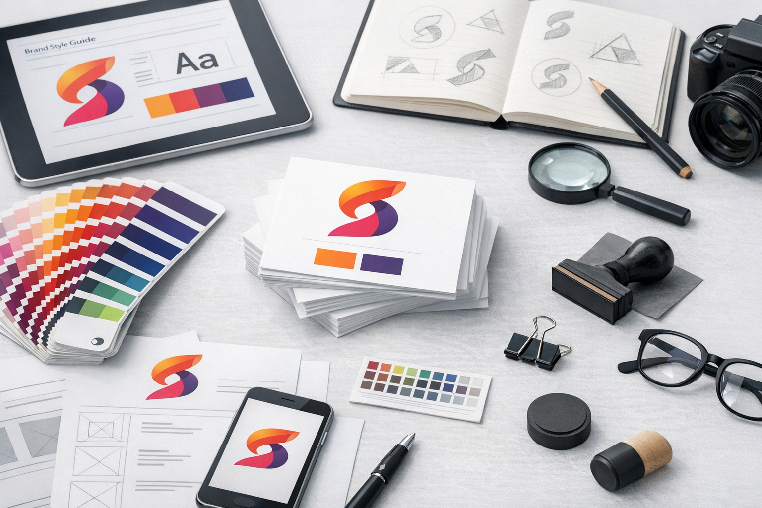
Logo Suite
A single logo rarely works everywhere. A practical logo suite often includes:
- Primary logo for standard use
- Secondary logo (stacked or horizontal variant)
- Icon/mark for small spaces (social avatars, favicons)
- Wordmark (text-only) for flexibility
Good logo systems are recognizable at different sizes, readable in black and white, and adaptable to both digital and print contexts.
Color Palette
Color is one of the fastest ways people form impressions. A functional palette usually includes:
- Primary colors that anchor the brand
- Secondary colors for variety and hierarchy
- Neutral colors (grays, off-whites) for backgrounds and balance
- Accent colors for calls to action and highlights
Include accessibility considerations, such as contrast ratios for text and buttons, and specify color values for different uses (HEX/RGB for digital, CMYK/Pantone for print).
Typography
Typography shapes personality and readability. Most identities define:
- Primary typeface (often for headings)
- Secondary typeface (often for body text)
- Optional accent type for special moments (quotes, labels)
Beyond font choices, define usage rules: heading sizes, line height, letter spacing, and when to use bold or italics. Consistent typography makes everything feel intentional, from your website to your proposals.
Imagery and Photography Style
Imagery is where a brand’s “world” comes alive. A clear direction might include:
- Lighting and color tone (warm vs. cool, high contrast vs. soft)
- Subject matter and composition (close-ups, candid, minimalist backgrounds)
- People and inclusion guidelines (representation, styling, locations)
- Post-processing and filters (or a strict no-filter approach)
The goal is a consistent look that customers can recognize—whether the image appears in an ad, blog post, or product page.
Graphic Elements and Iconography
Many brands include supporting elements such as patterns, shapes, illustrations, textures, badges, and icons. These help create consistency even when the logo isn’t present.
Iconography should follow clear rules: stroke width, corner radius, fill style, and level of detail. This keeps your UI, marketing materials, and presentations visually aligned.
Layout and Composition Rules
A brand can share the same logo and colors yet feel inconsistent if layouts vary wildly. Layout rules typically cover:
- Grid systems and spacing
- Margins and safe areas
- Text hierarchy (H1/H2/H3 styling)
- Button styles and call-to-action placement
These guidelines are especially valuable for teams producing content frequently, such as social posts, sales decks, and landing pages.
The Visual Identity Design Process
Designing a visual identity is both strategic and creative. A clear process reduces guesswork and improves the final outcome.
1) Discovery and Brand Strategy Alignment
Before design begins, clarify the foundation: your audience, positioning, competitors, brand personality, and goals. Useful inputs include customer research, messaging frameworks, and examples of brands you admire (and those you don’t).
2) Visual Direction and Moodboarding
Designers often create moodboards or visual territories to explore directions—color, type, imagery, and overall tone. This step helps you align on “the vibe” early, before details like logo refinements take over.
3) Concept Development
Next comes concept work: logo sketches, typography pairings, color exploration, and sample applications (like a homepage mockup or social post). Seeing identity elements in context is key—brands live in real layouts, not on blank white pages.
4) Refinement and System Building
Once a direction is chosen, the identity becomes a system. This includes refining logo geometry, setting color standards, defining typography scales, and creating reusable assets. A strong system balances flexibility (so it can evolve) with structure (so it stays consistent).
5) Brand Guidelines and Handoff
Guidelines turn design into something others can use. A practical brand guide typically includes:
- Logo usage (clear space, minimum size, incorrect uses)
- Color specs and accessibility guidance
- Typography rules and examples
- Imagery style and do/don’t examples
- Templates for common needs (social, slides, documents)
Handoff should include packaged files, organized folders, and notes on how to maintain consistency moving forward.
Common Mistakes to Avoid
Even well-intentioned brands can end up with an identity that looks inconsistent or underwhelming. Watch out for these pitfalls:
- Designing without strategy: If visuals don’t reflect positioning and audience needs, they won’t land.
- Overcomplicating the system: Too many colors, fonts, or styles can make execution messy.
- Ignoring accessibility: Low contrast and tiny type can exclude users and hurt performance.
- Inconsistent application: A great identity fails if it’s used differently across teams and channels.
- Following trends too closely: Trends can be useful, but a brand should remain distinctive and durable.
How to Know Your Visual Identity Is Working
Visual identity success isn’t just subjective—it shows up in real outcomes. Signs your identity is doing its job include:
- Higher recognition: People identify your brand faster in crowded spaces.
- More consistent marketing: Content looks cohesive even when produced by different team members.
- Improved trust and conversion: Users feel confident navigating your website, buying, or signing up.
- Easier decision-making: Clear design rules reduce back-and-forth and speed up production.
If you’re not seeing these benefits, it may be time to tighten your guidelines, simplify your system, or revisit strategic alignment.
Conclusion
Visual identity design is how your brand becomes recognizable, consistent, and memorable. By building a clear system—logos, color, typography, imagery, and layout rules—then documenting it with practical guidelines, you make it easier to grow without losing coherence. Whether you’re launching a new brand or refreshing an existing one, a thoughtful visual identity is one of the most valuable long-term investments you can make.
