What Is Web Graphics Design?
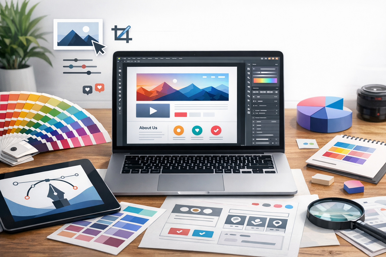
Web graphics design is the practice of creating visual assets specifically for digital interfaces—websites, landing pages, web apps, and online stores. It includes everything from hero images and illustrations to icons, product photos, infographics, and UI graphics. The goal isn’t only to “look good.” Effective web graphics design supports usability, clarifies information, strengthens brand identity, and loads quickly on real devices and network conditions.
Unlike print design, web graphics must adapt to different screen sizes, pixel densities (standard vs. Retina/HiDPI), and accessibility needs. That means planning for responsiveness, performance, and consistency across browsers and platforms.
Why Web Graphics Matter for User Experience and SEO
Graphics shape first impressions and influence how users navigate a page. The right visual hierarchy can guide attention to key actions (like “Add to cart” or “Request a demo”), while clear iconography reduces cognitive load and helps users find what they need faster.
From an SEO perspective, well-optimized web graphics can improve:
- Page speed: Smaller files mean faster loading and better Core Web Vitals.
- Engagement: Compelling visuals can lower bounce rates and increase time on page.
- Accessibility and discoverability: Descriptive alt text helps screen readers and can support image search visibility.
In short: web graphics are both a design and performance decision, and both affect how your site ranks and converts.
Core Principles of Effective Web Graphics Design
Clarity and Visual Hierarchy
Every graphic should have a purpose. Ask what the image is communicating and whether it helps users complete a task. Use size, contrast, spacing, and placement to establish hierarchy—headlines and key visuals first, supporting details second.
Common best practices include:
- Reserve the boldest visuals for primary calls-to-action and key value propositions.
- Avoid cluttered compositions; whitespace is part of the design.
- Use consistent alignment and spacing to keep pages scannable.
Consistency with Brand Identity
Web graphics should feel like they belong to your brand. That means consistent typography, color usage, icon style, illustration approach (flat, isometric, hand-drawn, etc.), and photo treatment (lighting, cropping, filters). Consistency builds trust—especially on high-stakes pages like checkout, pricing, and lead-gen forms.
Create a simple design system for web graphics, such as:
- A color palette with accessibility-friendly contrast pairs
- Reusable icon sets and UI components
- Photo guidelines (backgrounds, angles, subject framing)
- Illustration rules (line weight, corner radius, shadows)
Accessibility and Inclusive Design
Accessible web graphics design ensures more people can use your site effectively—including users with visual impairments, color vision deficiency, or cognitive challenges. It’s also often a legal and compliance requirement.
Key considerations:
- Alt text: Use meaningful descriptions for informative images; use empty alt (
alt="") for purely decorative graphics. - Color contrast: Don’t rely on color alone to convey meaning (e.g., error states).
- Readable text on images: Avoid baking important copy into images; if you must, ensure it scales well and remains legible.
Types of Web Graphics (and When to Use Them)
Raster Images: JPEG, PNG, WebP, AVIF
Raster formats are pixel-based and best for detailed imagery like photography. Each format has strengths:
- JPEG: Great for photos; small files, but no transparency.
- PNG: Supports transparency; larger files; good for crisp UI elements when needed.
- WebP: Excellent compression; supports transparency and animation; widely supported.
- AVIF: Often the smallest high-quality option; modern support is strong, but verify your audience’s browser mix.
In most modern workflows, exporting photos to WebP or AVIF (with fallbacks) offers major performance benefits.
Vector Graphics: SVG
SVG is ideal for logos, icons, simple illustrations, and scalable interface elements. Because vectors scale without losing sharpness, SVGs look great on any display density and often weigh less than equivalent PNGs.
Use SVG when you need:
- Sharp edges at any size
- Themeable colors via CSS
- Lightweight assets for UI (icons, badges, small illustrations)
Animations: GIF, APNG, Lottie, CSS Animations
Animation can demonstrate product value quickly, but it must be used intentionally to avoid distraction and performance issues.
- GIF: Common but inefficient; large files for short animations.
- APNG: Better quality than GIF but still can be heavy.
- Lottie: Great for lightweight vector animations (often exported from After Effects).
- CSS animations: Ideal for subtle UI motion (hover states, transitions) with minimal overhead.
Keep animations short, purposeful, and respectful of user preferences like “Reduce motion.”
Best Practices for Designing and Optimizing Web Graphics
Start with the Right Dimensions and Responsive Images
Design for the layout first, then export sizes that match real use. Oversized images are one of the most common reasons pages feel slow.
Practical tips:
- Export multiple sizes for responsive delivery (e.g., 480/768/1200/1600px widths).
- Use responsive image techniques (like
srcset) via your theme or image plugin. - For hero images, consider art direction: different crops for mobile vs. desktop.
Compress Without Visible Quality Loss
Compression is the fastest win for performance. Aim for “visually lossless” rather than perfect fidelity. For photos, this often means a quality setting where artifacts aren’t noticeable at typical viewing sizes.
- Choose WebP/AVIF when possible for photos and complex imagery.
- Run assets through compression tools (many WordPress image optimization plugins can automate this).
- Remove unnecessary metadata when exporting.
Use Color Strategically (and Consistently)
Color can communicate structure and emotion, but inconsistent or overly saturated palettes can feel unprofessional. Define primary, secondary, and neutral colors, and apply them predictably (e.g., primary color for primary buttons and key highlights).
Also, test your palette for contrast and color-blind friendliness to ensure information isn’t lost.
Typography and Text-in-Image Considerations
As a rule, keep text as real HTML whenever possible so it’s searchable, scalable, and accessible. If you must include text inside an image (such as a stylized banner), keep it minimal and ensure it remains readable on small screens.
For promotional graphics, consider designing a “safe area” so text doesn’t get cropped on responsive layouts.
File Naming, Alt Text, and SEO Basics
Help search engines and users understand your images:
- File names: Use descriptive, hyphenated names (e.g.,
minimalist-home-office-desk.webp). - Alt text: Describe what’s important and relevant to the page context.
- Captions: Use when they add clarity or credibility (e.g., source info, product details).
Tools and Workflow for Web Graphics Design
A smooth workflow reduces rework and keeps visuals consistent across pages. Many teams use a combination of:
- Design tools: Figma for UI and web assets, Adobe Illustrator for vector work, Photoshop or Affinity Photo for photo editing.
- Asset management: Shared libraries, design systems, and components for repeatable graphics.
- Export standards: Presets for common sizes and formats (SVG icons, WebP photos, AVIF hero images).
- Performance checks: Test pages with speed tools and verify image weight on key templates.
For WordPress specifically, ensure your theme supports responsive images and consider an image optimization plugin to automate compression and next-gen formats.
Common Mistakes to Avoid
- Uploading massive images and relying on CSS to shrink them—always export near the intended display size.
- Inconsistent icon styles that make a site feel stitched together.
- Poor contrast that hurts readability and accessibility.
- Too many decorative graphics that distract from content and slow down load time.
- Ignoring mobile layouts—a graphic that works on desktop may be unreadable on a phone.
Conclusion
Web graphics design is where aesthetics, usability, and performance meet. By choosing the right formats (SVG, WebP, AVIF), designing with hierarchy and brand consistency, and optimizing for speed and accessibility, you can create visuals that look great and work hard—supporting better engagement, stronger conversions, and a smoother user experience across every device.
