What Is Web Page Layout?
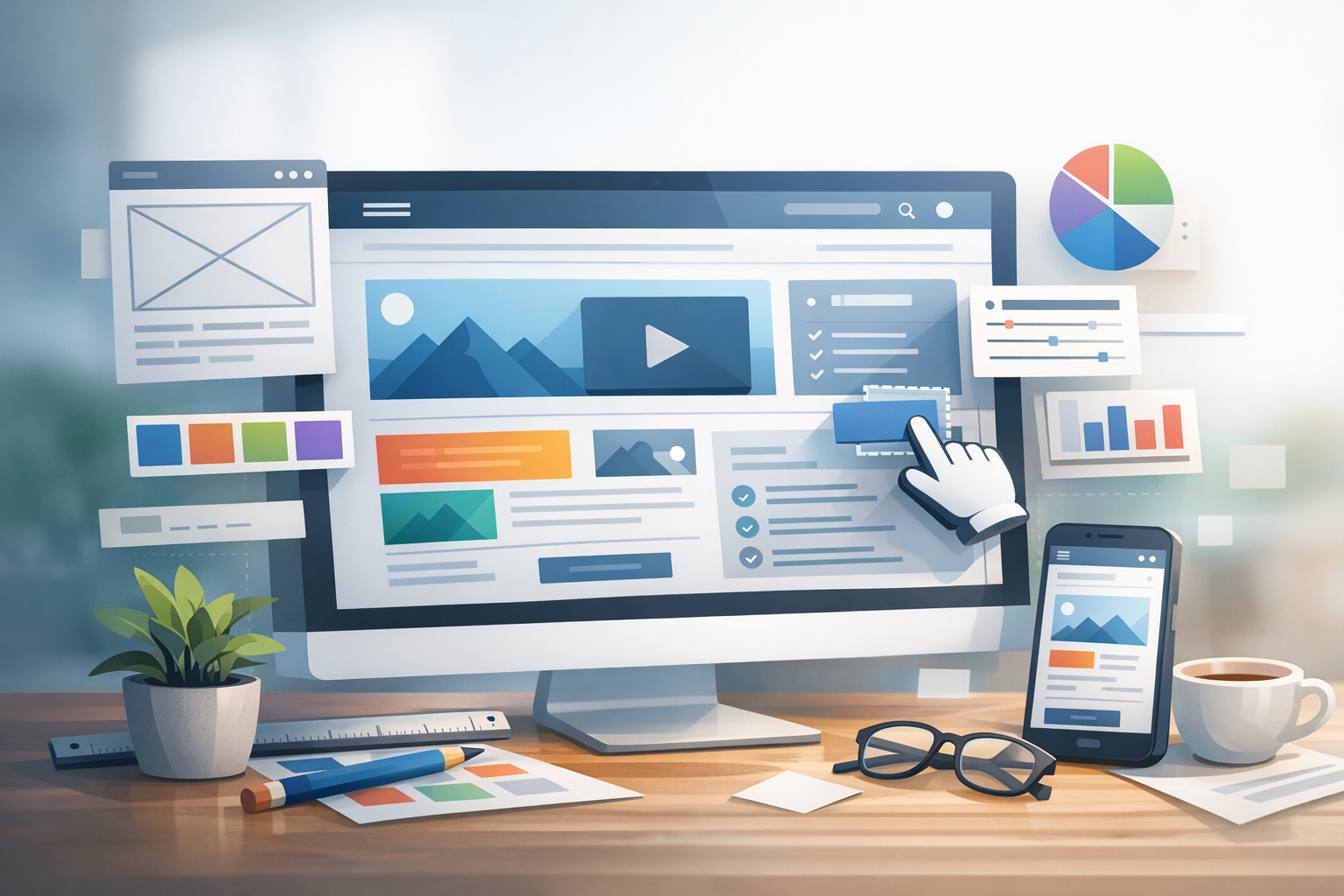
Web page layout is the way content is arranged on a page—how headers, navigation, images, text, and calls to action (CTAs) are structured to guide visitors and help them complete tasks. A strong layout makes a site feel intuitive: users can scan quickly, find what they need, and take action with minimal effort.
Layout is more than aesthetics. It impacts readability, accessibility, mobile usability, conversion rates, and even performance. Whether you’re building a landing page, an ecommerce product page, or a blog, layout decisions shape how people experience your brand.
Core Principles of Effective Web Layout
Visual hierarchy
Visual hierarchy is the art of signaling what matters most. You can create hierarchy through size, contrast, placement, color, and whitespace. For example, a page’s primary message should appear above the fold with a prominent heading, supported by a short explanation and a clear CTA. Secondary elements—like feature details or supporting links—should be present but not competing for attention.
Grid systems and alignment
Grids bring order to design. A consistent grid system helps align content blocks, maintain spacing, and create a polished feel. Common approaches include 12-column grids for flexible layouts and modular grids for content-heavy pages. Even when a design looks “freeform,” it usually relies on careful alignment behind the scenes.
In practice, aim for consistent margins, line lengths, and alignment edges. Misaligned elements subtly increase cognitive load and can make a site feel less trustworthy.
Whitespace and readability
Whitespace (or negative space) is the breathing room around elements. It improves comprehension by grouping related items and reducing clutter. Good whitespace also boosts readability by keeping paragraphs short, increasing line height, and preventing dense blocks of text.
As a rule of thumb, keep body text line length comfortable (often around 50–75 characters per line on desktop) and use spacing to separate sections so scanning is effortless.
Common Web Page Layout Patterns
F-pattern and Z-pattern scanning
Many users scan pages rather than read them word-for-word. On text-heavy pages, people often follow an F-pattern: across the top, down the left side, and occasionally across again. On simpler pages (like landing pages), visitors commonly follow a Z-pattern: top-left to top-right, down diagonally, then across the bottom.
Use these patterns to your advantage: place key headlines, navigation, and CTAs where scanning naturally occurs.
Single-column vs. multi-column layouts
Single-column layouts are ideal for mobile-first experiences, long-form content, and landing pages. They simplify scanning and keep focus on a single narrative.
Multi-column layouts can work well on desktop for dashboards, product category pages, and news-style sites. If you use multiple columns, ensure the primary content column is clearly dominant and sidebars don’t distract from the main goal.
Card-based design
Cards group information into repeatable blocks—great for product listings, blog grids, and portfolio galleries. They’re easy to scan and adapt well to responsive layouts. Strong card design includes consistent image ratios, clear titles, short supporting text, and a visible action (like “Read more” or “Add to cart”).
Hero sections and landing page structure
A hero section typically includes a headline, supporting copy, a CTA, and sometimes an image or illustration. The best hero areas answer three questions quickly: What is this? Who is it for? What should I do next?
Below the hero, effective landing pages often follow a simple flow: benefits, social proof, key details, objections/FAQs, and a final CTA.
Responsive Layout: Designing for Every Screen
Mobile-first approach
Mobile-first design starts with the smallest screen and scales up. This approach forces clarity: only the most important elements remain at the top, and everything else earns its place. It also helps ensure tap targets are large enough, text is readable, and navigation is easy to use with a thumb.
Breakpoints and fluid grids
Breakpoints are screen widths where a layout changes to fit the device better. Rather than designing for specific devices, focus on where your content needs more room. Fluid grids and flexible units (like percentages, rem, and fr in CSS Grid) keep layouts adaptable between breakpoints.
Practical tip: test the “in-between” sizes—not just common presets—because many layout issues appear at awkward widths.
Images, typography, and touch targets
Responsive layout isn’t only about columns. Ensure images scale without becoming blurry or causing layout shifts. Use responsive typography so headings don’t overwhelm small screens. And keep touch targets comfortably sized with enough spacing to prevent mis-taps—especially for menus, filters, and form controls.
Layout Elements That Impact UX and Conversions
Navigation and information architecture
Navigation should match your users’ mental model. Group pages into clear categories, keep labels descriptive, and avoid overcrowding the menu. For large sites, consider mega menus, breadcrumbs, and robust on-site search. A thoughtful information architecture reduces friction and helps people reach key pages faster.
Calls to action and content flow
A layout should guide visitors through a logical journey. Place CTAs where users are ready to act—often after a benefit statement, a feature explanation, or social proof. Use consistent button styles for primary actions, and make secondary actions visually quieter.
Also pay attention to content flow: break long sections into scannable chunks with subheadings, bullets, and supportive visuals.
Accessibility considerations
Accessible layout improves usability for everyone. Ensure sufficient color contrast, use clear heading structure, and don’t rely on color alone to convey meaning. Design forms with visible labels, provide focus states for keyboard navigation, and keep interactive elements reachable and predictable.
From a layout perspective, avoid hiding essential content behind hover-only interactions and ensure modals, menus, and dropdowns are easy to use with keyboards and screen readers.
Tools and Best Practices
Wireframes and prototypes
Wireframes help you plan structure before polishing visuals. Start with low-fidelity sketches to define hierarchy, spacing, and content blocks. Then move to prototypes to validate interactions and user flow. This process reduces rework and helps stakeholders focus on layout and usability first.
Design systems and reusable components
Design systems make layouts consistent and faster to build. By using reusable components—like headers, cards, feature sections, and CTAs—you maintain a cohesive look across pages. It also improves collaboration between design and development and makes future updates easier.
Testing and iteration
Great layout is rarely “one and done.” Use heatmaps, session recordings, and A/B tests to see what users actually do. Track metrics like bounce rate, scroll depth, and conversion rate, then adjust layout accordingly. Even small changes—like increasing whitespace, simplifying navigation, or repositioning a CTA—can make a measurable difference.
Conclusion
Web page layout is the foundation of a site’s usability and performance. By combining clear hierarchy, consistent grids, responsive behavior, and conversion-focused structure, you can create pages that feel effortless to navigate and compelling to act on. Start with a simple, mobile-first layout, build with reusable components, and keep improving through real user data.
