Introduction
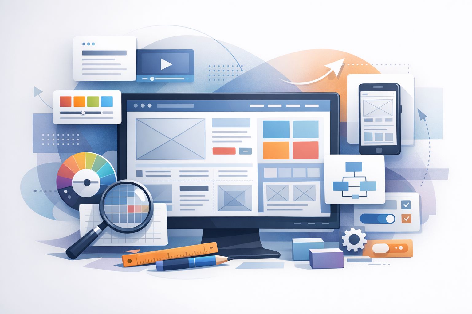
Website layout design is the structure that guides how people read, scan, and interact with your content. A strong layout helps users find what they need quickly, builds trust, and supports your goals—whether that’s sales, sign-ups, or simply keeping visitors engaged. In this guide, you’ll learn the core principles of effective layout design, common layout patterns, and practical steps to create pages that look great and convert well.
What Is Website Layout Design?
Website layout design is the arrangement of elements on a page—navigation, headings, text, images, calls-to-action (CTAs), forms, and footers—within a consistent visual system. It’s not just about aesthetics; layout influences:
- Usability: how easily users can navigate and understand your site
- Readability: how comfortably people can consume your content
- Conversion: how effectively the page encourages action
- Brand perception: how professional and trustworthy your site feels
Core Principles of Great Website Layout Design
1. Visual Hierarchy
Visual hierarchy is the order in which users naturally notice elements. You create hierarchy through size, color, contrast, spacing, and placement. Practical tips:
- Use a clear primary headline (H1) to communicate the page’s purpose instantly.
- Make your primary CTA visually distinct (button style, contrasting color, ample padding).
- Limit competing focal points—one page, one primary action is a helpful rule of thumb.
2. Consistency
Consistency reduces cognitive load. When your navigation, typography, and UI patterns behave predictably, users feel confident moving around your site. Aim for:
- A consistent header and footer across pages
- Repeatable design components (buttons, cards, forms)
- A cohesive type scale (e.g., H1, H2, body text sizes)
3. Whitespace (Spacing)
Whitespace isn’t “empty space”—it’s a design tool that improves clarity and focus. Good spacing:
- Separates sections so users can scan quickly
- Makes text easier to read (line height and paragraph spacing matter)
- Highlights key elements like CTAs and testimonials
4. Grid and Alignment
A grid system helps you align content and maintain visual balance. Even if visitors don’t notice the grid, they feel its benefits: order and professionalism. Common approaches include 12-column grids, card-based grids, and flexible CSS grid layouts.
- Align headings, text blocks, and images to consistent margins.
- Use equal spacing between related items (like feature cards).
- Avoid “almost aligned” elements—it creates subtle visual friction.
5. Responsive Design
Modern website layout design must work across screens: phones, tablets, laptops, and large monitors. Responsive design means the layout adapts—reflowing columns, resizing images, and adjusting spacing—without losing usability.
- Design mobile-first where possible (prioritize essentials on small screens).
- Ensure tap targets (buttons, links) are large enough for thumbs.
- Check how nav menus, tables, and multi-column sections behave on mobile.
Common Website Layout Patterns (and When to Use Them)
1. Single-Column Layout
A single-column layout is clean and focused, making it ideal for blog posts, landing pages, and content-heavy pages. It works especially well on mobile and keeps the user moving in one direction.
2. Two-Column Layout
Two-column layouts typically pair main content with a sidebar. Use it for resource pages, documentation, or blogs with category navigation—just ensure the sidebar doesn’t distract from the primary goal. On mobile, sidebars usually stack below the main content.
3. F-Pattern and Z-Pattern Layouts
These patterns reflect how people commonly scan pages:
- F-pattern: users scan across the top, then down the left, with shorter horizontal glances—common on text-heavy pages.
- Z-pattern: users scan from top-left to top-right, diagonally down, then across again—often used on simpler pages and landing pages.
Place your logo and key navigation near the top, and position CTAs along natural scanning paths.
4. Card-Based (Modular) Layout
Cards are flexible content blocks used for features, services, products, and blog previews. They’re great for responsive design because cards can stack or reorganize easily across breakpoints.
5. Split-Screen Layout
A split-screen design divides the page into two strong visual areas—useful for showcasing two options (e.g., “For Individuals” vs. “For Teams”) or pairing a bold image with a concise value proposition. Keep the messaging short and the actions clear.
Key Elements of an Effective Website Layout
Header and Navigation
Your header should help users orient themselves instantly. Best practices include:
- Keep top navigation focused (5–7 primary links is a common guideline).
- Use descriptive labels (e.g., “Pricing” instead of “Plans & Options” unless necessary).
- Make your CTA easy to find (e.g., “Get a Quote,” “Book a Demo”).
Hero Section
The hero section is your above-the-fold introduction. It should include:
- A clear headline that states the value
- A supporting subheadline that adds specifics
- A primary CTA (and an optional secondary CTA)
- Visual support (product screenshot, photo, or illustration) that reinforces the message
Main Content Sections
Break content into scannable blocks with headings, bullets, and visuals. Consider common sections like benefits, features, process steps, pricing, FAQs, and testimonials. Keep each section focused on one idea and use consistent spacing to avoid clutter.
Calls-to-Action (CTAs)
Effective CTAs are easy to spot and aligned with user intent. Tips:
- Use action-oriented language (e.g., “Start Free Trial,” “Download the Guide”).
- Repeat CTAs naturally after key sections—not just at the top.
- Reduce friction: clarify what happens next and minimize form fields where possible.
Footer
A strong footer supports navigation and trust. Include key links (contact, privacy policy, terms), social links, and optional trust signals like certifications or review platforms. For larger sites, consider a structured footer with grouped link columns.
Best Practices for Website Layout Design (Practical Checklist)
- Start with content: outline the page goal and key messages before designing.
- Use a type scale: choose consistent font sizes for headings and body text.
- Design for scanning: short paragraphs, descriptive subheadings, bullet lists.
- Prioritize accessibility: sufficient contrast, readable font sizes, clear focus states.
- Keep page speed in mind: compress images, avoid heavy layouts that rely on large scripts.
- Test responsive breakpoints: check key pages on multiple device sizes.
- Measure and iterate: use heatmaps, scroll depth, and conversion tracking to refine layout decisions.
Common Website Layout Design Mistakes to Avoid
- Too many competing CTAs: it can confuse users and reduce conversions.
- Cluttered sections: tight spacing and dense content make pages feel overwhelming.
- Inconsistent alignment: misaligned elements look unpolished and distract the eye.
- Poor mobile experience: tiny buttons, long menus, or unreadable text drive visitors away.
- Weak hierarchy: if everything is bold and large, nothing stands out.
Conclusion
Website layout design is where visual design meets user experience. By focusing on hierarchy, consistency, spacing, alignment, and responsive behavior—and by choosing layout patterns that match your content—you can create pages that are easier to navigate, more engaging to read, and more effective at converting visitors into customers. Start with a simple structure, test it on real devices, and refine your layout based on user behavior.
