
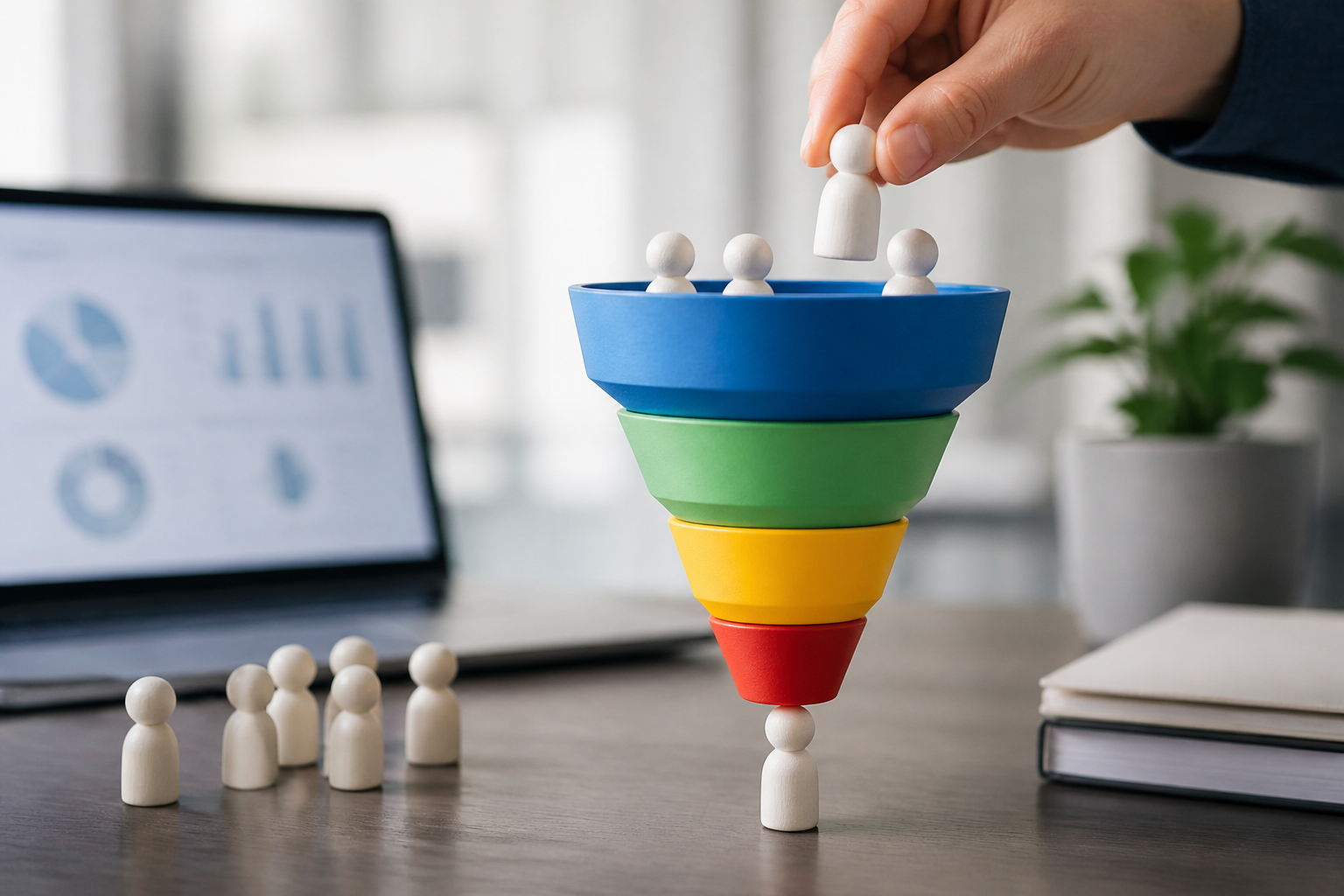
A steady stream of website visitors is useful, but it does not guarantee sales, sign-ups, or other business results. Conversion funnel design helps you understand the steps people take before acting—and improve the experience at each step. A well-designed funnel makes it easier for potential customers to find relevant information, build confidence, and move forward without unnecessary friction.
Whether you sell products, offer services, or grow an email list, the principles are similar: understand your audience, create a clear path to action, and use data to improve that path over time.
What Is Conversion Funnel Design?
A conversion funnel is a model of the journey someone takes from first discovering your business to completing a desired action. That action might be making a purchase, booking a consultation, starting a free trial, or subscribing to a newsletter. It is called a funnel because many people may enter at the top, while a smaller number complete the conversion at the bottom.
Conversion funnel design is the process of shaping that journey. It includes the pages, messages, offers, and interactions that help people progress from one stage to the next. The goal is not to pressure every visitor into buying. It is to make the next useful step clear and relevant to their needs.
The Core Stages of a Conversion Funnel
Funnels vary by business, but a common model has four stages. Treat these as a guide, not a rigid template: customers may skip steps, revisit pages, or arrive through different channels.
1. Awareness
At the awareness stage, people discover your brand through search, social media, advertising, referrals, or other channels. Your content should quickly communicate who you help and what problem you address. Helpful articles, informative videos, and clear landing pages can attract the right audience without making an immediate hard sell.
2. Consideration
Now visitors are evaluating options and deciding whether your solution fits. They may compare features, prices, providers, or approaches. Provide useful details such as product demonstrations, case studies, FAQs, comparison guides, and transparent pricing. Address common concerns directly instead of relying on broad claims.
3. Conversion
At this stage, a prospect is ready to take a meaningful action. A focused call to action, a straightforward form, and a smooth checkout can make the difference. Explain what happens after someone clicks, remove surprises, and ask only for information you genuinely need.
4. Retention and advocacy
The funnel does not have to end at the first purchase. Onboarding, thoughtful customer support, useful follow-up messages, and loyalty offers can encourage repeat business. Satisfied customers may also leave reviews or recommend your brand, bringing new prospects into the funnel.
How to Design a Conversion Funnel
Start with your audience and goal
Choose one primary conversion goal before designing pages or campaigns. Then identify the people most likely to take that action. What are they trying to accomplish? What questions do they ask? What might make them hesitate? Use customer interviews, support conversations, search data, and analytics to develop realistic answers.
Be specific about your audience. “Small business owners” may be too broad to guide a useful message. A more focused group, such as independent retailers looking for inventory software, gives you a clearer basis for choosing content and calls to action.
Map the path from entry to action
List the common ways people arrive and the steps they take afterward. For example, a visitor might discover a guide through search, visit a product page, review a case study, and then request a demo. Note where each step happens and what the visitor needs to know before continuing.
Look for gaps in that path. If an ad promises a specific benefit but leads to a generic homepage, the experience may feel disconnected. If a product page answers basic questions but leaves pricing unclear, interested visitors may leave to investigate elsewhere. Keep the message consistent from first touch to conversion.
Match content and calls to action to intent
Different visitors need different next steps. Someone learning about a problem may prefer a practical guide, while someone comparing vendors may be ready to see a demo. Use calls to action that fit the visitor’s level of interest. “Explore the guide” can be more appropriate for a new visitor than “Buy now.”
Make each call to action specific and easy to notice. Tell people what they will get, use clear language, and avoid competing buttons that make the next step uncertain. On forms, explain why you are requesting information and what follow-up to expect.
Reduce friction and build trust
Friction includes anything that makes it harder to complete an action: slow pages, confusing navigation, unnecessary form fields, unclear shipping costs, or a checkout that does not work well on mobile. Test the journey on different devices and remove obstacles wherever possible.
Trust matters just as much. Use accurate product details, visible contact information, secure payment options, and genuine customer testimonials where appropriate. Avoid unsupported promises or countdowns that create false urgency. A credible experience is more likely to produce lasting customers than a short-term lift from pressure tactics.
Measure and Improve Funnel Performance
Choose a small set of metrics tied to your goal. Depending on the business, these might include landing-page conversion rate, form completion rate, checkout abandonment, cost per lead, or repeat purchase rate. Track how people move between stages, not just the final number of conversions. A sharp drop at one step can point to a specific problem.
Use analytics to identify patterns, then combine the numbers with qualitative feedback. Session recordings, usability tests, surveys, and customer interviews can reveal why visitors struggle. For example, analytics might show that people leave a pricing page, while interviews reveal that the plan differences are difficult to understand.
Make changes one at a time when possible, and test important changes with A/B experiments. Define the outcome you expect before the test begins, and allow enough time and traffic to interpret results responsibly. A conversion lift is not automatically a win if it also attracts poor-fit leads or increases cancellations.
Common Conversion Funnel Design Mistakes
- Designing around assumptions: Confirm what customers need instead of relying solely on internal opinions.
- Using one message for everyone: Match content to the visitor’s source, needs, and stage of consideration.
- Optimizing only for clicks: Measure meaningful outcomes, such as qualified leads and retained customers.
- Adding too many steps: Keep the journey focused, and remove interactions that do not help visitors decide.
- Ignoring what happens after conversion: Provide a clear confirmation and a useful next step.
Conclusion
Effective conversion funnel design connects audience needs with clear, trustworthy experiences. Map the journey, remove friction, and measure what happens at each stage. Small, evidence-based improvements can make it easier for the right people to take action—and give them a good reason to return.