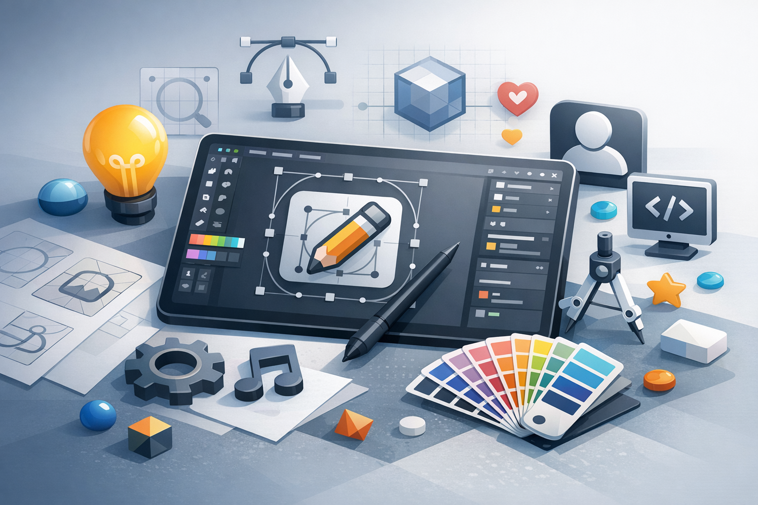
What is icon design?
Icon design is the craft of creating small, symbolic visuals that communicate an action, object, or idea at a glance. In digital products, icons help users navigate interfaces faster by reducing reliance on text and reinforcing meaning through consistent visual cues. Great icons feel “obvious” because they match user expectations, remain legible at small sizes, and fit naturally within a product’s visual language.
Unlike illustration, icon design is primarily about clarity and consistency. Every pixel matters—especially when an icon is used at multiple sizes across devices, platforms, and contexts (navigation bars, toolbars, buttons, empty states, and more).
Why icon design matters in user experience
Icons are a core part of UI communication. When designed well, they reduce cognitive load, speed up scanning, and improve accessibility—especially for users who prefer visual cues or are navigating in a second language. When designed poorly, they can confuse users, slow tasks, and add friction to everyday interactions.
Strong icon design contributes to:
- Faster recognition: Users can identify common symbols (search, settings, share) more quickly than reading labels.
- Consistency across screens: Repeated icon patterns help users build confidence in how a product works.
- Better aesthetics: A cohesive icon set elevates perceived quality and brand polish.
- Space efficiency: Icons convey meaning in compact areas where text may not fit.
Core principles of great icon design
Clarity and recognizability
An icon’s first job is to be understood quickly. Favor familiar metaphors and simple shapes. If you must use a specialized metaphor, consider pairing the icon with a label—especially for key actions—to prevent ambiguity.
Simplicity with purpose
Remove unnecessary detail that won’t survive at small sizes. Instead of “decorating” an icon, focus on the few features that distinguish it: the handle on a magnifying glass, the notch on a bookmark, the gear teeth in settings. Simplification should preserve the icon’s identity, not erase it.
Consistency across the set
Icons rarely live alone. Consistency is what makes an icon set feel professional. Define rules for:
- Stroke weight (e.g., 2px at 24px icon size)
- Corner radius and cap/join styles
- Perspective (flat vs. subtle depth)
- Level of detail (how many interior lines, cutouts, etc.)
- Optical alignment (how shapes “feel” centered)
Scalability and legibility
Icons must remain readable at common UI sizes (often 16, 20, 24, and 32 px). What looks great at 64 px can turn into a blur at 16 px. Design with small sizes in mind and test early. In some cases, you may need size-specific variants (a simplified version for 16 px and a more detailed one for 24+ px).
Visual balance and optical correction
Mathematically centered shapes can look off. Icons often require optical corrections—slight adjustments so they appear balanced. For example, circles may need to be a touch smaller than squares to look the same size, and vertical strokes may need subtle shifts to feel centered.
The icon design process (step-by-step)
1) Define the purpose and context
Start by clarifying where the icons will live (mobile app, web dashboard, marketing site) and how they’ll be used (navigation, feature list, status indicators). Also identify whether icons will be standalone or paired with labels. Standalone icons require stronger metaphors and clearer shapes.
2) Establish style guidelines
Create a mini style guide before drawing a full set. Decide on:
- Grid size (commonly 24px or 32px)
- Stroke vs. filled icons
- Stroke weight and alignment (centered stroke is common)
- Corner radius, angles, and line endings
- Brand characteristics (friendly, technical, playful, premium)
This ensures the first icon doesn’t become an “accidental standard” that’s hard to scale into a cohesive library.
3) Sketch and explore metaphors
Sketch quickly—on paper or digitally—to explore multiple metaphors. For example, “security” could be a lock, shield, key, or checkmark badge. Choose the metaphor that aligns with your users’ expectations and your product’s tone. If possible, validate with quick feedback from teammates or users.
4) Build on a grid
Move to vectors and build icons on a consistent grid. Use guides to standardize padding and key proportions. A grid helps keep line weights consistent, aligns edges, and improves pixel-level crispness when icons are exported.
5) Refine details and apply optical adjustments
Refinement is where good icons become great. Focus on:
- Negative space: Ensure interior cutouts don’t collapse at small sizes.
- Distinct silhouettes: Icons should be recognizable even when blurred or viewed quickly.
- Stroke continuity: Avoid awkward tangents and cramped intersections.
- Consistency: Compare icons side-by-side and harmonize proportions.
6) Test at real sizes and in real UI
Always test icons in context—not just on an artboard. Place them in buttons, navigation, and toolbars. View them at 100% on multiple screens. Check light and dark backgrounds and confirm that the icon reads well next to other UI elements.
7) Export, name, and document
Export assets in the formats your team needs (SVG for web, PDF/SVG for handoff, and platform-specific formats if required). Use consistent naming (e.g., icon-search, icon-settings) and document usage guidelines: recommended sizes, padding, color rules, and do/don’t examples.
Common icon design styles (and when to use them)
Outline icons
Outline icons are clean, modern, and flexible. They work well in dense UIs because they feel lightweight. Ensure stroke weight is consistent, and consider filled variants for active states.
Filled (glyph) icons
Filled icons have strong presence and often read better at smaller sizes. They’re great for mobile navigation bars and high-contrast UI. Watch for muddy details—filled shapes need carefully managed negative space.
Duotone icons
Duotone icons can add hierarchy by using a secondary tone for supporting shapes. They’re useful for dashboards and complex products, but require a thoughtful color system and strong accessibility checks.
Illustrative or brand icons
More decorative icon styles can reinforce brand personality in marketing pages or onboarding. Keep them distinct from UI action icons to avoid confusion, and don’t sacrifice clarity for flair in functional areas of the interface.
Accessibility and usability considerations
Icons should support all users, including those using assistive technologies or experiencing low vision. Key considerations include:
- Color contrast: Ensure icons meet contrast requirements against their background (especially for critical actions and statuses).
- Labels and tooltips: Provide text labels for important or uncommon actions. Use tooltips for icon-only controls on desktop.
- Touch targets: On mobile, the tappable area matters more than the icon size. Aim for comfortable touch targets (often ~44px minimum).
- Don’t rely on color alone: If an icon indicates status (error/success), pair color with shape or text where possible.
- Semantic meaning: In implementation, ensure icons have appropriate accessible names (e.g., ARIA labels) when used as controls.
Best practices for building a cohesive icon set
Create a small “foundation” first
Design a core group (e.g., 10–20 icons) that represent varied shapes and complexity—navigation, actions, objects. Use these to validate your rules before scaling the library.
Standardize key measurements
Define consistent padding, corner radii, and stroke weights. Many teams use a 24px grid with a consistent live area (for example, 20px) to keep icons visually aligned when placed together.
Design for states
Plan how icons behave across states: default, hover, active/selected, disabled, and loading (when applicable). Consider pairing outline and filled variants, or using subtle color changes for state feedback.
Use recognizable metaphors—and be consistent
If a trash can means “delete,” don’t switch to an “X” elsewhere unless there’s a clear reason. Users learn icons through repetition. Consistent metaphors reduce mistakes and speed up navigation.
Keep an eye on international and cultural meaning
Some symbols aren’t universal. For example, a mailbox shape, hand gestures, or certain metaphors can vary by region. When in doubt, test with a diverse audience or use clearer labels.
Conclusion
Icon design is equal parts communication and craft: you’re translating meaning into a compact visual form that must stay clear, consistent, and scalable. By grounding your work in strong metaphors, designing on a grid, testing in real UI, and documenting a cohesive system, you can create icons that improve usability and make your product feel polished from the first glance.
