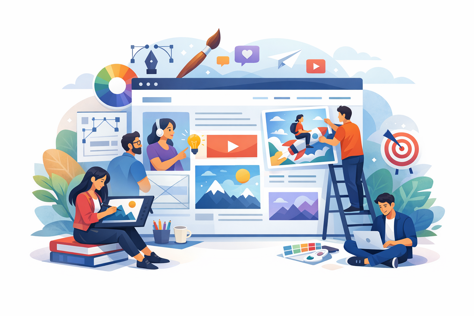
What Is Illustration Web Design?
Illustration web design is the use of drawn or digitally created artwork—characters, scenes, icons, patterns, and custom graphics—as a core part of a website’s visual language. Unlike stock photos or purely typographic layouts, illustrations can be tailored to your brand’s personality, messaging, and user experience goals. They can live in hero sections, explain complex features, guide navigation, reinforce trust, or simply make a site more enjoyable to use.
Good illustration web design is not “decoration.” It’s a strategic design choice that supports clarity, brand recognition, and usability—while giving you a distinctive look that’s hard to replicate.
Why Illustrations Work So Well on Websites
They make your brand instantly recognizable
Custom illustration styles—line art, flat vectors, 3D-inspired renders, hand-drawn sketches, or collage—create a signature look. When repeated across pages (homepage, product screens, onboarding, blog graphics), they build visual consistency that users remember.
They simplify complex ideas
Illustrations excel at showing concepts that are hard to photograph: software processes, data flows, abstract services, and “before/after” transformations. A well-designed visual metaphor can reduce cognitive load and help users understand your value proposition faster.
They add warmth and personality
Many industries—finance, healthcare, cybersecurity—can feel intimidating. Friendly illustrations can soften the tone without sacrificing professionalism, making users more comfortable exploring, signing up, or reaching out.
They support accessibility when used thoughtfully
Illustrations can improve comprehension for different learning styles. When paired with clear headings, sufficient color contrast, and descriptive alt text (especially when the illustration conveys information), they help more people access your content.
Common Types of Illustrations Used in Web Design
Hero illustrations
Hero sections often set the emotional tone of the site. A custom hero illustration can communicate your product category, audience, and brand voice in seconds. The best hero artwork supports the headline rather than competing with it.
Icon sets and micro-illustrations
Small supporting illustrations—feature icons, bullet visuals, badges, empty-state graphics—add polish and clarity. Consistent stroke weight, corner radius, and color usage matter here; mismatched icons can make a site feel fragmented.
Explainer and storytelling scenes
Multi-step illustrations can guide users through a process (onboarding, how it works, pricing tiers). These are especially effective when paired with scannable copy and a clear call to action after each section.
Background patterns and textures
Subtle illustrated patterns can add depth without slowing the site down—think light grain textures, abstract shapes, or repeated motifs. Keep them low-contrast so they don’t interfere with readability.
Interactive illustrations
Animated SVGs, scroll-triggered scenes, or small hover interactions can make a site feel premium. The key is restraint: motion should guide attention and provide feedback, not distract from conversion paths.
Best Practices for Illustration Web Design
Start with brand strategy, not style trends
Before choosing an illustration approach, define your brand attributes (e.g., confident, playful, calm, technical). Your illustration style should reinforce these traits. A whimsical doodle style may be perfect for an education app, but it could undermine trust for a legal services site unless carefully executed.
Design for clarity and hierarchy
Illustrations should support reading flow. Use size, placement, and contrast to keep headlines and calls to action dominant. A practical rule: if the illustration is the first thing users notice and it doesn’t immediately clarify the message, it’s too loud.
Keep the style system consistent
Create a mini “illustration design system” so visuals feel cohesive across the website:
- Palette: primary and secondary colors, plus rules for gradients or shadows
- Line rules: stroke width, caps, joins, and whether outlines are used
- Shapes: geometric vs. organic, rounded vs. sharp
- Character rules: proportions, facial detail level, and diversity guidelines
- Lighting and depth: flat, semi-flat, or 3D cues
Optimize performance from the beginning
Illustration-heavy sites can become slow if assets are not optimized. Aim for lightweight formats and smart delivery:
- Use SVG for icons and simple vectors (scales cleanly and compresses well).
- Use WebP/AVIF for raster illustrations when SVG isn’t practical.
- Compress and lazy-load non-critical images below the fold.
- Avoid oversized exports; serve appropriately sized images with
srcsetwhen needed.
Make accessibility part of the workflow
Illustrations can be inclusive and accessible with a few habits:
- Add alt text when the illustration communicates meaning; use empty alt (
alt="") for purely decorative images. - Maintain color contrast for text overlaying illustrated backgrounds.
- Respect reduced motion preferences for animations (e.g., disable or simplify motion when users opt out).
Use illustrations to guide conversion paths
Strategically placed visuals can lead users toward the next step. Consider:
- Directional cues (subtle lines, gazes, or composition pointing toward a button)
- Illustrated “proof” moments (badges, outcomes, simplified charts)
- Friendly empty states that help users recover from errors and continue
Illustration Web Design Trends (Used Wisely)
Bold, minimal character design
Simple characters with strong silhouettes and limited facial detail can feel modern and scalable. This trend works best when paired with clean typography and ample whitespace.
Soft gradients and subtle depth
Gentle gradients and shadow cues can add dimension without heavy 3D rendering. Keep depth consistent across the site so components don’t feel mismatched.
Hand-drawn accents for authenticity
Sketch lines, imperfect shapes, and marker-like textures can convey a human, approachable brand. Use them as accents—overusing hand-drawn elements can reduce readability and perceived polish.
Micro-animations for feedback
Tiny animations—like an icon that reacts on hover or a loading illustration—can make interfaces feel responsive. Prioritize usability: motion should clarify state changes and reduce uncertainty.
How to Get Started: A Simple Workflow
1) Define your goals and pages
List where illustration will have the most impact: homepage hero, features, onboarding, pricing, blog, or support pages. Tie each visual to a user goal (learn, compare, trust, act).
2) Build a moodboard and choose a style direction
Collect references for color, line style, composition, and character approach. Then narrow to one direction that matches your brand attributes and audience expectations.
3) Create a reusable illustration kit
Start with core building blocks (icons, shapes, a few characters, a scene template). A modular kit helps you scale the design across pages without reinventing the style each time.
4) Prototype in context
Test illustrations inside real layouts with real headlines and buttons. What looks great in isolation can overwhelm a section when combined with UI elements.
5) Measure and refine
Use analytics and user feedback to see if illustrations improve engagement and conversions. A/B test hero variations, reduce visual noise on key landing pages, and adjust placement based on scroll and click behavior.
Conclusion
Illustration web design can transform a website from generic to memorable—while improving clarity, trust, and user experience. The key is to treat illustrations as a strategic system: consistent style rules, performance-friendly assets, and thoughtful placement that supports your content and conversion goals. Start small, design with intent, and build a cohesive illustration toolkit that grows with your brand.
