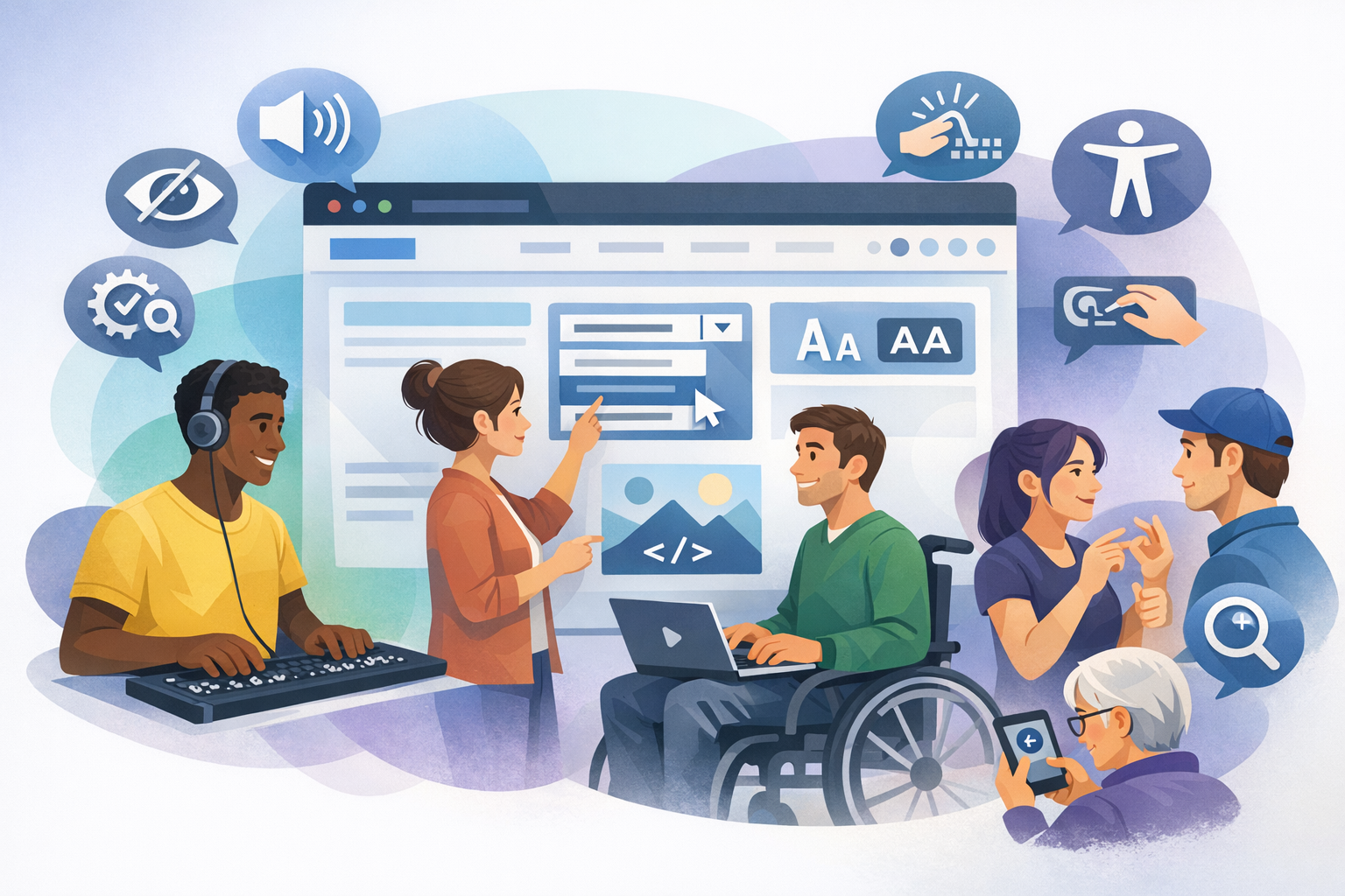
What is inclusive web design?
Inclusive web design is the practice of creating websites and digital products that can be used by as many people as possible—regardless of ability, language, device, context, or level of digital confidence. It goes beyond “making a site accessible” as a final checklist item; instead, it builds usability and dignity into the experience from the start.
Inclusive design recognizes that people interact with the web in many different ways: using screen readers, keyboard-only navigation, voice input, captions, high-contrast modes, small screens, slow connections, or one-handed use. It also acknowledges temporary and situational limitations—like a broken arm, bright sunlight, a noisy train, or caring for a child—where inclusive choices help everyone.
Why inclusive web design matters
Better experiences for real people
Inclusive design is ultimately about people. When a form can be completed with a keyboard, when text is readable, when videos have captions, and when instructions are clear, more visitors can accomplish what they came to do. This reduces frustration and makes your site feel trustworthy and welcoming.
Stronger business outcomes
When more people can use your site, you reach a wider audience and reduce drop-off. Inclusive improvements often boost conversion rates, reduce support requests, and improve customer satisfaction. Many inclusion practices also improve mobile usability and performance—two factors closely tied to sales and engagement.
Legal and ethical responsibility
In many regions, accessibility requirements apply to public sector organizations and often to private businesses too. Designing inclusively helps you align with standards such as the Web Content Accessibility Guidelines (WCAG) and reduces legal risk. More importantly, it demonstrates a commitment to fairness and equal access.
Core principles of inclusive web design
1) Start with diverse users and real contexts
Inclusive design begins by expanding who you consider “typical.” Include people with different abilities, ages, languages, and levels of tech comfort in research and testing. Also consider context: low bandwidth, older devices, bright outdoor environments, or multitasking situations.
Practical tip: Create personas that represent diverse needs (e.g., a keyboard-only user, a low-vision user, someone reading in a second language) and validate them with real feedback.
2) Prioritize clarity over cleverness
Clear navigation labels, readable typography, and straightforward language make experiences more inclusive. “Delight” should never come at the cost of comprehension. Reduce cognitive load by using familiar patterns, consistent layouts, and concise calls to action.
Practical tip: Use plain language, short paragraphs, and descriptive headings so users can scan and understand content quickly.
3) Provide multiple ways to perceive and interact
People access information differently. Inclusive design offers alternatives: text equivalents for images, captions for video, transcripts for audio, and layouts that work with zoom and reflow. It also supports different input methods—mouse, keyboard, touch, and assistive technologies.
Practical tip: Don’t rely on color alone to communicate meaning (for example, “fields in red are required”). Pair color with text, icons, or patterns.
Inclusive web design best practices (with examples)
Typography and readability
- Use legible font sizes: Aim for a comfortable base size (often 16px or more) and sufficient line height.
- Maintain strong contrast: Ensure text contrasts clearly against backgrounds, including for links and muted UI text.
- Avoid dense walls of text: Break content into headings, bullets, and short sections.
Example: If you use light gray text for descriptions, confirm it still meets contrast guidelines and remains readable on mobile in bright light.
Color and visual design
- Don’t encode meaning with color only: Pair color with labels (e.g., “Error: Password too short”).
- Design for high contrast modes: Ensure components remain visible when users enable system contrast settings.
- Support dark mode thoughtfully: Preserve contrast and avoid low-contrast “dark gray on dark gray” designs.
Example: In charts, combine color with patterns or direct labels so data is understandable for color-blind users.
Navigation and layout
- Use consistent navigation: Keep menus, search, and key actions in predictable places.
- Make focus visible: Keyboard users need a clear focus indicator when tabbing through links and controls.
- Use meaningful headings: Structure pages so users (and screen readers) can jump to sections easily.
Example: A “Skip to main content” link helps keyboard and screen reader users bypass repeated menus.
Forms and interactions
- Label inputs clearly: Use persistent labels, not placeholder-only text.
- Provide helpful error messages: Explain what went wrong and how to fix it, in plain language.
- Make targets easy to tap: Ensure buttons and links are large enough for touch and motor accessibility.
Example: Instead of “Invalid input,” try “Enter a phone number with country code, like +1 555 123 4567.”
Images, media, and content alternatives
- Add informative alt text: Describe the purpose of the image, not every detail.
- Use captions and transcripts: Captions help in noisy environments and support deaf and hard-of-hearing users.
- Avoid autoplay: Unexpected audio can be disruptive and difficult to stop for some users.
Example: For a product photo, alt text like “Blue waterproof hiking jacket with hood” is more useful than “jacket image.”
Performance and resilience
- Optimize loading: Fast sites are more inclusive for users on slow connections or older devices.
- Design for interruptions: Preserve form progress and avoid short timeouts.
- Progressive enhancement: Ensure core tasks work even if some scripts fail or features aren’t supported.
Example: If a checkout relies heavily on JavaScript, provide graceful fallbacks so users aren’t blocked by device limitations.
Inclusive web design process: how to implement it
Build inclusion into planning and design
Start with requirements that include accessibility and inclusion, not just visual preferences. Use design systems with accessible components (buttons, modals, form fields) and document patterns such as focus states and error messaging.
Test early and often
Combine automated tools with human testing. Automated checks can catch common issues (like missing alt text), but real users and assistive technology testing reveal practical barriers.
- Keyboard testing: Can you navigate and complete key tasks without a mouse?
- Screen reader spot checks: Are headings, labels, and announcements meaningful?
- Zoom and reflow: Does the layout remain usable at 200% zoom?
Collaborate across roles
Inclusive outcomes require shared ownership. Designers, developers, content writers, QA, and product stakeholders should agree on standards and review work against them. Content teams play a major role—clear writing, descriptive links, and structured headings are essential.
Measure and iterate
Track feedback and behavior: form completion rates, drop-off points, search refinements, support tickets, and user comments. Treat inclusion as ongoing improvement, not a one-time project.
Conclusion
Inclusive web design creates better experiences for everyone by making websites easier to perceive, understand, and use across a wide range of needs and situations. By focusing on clarity, flexible interaction, accessible content, and resilient performance, you can build digital experiences that welcome more people—and deliver stronger results at the same time.
